
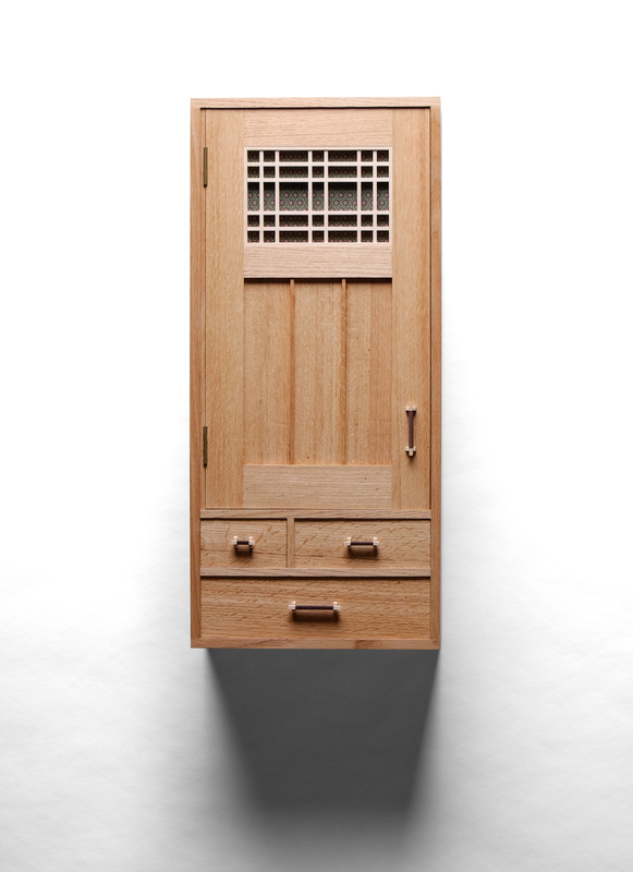
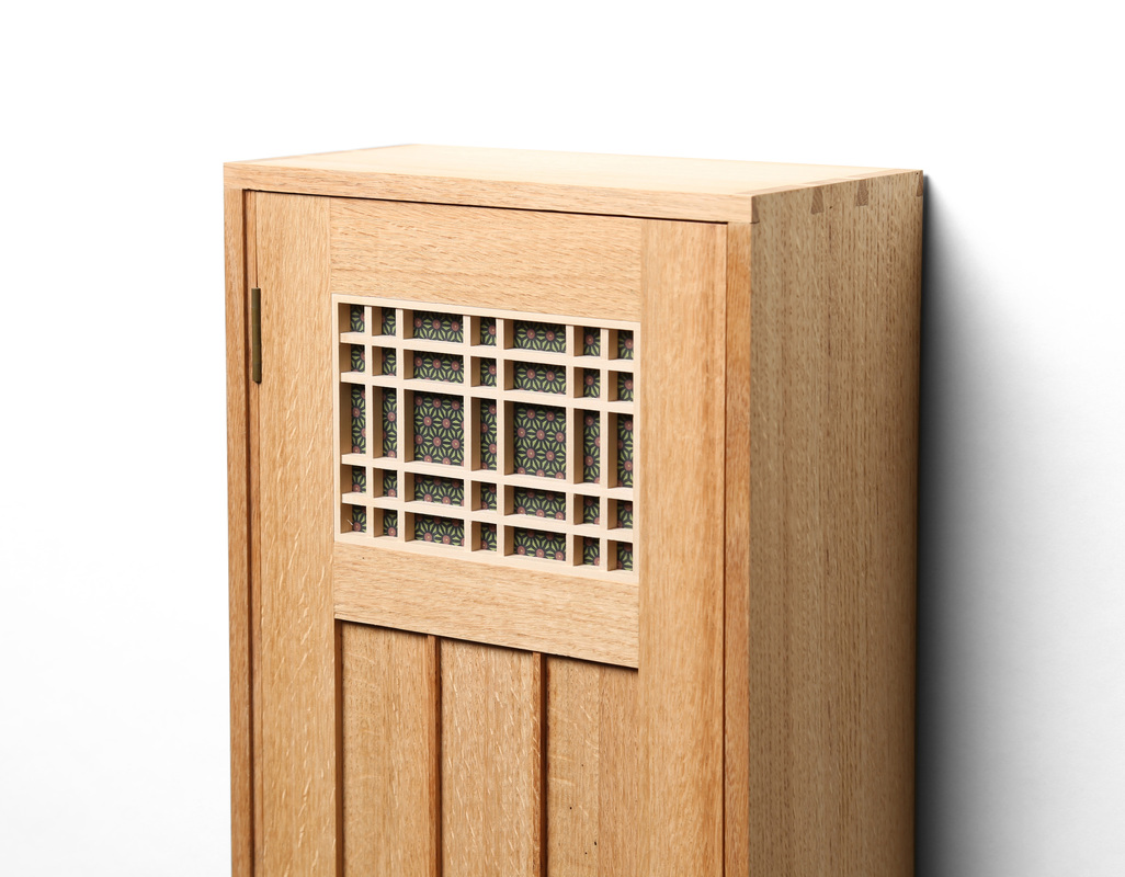
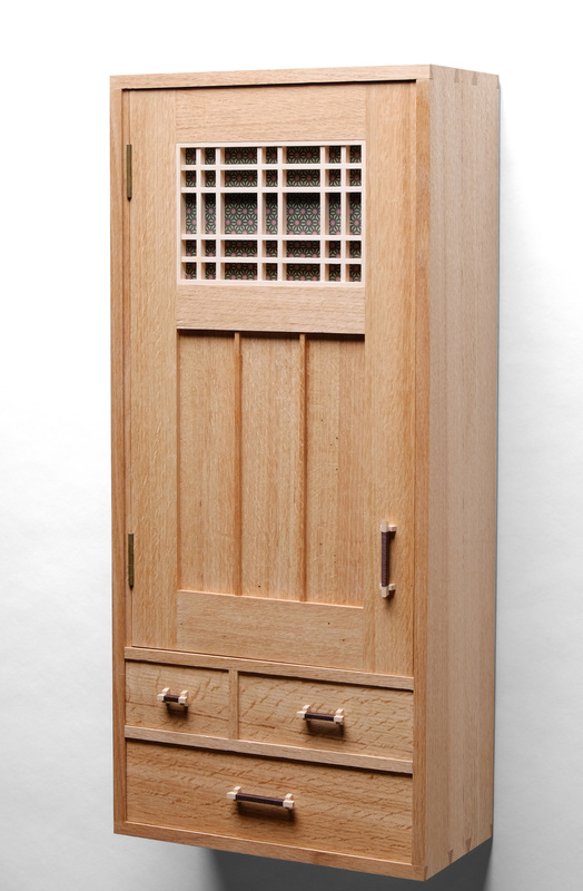
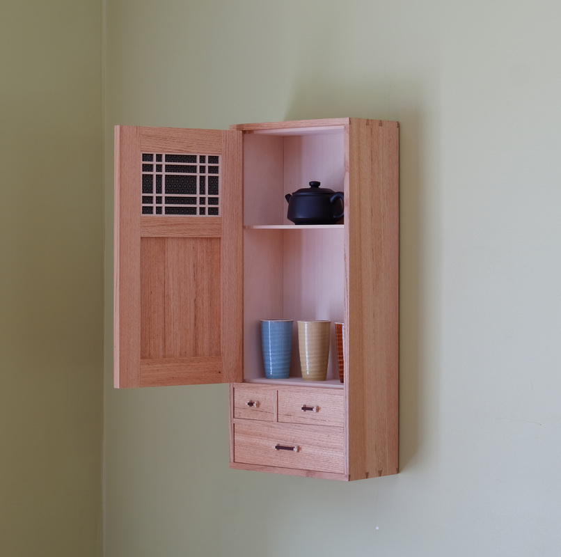
  I was teaching at Peters Valley Craft Center in early summer 2015, and was asked to participate in an upcoming gallery show that would feature work inspired by Peters Valley. I asked if I could take a big, weathered chunk of oak that had been sitting of the wood shop's front porch for years. I think it had been used as door stop. My plan was to make a box from it. Unfortunately, when I cut into it, I discovered that it was still too wet to use. So, I just cut it into about 6 perfectly quartersawn boards and stickered them in my shop. One year later, the boards were dry and I set about to make something from them. Based on the size of the boards (5 in. wide, about 5/8 in. thick, and over 30 in. long), I figured I could make a small wall cabinet with a few drawers and a door. This cabinet strikes out in a new direction for me, and I took it primarily because of the wood I was using. Oak, with its bigger pores, has a much rougher texture than cherry (the species I use most often). It's a texture that's not well-suited to the minimalist, clean, and modern aesthetic I've developed. So, I incorporated a few details that I stole from Mike Pekovich (who primarily works with quartersawn white oak). I inset the door and drawers, and used two vertical dividers to break up the lower door panel. I also used butt hinges instead of knife hinges. The hinges are mortised into a hinge strip, a brilliant and necessary detail that allows the inset door to swing fully open on butt hinges. I don't know if I can explain why these small changes make the cabinet better suited for oak, but they do. Still, they don't override my own aesthetic. It looks like a cabinet that I made, instead of one that Mike made. This is because of my sense of proportion, which is different from his, my penchant for having two rows of drawers with the top row being dividing unevenly, my love for flush dovetail joinery, and my stripped down take on kumiko. Of course, the fact that I used this style of pull doesn't hurt to mark the cabinet as mine. In the end, I think I ended up with a cabinet that is clearly mine, but tailored for the wood species used. OK, a few words about this red oak: It is amazing. It starts with the cut of the grain, quartersawn. There are no ugly cathedrals. It's nice to be your own sawyer. Perhaps there's a sawmill in my future. I think it also helps that this is Northern red oak, as opposed to Southern red oak. The Southern one is that nasty super red stuff used to make a lot of manufactured furniture. Oak from up North is brown, but still has a red cast. It's a lovely color. Finally, there is some nice variation in the color. Take a look at the side that's facing the camera. Notice that it's darker at the front and then transitions to a creamy brown. I like this. I guess the most interesting thing about this cabinet is the door, which is nice, because that's what I intended. When designing the door, I knew that I wanted a kumiko panel up to and a solid wood panel beneath it. I sketched out some ideas, fooling around with their sizes in relation to one another. Having the kumiko panel smaller looked the best, and I chose to divide the door into thirds, with the bottom panel and middle rail taking up about two-thirds of the door. The kumiko panel isn't a traditional design. Why? Because I have some kind of clinical obsession with using rectangles and squares to create patterns. The kumiko is basswood set on top of a plywood panel that's covered with Chiyogami paper. The inside of the door has a similar kumiko over the same paper. I'll still use fabric, but I'll also begin to use Chiyogami and other Japanese paper more often. As I was looking for paper to use in this cabinet, I waded through dozens and dozens of internet pages. The hardest thing to judge was the size designs printed on the papers. As with grain and fabric prints, the paper needed to have print that was proportionally right for the door and cabinet. I think I did alright. The two vertical dividers were an addition to the door after I assembled it dry. The panel just looked blah and too big. The dividers work, because they echo the kumiko pieces above them and also because they break the panel into smaller panels. This is where design really happens: In the small details. I wish I had foreseen that a single panel would look horsey, but at least I caught it in time. One last thing before I get back to the first day of the college football season. (Hey, I grew up in the South.) Here's how I arrived at this kumiko pattern. I like kumiko, but I don't like it when the kumiko is the thing on display. I like to use it to create a pattern and give emphasis to the color, fabric, or paper behind the kumiko. So, I designed the kumiko to have big open spaces in the middle. This puts the cool Chiyogami paper on display, framing it. At any rate, on to some random thoughts.
10 Comments
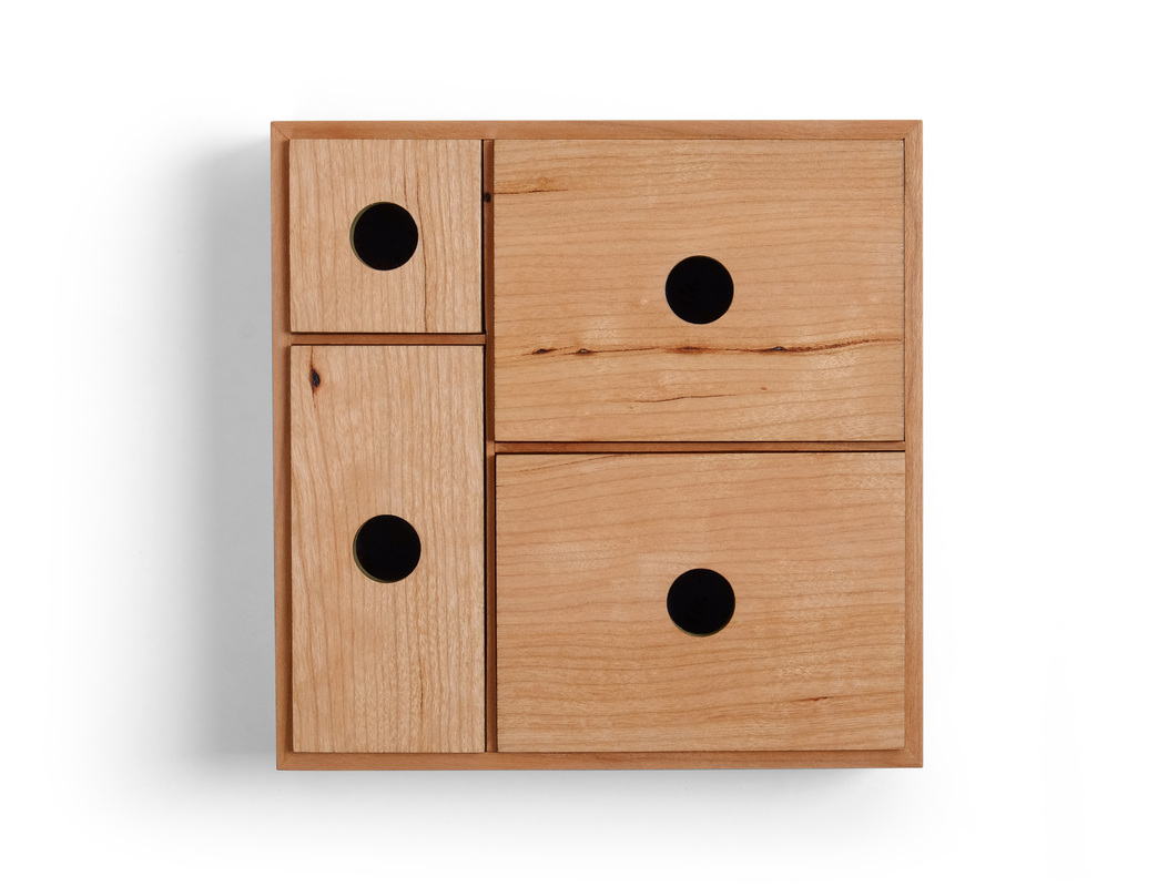
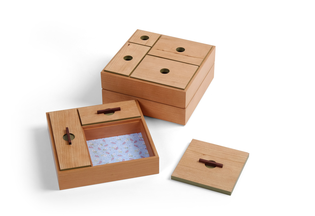
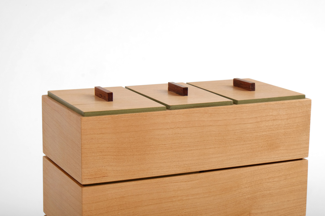
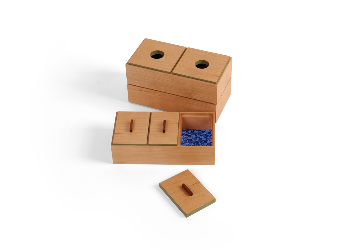
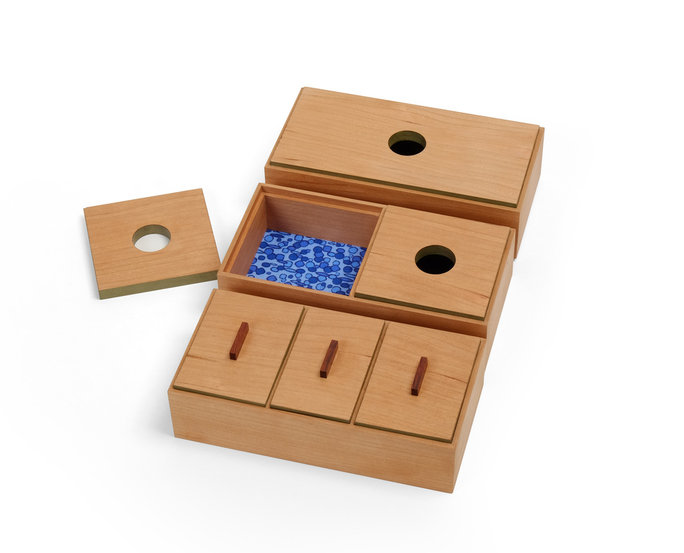
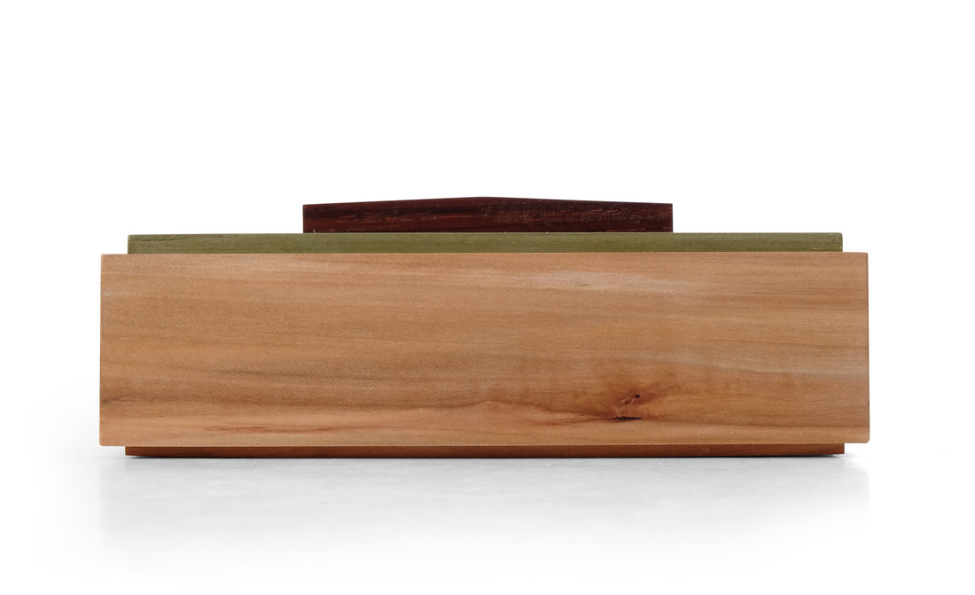
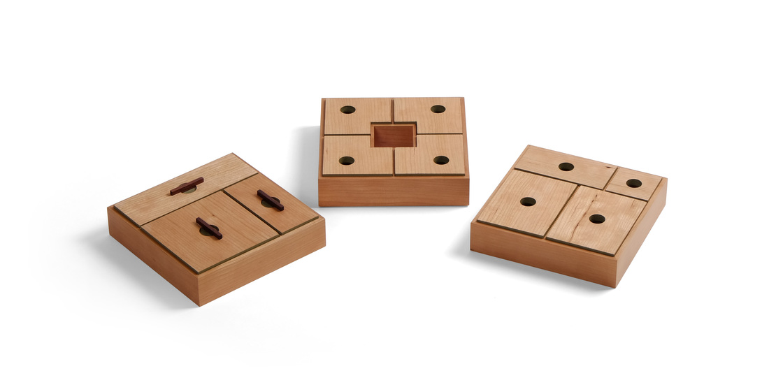 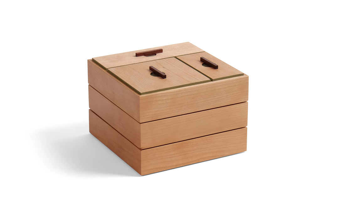 Box 52. Done. And that's all I have to say about that. Kidding. I always have plenty to say. This is another stacking box, like box 49, but I changed the shape from rectangle to square, taking box 48 as my starting point (I really like box 48). I think box 49 is too tall, so this time I made the sides 1 1/4 in. tall instead of 1 1/2 in. I know it's impossible to tell from these photos, but the lower height is an improvement. I also like the square format for the boxes. (I'm actually excited about designing more square boxes in the future. I can't believe I never tried a square box until No. 48.) The biggest benefit of the square is that I had more latitude in dividing the boxes into compartments. For the top box, I used the same arrangement as I did for box 49. For the middle box, I added a compartment. For the bottom box, I added another compartment, but not another lid. A square compartment in the middle of a box with others wrapping around it: I've had this arrangement in mind for years. I finally said fuck it and gave it a try. It wasn't as hard to do as I feared. I did not use a lid for it because I wanted a pop of color in the middle and I thought the fabric would be cooler than a painted lid. Here's something I don't like: Dumb figure holes on the two lower boxes. They suck. As I was working on this box and running through all the different ways I could make a pull for them, I was getting bummed out because I thought that I just wasn't able to design a good pull for them. The problem is that the bottom of the box above sits on the lid of the box below, so the pulls on the box bellow must be flush with the lid. That's a tough constraint to work with. However, I realized that the problem wasn't really a design problem. It's an engineering problem. I needed to change how the upper box sat on the lower box. I've figured that out now, and the next time I build a box like this (soon, I think), I'll be able to have pulls that are at least a bit proud of the lid. Then, I'll be able to design a lovely pull for the lower two boxes. So, some progress was made. I think that's all I have to say, so let's here are the customary random thoughts.
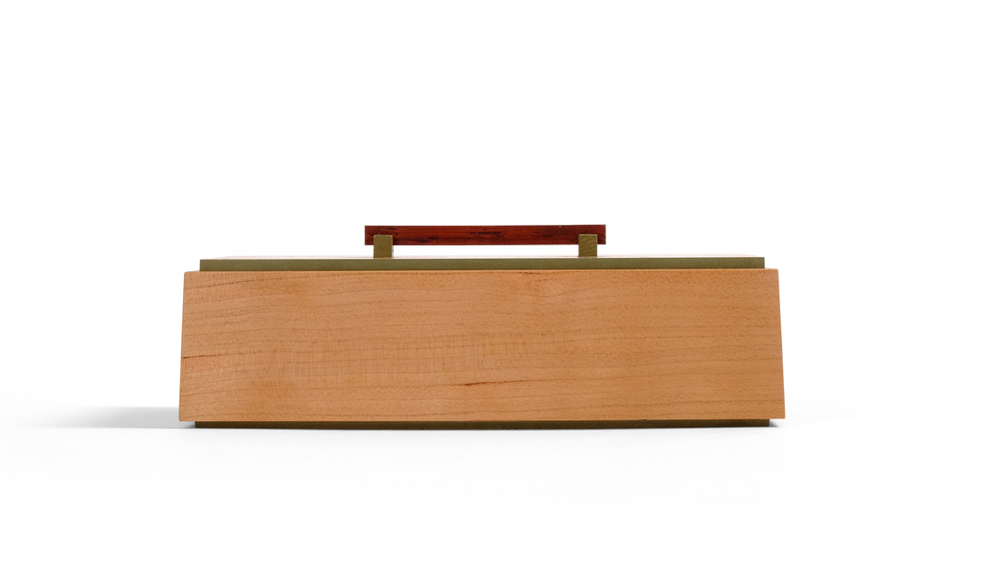
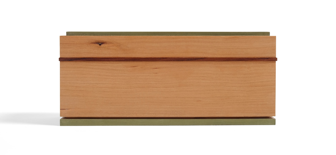
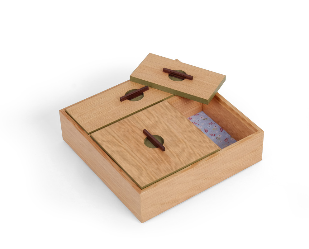
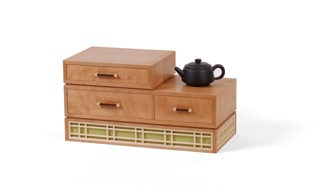 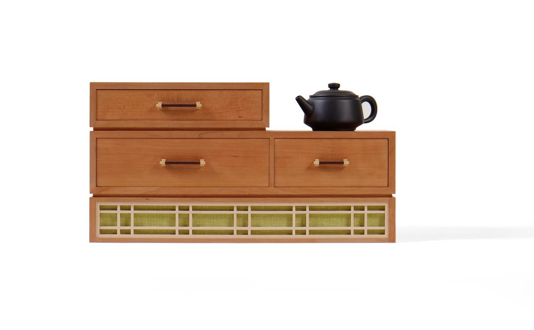 I really wish this was box 52, because it brings together so much of what I've been doing for the past year that it's the perfect culmination for the 52 boxes project. This is certainly the best box I've made so far. (Actually, box 52 is already done, so I think it's the best of all the boxes, too.) Hell, it's almost certainly the best piece I've ever made. But it's box 51, so let's skip the overwrought nonsense and get doing what needs to get done. The base is a good place to begin. The idea for a base like this one came to me one day while Mike Pekovich and I were driving back from lunch (sushi, I think). If I remember correctly, we were talking about kumiko and all the things you could do with it. Out of nowhere an image came into my mind, and I said, "I could make a box with a tall base and have kumiko wrap around it." I'm not sure what I had in mind then, but I was confident that it would look cool. OK, so what was I thinking when I got around to developing the idea into an actual box? Well, the first thing I tackled was how tall the base needed to be in order to get a nice looking kumiko pattern into it, and how that would affect the size of the case on top of it. I sketched out rectangles stacked on top of one another and experimented with different heights for them. A base that was slightly shorter than the "box" on top of it but as taller or taller than the uppermost "box" looked right to my eye. (How's that for some solid design advice? Well, actually, it's pretty damn good. Sketch, mother fucker, sketch.) What you end up with is a base that is tall enough for some nice kumiko to fit into it, but not so tall as to dominate the piece as a whole. There's a harmony between the three levels even though the base is visually striking. That's what I'm always after: Something that has a lot of graphic punch but that isn't unbalanced. So, after I figured out that business, I sketched out ideas for the two rows of drawers. I wanted a space on the right hand side for a tea pot or some such thing, so I made the top row just a single drawer. The bottom row, I knew from previous experience with thin parts, couldn't be a single drawer. Thin parts like these tend to sag when they're longer than about 10 in., so I split the bottom row into two drawers. The wider one is 10 in. and the smaller one is about 7 in. wide. This told me that the top drawer should end in line with the wider bottom drawer. (Sometimes I think that I should explain how I knew this. I suppose I could by saying that it just looks better than if the top drawer were not as wide or wider. But this explanation doesn't cut the mustard with the philosopher in me. After all, why does it look better? Then we must get into a discussion of beauty, the roll of proportion, symmetry and asymmetry in beauty and all manner of abstract nonsense. Fascinating for sure, but definitely not practical. But then again, I have a gut feeling that it's just instinct.) Oh, I suppose I could explain that the width of the drawers are a result of determining how much space I would need on the right side to put a small tea pot or some other little piece of pottery. Based on some pieces that I own, I figured 7 in. would suffice. Some sketches told me that 10 in. on the other side would look nice. From there is was a matter of determining how tall the bottom drawers needed to be so that they could hold loose tea (left side) and tea packets (right side). The top drawer is for pennies, acorns, and tales of adventure (hat tip, Saint Orange.) OK, so what about the kumiko pattern? I wanted something geometric but not so crowded that it would obscure the fabric behind it. That meant a lot of negative space. I wanted two horizontal kumiko pieces between the frame and spaced them asymmetrically (more space between them than at the top and bottom) to let the fabric show through more prominently. The vertical pieces are done in pairs, because, well, I knew that it would look better than to do them individually. (Of course, there was some sketching involved, too.) The vertical pattern for the front/back had to be different that the pattern for the sides because the front/back aren't a multiple (in length) of the sides. So, I started them the same on the ends (a pair of vertical pieces 1 in. from the ends and spaced 5/8 in. apart), but the sides just have two single pieces between the pairs at the ends. I divided the space between the two pairs into thirds because there are three pairs of verticals between the two end pairs on the front and back. How did I figure all of this out? Magic 8 ball and rum. Or was it rum, then magic 8 ball? And that's magic 8 ball, not magic 8 ball. There is so much else I could say about how I designed this box, but I need more time to dissect and then organize my thoughts. I will say that all of the cherry for this one came from a single 12/4 board. I resewed it to create 3/8 in. thick boards from the edge grain. I then glued up three of these new boards to create the panels for the sides. These boards ending up being mostly quartersawn and heavily figured. Hell, the entire 12/4 board was heavily figured, even on the flat sawn faces. I hate figure. It's a pain to machine and plane, and can be distracting. And I think folks lean on figure as a crutch to make otherwise shitty design somewhat attractive. It works OK here, though, because the design is good. (When it comes to ego, the Egyptian pharaohs had nothing on me. I'm better looking than Clooney, too.) Well, I'm beginning to wander, so here are some random thoughts.
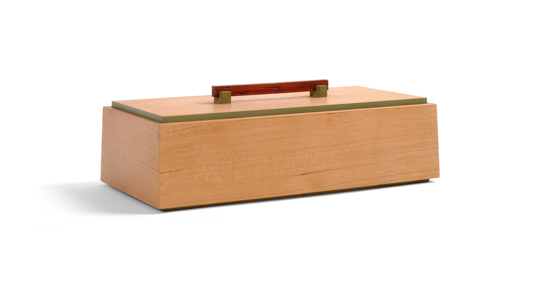
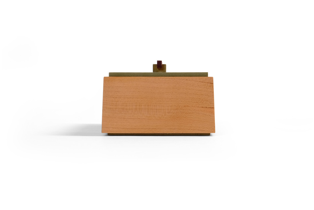
 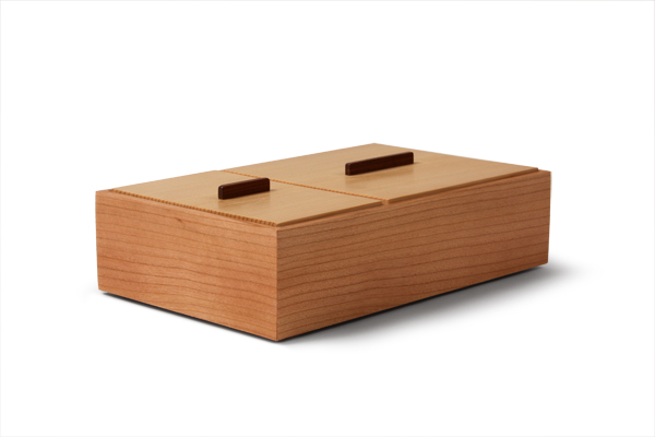 This one feels like a big deal. It's box 50, after all, but I also think it's important because it's a refinement of a box that I've been making for several years: my old friend, the two compartment box (right). It has smaller overall dimensions (1 1/2 in. by 3 in. by 6 in. versus 2 in. by 5 in. by 8 in.), has one compartment instead of two, uses a more stylish pull, and has thinner sides and top. These differences make the box simpler and more delicate, but what makes it more elegant is the inward sloping sides and milk painted edges on the top. These are subtle things, certainly, but they make a big difference. However, I'm kicking myself a bit because had I used a slightly different pull, a slimmed down version of the one I used on box 46, this would be a perfect little box. I guess I'll have to make it again in the near future, just not before I finish the 52 box project. That's quickly coming to a close. And I already have the last two boxes designed (in fact, box 51 is just about done). The inspiration for this box came from the second box I ever made (many, many years ago). We still have that box. It sits on my wife's dresser. It's at least 1 in. taller, and is closer to square in width and length. It also has sloping sides, but I made them by starting out with thick sides and planing the slope into them after assembly. This box has 3/16 in. thick sides. There are compound miters at the corner that result in the inward slope. As I did for boxes 13, 14, and 15, I used a "wedge" to cut the compound miters, the rabbets, and the top and bottom edges. I like the technique because the wedge guarantees that all of the angles will be correct. As a result of the more refined construction, this box is more elegant than the original. I'd like to say that a lot of careful thought went into the design of this box, but that wouldn't be true. I looked at the older box, asked how I would make it now, and the answer came to me quickly. Make is shorter, make it a rectangle, and use compound miters at the corner. I also used the bottom to create a shadow line at the bottom. And the pull is similar to others that I've used. What I did, in other words, was take design details that I've been using this past year and put them together in a new way. In a way, there's nothing new hear, but in truth its a very new box. And it's one of favorites. I love its delicacy, elegance, and the beautiful fabric inside. I don't think I have anything else to say about this one, but you're more than welcome to ask questions if you have them. Here are a few random thoughts.
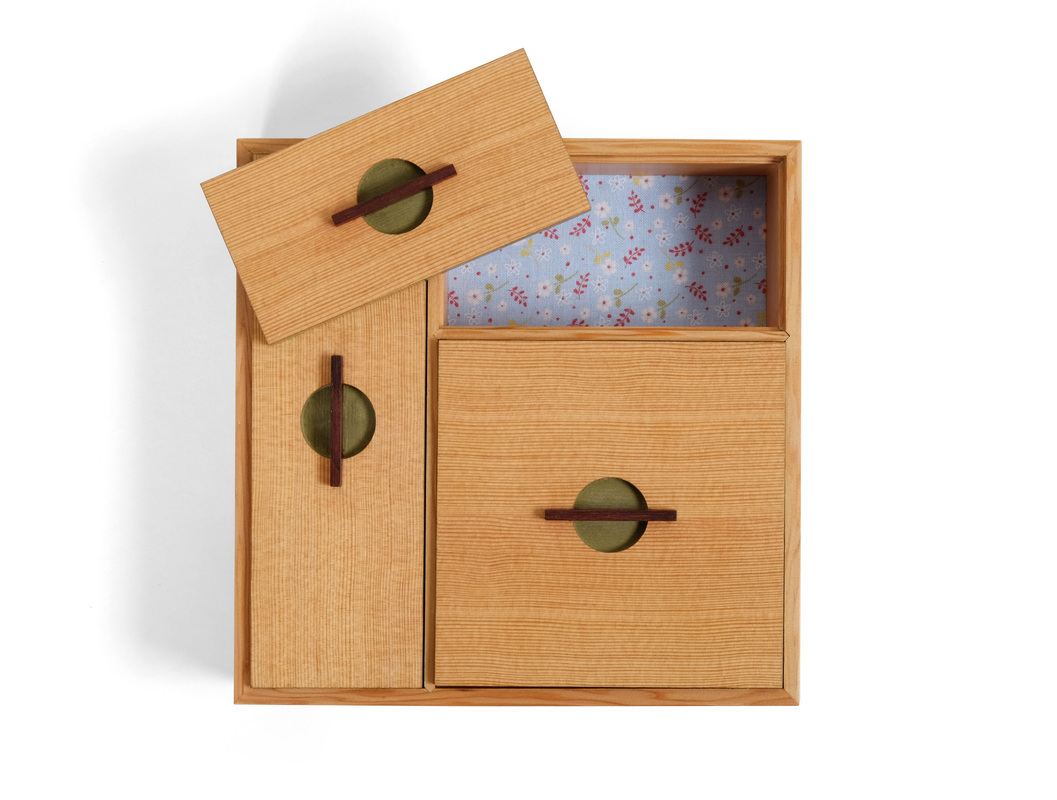
  I made this box and the last box to experiment with a few ideas before bringing them together in a third box, which will be one of the last two I make for the 52 box project. With box 48 I was working on how to join two thin dividers. Here, I’m testing a theory on how to stack boxes. Perhaps you can decipher where I’m heading, but I won’t say anymore now. Let’s get to the box at hand. Unless your vision is as poor as my friend from the North, Bubbles, you will have noticed by now that this box is actually three boxes that stack one on top of the other. The idea for it came from a conversation I had with Mike Pekovich some time last year. He was telling me about a box (for lack of a better term) that he had seen at a museum. It was carried by a samurai. There were a few boxes that stacked on top of one another and were held together by leather (or fabric) straps. It hung from a belt and was used to carry coins and other stuff. I suppose it was something like a stacking bento box. It sounded very cool and on the spot I decided to make a set of stacking boxes. I just had no idea how to do it. A short time later I realized that many of the boxes I had been making in the 52 box project lent them selves to stacking because I was using a rabbet in the top and bottom of the sides to hold the lid and bottom. If I made two boxes with the dimensions and cut identically sized rabbets on the top and bottom on both boxes, the lid for one box would fit into the rabbet on the bottom of the other box. And the lid for the lower box would capture the box on top of it, holding the box in place. This is how these three boxes stack. Of course, me being me, there had to be a shadow line between the boxes. So, the top two boxes have very thin bottoms, but not so thin that the box sits on the box sides beneath it. The lid of the lower box holds the upper box about 1/16 in. above. And there’s your shadow line. I like the shadow line here because it reveals that there are three boxes stacked rather than a single absurdly tall and narrow box. But that visual break between the boxes does something else, too. There is no grain match as you move up from one box to the next. I didn’t cut the sides from a wide board, in other words. This lack of match would have been noticeable had there been no space between the boxes, but it’s really not with the shadow line there. That’s a good thing. When planning this box I knew that I wanted each box to have a different number of compartments, but before I gave any extended thought to this, I kicked around different proportions for the boxes themselves. I finally settled on a rectangle that's twice as long as it it wide. To keep the stacked boxes a reasonable height, I made the sides 1 1/2 in. tall. After deciding on a fairly narrow rectangle, I knew that a divider along the boxes length wouldn't be practical, because it would create two long and very narrow compartments. So, all of the dividers run across the width. After that it was a fairly quick trip to a box with one compartment, one with two compartments and one with three. The compartments for the top box are not all the same size. The one in the middle is narrower. Why? Because cutting dadoes for the dividers in exactly the right location to end up with three equally sized compartments would be crazy hard. But cutting dadoes to make the two outside compartments the same size with a smaller (or larger) middle compartment is a snap. So, that's what I did. (I know this leaves a big question—why is that true and how the hell did you do it?—hanging unanswered, but I beg your pardon, I never promised you a rose garden. There was also the decision about which box would go on the bottom, which in the middle and which on top. There is an argument for going three, two, one from the bottom up. However, a box with one compartment is a solid foundation because it's unbroken. So, it went on the bottom. The box with three compartments looks like three little boxes next to one another, so it went on top. And that's all I have to say about that. Once again, I've blathered on. Here are your randoms for the week.
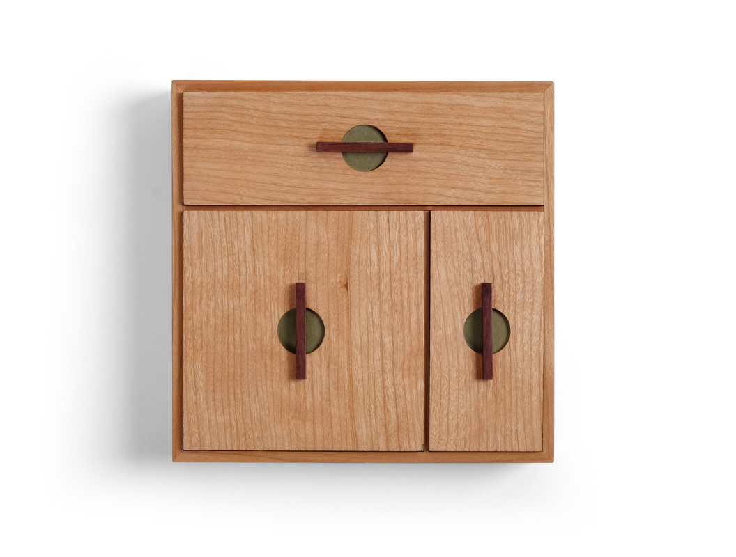
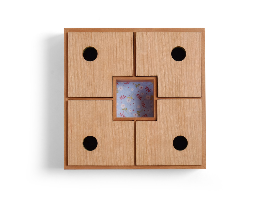
  I made a two of this box. One was for the 52 boxes project and the other was for the daughter of a friend who has given me a lot of great lumber over the last few years. When he gave me some wonderful vertical grain Douglas fir recently, I decided to use it to make a box for his adorable little girl. The boards were left over from a sideboard he'd made for her room. He and I have very different styles, but the fact that the box and sideboard were made from the same boards holds the two together. I know that doesn't say much about the design, but it's a part of this box's story. In fact, the wood is the origin of the box. I normally design and then pick lumber, but this time I was starting with the lumber and needed to develop a design that played to its strengths. I also needed more vertical grain Douglas fir, because what my friend had given me was really only enough for one box. Fortunately, I once found a 3 in. thick, 6 in. wide and 12 ft. long piece of Douglas fir in the corner of a lumber yard. I bought it without a second thought. I'm glad I did, because it's got some figure to it, a lovely, warm color, and super tight grain that's a bit wavy. (I used it's end grain to veneer the drawer fronts on this cabinet.) At any rate, I was designing with vertical grain Douglas fir in mind. What I wanted was a box that emphasized the tight, straight grain. This is no trouble on the sides. Make them rectangular, with the grain running the length. The lid is a different story. I knew that I wanted the box to have at least three compartments, because the three corresponding lids would allow me to play with the fir's grain. However, a box with overall rectangular dimensions limits the shape, size and arrangement of the compartments. So, I went square. I think this is the first square box I've ever made. It's 6 in. square, to be exact. The narrow, full-width compartment is 2 in. wide, or one third of the box's overall width. The smaller of the two 4 in. long compartments is 2 in. wide. The larger one is 4 in. square. These divisions make for compartments (and lids) that are well proportioned in themselves, in relation to one another, and in relation to box's overall dimensions. At the risk of putting even myself to sleep, here's a more detailed explanation of what's going on. The basic dimension of this box is 2 in. The sides are about 2 in. tall when you take the bottom and lid into account. The box is 6 in. square. That's three times the basic dimension, so there are three compartments. The dimensions for the compartments are all multiples of 2 in. My good friend Charles Hermann helped me work all of this out. He has a beautiful mind. (Get thee to Google to decipher this reference, my friends.) Back to the grain. The division and orientation of compartments allowed me to use the grain more boldly. It runs in one direction on the left side, and 90 degrees to that on the right side. Yet, because the grain is subtle, there's no uncomfortable tension created by this redirection of the grain. Somehow it's a dissonance that creates a harmony. I can't explain why this last statement, which makes the philosopher in me suspect it as Grade A bullshit, but I'll think about it some more and see if I can come to a meat-and-potatoes explanation. I wonder if my old friends, the Pythagoreans, might have something to say about this. Well, that's a lot of talk about grain, proportions, and patterns. Let's talk about something else: the pulls. This is the second time I've used this pull on a box. What I like about them is the play between the circular mortise and the thin, rectangular pull. Combined, they create a nice visual set against the background of the tight, straight grain of the Douglas fir. The depth of the mortise allows me to use a pull that's very low but still gives enough grip (the pull extends down into the mortise). And before you ask: No, I didn't use the same technique that was recently feature in Fine Woodworking magazine. (Everyone reads Fine Woodworking, right?) I don't mortise for the pull. Rather, it's T-shape and the horizontal bar fits over the lid. OK, I've written a lot, so I'm going to stop. (Don't worry, I've addressed the major design points of this box.) Enjoy some random thoughts.
When I began my 52 boxes in 52 weeks project, the primary goal was to develop my design aesthetic and improve my design skills. I'm not ready to decide whether I've accomplished those goals, but I think it's OK to discuss something that I've learned, and offer an illustration of it. Here it is: design happens through evolution not revolution. I suspected this before I began, but I've watched it happen over the last 11 months and have no doubt about it now. This evolution is not a result of some natural talent for design. It is, rather, the outcome of asking a simple question: What could I do differently? I'd like to demonstrate this truth by explaining how I came to the very lovely pull used on box 46. What I hope is that you'll read this and feel empowered. Good design isn't difficult. All it takes is the willingness to ask a question, and the courage to fail (because not everything you try out will succeed). Well, let's get started. Click on the pictures below to see a larger version.
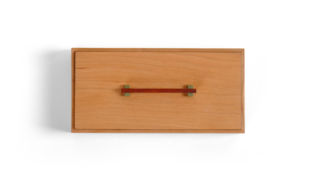
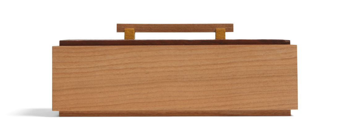
  Here's the second of two boxes that I made using the same dimensions for the box body, and the same species of wood (actually, both boxes were made from the same board). The first box was posted last week. I wanted to see how different, how unique, I could make two boxes that had these similarities, that were the same box at their core. There was an easy way to make them different. I could have given one of them eight legs and a head, making it a spider box. Or some other whimsical nonsense. I wanted more of a challenge, so I limited myself to variations in the lid, pull, and base. What's funny is that although I did make two boxes with unique souls, I also ended up with two boxes that are clearly from the hand of the same maker. I suppose that's really not surprising, but when I first put them next two one another I was struck by it. Actually, it makes me happy. I think it shows an admirable level of design maturity (I'm sure I'm flattering myself in thinking this). I took a narrow set of design parameters and created two distinct boxes that are clearly expressions of my aesthetic. I didn't have to resort to outlandish and absurd differences to get the job done. A few subtle changes is all it took. I believe this means that I've grown as a designer, developed a better understanding of how to apply my aesthetic. This also means, I believe, that my aesthetic is flexible, and this makes me happy, too (a point further illustrated by box 45). Well, that's enough philosophic ruminating. Let's get to the box at hand. I think that as I talk about what I was thinking as I designed this box I won't be able to avoid talking about the first box, but that should be instructive. I'll start with the pulls. On this box the pull is cocobolo banding that wraps around all four sides of the box. I made it just as I did the pull/lid keeper on box 36. It's less than 1/16 in. proud of the sides, but this is more than enough for your fingers to get hold of and pull the lid off. This is a very different style of pull than the one I used on the first box. But, notice that this pull is cocobolo, and that I wrapped the pull for the first box in brown thread. Brown is a nice complimentary color for the cherry box and green milk paint. It makes a great third color to introduce. Using it in the pull means that there will be less of it than both the warm, earthy reddish brown of the cherry and the lovely green milk paint. I'll admit that I chose cocobolo without thinking of the connection to the brown thread, but I certainly chose it for the same reasons that I went with brown thread. It's a strong wood that works well as a tertiary color. (As a primary or secondary wood, cocobolo becomes is overbearing, I think.) At any rate, the pull turned out to be something that both distinguished the second box from the first, but also connected the two. On to the base. I've used this style before (boxes 41, 42, and 44), and I'm starting to really like it. It's plywood with a shopsawn veneer on the bottom face and fabric on the top face. The edges are painted with the same custom green milk paint as the edges of the top. The bottom's edge is thicker than what you see of the top's edge, so the bottom has more weight and can anchor the box. I made this bottom a bit different that I did when I used it previously. The plywood portion of the bottom fits into a rabbet in the box. This means that there is a fairly deep rabbet around the top edge of the bottom, which results in a dark, distinct shadow line. The box seems to float above the bottom. I like it. As for the top, I made it by gluing a panel into a rabbet and then cutting the box body in two. It's quite similar to, but still quite different from the top I used for the first box (a panel that fits into a rabbet). The liner does not keep the lid in place, the pull does. As I did with the first box, I painted the edge of the panel to create separation between the box sides and the lid panel, and I did it for the same reason. It allows the panel to pop as if it were a second species, or a highly figured piece of cherry even though it's cut from the exact same board as the sides. The green creates a visual boarder around the panel. Random thoughts time let it be.
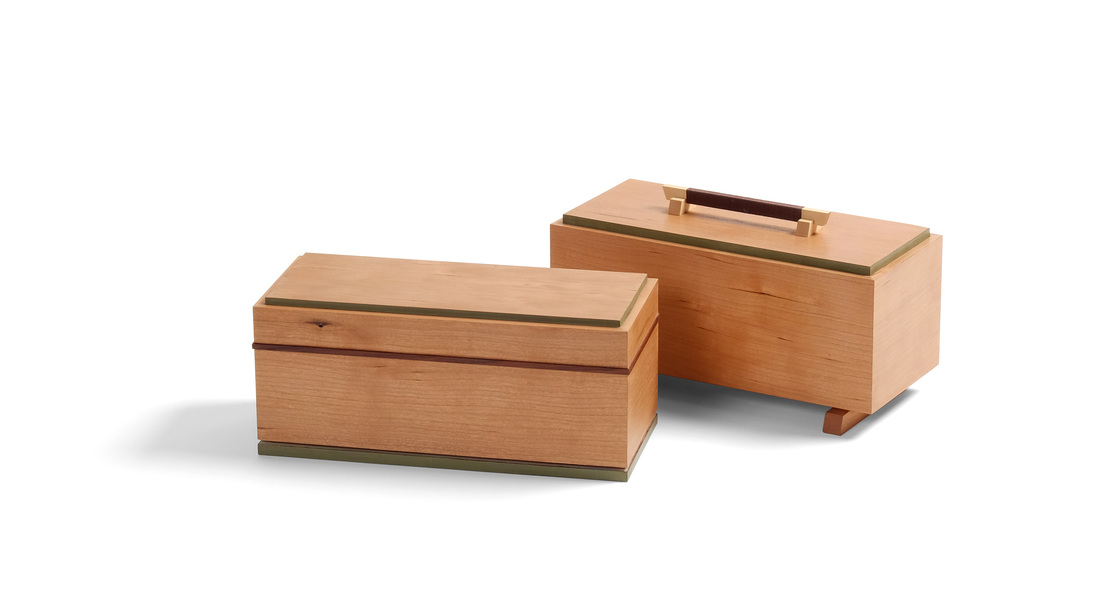
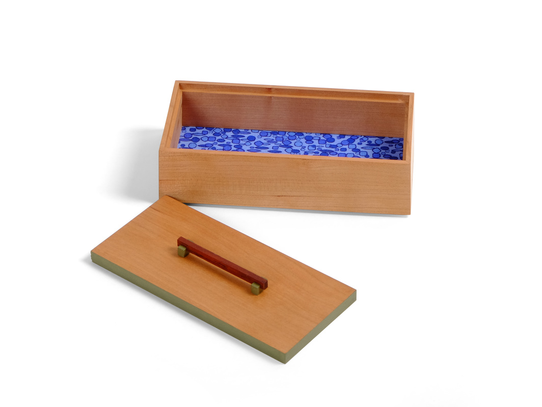
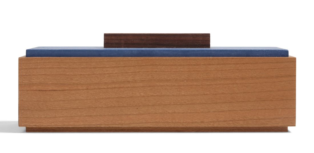
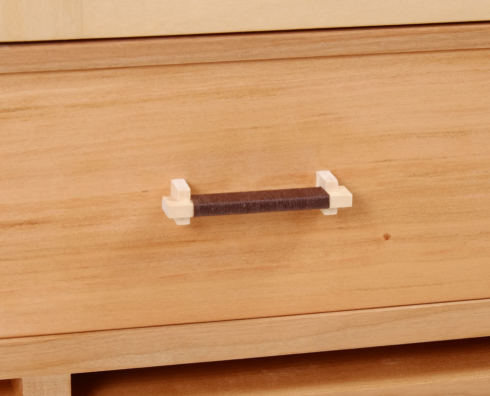
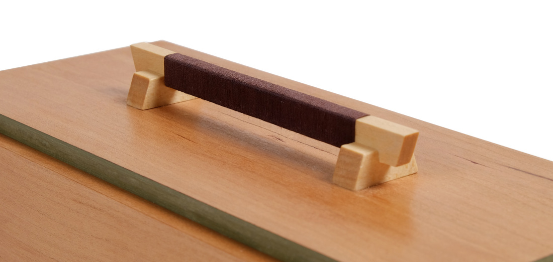
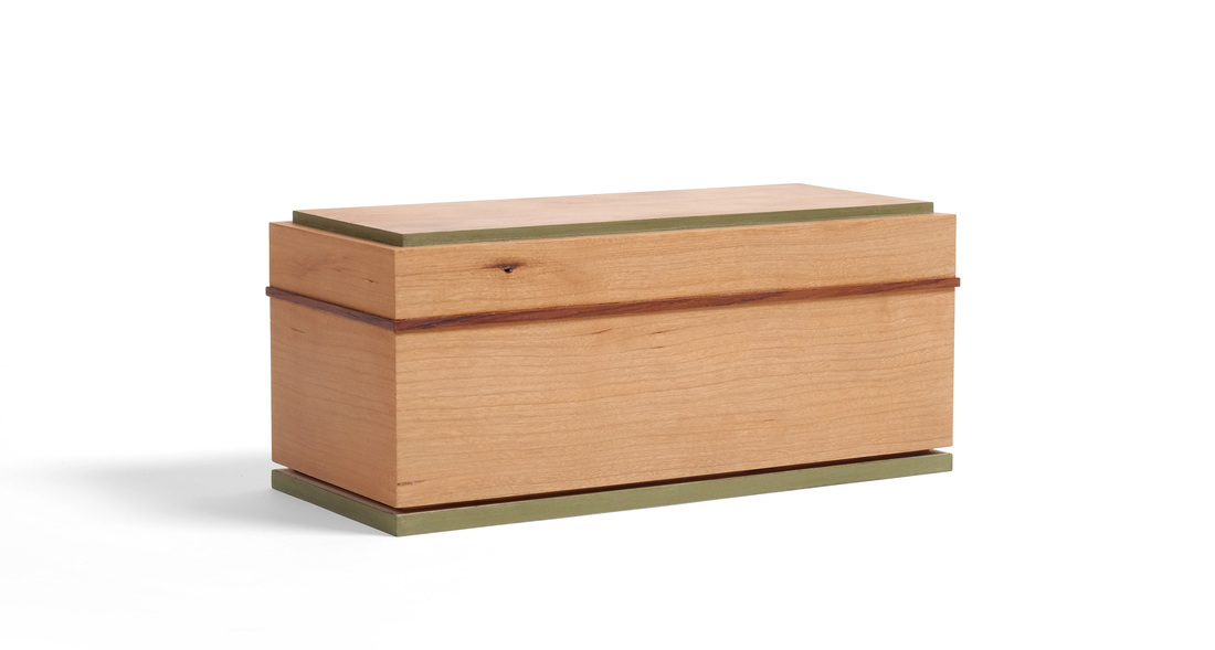
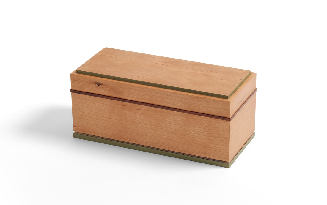
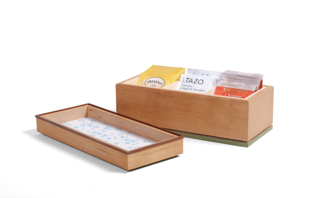 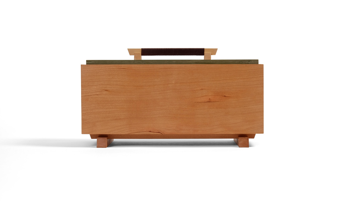 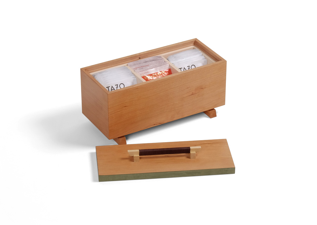 This is the first of two boxes that I made using the same dimensions for the box itself (that is, not including feet, lids, pulls, etc.). I even made both boxes from the same piece of cherry. Why? I wanted to see how different I could make them. Next week I'll post the second box. Both boxes were designed to hold tea packets. I started from the known dimensions of a tea packet (and it's a common size) and worked out from there. There are three slots for tea. These are created by a liner that is dry fit in the box. After adding up all of the involved dimensions (side thickness, liner thickness, top/bottom thickness, width and height of a tea packet, etc.), I knew the width, length, and height of the box. From there is was a matter of figuring out how to give each box its own unique soul. The first two decisions I made about this box is that it would sit atop some type of foot structure and that I would not cut the sides apart to make a lid (as I did on box 30, for example). I tackled the lid first. I went with an old friend: The lid that sits down in a rabbet cut into the inside face of the sides. A lid this big would need a substantial pull. Last week, I used some cool thread wrap pulls on a large tea cabinet. I decided to adapt that pull style to this box. This pull is much larger (the horizontal bar is 4 1/2 in. long), which gave me enough meat to work with that I could bevel the ends of the pull and the ends of the feet. The bar and feet are made from basswood, and the thread is a brown embroidery thread (thicker is better for this purpose). I applied shellac to the basswood before wrapping the thread. I think the pull turned out quite well and it's a style of pull that I'll continue to explore and develop. For the sake of stability, I made the lid from plywood, gluing shopsawn veneers to the top and bottom faces. The veneers were cut from the same board as the sides. The plywood top also allowed me to glue the pull to the lid without any concern that wood movement might eventually pop the pull off. The edges of the lid are painted with a custom green milk paint. I don't know if I've ever explained why I occasionally paint the edge of lid. Here it creates separation between the lid and the sides. Without this bit of color, the lid and sides would simply melt into one another, because they're made from the same piece of wood. The color and grain match is perfect, and without the green you'd just have a big, indistinct blah. This little strip of color creates a border between the two, which allows the beautiful warmth of the cherry's color and its calm, but elegant grain really pop. The box is subtle and unassuming but still possesses a striking beauty. This approach appeals to me far more than slapping a wildly figured or super-contrasty wood on the box as a lid. (As I see it the dependence of figured and contrasting wood is lazy design.) After I figured out the lid and pull, it was easy to work out what the box would be sitting on. The feet are just a modified version of the pull. There are two long horizontal pieces and the feet are much longer, too. This design creates a balance between what's above and below the box. The bottom is plywood, which is important because the best (and most stable) way to attach the feet is to glue them on. However, if they had been glued to a solid wood bottom, the bottom's movement definitely would have either pulled the feet apart or caused the bottom to split. So, plywood it is. There's a shopsawn veneer on the bottom face of the plywood. And like the feet themselves, the veneer is cut from the same piece of cherry as the box and lid. By the way, the top surface of the bottom is covered in a very nice fabric. Sure, you'll never see it because of tea packets. But it's there for the occasional glimpse, to show that every detail has been carefully considered. Well, I think that's enough. Here are the random thoughts, which I enjoy writing even if no one enjoys reading them.

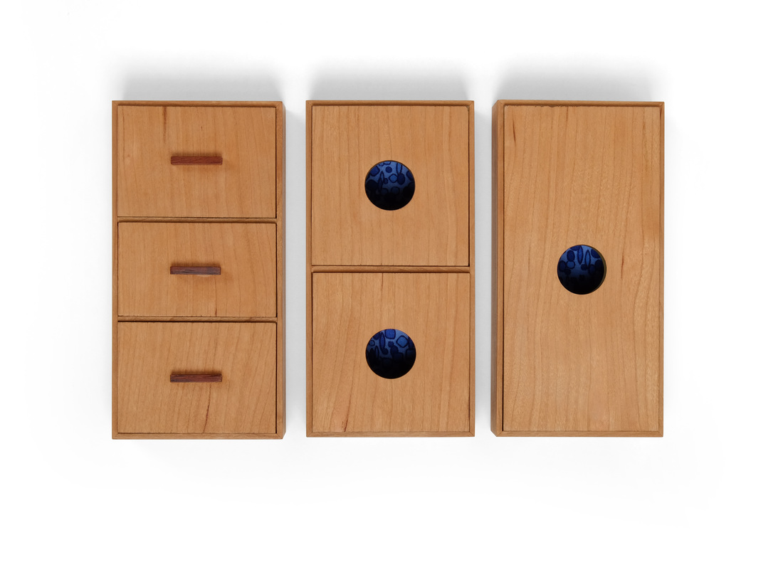
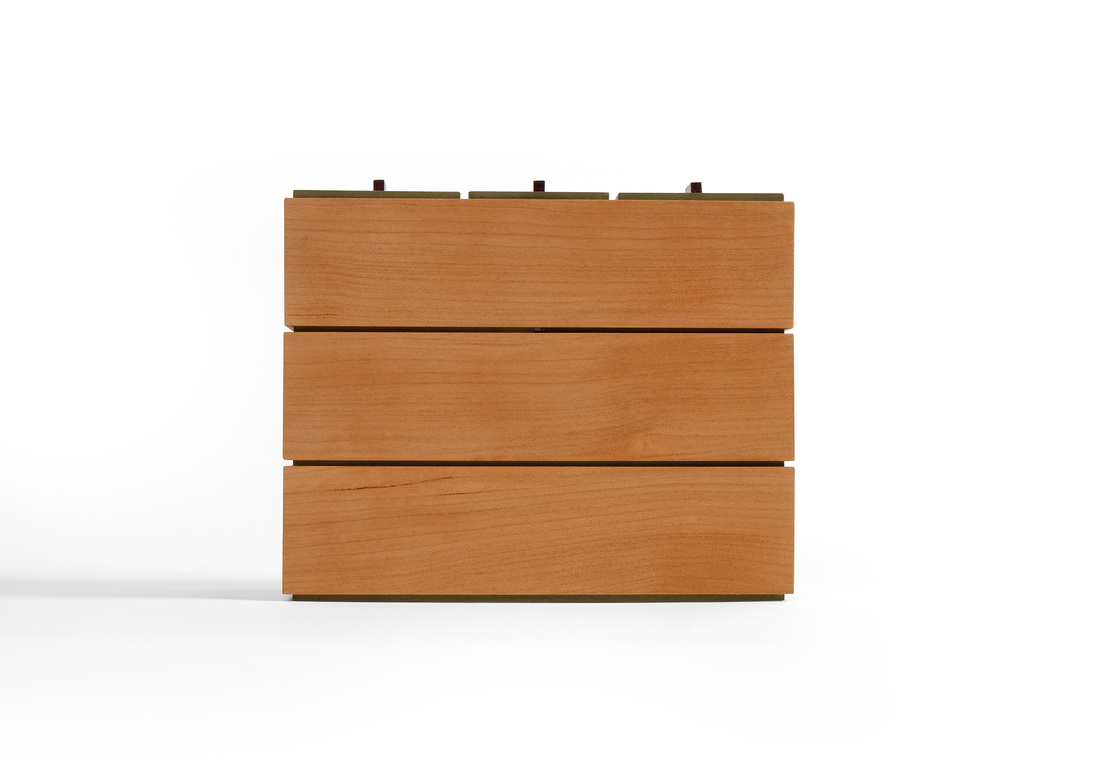
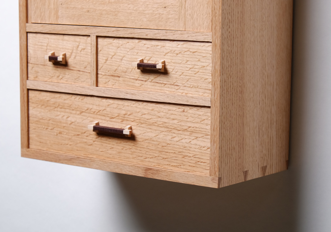
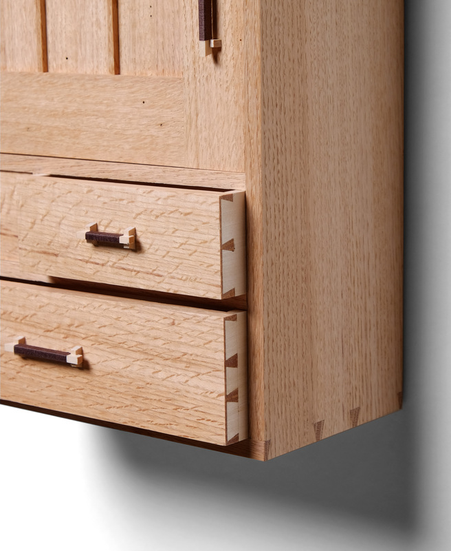
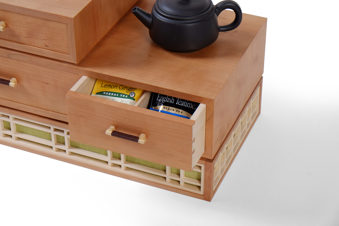
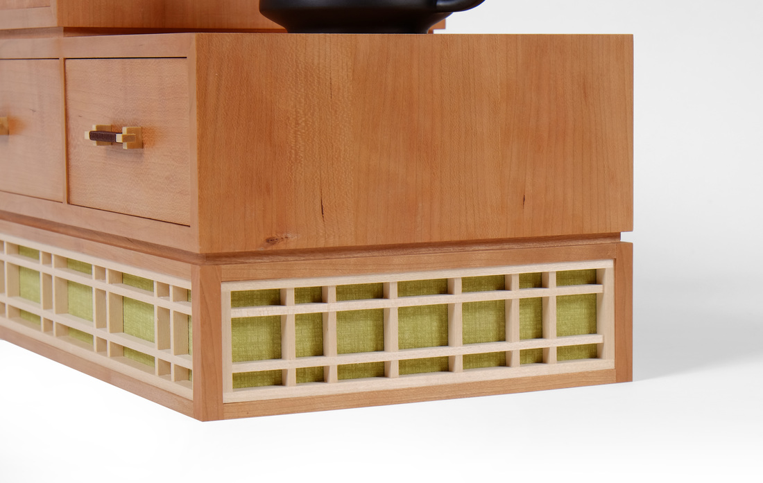
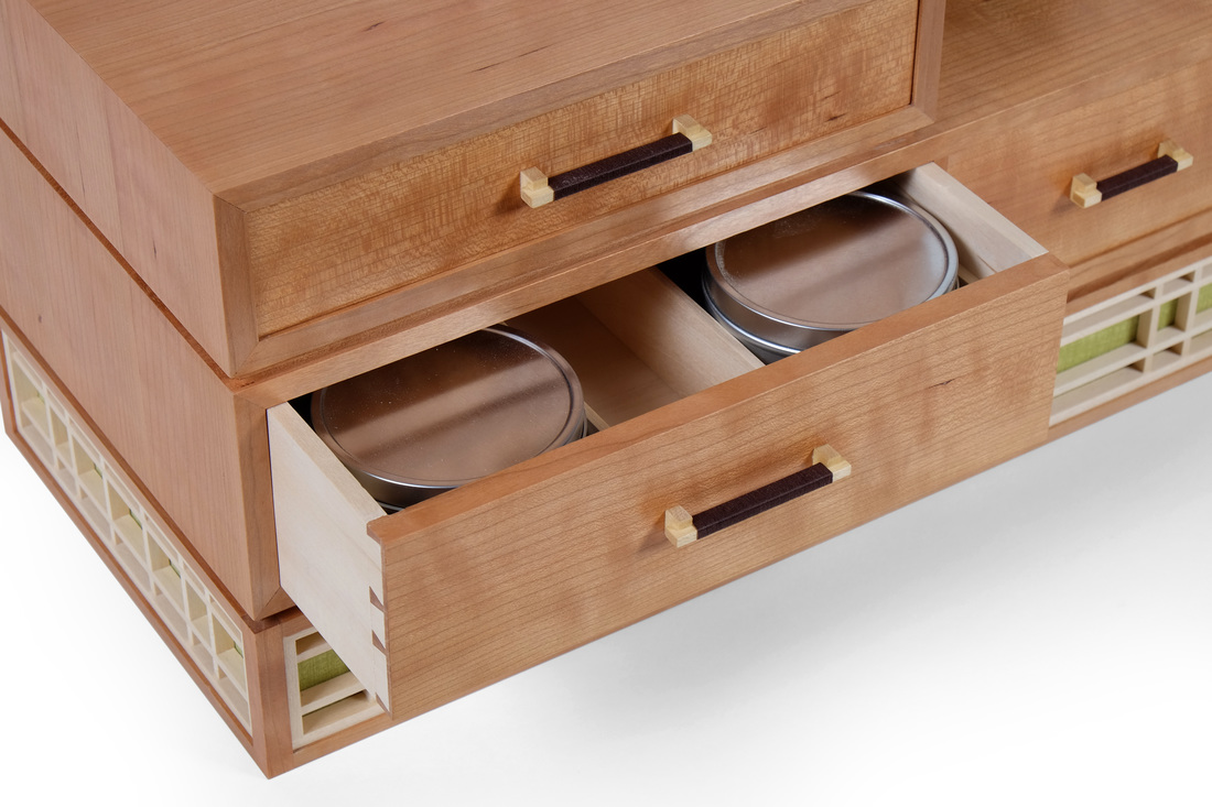
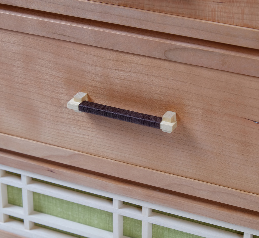
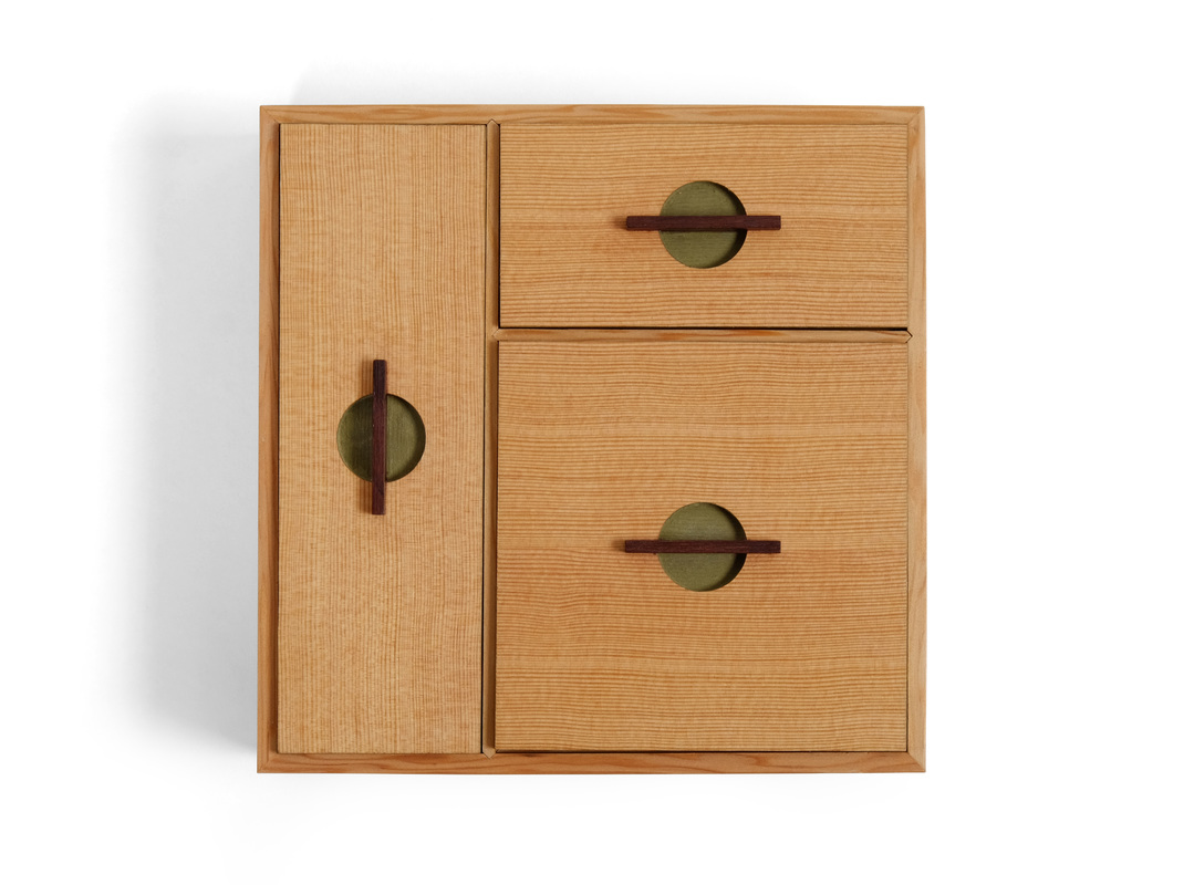
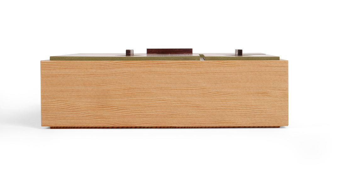
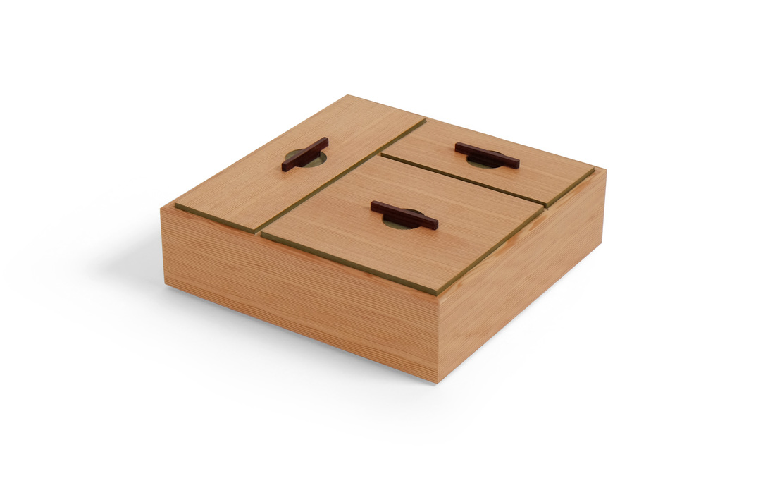
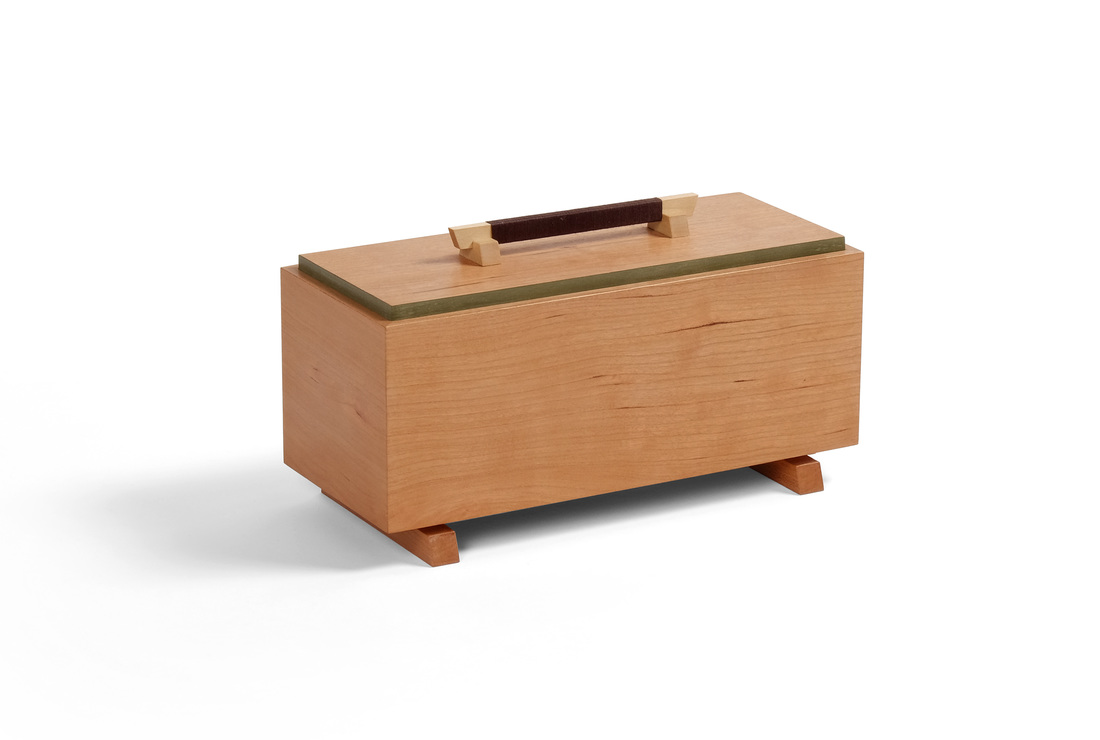
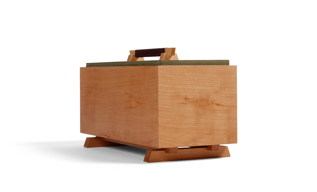
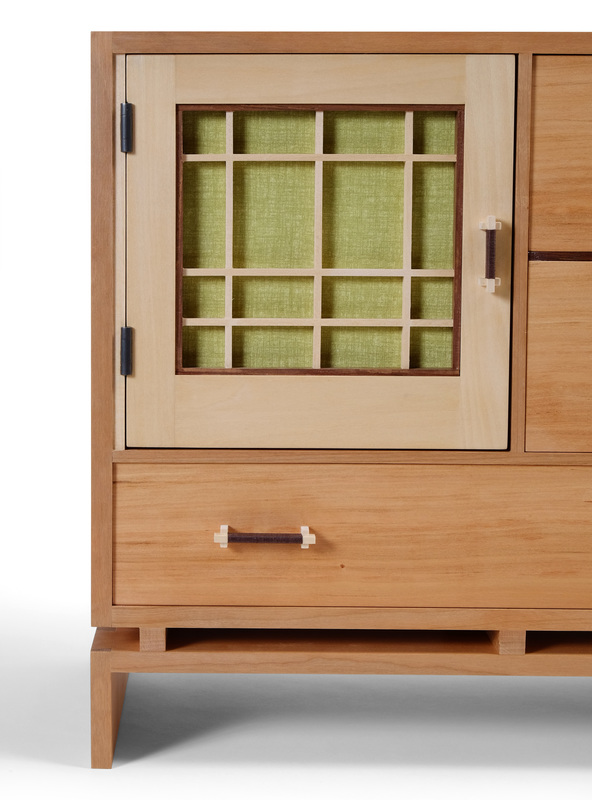
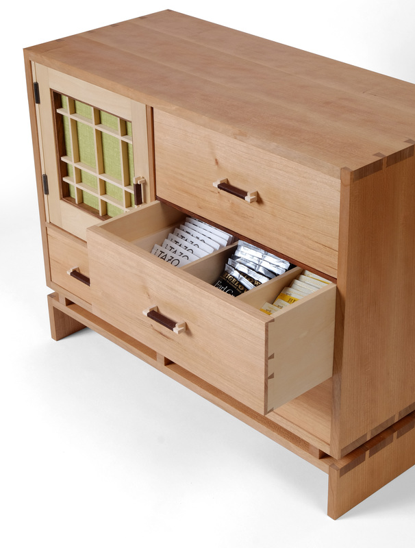
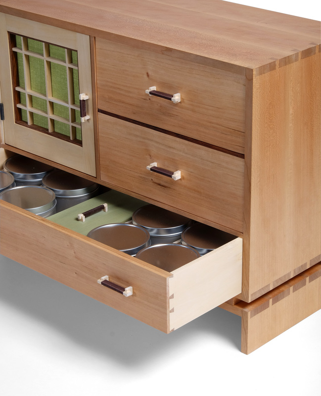
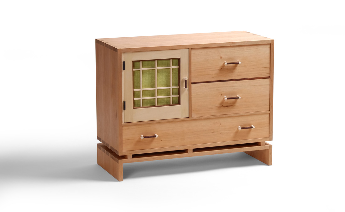
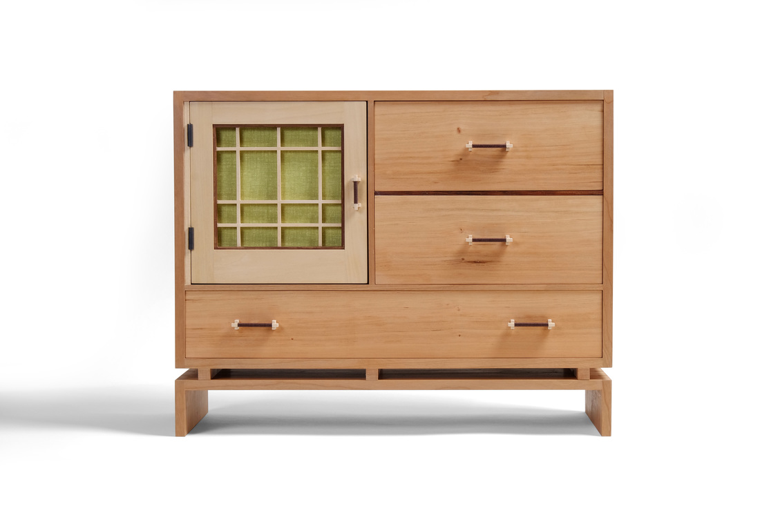 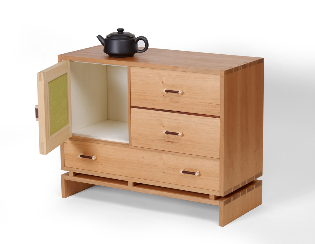 It's been a while since I last posted a new box, and this box is the reason why. I first posted a drawing of it eight weeks ago on my Instagram feed. Since then I've started and completed four other boxes, and taken two long trips for work. I've been working on it all along. And now it's done. Happy, happy, joy, joy. (Yes, I watched Ren & Stimpy. No, I did not use psychedelic drugs.) Let's get to it, then. To begin, it's a tea box. The bottom drawer holds loose tea. The two top drawers hold tea packets. Behind the door is a cubby for a teapot and teacups. I don't drink tea, but I very much like the ritual of drinking tea. I don't have in mind the Japanese tea ritual (although this box clearly has some nods to Japanese design), but the ritual of afternoon tea at Fine Woodworking. It's a brief break in the day when most of the staff gets together to relax and talk. The folks I work with are wonderful, funny, bizarre (in the most glorious and endearing ways), endlessly interesting, and even a bit bawdy. There is a clockwork to the way tea time happens: who boils the water, who sits (or stands) where, what we talk about, the jokes we make, etc. I love the work at the magazine, but I cherish the people I work with even more, and that's especially true at tea time. I made this box for them, from my fondness for them. (By the way, there is no doubt that I am the most bizarre, and perhaps most bawdy, of the bunch.) This box is nearly as big as the kindling box I made not too long ago, and takes its basic form from the kindling box, too. The case sits upon a base, separated by some spacers. Note that the middle spacer is in line with the divider between the door and drawers. Pleasant. Harmony. Had it been centered between the other two spacers, it would have created a visual disconnect, and instead of blending quietly into the piece it would have been a jarring presence. As it is, the three spacers become part of the overall case structure, and the negative spaces they create contribute to the overall success of the box. The bottom drawer is shorter than the other two, but I think it works here. I was skeptical at first, because wider drawers at the bottom give a piece visual grounding. With this box, the base creates a sense of lightness and elevation, so it's OK that the bottom drawer is shorter. Like the base, it's helping to lift up the box. But if you take the two together they are a solid foundation for the box. How does that work? It's the vertical divider between the door and two top drawers. The bottom drawer and base run the full length of the box. The space above them is divided, so you get a visual division between the bottom drawer/base and the upper part of the case. And here we come to the importance of varying the thickness of parts. The thickest parts are those on the perimeter of the case and base. The horizontal divider above the bottom drawer is slightly thinner. So too is the vertical divider separating the door from the two drawers on the right. They define the internal structure. The cocobolo divider between the two upper drawers is thinner still so that those two drawers are structurally subordinate. This variation in thickness creates a structural hierarchy that visually tells you that the base and bottom drawer are taken as a foundational pair even though they are separated by some beautiful negative space. This all makes sense to me. I hope it makes sense to you. If it doesn't, write your questions on the back of a post card and mail them to the guys at Car Talk. They're smarter than I am, and much funnier, too. Holy yard goats! This is getting long, and I haven't even gotten to the door and pulls yet. So, what about the door? It's made from basswood, which I chose because of it's color and lack of any visible grain. I wanted the door to be about the fabric panel and lattice that overlays it. Mike Pekovich, my friend and colleague at Fine Woodworking, has been experimenting (quite successfully) with kumiko recently. (Check out his Instagram feed to see what he's been up to. It all rocks the house party.) As always, I feed off what he's doing. But traditional kumiko patterns would obscure the color off the fabric panel, so I went for a simple pattern based on rectangular negative spaces. This is much more in keeping with my design aesthetic. It's also in keeping with my propensity to take traditional material and design details and use them in very modern ways (milk paint, for example). I like how it turned out, and I plan to use lattice work more often. I chose cocobolo for the frame to create some separation between the door and the lattice. It was a risk, but I think it worked out nicely. I had already decided to use cocobolo for the front edge of the divider between the two top drawers, and using it for the frame gave some unity between the two halves of the upper part of the case. And cocobolo brings us to the pulls. All of their parts are 1/8 in. thick, like the parts of the lattice work. The little feet have notches in them into which the bar fits. In this way they are tied to the kumiko. I then wrapped brown embroidery thread around the section between the feet. The color of the thread ties the pulls to the cocobolo. (On a side note, these pulls are closely connected to the pull on box 10, because I got the idea for them from that box.) Also, the notion of a pull with cord or thread wrapped around it is something I've seen in Japanese furniture, but I don't have the wherewithall to find anything I could link to. There is still so much more that I could write about the design of this box. Why did I use an asymmetric pattern for the lattice? Why green fabric and not blue or red or yellow? Why butt hinges instead of knife hinges? And what was I thinking when I painted the inside of the cubby white? The answer to all of these questions is 42. And don't forget your towel. Are they still random if I do them every time?
|
AuthorI love furniture design, and smart techniques. This blog is about both. Archives
August 2020
Categories |


 RSS Feed