
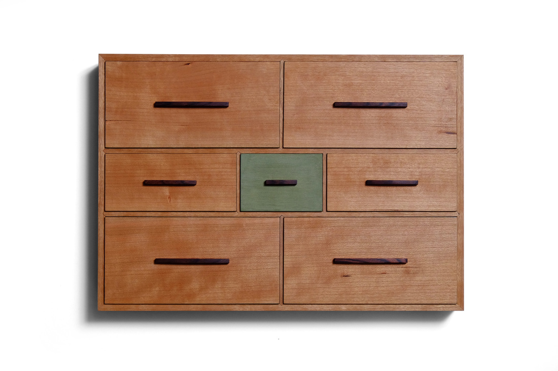
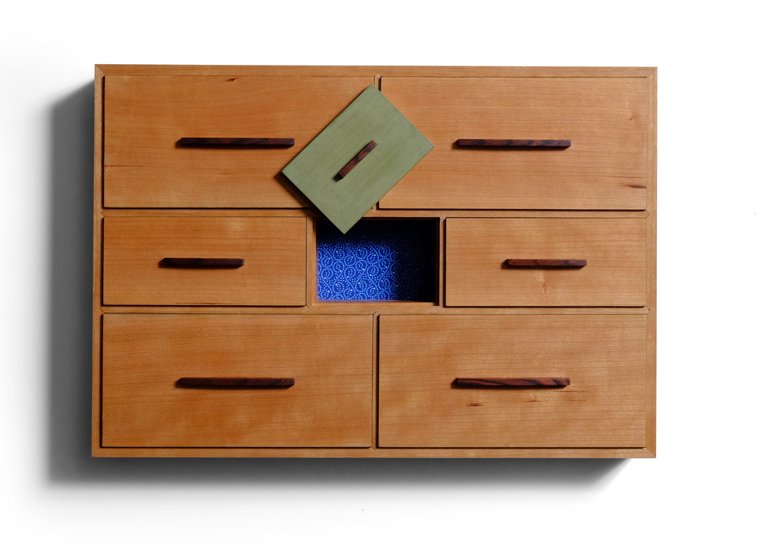
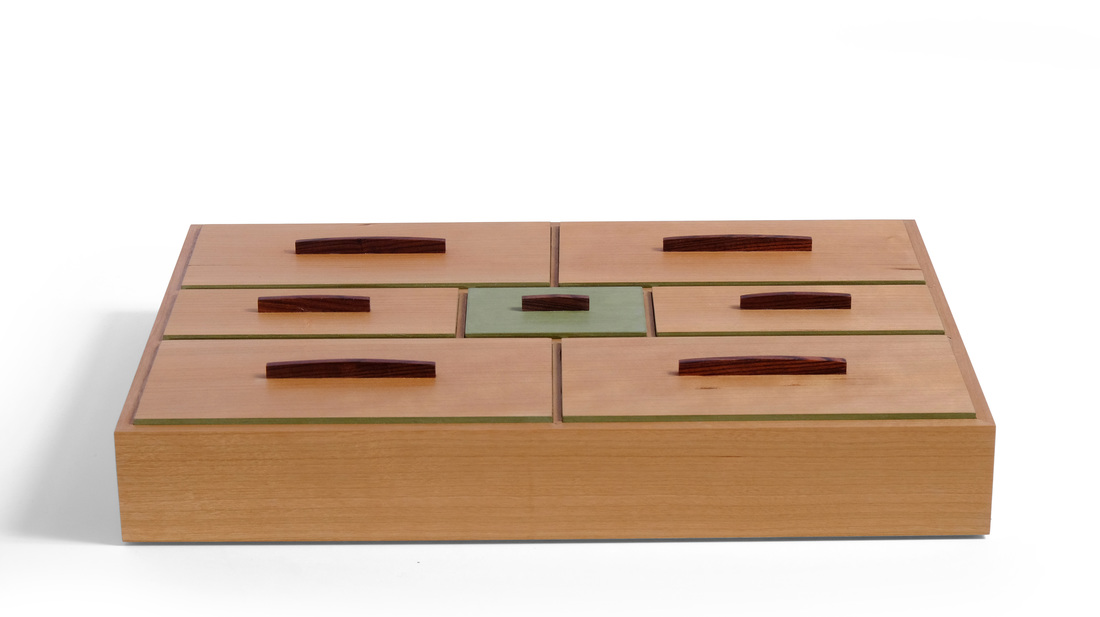
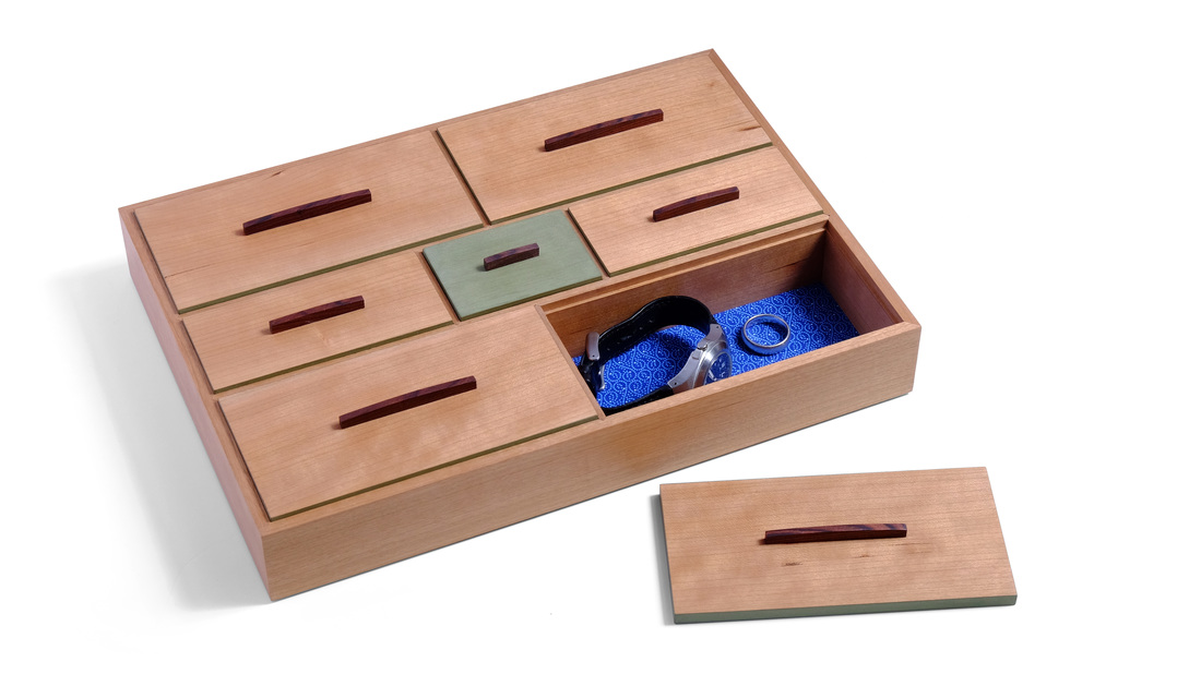
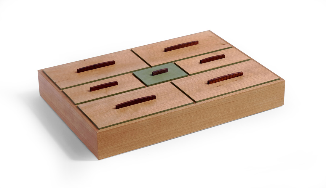
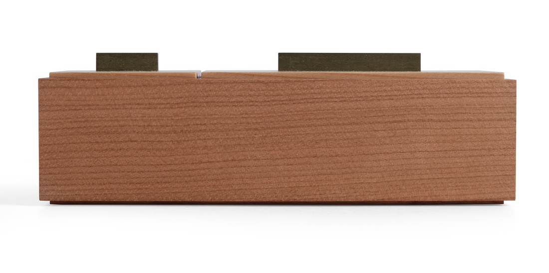
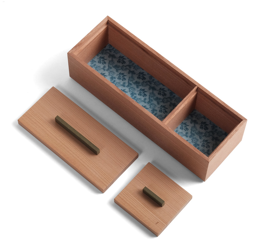
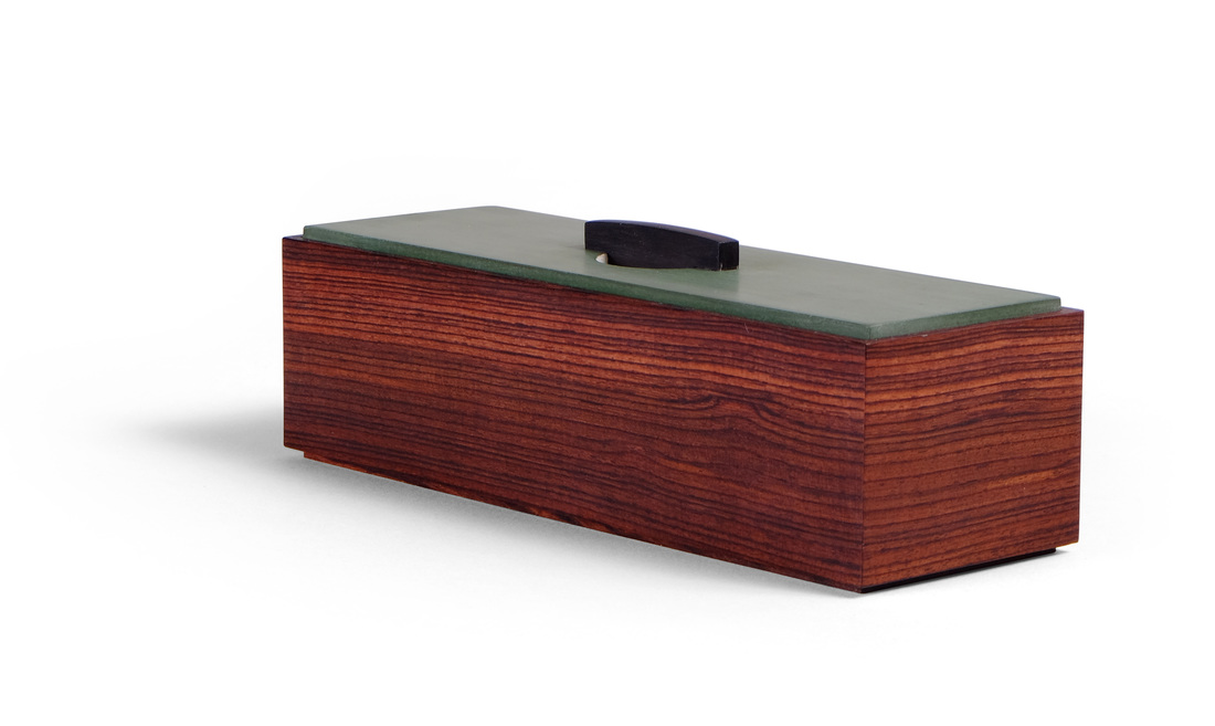
  When I'm designing a box, the first three things I think about are the box's proportions, whether I'll be able to use the box's elements (lids, pulls, etc.) to create a geometric pattern, and how to incorporate a bit of color without overpowering the box. All three elements have a prominent role in box 35. I'm not sure how I feel about the box, but the more I'm around it, the more I seem to like it. This is the biggest box I've made so far, it's just over 12 in. long and 8 in. wide. The sides are 1 3/4 in. tall. It had to be this big to get so many compartments into it and still have them useable. I actually started out by determining the sizes of the individual compartment lids. I drew them out full scale, with the spaces between them, and that determined the overall dimensions. Of course, I could have adjusted the length of width of the lids to change the box's proportions had they not been good. I'm glad that I didn't need to do that. However, figuring out that stuff came second in the design process. From the start this box was all about looking straight down at the lids, so I started by sketching out various patterns for them. I did this on a piece of graph paper with a 1/8 in. grid, so that I could draw a bunch of neat little scale patterns that are proportionally accurate. I don't worry about dimensions at this point. After I had the pattern and the proportions (for the big lids, it was 1 wide by 2 long—a nice proportion of width to length) I figured out the actual dimensions (going with 3 in. wide by 6 in. long). The spaces between the lids are just as important as the lids, so I spent some time figuring this out. The visible top edge of the sides is 1/4 in. wide. The two long dividers that separate the three rows are 3/16 in. wide on their top edge, and the dividers on each row are 1/8 in. wide on their top edge. The lids sit in 1/16 in. rabbets, so the sides are 5/16 in. thick. The long dividers are also 5/16 in. thick, but have a rabbet on both sides. The short dividers are 1/4 in. thick. The lids, plus the spaces between them, create a nice pattern. The pulls also create a pattern. There are a couple things at play with the pattern created by the pulls. First, there's the placement of the pull on the lid. I centered them, knowing this would create almost a rounded pattern. Second, there is the length of the pulls. Changing their length would change the look of the pattern. I think I did OK on this point. The pulls were actually the hardest part of this box. Initially, I was going to use rectilinear pulls, but they looked weird. Fortunately, I recalled the pull I made for box 33. It's something of a stressed arc. I used that shape here, too. It greatly improve the look of the box over simple, straight top edges on the pulls. No matter how good you think something looks, always ask yourself what you could do differently and play around with the ideas that come to mind. So, that's proportions and patterns. Let's talk colors. You've got the earthy, warm brown of the cherry. (All of the cherry came from a single board. It's the edge grain of a very old piece of 12/4 I bought from a former FWW editor, along with many other pieces of 12/4 cherry.) Then there's the rich brown of the kingwood pulls (made from material left over from the sides of box 33). I knew that I wanted paint the center lid. Picking the color wasn't tough. This particular green goes well with just about every wood I use. But that's not the only place I used it. I also used it on the edges of the other lids. This, I thought, was necessary to give some separation between the cherry lids and the cherry sides. It helps to emphasize the pattern created by the lids, too. The edge of the bottom is painted green, too, but you can't see it in any of these pictures. The last bit of color is discovered when you open one of the compartments. I covered the bottom with a bold, blue fabric. I love how it jumps out, and adds a bit of brightness to the interior. There's a lot more I could write about this box, but I've blathered enough. Let's get to some random thoughts.
8 Comments
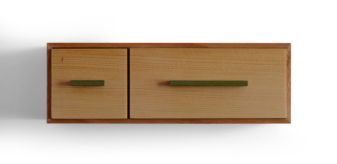
  This box is similar to box 33. They have the same dimensions, the bottoms were constructed in the same way, and both boxes have lids that sit inside a rabbet. But for all that similarity, they really are quite different. I made them both as an exercise to see if I could make two boxes with their own souls even though they had several important similarities. If I'm being honest, I'll admit that it was as I was designing this box that I realized a similar one would work nicely with box 32, so I began designing this box and box 33 in parallel. It was fun to make two boxes at the same time, using the same milling procedures, the same machinery setups, etc. and end up with two distinct boxes. This version of the box sprung from my dissatisfaction with box 6, which is the one box I've made so far during this adventure that I don't even remotely like. Box 6 is a second take on a box I made several years ago (that's it in the photo just over there, on the right). This time I went back to the original woods, cherry and white pine. It's a very good combination. This pine is some seriously old stuff that grew wickedly slow. I have friend who likes old timber frames (OK, it's John Tetreault from Fine Woodworking). He's using a bunch of old frame parts to make a wood shed and art studio on his property. He cut some pine timbers (about 8 in. by 8 in.) short and gave me the offcuts. It has super tight grain and a beautiful, lustrous color. The white pine that you can buy at the lumber yard now is a sad, pale semblance to the good old stuff. To match the tight grain of the white pine top, I used some cherry edge grain that also had very tight grain lines. Although the woods are the same, I changed the dimensions dramatically. The original is 2 in. tall, 5 in. wide and 8 in. long. I wanted this one to be small and more rectangular. It's about 1 1/2 in. tall, 2 in. wide and 6 in. long. The divider is 2 in. from one end. I know I've harped about the importance of proportions, so I'll go easy this week, but good proportions are so terribly important. Get them wrong and the box is simply bad. The original version of the box had cocobolo pulls. I didn't want to repeat that, so I went with painted pulls. I wanted them to be green, and I got lucky that I had some divider material left over from box 31. I just ripped it to width, cut it to length and then painted the ends. Perfect. I like the green with the cherry and pine. Another slight change from the original involves the fabric on the inside. Back then I glued fabric to some thin foam. This time I glued it to the bottom before I installed the bottom in the box. I really like the clean look of the fabric in this box. (I also used a different blue fabric. This one has a softer look.) Please humor me as I let fly with a few random thoughts.
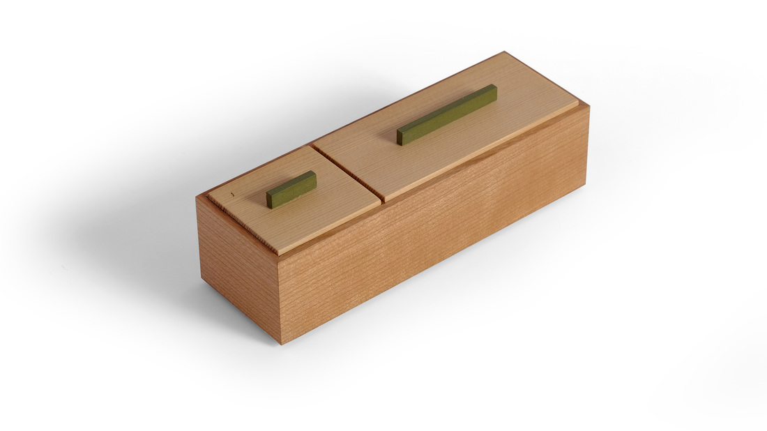
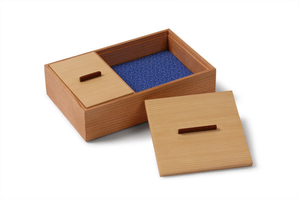
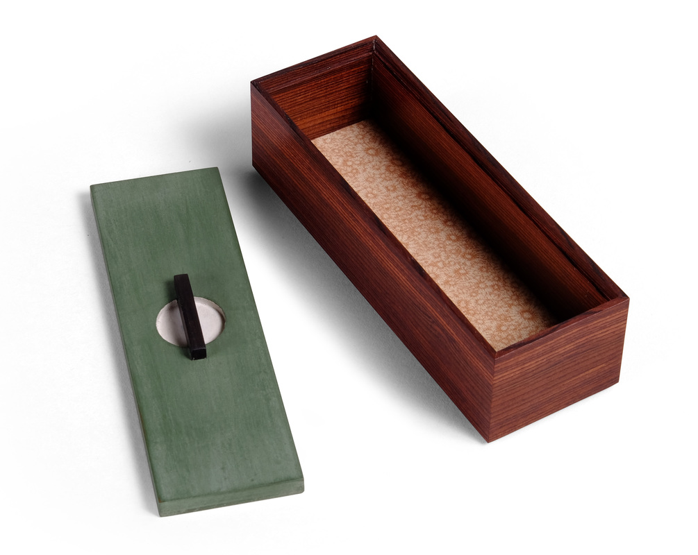
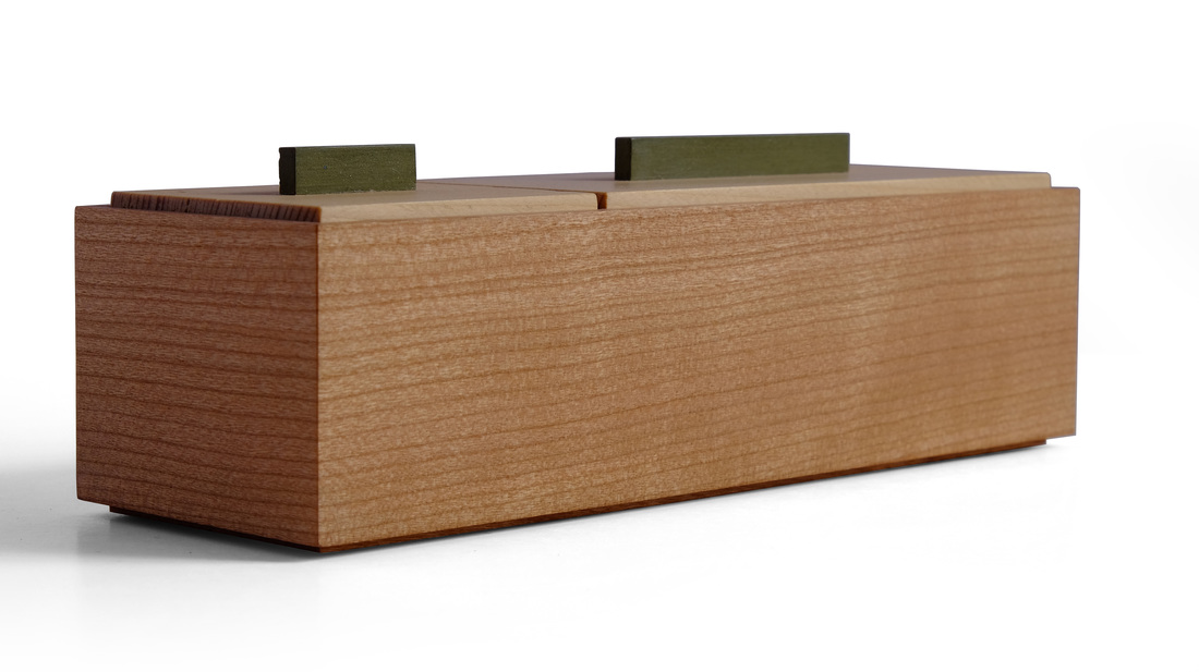
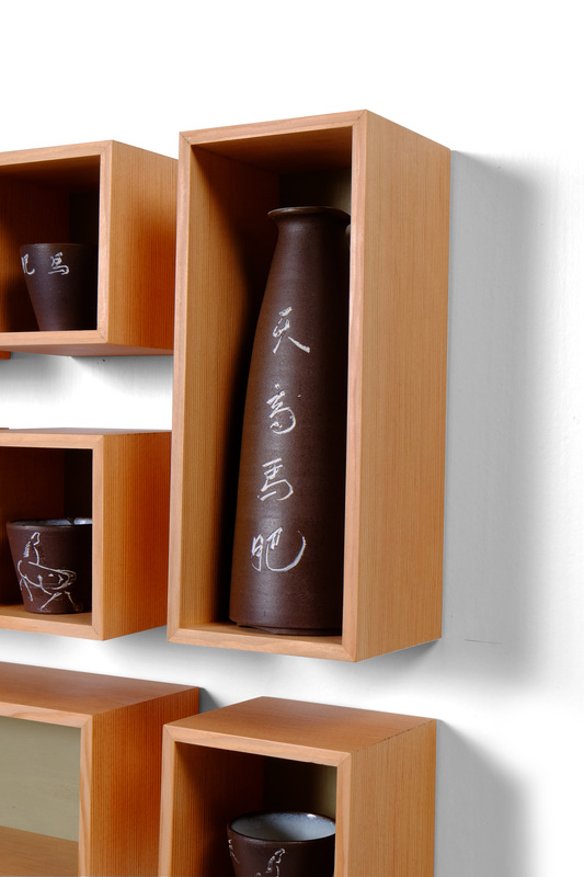
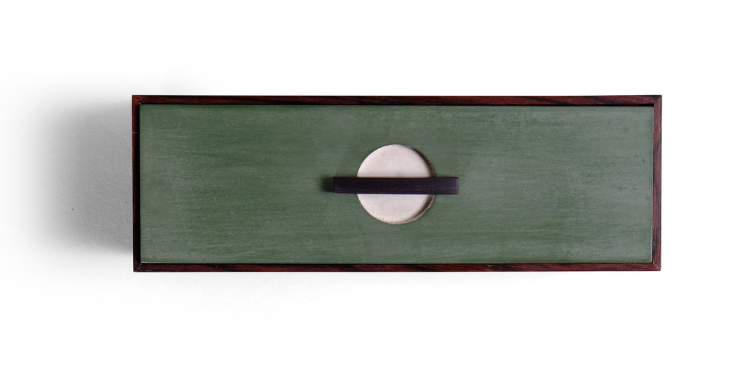  I made this box to fit inside the rectangular and horizontal box in the set of wall-hung display boxes that I posted last week (box 32). The interior dimensions of that display box determined the dimensions of this box. And I knew it was going to be a simple box with a top sitting in a rabbet, and my standard bottom (plywood covered in shopsawn veneer and glued into a rabbet). But that's all I knew. There were important questions left to answer: What to do with the top? And what about the interior? And I had no idea what kind of pull I should use. But before I could answer those questions, I needed to figure out the box body first. I had the perfect piece of wood for it. This past summer when I was working at the Lie-NIelsen open house up in Maine, I began rummaging through the exotic woods for sale at the bench of Travis Knapp, who runs the eBay store RareWoodsUS. I found a 12 in. long blank about 1 3/4 in. square. I didn't know what species it was, but the edge grain was amazing: beautiful, tight, straight grain. And the color was fantastic, too. Travis said it was kingwood. I bought it, went back to my bench, then planed that edge grain clean. I feel in love. I'd been sitting on that piece, waiting for the right box to come along. This was the box. I knew that the wood's color would go great with the brown of the sake set. And the straight lines would compliment the vertical grain Douglas fir of the display boxes. I've never used an exotic wood for the body of a box—I prefer to save it for pulls and other small accents—but I'll have to try it again soon. If I can just find another piece of kingwood with grain like this! Knowing that this box would sit inside one of the display boxes helped me figure out what to do with the top: Paint it green. I used Lexington green milk paint, knowing that a darker green would stand out against the light green I used for the backs of the display boxes. And the dark Lexington green would compliment the rich brown of the kingwood. But the pull is really part of the top, and I had no idea what to do. So, I made and finished the box, painted the lid, and then set the lid in the display box as it hung on a small piece of drywall (temporarily, for photography). Mike was looking with me and suggested drilling a hole through the top and painting the inside edge created. "Paint it white," he said, "because the inside of the sake set pieces is also white." Good idea, I thought. He then said, "Make it a little round scoop instead of a hole." I took that idea and ran with it. The hole is shallow and has a flat bottom. I painted it with snow white milk paint. I then made a pull from ebony. The shape took a while. I fit the "tenon" part to the hole and then started shaping, putting the pull in place and taking a look, then going back to work on the shape. I like the final shape. It's low, so it doesn't overshadow the box, and the curve is very subtle. I shaped it all with a chisel and a rasp. And I really like the graphics of the rectangular green top with a white circle in the middle that's bisected by the thin rectangular ebony pull. For the interior, I put into play a suggestion made to me by another Fine Woodworking colleague, John Tetreault (he's a great designer and furniture maker, too.) We were discussing a group of 40 boxes (not part of this 52 box business) that I am making and he suggested that instead of painting the interior face of the bottoms, I should just glue some fabric to them. I liked the idea and decided to try it out here. I set the box over several different pieces (various colors, patterns, etc.) and settled on a piece that has brown flowers on it. It looks great. And glueing it to the bottom results in a much cleaner look than when I glue it to a thin foam pad. I'm fortunate to work with such great designers. I doubt I executed either Mike's or John's suggestion as they would have, but that's the way it should be. Well, then here are some random thoughts.
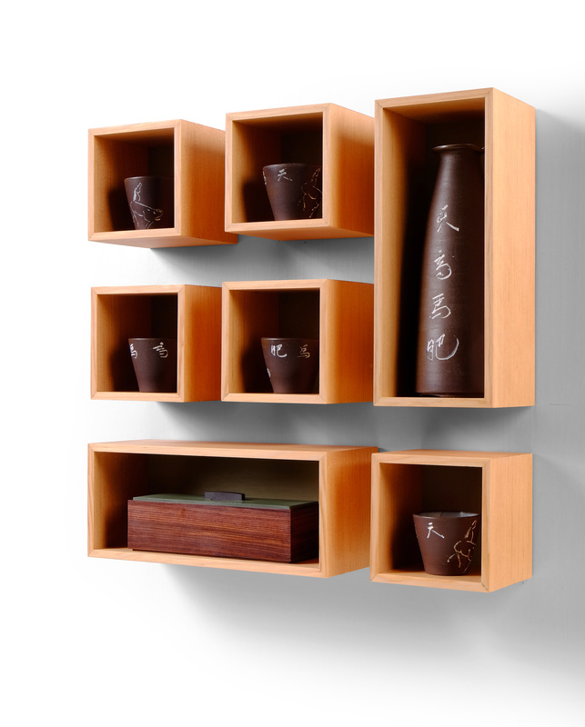
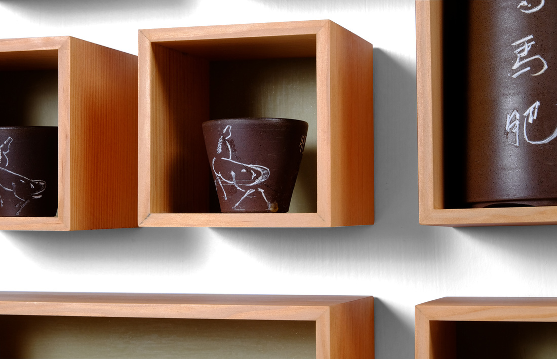
 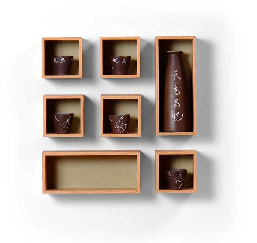 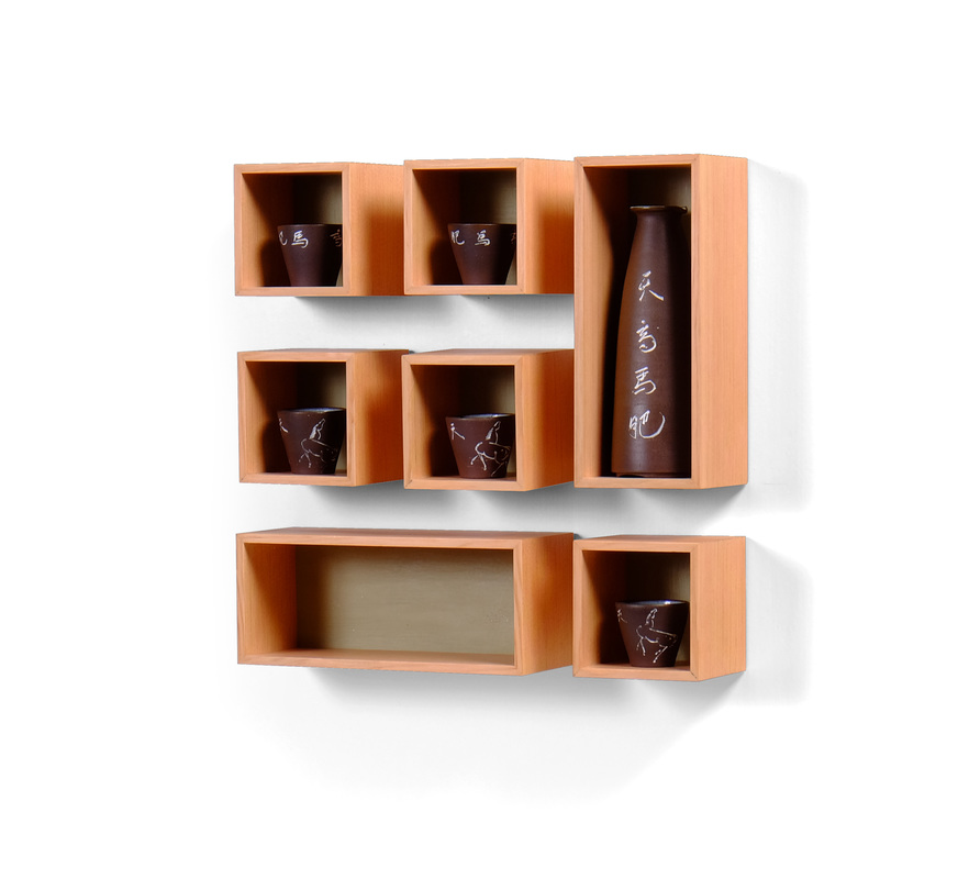 I suppose I should address the elephant on the wall first. Some might contest that this week I've not made a box. To this objection I say, "tis but a silly word, box. It means nothing to me." Perhaps that's not sufficient. Here's what I really think on the matter. I set the rules for this challenge and I decide what counts as a box. That too sounds a bit pissy, but so it goes. This is a wall mounted box designed to hold, keep safe, and display a sake set that belonged to my maternal grandparents. I can remember it in their house for as long as I can remember going to their house. My grandfather died first, about three years ago, and then my grandmother died little more than a year later. I went to their house after her funeral and was allowed to take this as a memento. I always liked it. I still do. If you look closely, you can see that a few of the cups were broken through the years and glued back together. I like that. The set meant something to my grandmother—enough that she kept gluing cups together—and so it means all the more to me. Well, that's the story of the sake set, or at least as much as I'd like tell in a public forum. I began thinking of how to display the carafe (I have no idea what the proper word is) and five small cups, and went through a lot of ideas for the overall design before I settled on using a small box for each piece. I was drawn to individual boxes because it would allow me arrange them in a nice geometric pattern (I do love me some geometric patterns) and to present each piece as something significant in itself. It then took several pages in the sketchbook to find the arrangement that I liked best. It's the one you see here. This left me with a bit of a problem: Why the hell do I need that other long box at the bottom? I don't know but it balances the pattern well, so I stuck with it. I originally planned to put a drawer inside it. But the proportions aren't right for a drawer (the box isn't deep enough for one thing). Then, in a moment of opportunistic genius, I realized that I could put a box in there! Two birds, meet one stone. At the risk of spoiling the surprise even more, this smaller box that goes inside the box at the bottom will be box 32. My thought next turned to how to make the boxes and the finer details. I wanted simplicity. The boxes are not what's on display here. A simple mitered box would fade into the background, but provide an elegant frame around each piece. The back of the box, I knew, needed to be painted a light color to provide some luminescence inside the box, and so that the sake set pieces would stand out against the back. Green can go nicely with brown, so I set about mixing up a custom green milk paint. This one is mixed from marigold yellow, Federal blue, and buttercream. The wood species fell into place after that. Douglas fir looks great with green and brown. Vertical grain Douglas fir looks awesome on miter boxes. The grain on the fir I used here is so tight and fine. It's the perfect amount of subtle for the task at hand. If you're curious, the unit of measure for subtlety is snurtles and this fir comes in at exactly eight snurtles. (Also, the fir came from a piece of roughsawn 8/4 vertical grain fir that I bought from a former FWW editor. I actually bought two pieces from him. Always buy good lumber when you come across it. Eventually, you'll find a use for it, even if it's after your wife leaves you because the entire garage is filled to the ceiling with glorious lumber, and the spare bedroom holds all the shorts.) I don't know if there's anything else to say. I suspect I'll have more next week when I reveal the little box that fits inside the bigger box at the bottom of this arrangement. Until then, feast (or starve, depending upon your opinion of my eccentrities) yourselves on a few random thoughts.
|
AuthorI love furniture design, and smart techniques. This blog is about both. Archives
August 2020
Categories |


 RSS Feed