
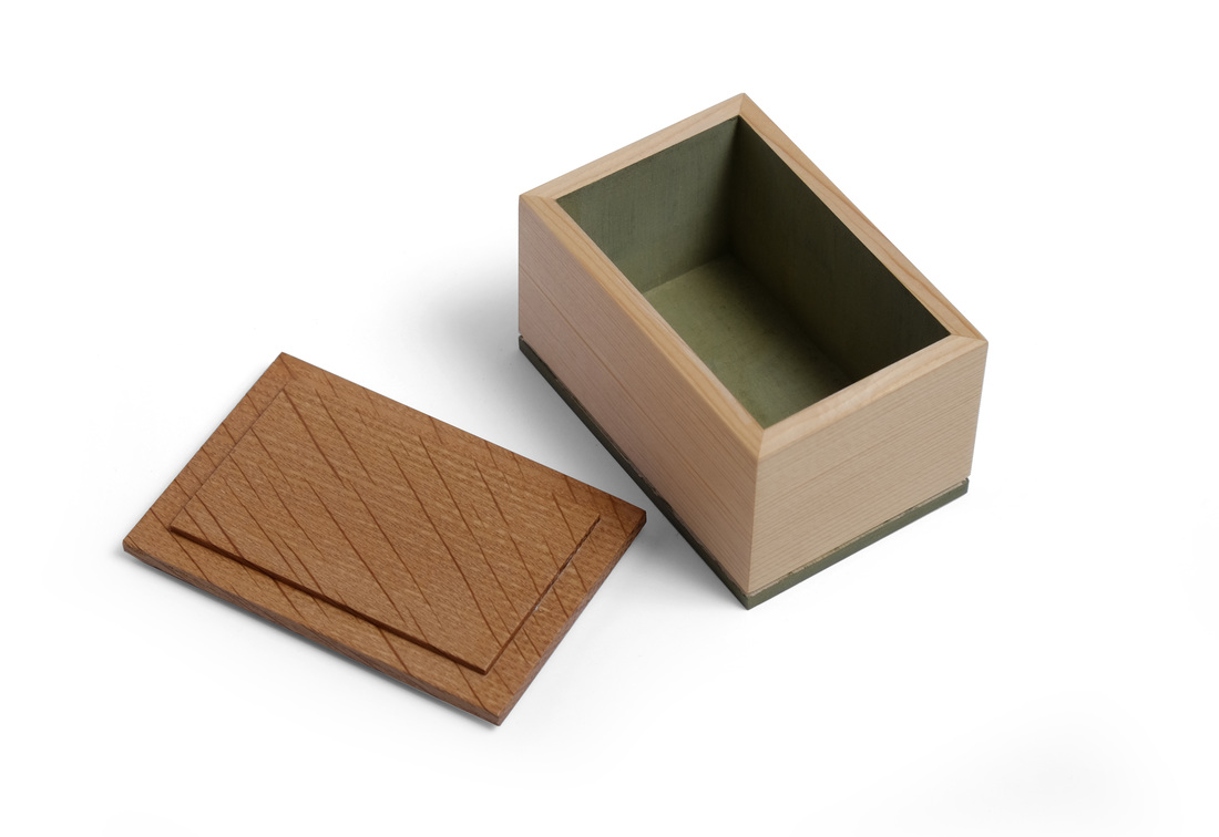
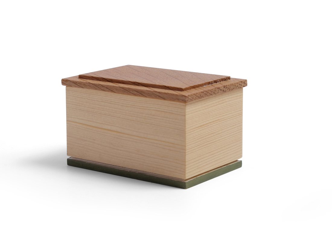
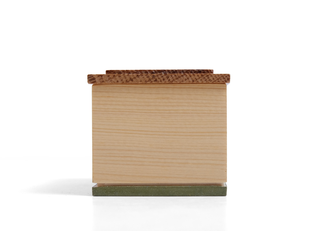
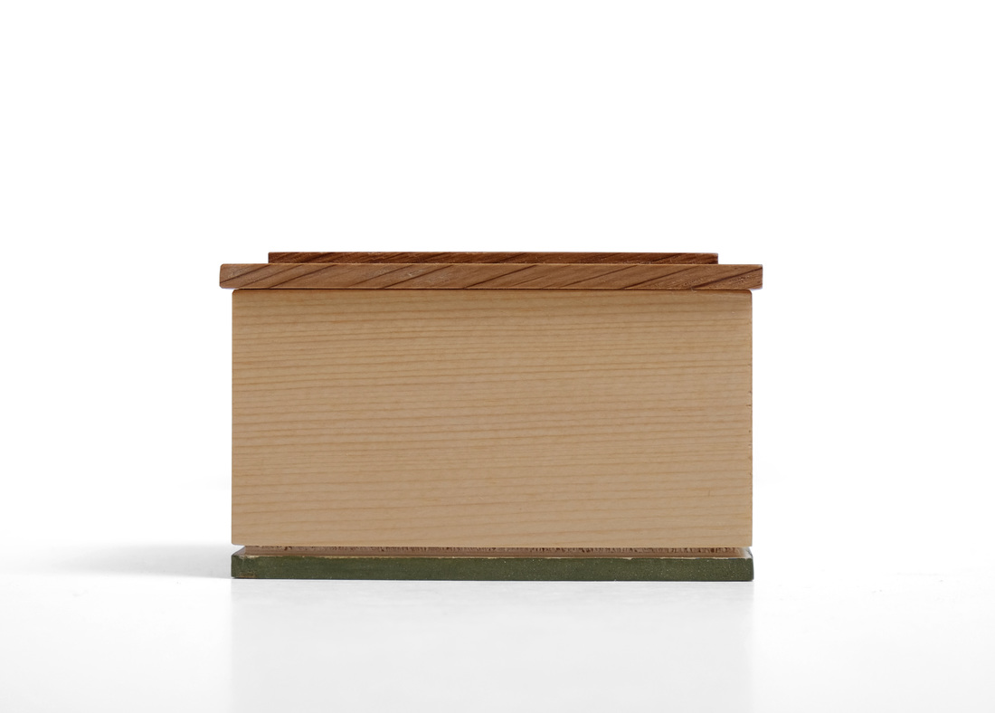
  This is a little sugar box. The sides are made from salvaged, old-growth white pine that's quartersawn. The grain is very fine, tight and straight, which makes it just right for a box this small. However, it presented a problem when it came time to pick a piece of wood for the lid. I didn't have a species in mind, really. I was more concerned with finding something with very tight, very straight grain. I found what I wanted in a small white oak board. (I think I picked it out of the scrap bin in the FWW shop many years ago.) It's quartersawn, which might have been a problem had the ray fleck been wild or large. Luckily, the flecks are narrow and straight, running diagonally across the grain. I love the look. I was fortunate to have both white pine and oak with grain proportionally well-suited for this little box. Grain spaced more widely, or flatsawn grain, would make for a less delicate and elegant box. Having chosen wood for the sides and lid, I turned my thought to milk paint. The custom green paint that I've used in the past goes very well with white pine and white oak, so I settle on this color fairly quickly. How to use it was another question. Because the box is so small, I didn't want too much paint on the outside, and I didn't want to paint any part of the sides--the grain is just too beautiful to paint over. So, I thought about the bottom and realized that I had an opportunity to use a style of bottom that I've had in mind for a while but not used yet. I normally use the bottom as a way to create some separation between the box and the surface that it sits on, and because the bottom is inset from the outside faces of the sides, a narrow shadow line is created. This gives the box a lighter and more delicate appearance. The bottom of this box was not made like that. It's more like a little pedestal for the box to sit on. I glued some shopsawn veneer (from the same piece of pine as the sides) to a very thin piece of plywood. I then rabbeted around it's top face. After gluing the bottom to the box (this is why I went with a laminated bottom rather than a solid wood one), a small groove was created to give some separation between the box and bottom. And because the bottom is so thin, the bit of edge left was just the right size to be painted without becoming overbearing. I'm pleased with how it turned out. The lid is rabbeted on the top and bottom. The field created by the rabbets on the bottom fit into the box and keep the lid on. It overhangs the sides about 1/16 in. so that you get ahold of it to take it off. Here are some random thoughts.
3 Comments
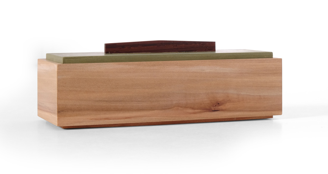
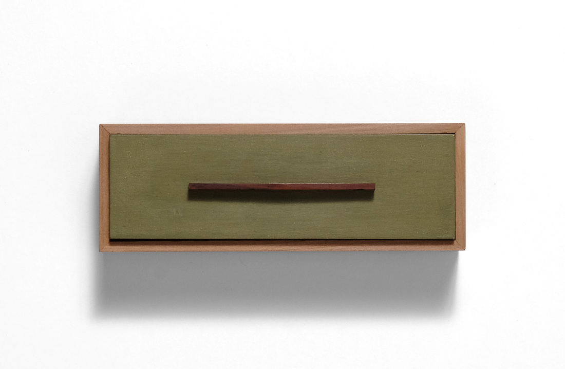
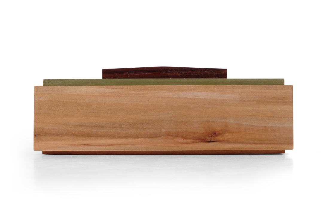 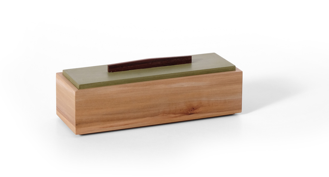 When I first set out on this adventure in box making, I explicitly had it in mind that there would be some boxes that I would make more than once, so that I could explore the design and hopefully improve it with each iteration. Box 40 is one of these boxes. It the same as boxes 1, 2, 7 and 8. There are a few subtle differences, of course. First, box 40 is made from apple. It's one of my favorite woods, and I had a small piece that was just big enough for the sides and bottom of this box. The lid is painted with milk paint, like those other boxes, but it's a different color. This green is my favorite color of milk paint, and it looks great with apple. Third, the interior is finished with a bit of fabric glued to the bottom. Finally, (and this is there true reason I took a fifth stab at this box) I used a new style of pull for this box. It's the same pull I used on the biggest lids on box 35. When I made it for that box, I thought it might look good on other boxes that I've made, so I made a box to test out that theory. I think this new pull is a big improvement, bringing the box to a higher lever of refinement and one step closer to being a fully resolved design. The previous pull for this box was just a stick. Honestly, it was a stick because I didn't know what else to do. It wasn't until box 35 that I begin to think differently about the pull. That's all creativity reall is. It's simply a matter of answering the question "What can I do differently?" I learned that lesson from Hank Gilpin. He's brilliantly creative, and prior to meeting him I thought creativity was an innate talent. In truth (or at least this is how I understand it now) it's a skill that you can develop. and it's developed one step at a time. But you can't develop this skill if you don't use it. So don't be afraid. I'm not "artistic," I'm just not afraid to try something and screw up. I'm not afraid to take a step and fall. Failure is wonderful, because it gives you a chance to try again, to work harder, to learn, and to become better. (This is also why you should appreciate those folks brave--or rude--enough to tell you when you've mucked it up.) So, the next time you sketch something out, pick one detail and sketch out 20 different takes on it. Repeat this practice again and again. Or just sit and draw as many different pulls as you can, each one slightly different than the next. There will be a lot of failure, but there will also be success. By the way, don't worry if you think you can't draw. You can. Sketch fast and don't think. The more you do it the more it will look like what you see in your mind. Oh my stars, how did this become a pep talk? Now back to our regularly scheduled programming: Actually, this box might now be fully resolved, but I could always try out some other pull shapes and interior treatments. In fact, the pull might be slightly better if it were a stressed curve. Just a bit of rounding off rather than coming to a peak, and it would be quite nice. This is exciting for me. Sure, this box isn't as sexy as the last two, but it feels great to see a design evolve and get better. I need to do this with other boxes that I've made, but that will have to wait for most of them until after I've completed 52 boxes. I'll be back at new designs with box 41. OK, let's get random.
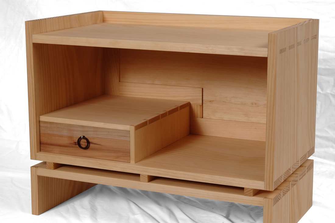
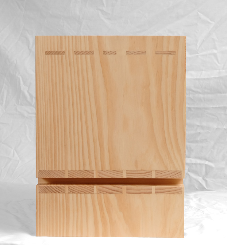
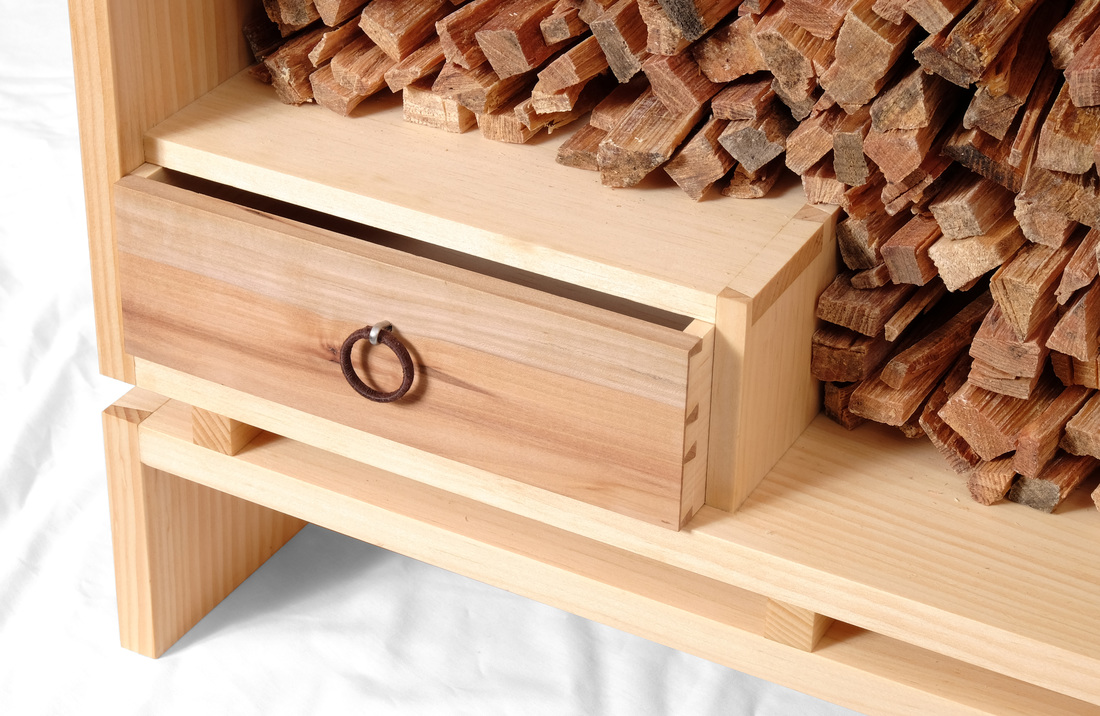
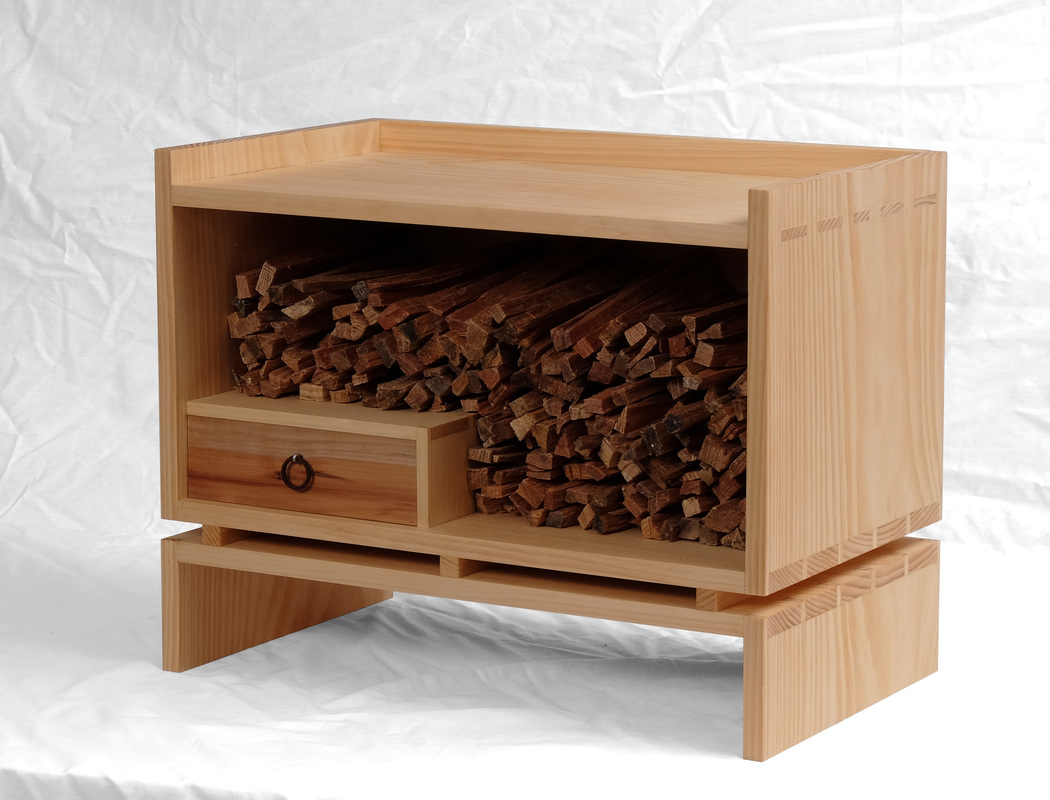 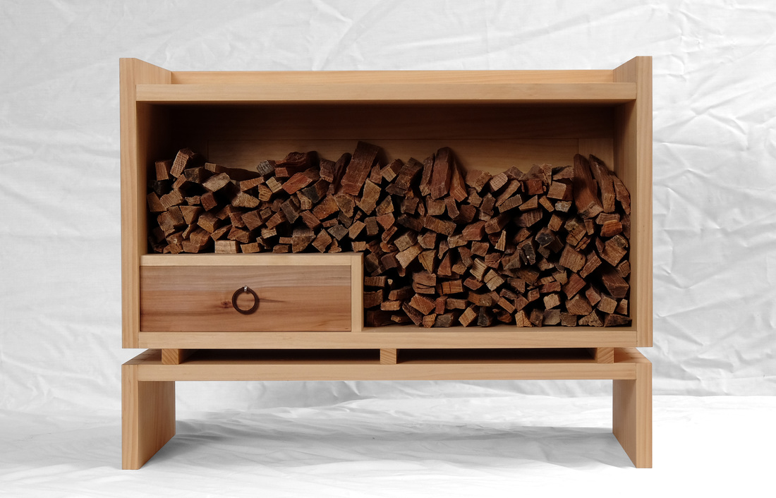 So, this is what happens when two other guys at Fine Woodworking make kindling boxes and I decide that I should make one too. One of the other guys is John Tetreault and his box will be shown in the Handwork department of FWW #253. The second guy is Mike Pekovich. Here's a picture of his. What both of their boxes have in common is that the opening is on top of the box, and that makes perfect sense given the job their designed to do. When I began thinking about a kindling box (actually mine is a box for fatwood), I was thinking of having the opening on top, but using a lid on hinges so that it would be neat and tidy--in keeping with my overall preference for clean lines. However, something about that struck me as odd, and I don't really know why, but I thought to myself, just turn it onto its side. The fatwood I used to start my wood stove is of a uniform length and can be stacked easily, so I knew it would work. Yet, I thought that a box open on one side with a bunch of kindling stacked in it would look a bit strange, so I decided to add a drawer to hold matches, a lighter, or anything else you might need to start a fire. Putting the drawer at the bottom would create some shape to the interior, especially with the kindling stacked ups the side and over the top of the box compartment. I really like the way it looks. I next thought about the joinery, and a base. For quite some time I've wanted to make a box with through mortise-and-tenon joinery, where the tenons where sized and spaced in a way similar to how I size and space dovetails. Running the sides up past they top allowed me to use the joinery for the top. If you did this at the end of a board the mortises would be too weak. (Running the sides and back up past the top also created a cool little gallery.) I was unsure what to do at the bottom of the box. I could have run the sides down past the bottom, allowing me to use the through tenons again and to create feet, but I thought that the box would look too traditional, and I wanted something modern. So, I split the base off from the box and used through dovetails on both. The size and spacing of the tails mirrors the size and spacing of the tenons. I deliberately chose to put the tails on the horizontal boards so that you'd see their endgrain when looking at the sides, just like you see the tenons' endgrain. I also rain the grain continuously up the sides from the base to the box. It helps tie the two together. To space the box and base, I used three small bars that are as thick and wide and the other parts are thick. The drawer front is apple. The other drawer parts are white pine (just like the box). I thought about painting the front with milk paint, but this piece of Apple was exactly the right thickness and width for the front, and I knew that the Apple would look great with the white pine. For the pull, I stacked two metal rings, one in front of the other, and then wrapped them with a thick brown thread. The pull hangs on a stainless steel cotter pin. I love it. Finally, the back. I wanted to use a frame-and-panel back to control wood movement. It also allowed me to glue the back in place, which is important because screwing it in place really wasn't an option. However, I did use three nails to secure it to the top. Glue was used on the sides and bottom. But anyway, back to what's really cool about the back. It has the standard two rails and two stiles, but I decided to try out something that I've seen Clark Kellogg use, so I added to pieces to the frame and these follow the contour of the drawer compartment. It looks awesome and wasn't hard to do. Thanks, Clark.
 |
AuthorI love furniture design, and smart techniques. This blog is about both. Archives
August 2020
Categories |
 RSS Feed