
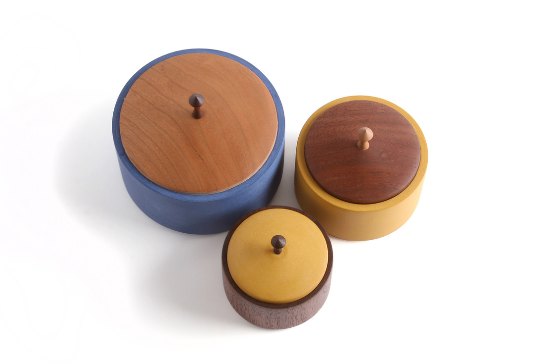
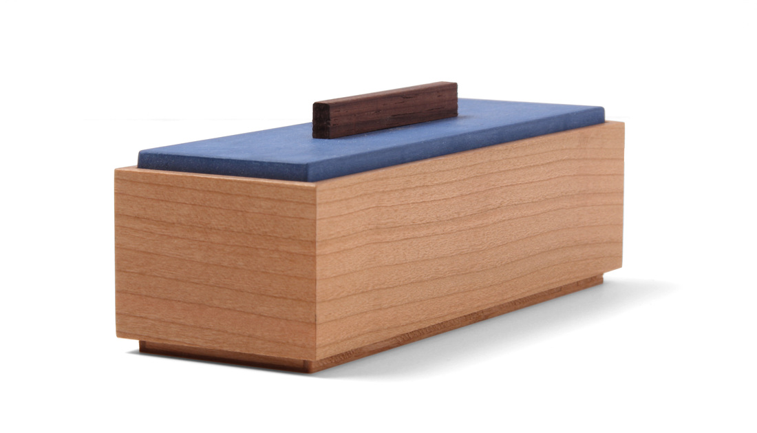
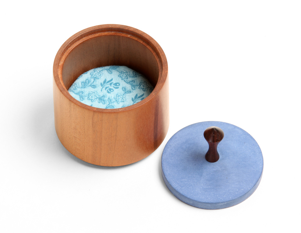
  I didn't chose to make this box. I made it because a jeweler I met really liked my smallest round boxes and thought they'd be a great way for someone to present the engagement and wedding rings she makes. Within a week of her and I discussing the possibility, she sold one to a client. So, I had to make one. I'm happy I did. I didn't have any of the round boxes on hand, and, to be honest, I couldn't remember the exact dimensions of the smallest ones (the walnut with marigold yellow lid box in the photo at right). I found a reference to dimensions in a tweet from ages ago, so I went with those. (Originally, I wrote that it was in a blog, but I was wrong about that.) Well, as it turns out (and this doesn't surprise me) I wasn't exactly precise with those dimensions in the blog. When I'm asked for dimensions, I typically round up or down, or just give something in the ballpark. Why? Well, I'm a bit protective of my eye for proportion. I put a lot of thought into the proportions of a box and I'd rather not just give that away so that there can be untold numbers of exact copies floating around. (If I publish something in the magazine, then there are precisely correct dimensions.) I suppose some might not like this dissimulation, but design in the hardest part of making furniture—and it's the most personal. At any rate, that's a long way of saying that this week's box was bit of an accident, because I really did set out to make another box identical in proportions to the walnut and marigold box. But I tricked myself and made a different box altogether. Oh well. I'm happy the proportions work, because it means that if someone else used them, then they got a nice box, too. This new round box, which is cherry and has a blue lid, is smaller in diameter and just a touch taller. I also made the lid thinner. And from the picture of the two side by side, you can see that the pulls are also different. I thought the walnut and marigold version was small, but this one is very delicate. I love it. Now I have four different sizes of the box. Actually, I've made one bigger than the blue body with cherry lid box in the photo above, but I made it only once. It's nice, but requires too much work to make (glueing up blanks, hollowing out tons of wood, etc.). Here's a nice point about turning a box like this. Notice that the sides are not perfectly vertical. The box is actually slight smaller in diameter at the top than at the bottom. The even roll in slightly at the top lip. If the sides were perfectly vertical, the box would have the illusion of being slightly wider at the top. Tapering the diameter ever so slightly makes it appear straight. It also makes it seem more delicate. And delicate is a good thing on little boxes. The pull is a variation on a shape I use for every pull that I make, no matter what it's for. I love the shape. That asymmetric curve is lovely. Want to know how I came to it? It's the perfect shape to fit between my thumb and forefinger when I grasp a pull with them. The first time I turned the pull I kept working that arc until it was nice and comfy between my fingers. That's how I'd grasp a pull. If you grasp one differently, then you'd end up with a different shape to satisfy what's comfortable for that grip. This is a great lesson in how function and use determines form. If you do it right, then the form will be graceful. Finally, one of the great charms of milk paint is how variable it's color can be. This little batch I mixed up is much paler than other batches I've mixed. Look at the deep blue of the box body in the photo above. That's a lot richer blue than the lid of box 11. Still, both colors are great. Milk paint almost always look great. My goodness, did that run on (and is perhaps a bit disjointed). Let's get to it. Random thoughts.
1 Comment
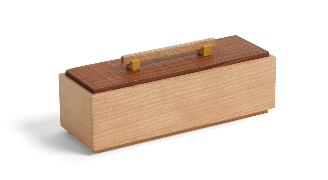
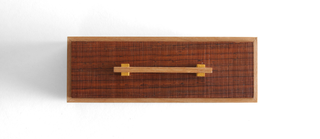
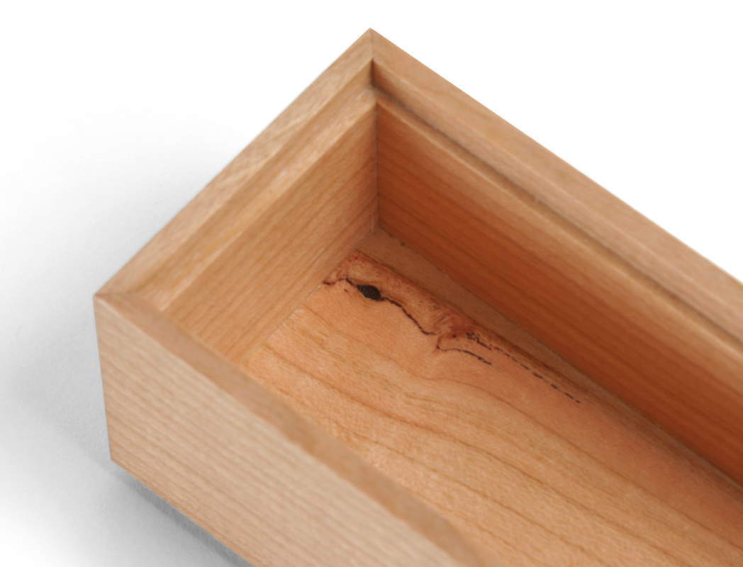
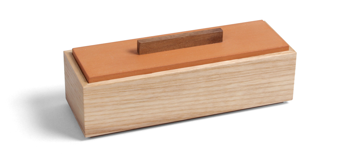
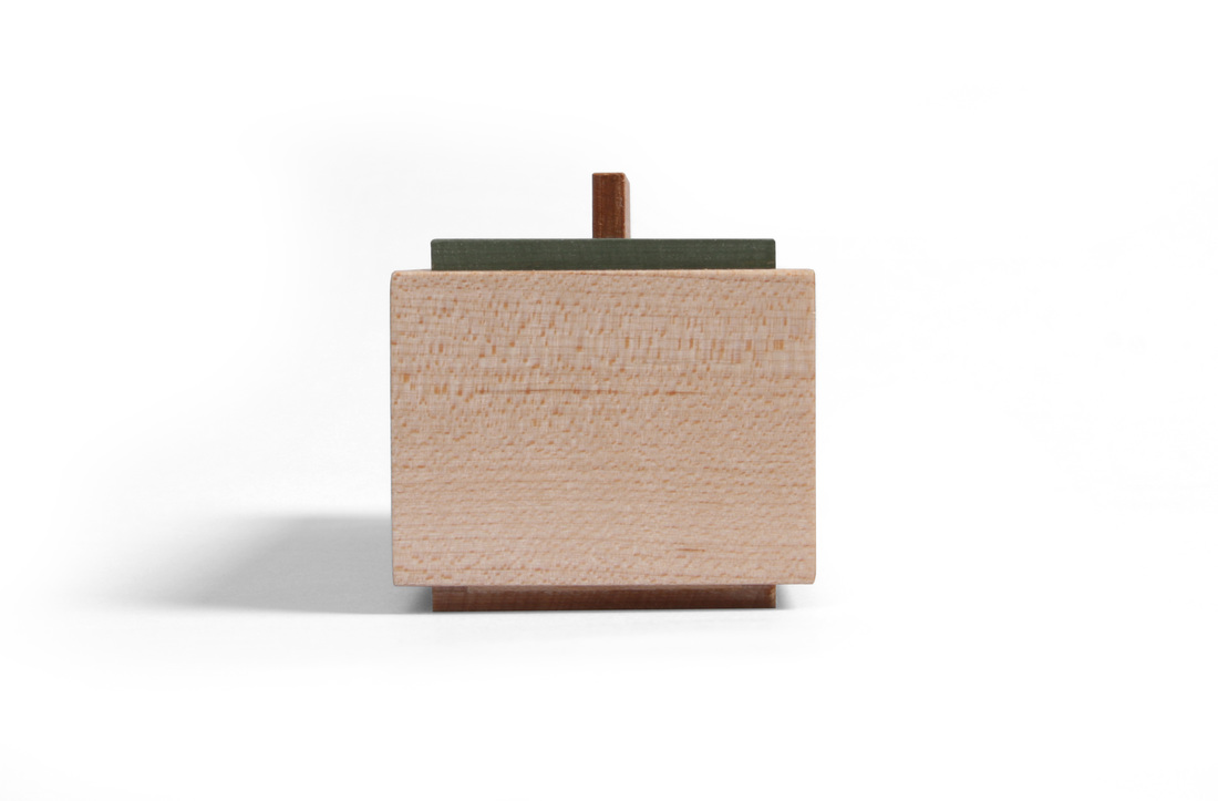
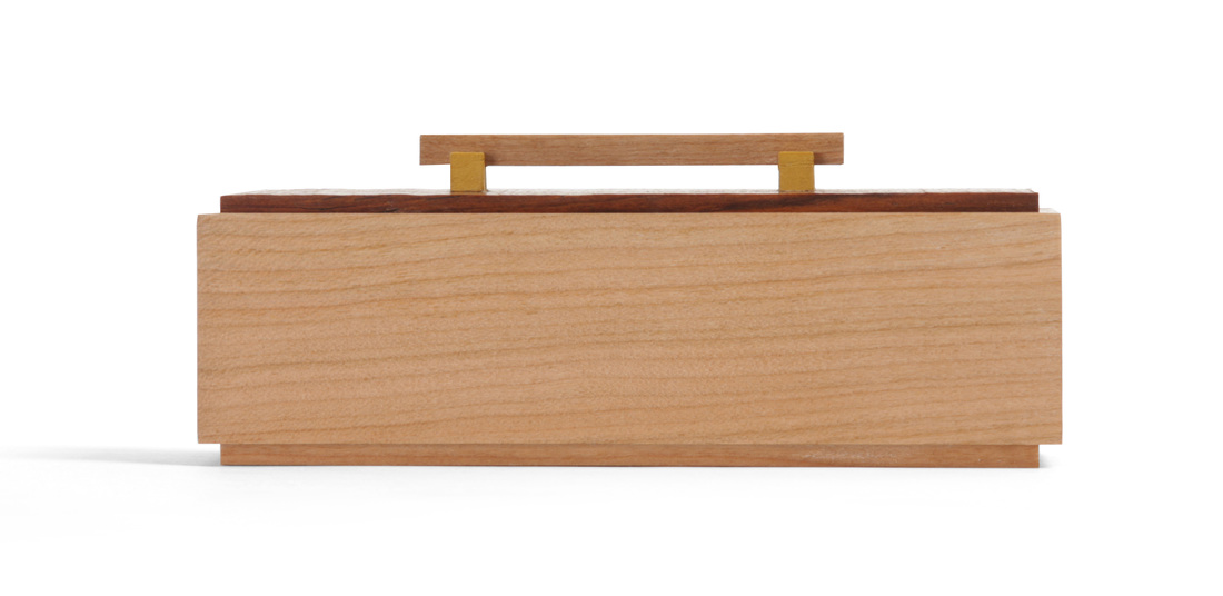 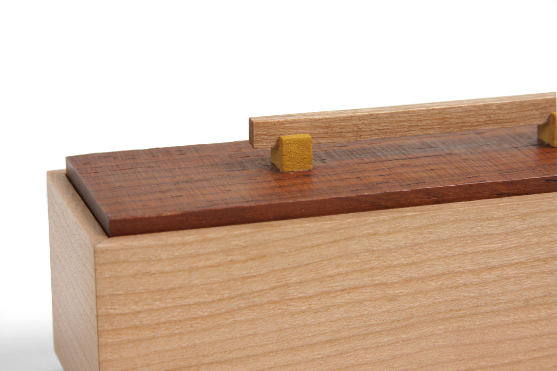 This is a little box—just 5 in. long and 1 3/4 in. wide—but it's big in terms of developing my design aesthetic. The body of the box is fairly standard for me. The lid is a whole other story. The pull, I'm sure, is the most obvious change for me. I've always done very simple pulls for boxes like this. Just a thin piece of wood glued to the top. This box is sporting a cherry pull elevated on little feet or stands that are painted with marigold yellow milk paint. I like this box. It's sitting here with me at the desk, and it's more charming in person that it is in these photos. And it's convinced me to explore pull styles for my boxes. I have several designs in mind. The really challenge is making them, because they're so small. A less obvious deviation from my established design aesthetic is the cocobolo lid. First, I've only used cocobolo for something other than a pull once before. (I used it for the center drawer front on a bow front cabinet I made for Fine Woodworking that was featured on the cover.) Exotics, I think, are too strong and dominate to be used for anything other than an accent. But this lid is causing me to rethink the role they can play in my furniture. When I was making this box, I really wasn't thinking cocobolo for the lid, but I stumbled across this piece in my box of cocobolo and ebony. It has strong, straight grain that's scaled perfectly for this box's proportions. And it had one face that was still rough from bandsawing (click on the picture above to see this in better detail). I though the rough surface would look cool, so I left it. I stole this idea from a box that Mike Pekovich made a few years ago. I'm certain to use it again. This pull is an exercise in details. So, too, is the inside of the box. There's a wonderful little pitch pocket in the corner of the bottom that is visible when you take the top off. It creates just enough irregularity and breaks up the clean, straight grain of the cherry in a very nice way. When I'm picking wood to make a box, I'm always looking for straight grain with little spots of pitch, or curl, or a pin knot. Clean with some character. That's the ideal wood for me. Also, always pay attention to the details. Thoughtful, good design begins with the overarching themes, but ends with the details. If you forget them, then you haven't finished the design job. (That's how I think about it at any rate.) On to the random thoughts.
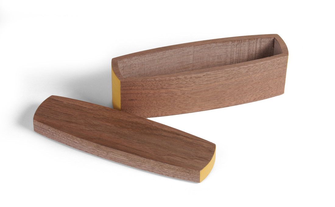
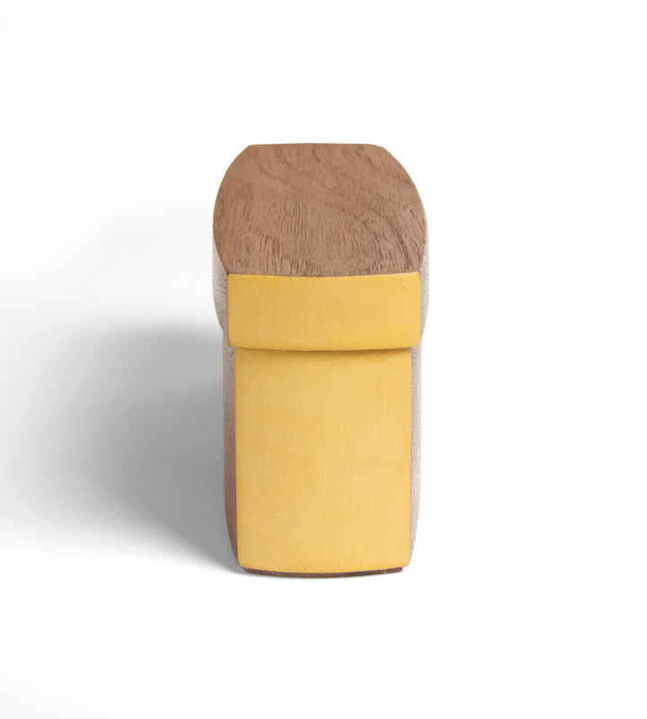
 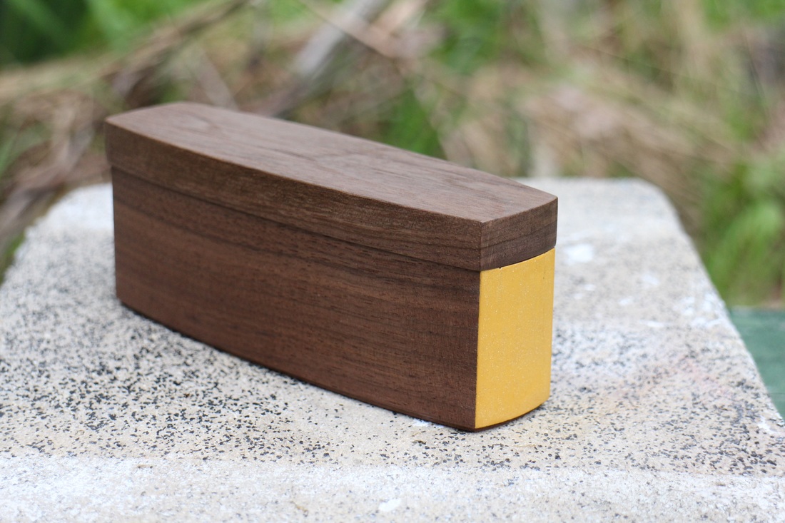 This box might look like others that I have made (walnut and marigold yellow together), but there is a huge difference between it and everything else I've made. This is my first bandsawn box. In the past, I've made it clear that I really do not like them (listen to our discussion with David Picciuto, the Drunken Woodworker). Here's why. The vast majority of the bandsawn boxes that I've seen are ugly. Very ugly. The reason why they are ugly is simple. The folks who make them focus on the fact that they're making a box with a bandsaw, so they throw in all kinds of wacky curves, goofy shapes, and drawers within drawers. The box is meant to display the fact that it was made with a bandsaw. Who cares how something was made other than the person who made it? (I know other woodworkers do. We care too much about that sometimes.) Personally, I want the people who see my boxes not to even think about how I made it. I want them to say, "That's beautiful." So, I tried to make a beautiful bandsawn box. Perhaps I succeeded. Perhaps I didn't. I'll definitely try again. OK, I'm getting off the soapbox before I go too far. I made this box while at Peters Valley School of Craft teaching a woodworking course. (By the way, Peters Valley is a wonderful place to take a class.) I actually made two of this box. The first one was sold in the weekly auction held to benefit the school. The only difference between that box (right) and this one is that I painted the ends of the lid, too. I like both of the boxes, but I think the original (no paint on lid) is a bit more elegant. However, I do like that the lid on this version overhangs the box body more. I intentionally made the lid on the first one smaller, but the overhang got so small that it no longer looks intentional. Design should always be intentional—and look that way. This box was a good learning experience. I've definitely thought of ways to improve the craftsmanship on my next bandsawn boxes. One of the things I figured out after making the first version of the box, but before starting the second one, is that you get tighter glue lines if you do not sand the bandsawn surfaces after cutting them. Look at the picture below that shows the inside of the box. Those are machine marks left by the bandsaw. That could be a very cool surface texture on the inside. The next time I make a bandsawn box, I'll work on controlling the appearance of the machine marks. For example, for a fairly nuanced surface, I could use a variable pitch blade, like the 3-4 variable TPI resaw blades on the market. These blades are also very thin, and that would help with the glueline. There's not much else to say, but if you have questions, please ask. I'll answer as best I can. Now for some random thoughts.
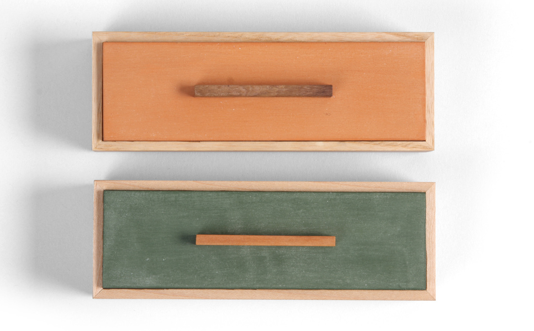
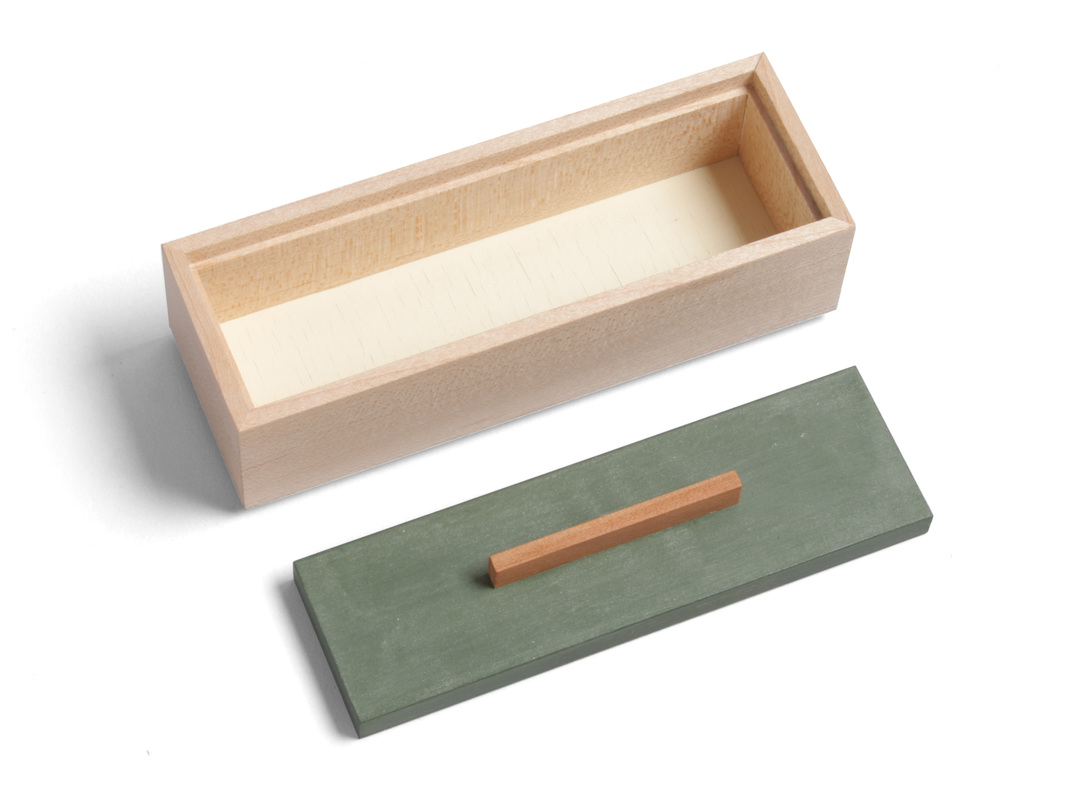
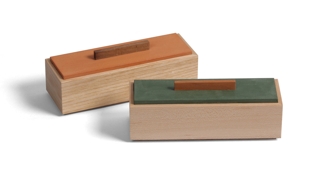  These two boxes are identical to the first two I made (one of them is just below, on the left), except in the woods and paint colors. When I made those two boxes, I knew that I would come back to the design, because I like it so much and I wanted to experiment with other species for the boxes and different milk paints for the lids. I might return to this design later, too. I already have a few ideas about how to change it up a bit (and, in fact, I've already turned one of those ideas into a reality—it's box 14. Yes, I am working ahead of what I am putting up on the blog.) And I don't think this violates the spirit of my 52 boxes challenge as I laid them out. Actually, it's explicitly in keeping with it. In this new pair, one of the boxes is made from rift sawn ash, has a pumpkin lid, and the lift is made from the wortled heart wood of a quizzical pear tree. The other is quartersawn maple with a Lexington green lid. Its lift is apple. Of the two, I think I like the maple one better. The grain is so tight, and there's a bit of chatoyance to it. The green is also a great match for the maple and apple. But the ash has an earthy undertone that goes quite well with the pumpkin milk paint. The darker grain lines are a nice match with the milk paint, too. It's hard. I like it, too. I suppose it's like choosing between your kids—on one day you (might) like one more than the other, but you never stop loving either. There is one way (other than wood species and paint colors) that boxes 7 and 8 are different than boxes 1 and 2. Where the bottoms of the first two were natural wood on both faces, I painted the top face of the bottoms for these two new boxes (taking a cue from box 5). The color is custom, comprised of mostly snow white with a touch of marigold yellow. I like it. Once again, I got that cool crackle effect. My colleague at Fine Woodworking, Dillon Ryan, has surmised that it is caused by the plywood swelling due to the water in the milk paint. When the plywood dries and shrinks, you get the crackle. I think this makes sense, because the top veneer of the plywood is so thin. With solid wood the crackle doesn't happen because it doesn't expand and shrink in the same way. I made these two boxes the same week that I made box 6. In fact, I made all three at the same time. After you have a design figured out, it's not hard to knock out a couple of boxes using it. I find this encouraging. Perhaps one day I can make and sell boxes for a profit. Hmm. I think it's time for some random reflections.
|
AuthorI love furniture design, and smart techniques. This blog is about both. Archives
August 2020
Categories |


 RSS Feed