
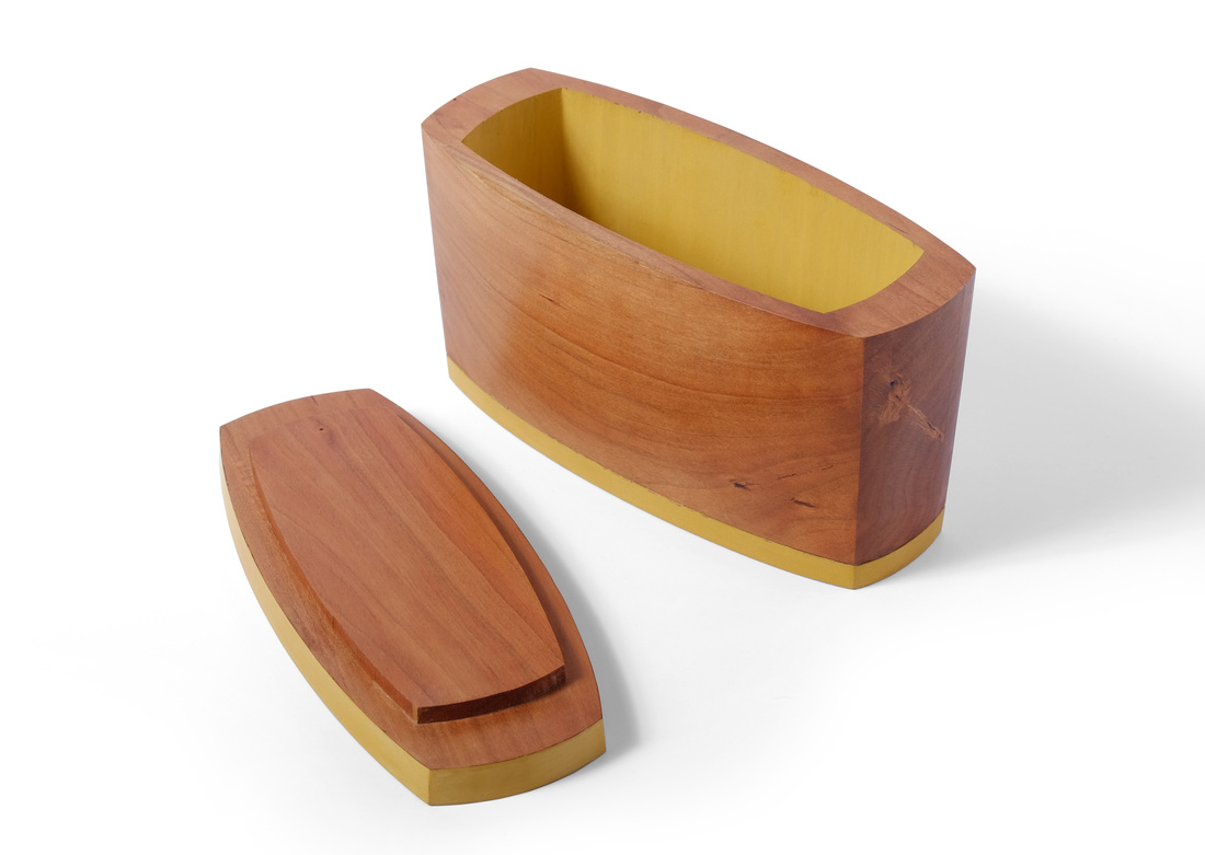
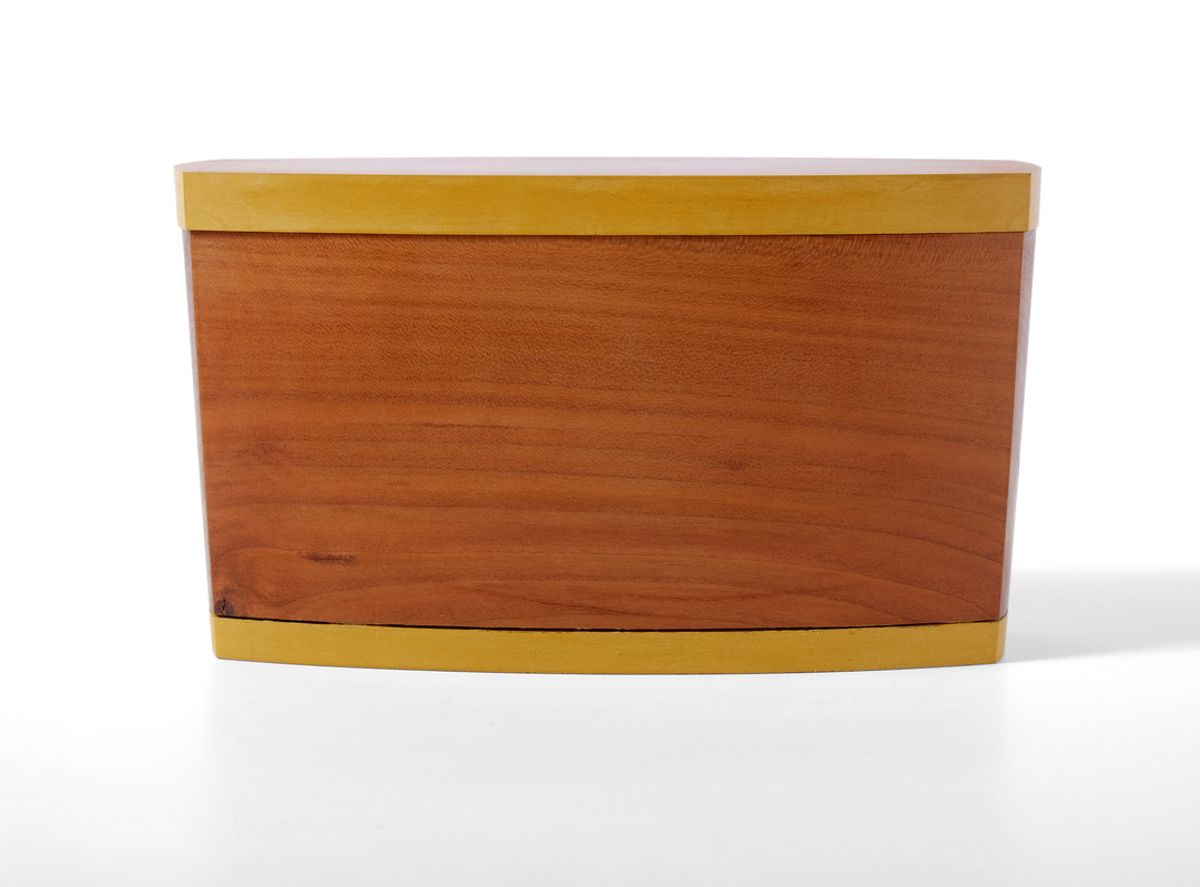
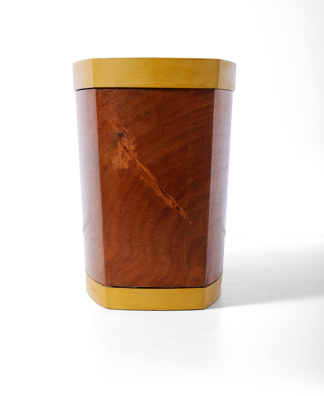
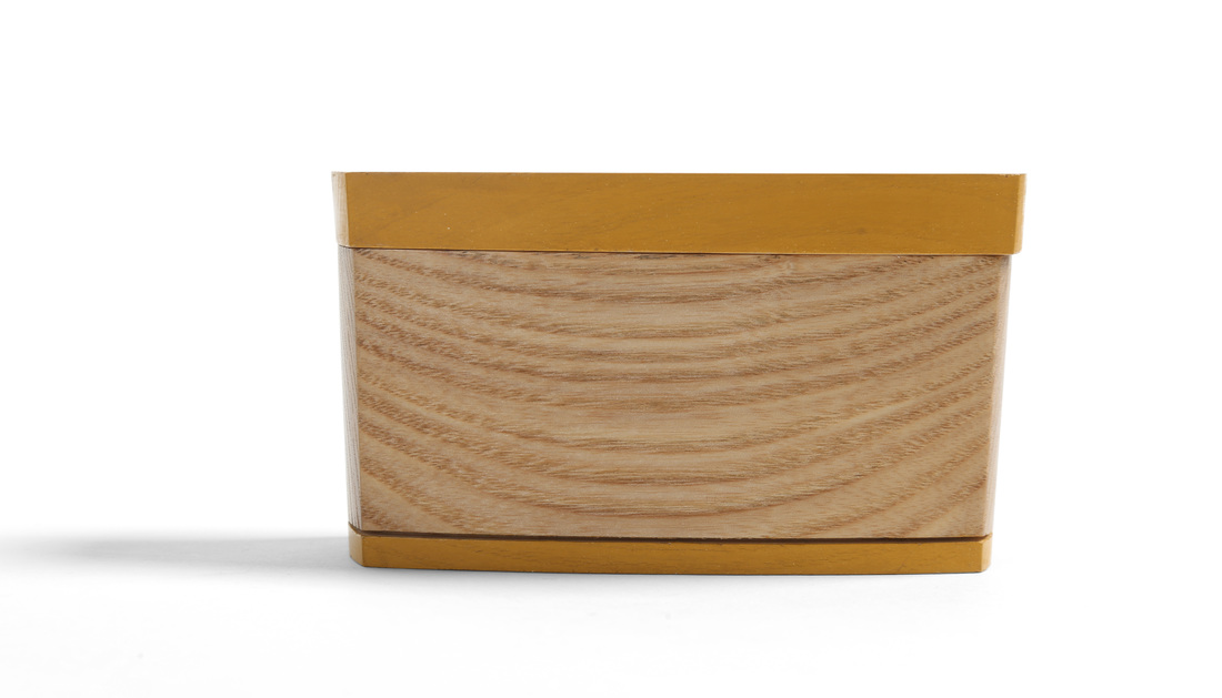
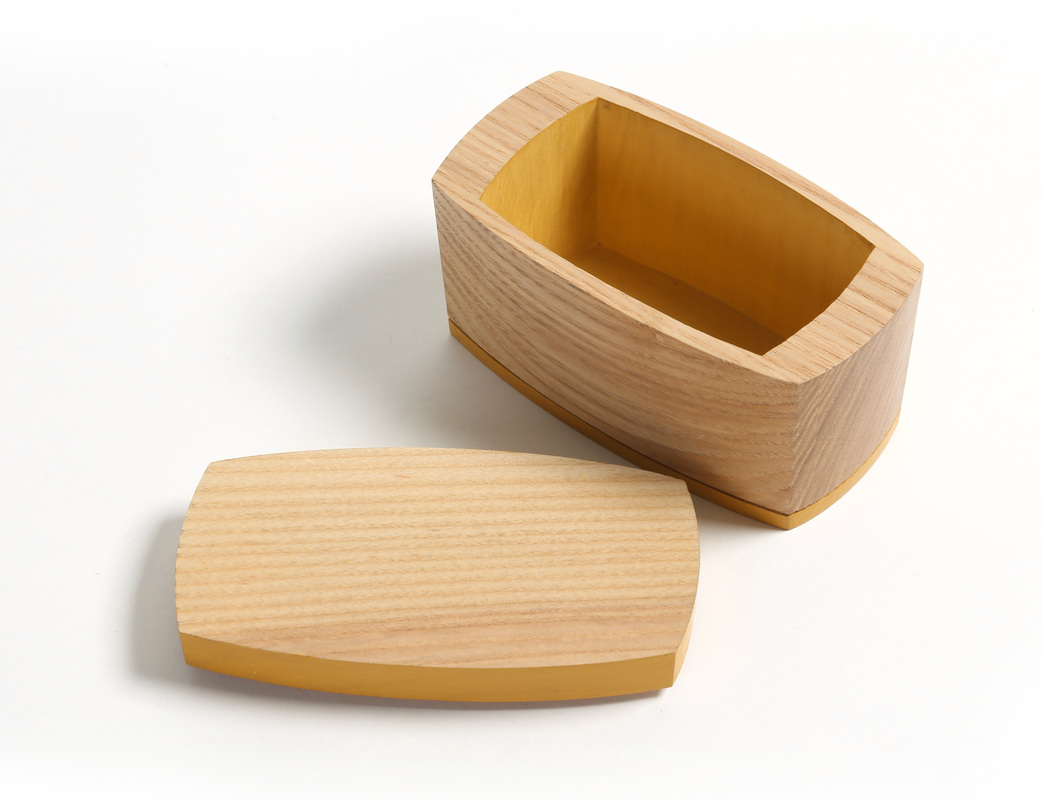
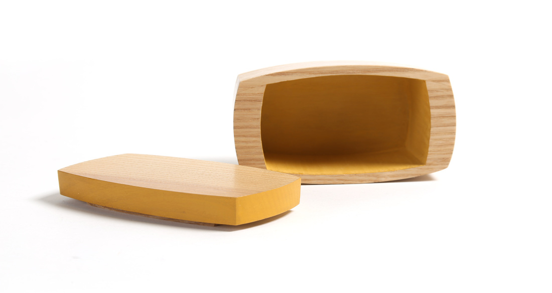
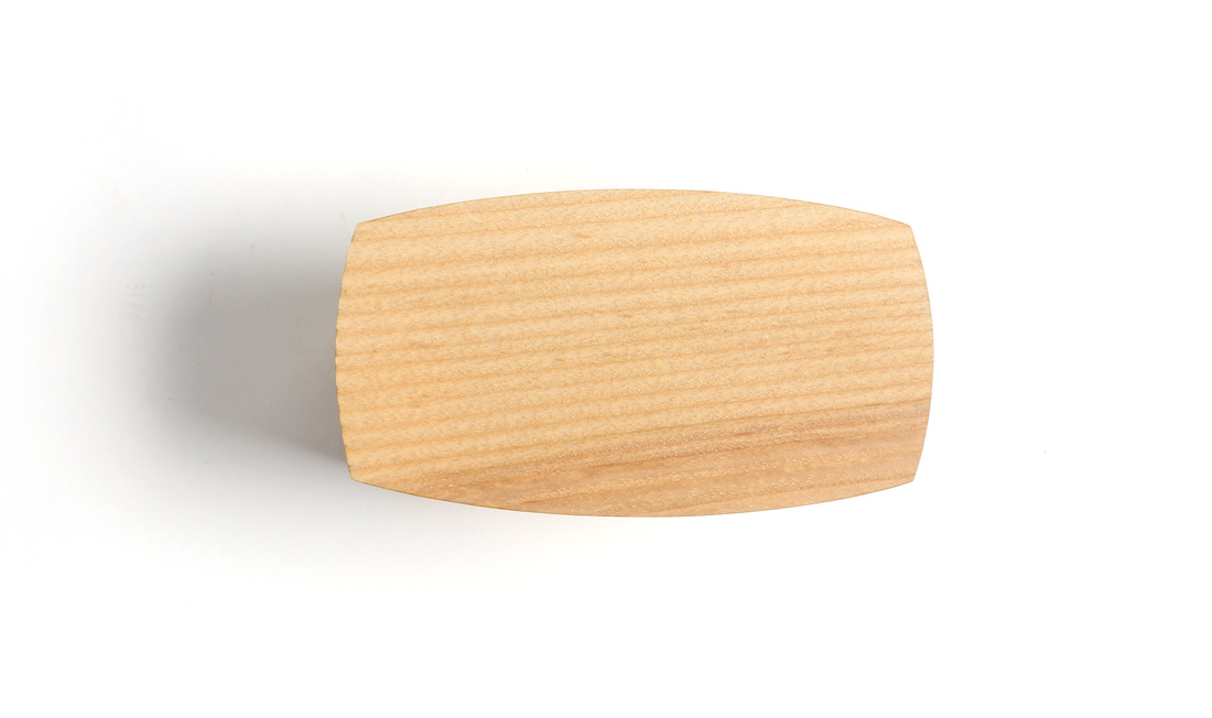
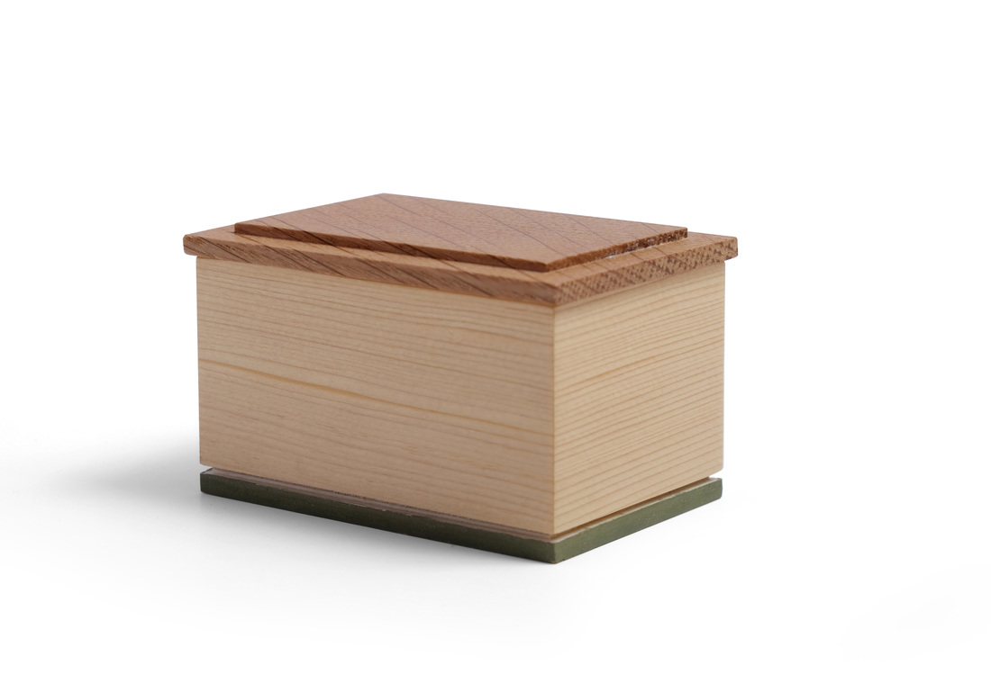
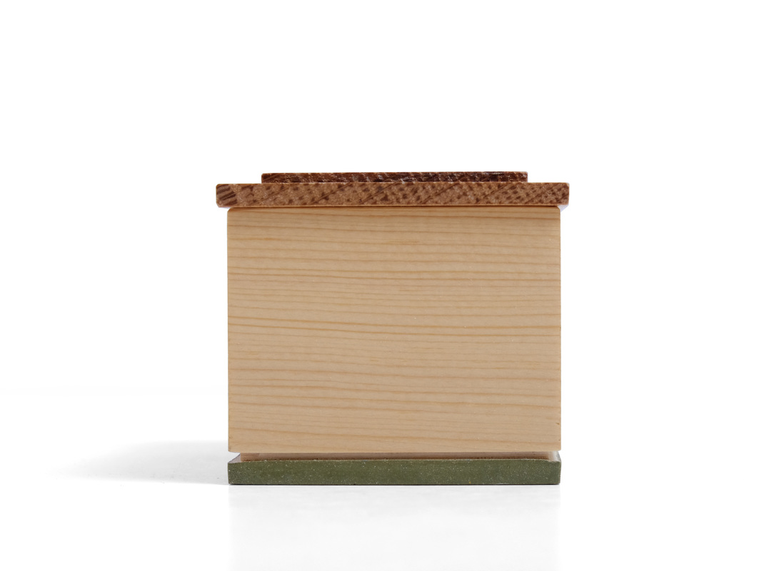
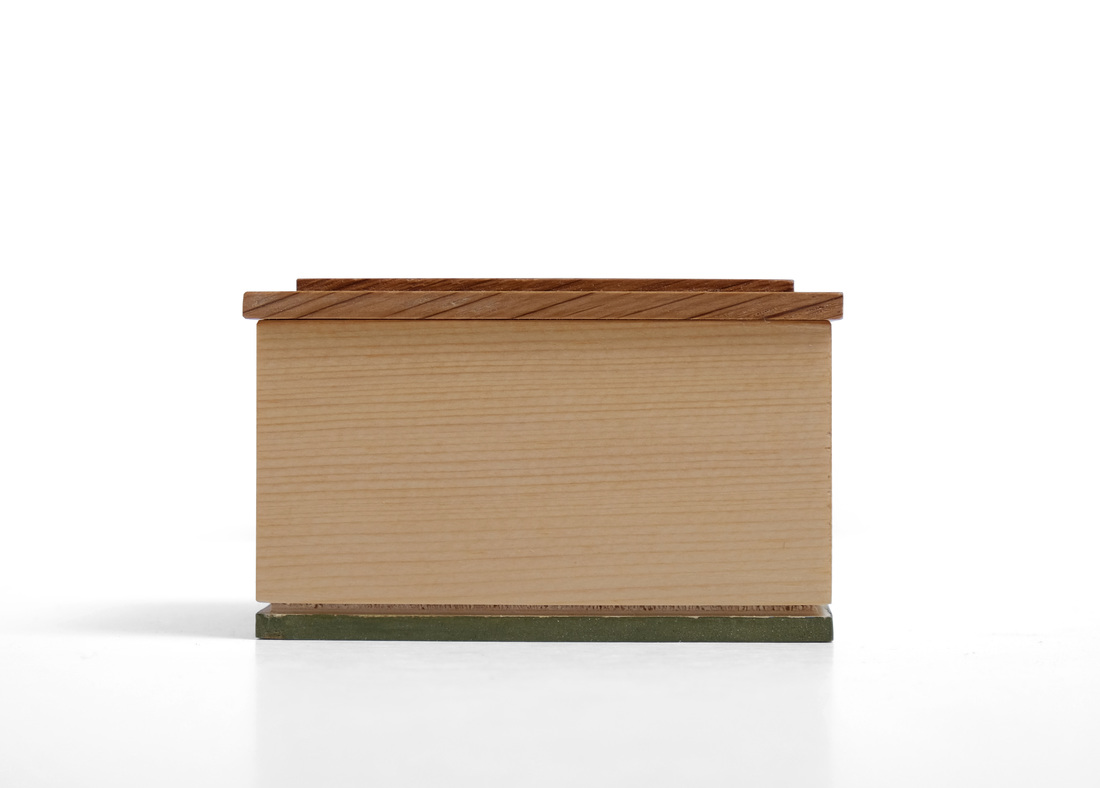
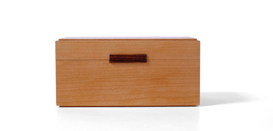
  Here's another bandsawn box. The design is the same as box 42, but this one is larger and made from cherry. I like it better. Here's why. Because the box is taller, the sides appear to angle out more. They don't (it's the same angle on both boxes), but they appear to, and that's cool. Also, cherry—especially this particular piece of cherry—looks much better with marigold yellow milk paint than ash does. The proportions of this box are more elegant, I think. But then there is also something about this box that I can't quite put my finger on. It simply strikes me as more appealing. It has something to do with the colors. The cherry, which is finished in a very light cut of shellac that barely affected its color, is so warm. It's the deep, rich, earthy red of aged cherry, but there is a hint of honey to hit. And not just the color of honey, but the chatoyance of honey, too. Paired with the yellow milk paint, it's irresistible. Oh, now I'm getting closer to what pleases me about this box. You see, I'm not talking about how it was made, but only about how it makes me feel. It's beautiful. It truly is. Everything else fades away. And that's what I strive for when making any piece of furniture or box. I want to look at it, to feel it's beauty and not think a lick about all the hard work, all the technique, the skill, and the knowledge that went into it. I strive for a purely emotional response. I want to speak to that part of us that feels beauty. When that happens I believe I've done something worthwhile, that I've made something that transcends the maker. It's a rare and perhaps fleeting accomplishment. (It is also possible—highly likely, even—that I'm just a self-absorbed fool taken with his own mediocrity.) I don't have anything else to say about this one, so let's get to some random goodness.
2 Comments
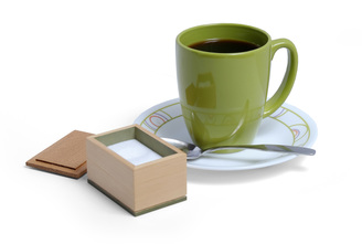
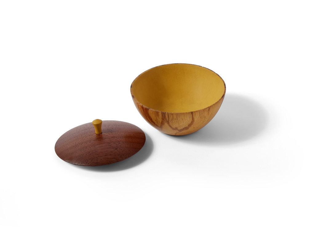
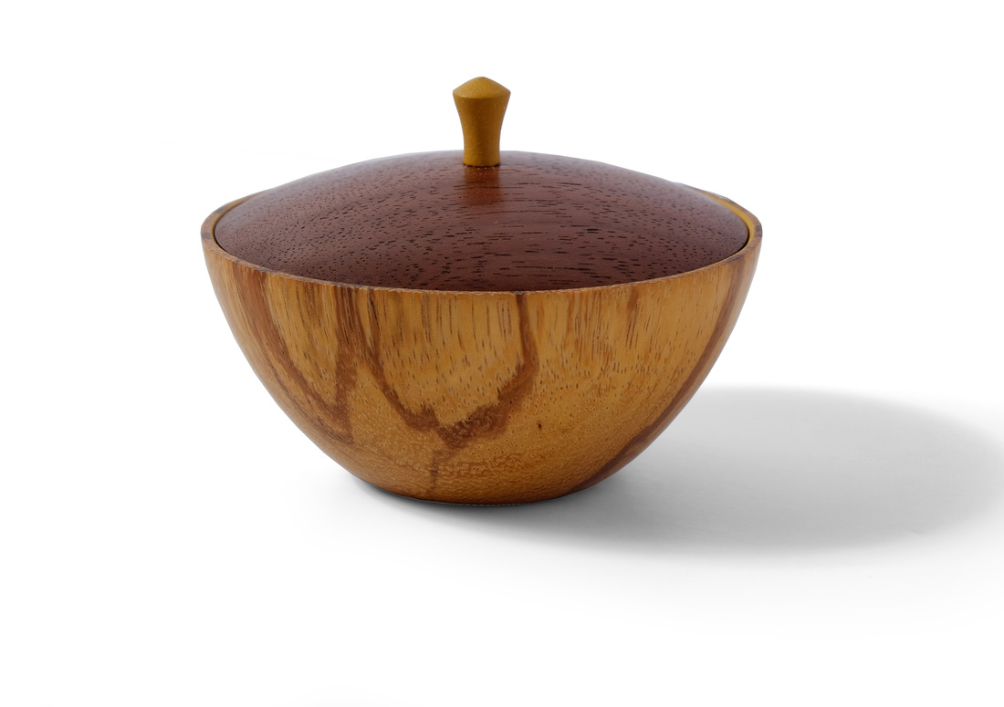
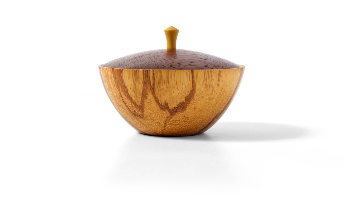  This week brings another sugar bowl (box 41 was the first). It's turned, giving it a more elegant look. I took inspiration from a variety of Japanese pottery I've seen. In particular, the shape of the bottom was informed by some small tea cups that I own. It's a beautiful shape. Fortunately, the bold lines running through the wood do not struggle against it. The wood is marblewood, which I've not used before. It's a tropical wood from South America (the northeast region, I believe), and this is heartwood. It's quite striking. It works fairly well, about the same as cocobolo. Because this box is meant to hold sugar (or salt), I painted the interior with marigold yellow milk paint, a non-toxic finish. I also happen to like the contrast between the wood on the exterior and the paint on the interior. It was the painted interior that led to the lid's design. It sit down in the bottom, so that about 1/16 in. of the side is visible above it. I thought that the yellow would create a delightful separation between the bottom and lid. I like this idea, and I'm pretty sure I'll return to it before I've completed all 52 boxes. Picking the wood for the lid wasn't too hard. The brown lines running through the marblewood immediately suggested walnut. Those lines tie the chocolate brown lid to the lighter, almost almond, brown of the bottom. This is a good example of using woods that compliment rather than contrast with one another. To determine the lid's arc, I quickly sketched out the body on some paper and then tried out several different arcs for the top. A low, relaxed arc seemed to work best. One last note, about the lid. The underside is hollowed out a bit. I thought this would be more delicate and elegant than leaving it flat. I didn't decided on the pull until after I had turned the lid. I typically use a third wood for my pulls (cocobolo being a favorite, along with apple). When the lid (or drawer front) is a dark wood like walnut, I use a lighter wood for the pull. However, if I used a wood like apple and left it natural, I'd be introducing a fourth color into the box. Instead, I painted the pull to match the yellow interior. It's a preview of the surprise awaiting you when you take the lid off. As for the shape, it's reminiscent of every pull I've ever turned. I think it goes nicely with the curves of the box body and lid. Of course, there must be random thoughts.
  It took longer than I expected, but I finally made a bandsaw box using the techniques set out by Michael Cullen in his recent Fine Woodworking article. What's cool about his take on the bandsawn box is that he tilts the bandsaw table so that when he cuts the interior of the box, it's narrower at the bottom than at the top. The waste created is tapered, and can later be used to make a plug that becomes a seamless bottom for the box. This solves one of the biggest problems with bandsawn boxes: The blade removes material and when you glue everything back together, they really don't fit together quite right. You get gaps, misalignments, and the like. Cullen's technique overcomes the kerf. It's awesome. Of course there is something far more awesome about his boxes: They are freaking beautiful—lightyears beyond every other bandsawn box that I've ever seen. Technical wizardy is always admirable, but aesthetic brilliance trumps it every time. So, I tilted the table about three degrees for this box and cut out the inside first, leaving the outside square (just as Cullen does) for the glue up. However, my plug didn't fit back into the box very well, due, I am sure, to my inadequacies as a craftsman. There were gaps, and I did't want that. But like a lightning bolt, box 41 came to mind. For that box, I used a piece of plywood (with shopsawn veneer on it's bottom face) for the bottom. I rabbeted it's top edge and then glued it to the bottom edges of the sides. It struck me that I could do that here, too. Using this style of bottom solved the kerf problem as well. More importantly—at least for me—the box looks like something I designed. That's what I like about this box. It's significantly closer to being a box that fits into my aesthetic domain than the first two bandsawn boxes that I made (boxes 9 and 16. See the picture at right). Cullen's technique partly explains that. The flared body (a consequence of tilting the table) adds elegance to the slightly arced sides. But it's also due to my willingness to chuck the notion that a bandsawn box has to be made by gluing all the parts back together. In this case, I've thrown out the bottom, and created a more refined box in the process (by this I mean it's more refined than the box I would have made had I used the plug for the bottom). I don't have to play by the bandsawn box rules when I'm making one. You don't either. The result is greater conceptual and aesthetic freedom. I'm now much further down the road to making bandsawn boxes that are truly mine. This might seem a grandiose conclusion from such a simple little box—and it might seem sad that it took me so long to figure out that I don't have to play by the rules—but throughout my life I've found that profound insight comes from seemingly innocuous tinkering (be it philosophic or mechanical in nature). The most valuable truths, the ones that are elegant, simple, and far-reaching, are the hardest to find. Like your nose, they are right in front of you, but damn near impossible to see. It takes a moment of true clarity and vision to see them. And now that I understand this simple truth (one that I took for granted in other contexts, but not this one), I believe that I'll be able to tame that foul beast, the bandsawn box. I suppose that what I'm trying to say is that it's not really the case that I learned that I can break the rules. What I realized is that the bandsawn box is not as limited as I thought it was. I was still getting tripped up by the technique. Well, I now see that I can monkey with that technique more than I was already and still have a bandsawn box. That's the revelation. It's a redefining of what makes a bandsawn box a bandsawn box. OK, some random thoughts.
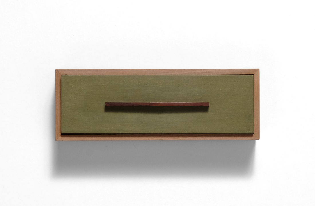
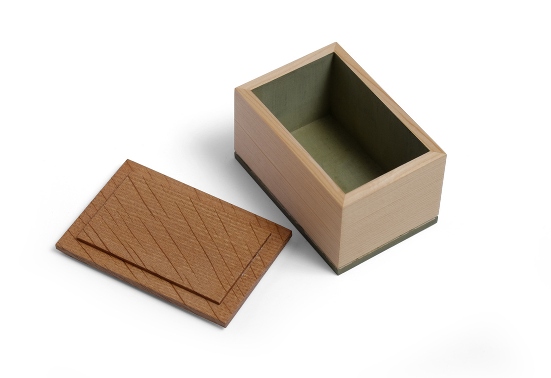  This is a little sugar box. The sides are made from salvaged, old-growth white pine that's quartersawn. The grain is very fine, tight and straight, which makes it just right for a box this small. However, it presented a problem when it came time to pick a piece of wood for the lid. I didn't have a species in mind, really. I was more concerned with finding something with very tight, very straight grain. I found what I wanted in a small white oak board. (I think I picked it out of the scrap bin in the FWW shop many years ago.) It's quartersawn, which might have been a problem had the ray fleck been wild or large. Luckily, the flecks are narrow and straight, running diagonally across the grain. I love the look. I was fortunate to have both white pine and oak with grain proportionally well-suited for this little box. Grain spaced more widely, or flatsawn grain, would make for a less delicate and elegant box. Having chosen wood for the sides and lid, I turned my thought to milk paint. The custom green paint that I've used in the past goes very well with white pine and white oak, so I settle on this color fairly quickly. How to use it was another question. Because the box is so small, I didn't want too much paint on the outside, and I didn't want to paint any part of the sides--the grain is just too beautiful to paint over. So, I thought about the bottom and realized that I had an opportunity to use a style of bottom that I've had in mind for a while but not used yet. I normally use the bottom as a way to create some separation between the box and the surface that it sits on, and because the bottom is inset from the outside faces of the sides, a narrow shadow line is created. This gives the box a lighter and more delicate appearance. The bottom of this box was not made like that. It's more like a little pedestal for the box to sit on. I glued some shopsawn veneer (from the same piece of pine as the sides) to a very thin piece of plywood. I then rabbeted around it's top face. After gluing the bottom to the box (this is why I went with a laminated bottom rather than a solid wood one), a small groove was created to give some separation between the box and bottom. And because the bottom is so thin, the bit of edge left was just the right size to be painted without becoming overbearing. I'm pleased with how it turned out. The lid is rabbeted on the top and bottom. The field created by the rabbets on the bottom fit into the box and keep the lid on. It overhangs the sides about 1/16 in. so that you get ahold of it to take it off. Here are some random thoughts.
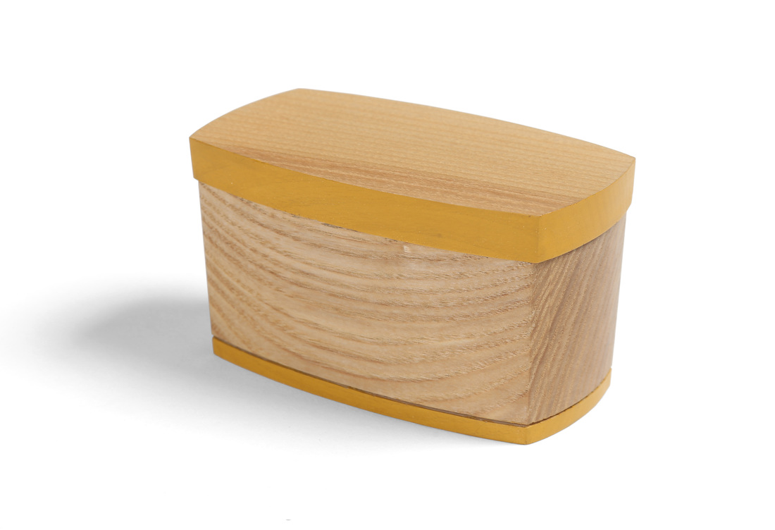
  When I first set out on this adventure in box making, I explicitly had it in mind that there would be some boxes that I would make more than once, so that I could explore the design and hopefully improve it with each iteration. Box 40 is one of these boxes. It the same as boxes 1, 2, 7 and 8. There are a few subtle differences, of course. First, box 40 is made from apple. It's one of my favorite woods, and I had a small piece that was just big enough for the sides and bottom of this box. The lid is painted with milk paint, like those other boxes, but it's a different color. This green is my favorite color of milk paint, and it looks great with apple. Third, the interior is finished with a bit of fabric glued to the bottom. Finally, (and this is there true reason I took a fifth stab at this box) I used a new style of pull for this box. It's the same pull I used on the biggest lids on box 35. When I made it for that box, I thought it might look good on other boxes that I've made, so I made a box to test out that theory. I think this new pull is a big improvement, bringing the box to a higher lever of refinement and one step closer to being a fully resolved design. The previous pull for this box was just a stick. Honestly, it was a stick because I didn't know what else to do. It wasn't until box 35 that I begin to think differently about the pull. That's all creativity reall is. It's simply a matter of answering the question "What can I do differently?" I learned that lesson from Hank Gilpin. He's brilliantly creative, and prior to meeting him I thought creativity was an innate talent. In truth (or at least this is how I understand it now) it's a skill that you can develop. and it's developed one step at a time. But you can't develop this skill if you don't use it. So don't be afraid. I'm not "artistic," I'm just not afraid to try something and screw up. I'm not afraid to take a step and fall. Failure is wonderful, because it gives you a chance to try again, to work harder, to learn, and to become better. (This is also why you should appreciate those folks brave--or rude--enough to tell you when you've mucked it up.) So, the next time you sketch something out, pick one detail and sketch out 20 different takes on it. Repeat this practice again and again. Or just sit and draw as many different pulls as you can, each one slightly different than the next. There will be a lot of failure, but there will also be success. By the way, don't worry if you think you can't draw. You can. Sketch fast and don't think. The more you do it the more it will look like what you see in your mind. Oh my stars, how did this become a pep talk? Now back to our regularly scheduled programming: Actually, this box might now be fully resolved, but I could always try out some other pull shapes and interior treatments. In fact, the pull might be slightly better if it were a stressed curve. Just a bit of rounding off rather than coming to a peak, and it would be quite nice. This is exciting for me. Sure, this box isn't as sexy as the last two, but it feels great to see a design evolve and get better. I need to do this with other boxes that I've made, but that will have to wait for most of them until after I've completed 52 boxes. I'll be back at new designs with box 41. OK, let's get random.
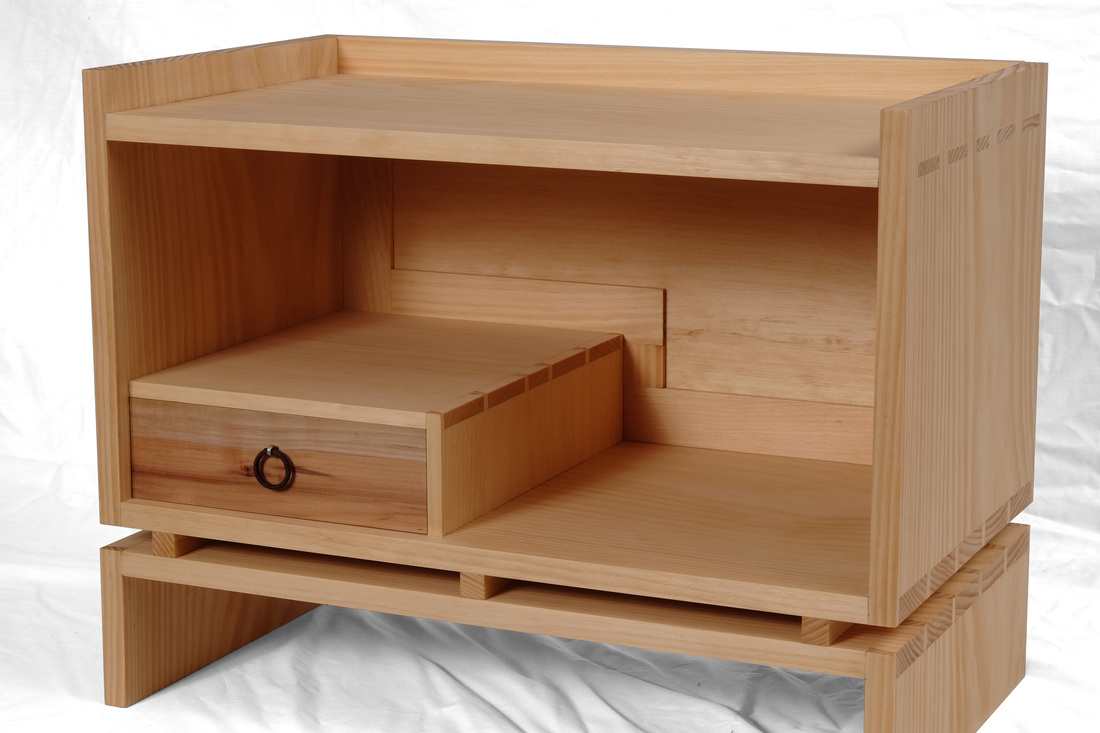
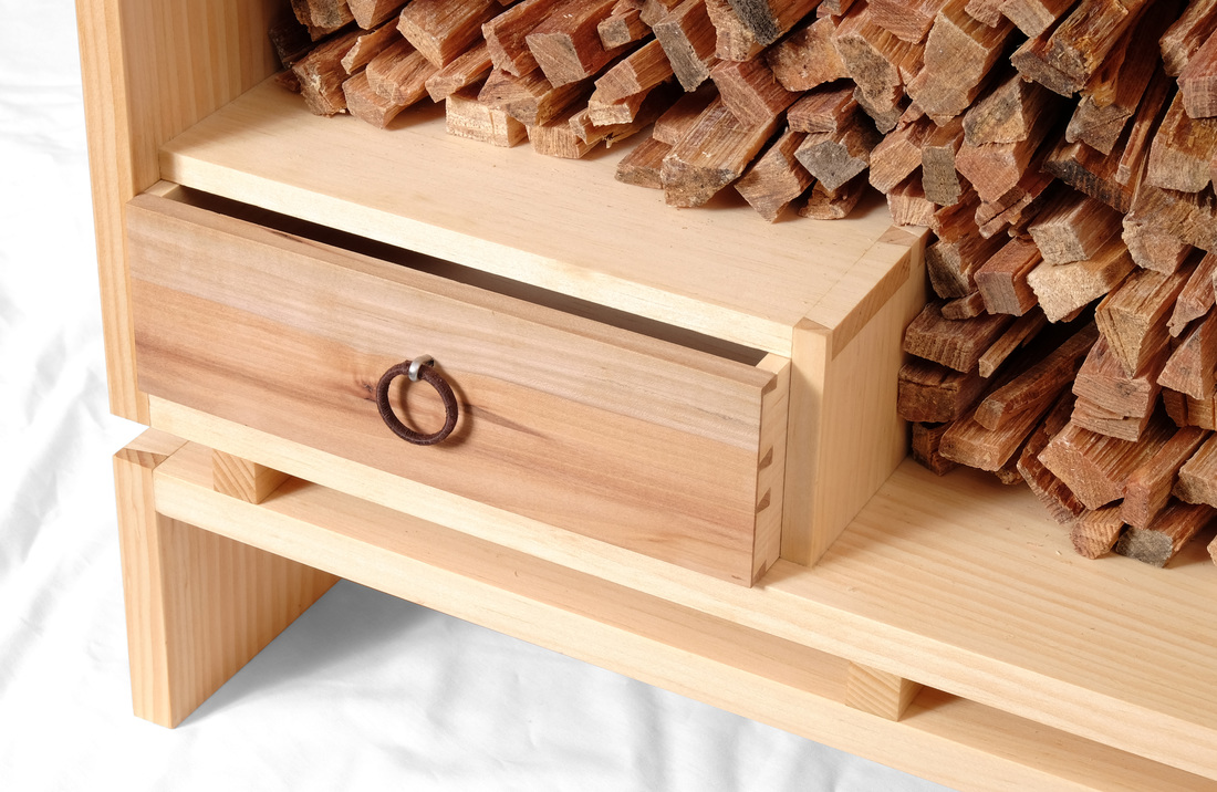
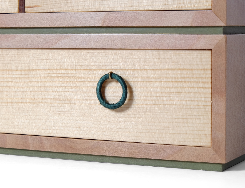
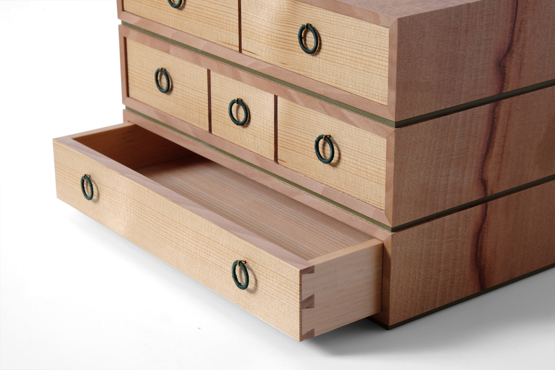
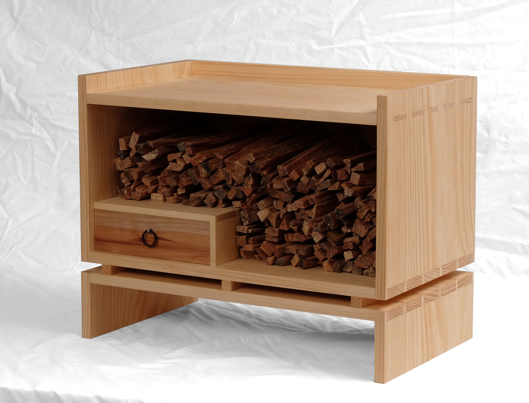 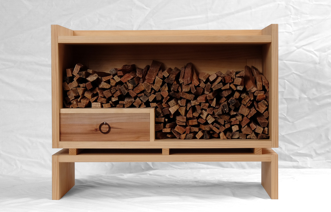 So, this is what happens when two other guys at Fine Woodworking make kindling boxes and I decide that I should make one too. One of the other guys is John Tetreault and his box will be shown in the Handwork department of FWW #253. The second guy is Mike Pekovich. Here's a picture of his. What both of their boxes have in common is that the opening is on top of the box, and that makes perfect sense given the job their designed to do. When I began thinking about a kindling box (actually mine is a box for fatwood), I was thinking of having the opening on top, but using a lid on hinges so that it would be neat and tidy--in keeping with my overall preference for clean lines. However, something about that struck me as odd, and I don't really know why, but I thought to myself, just turn it onto its side. The fatwood I used to start my wood stove is of a uniform length and can be stacked easily, so I knew it would work. Yet, I thought that a box open on one side with a bunch of kindling stacked in it would look a bit strange, so I decided to add a drawer to hold matches, a lighter, or anything else you might need to start a fire. Putting the drawer at the bottom would create some shape to the interior, especially with the kindling stacked ups the side and over the top of the box compartment. I really like the way it looks. I next thought about the joinery, and a base. For quite some time I've wanted to make a box with through mortise-and-tenon joinery, where the tenons where sized and spaced in a way similar to how I size and space dovetails. Running the sides up past they top allowed me to use the joinery for the top. If you did this at the end of a board the mortises would be too weak. (Running the sides and back up past the top also created a cool little gallery.) I was unsure what to do at the bottom of the box. I could have run the sides down past the bottom, allowing me to use the through tenons again and to create feet, but I thought that the box would look too traditional, and I wanted something modern. So, I split the base off from the box and used through dovetails on both. The size and spacing of the tails mirrors the size and spacing of the tenons. I deliberately chose to put the tails on the horizontal boards so that you'd see their endgrain when looking at the sides, just like you see the tenons' endgrain. I also rain the grain continuously up the sides from the base to the box. It helps tie the two together. To space the box and base, I used three small bars that are as thick and wide and the other parts are thick. The drawer front is apple. The other drawer parts are white pine (just like the box). I thought about painting the front with milk paint, but this piece of Apple was exactly the right thickness and width for the front, and I knew that the Apple would look great with the white pine. For the pull, I stacked two metal rings, one in front of the other, and then wrapped them with a thick brown thread. The pull hangs on a stainless steel cotter pin. I love it. Finally, the back. I wanted to use a frame-and-panel back to control wood movement. It also allowed me to glue the back in place, which is important because screwing it in place really wasn't an option. However, I did use three nails to secure it to the top. Glue was used on the sides and bottom. But anyway, back to what's really cool about the back. It has the standard two rails and two stiles, but I decided to try out something that I've seen Clark Kellogg use, so I added to pieces to the frame and these follow the contour of the drawer compartment. It looks awesome and wasn't hard to do. Thanks, Clark.
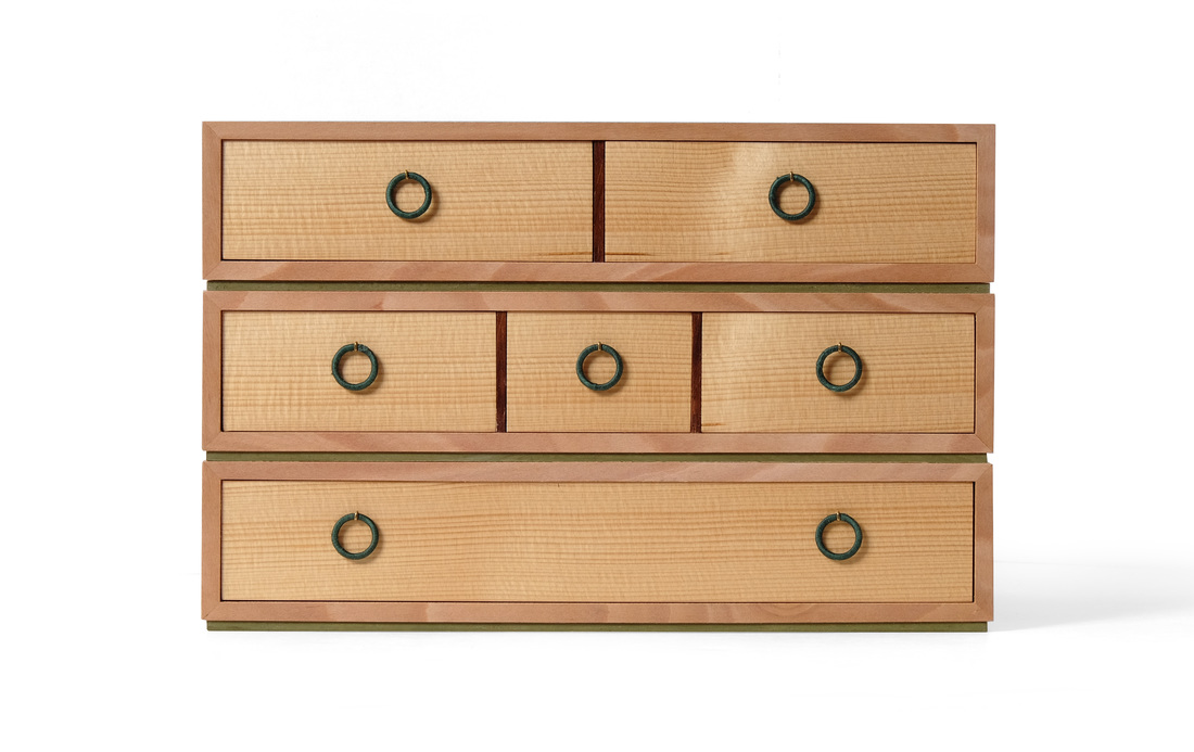
  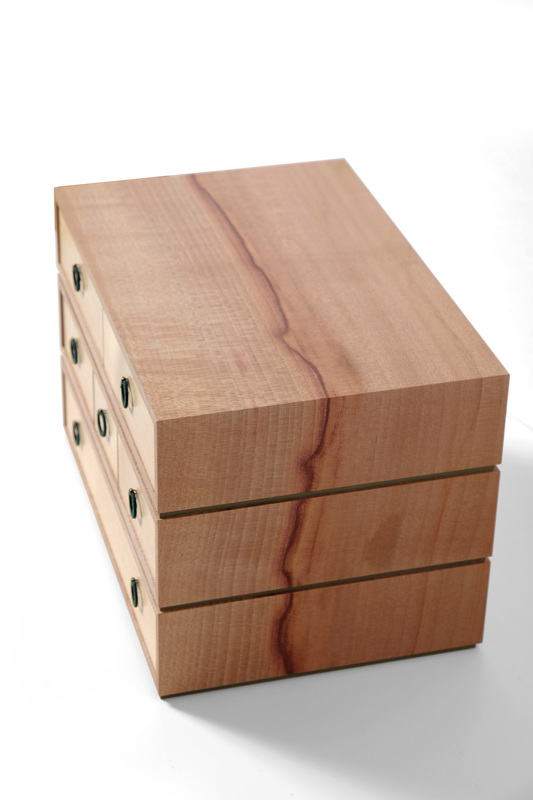 Box 38 took a long time to make, at least compared to the first 37. From beginning to end, I spent two weeks on it. Why so long? Six little dovetailed drawers with seven little ring pulls. And let me not forget the drawer bottoms. Those ate up some time, too. I'll get to drawers later. I want to start with with the box as a whole. What we have here is three separate boxes that are connected by some thin (1/8 in. thick) spacers. They're made from a piece of madrone, and the grain runs up the side, over the top, then back down the other side. It's a dramatic piece of madrone, as it has both sapwood and heartwood. The sapwood, which is a bit lighter in color and on the front of the cabinet, is separated from the heartwood by a dark undulating streak. It's an amazing and striking graphic. This streak is critical to the design's success. It holds the three boxes together, even though they're separated by small gaps. Of course, it also just looks amazing. There's no denying that this particular piece of madrone is spectacular. (And woe is me, because I've now used up all of my madrone. All that's left are offcuts. Perhaps there's enough for a little box.) The madrone's phenomenal beauty actually made it difficult to make the drawers. The fronts are old growth quartersawn white pine. However, these are the second fronts the drawers have had. The first set of fronts where madrone, cut from the same board as the boxes. The dark streak ran down the center of the middle row of drawers. But it's horizontal run was so in tension with the streak on the boxes, that I cut those fronts off almost completely (I kept the dovetail joinery) and then glued on the white pine veneers that you see. They're thick for veneers, between 1/32 and 1/16 in. thick. The very tight and subdued grain of the white pine works much better with the grain on the boxes. The fronts are really just a nicely contrasting color with a hint of grain. It helps that the grain lines are reddish-brown, which connects the fronts to the earthy browns and reds of the madrone. So, instead of a strong, visual grain fighting against the grain of the boxes, theres just a lovely, warm honey-colored bank of drawer fronts. Many years ago, I made a cabinet from this same madrone, and used old growth quartersawn white pine for the interior drawer fronts. I thought it looked great then, and I still do. Viewed from the front, the drawers create pleasing geometric pattern that's nicely accentuated by the ring pulls. I made the pulls from small metal rings, wrapping them in a thick thread that's a shade of green much darker (and closer to true green) than the milk painted spacers. The pulls hang from small brass cotter pins. These are, in essence, the same pulls that I used on box 4, but I didn't use hemp twine, because I thought the twine's color and coarseness weren't suitable for this box. The pulls aren't the only similarity between boxes 38 and 4. I used a walnut divider on box 4. This time it's cocobolo, but I set the divider back 1/16 in. and the drawers are flush with it. The divider on box 4 is flush with the front edge of the box and only drawers are inset. Also, the idea of box 38 came from wondering what box 4 would look like if I stacked two more on top of the original. Design is evolutionary, not revolutionary. And it's certainly not ex nihilo. Back when I was making box 4, I ripped some nice walnut to create narrow strips with very straight grain. They came from the edge, rather than the face, of a board. I did the same here. I ripped several thin strips from a piece of white pine to turn the edge grain into face grain. I glued them up into a panel and planned them to fit into the drawer bottom groove. So, the bottom is just 1/8 in. thick. That's plenty thick for a little box like this, as long as you don't store your Pee Paw's coin collection in the drawers. (And, anyway, dear old Pee Paw would want you to sell that coin collection and buy a few new planes and a colossal bandsaw with the money. Hop to it.) I love the tight, straight grain of the bottoms. It's just as important to be beautiful on the inside as on the outside. Well, I don't think I have anything else to say, so let's get random.
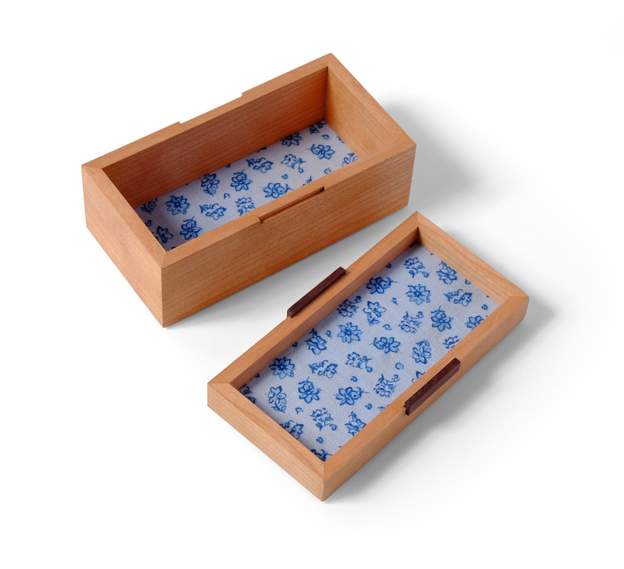
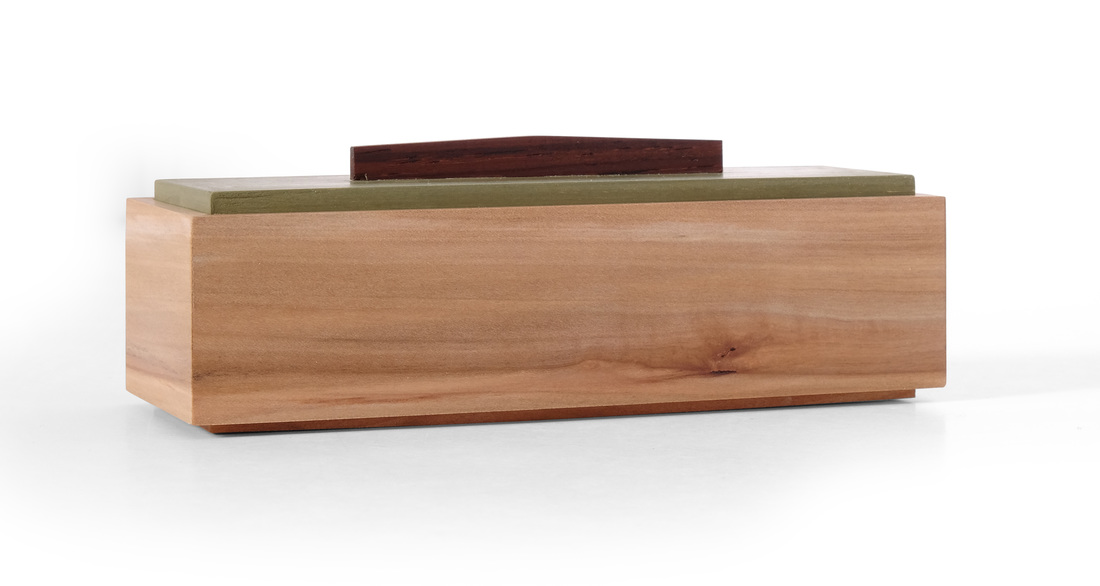
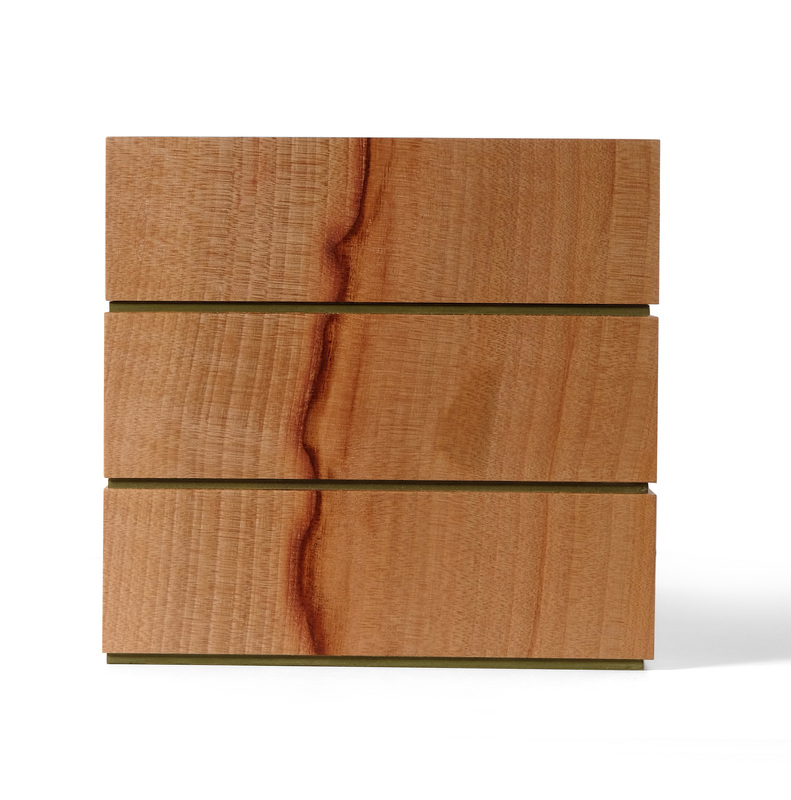
  This is box 37, which I made at the same time I was making box 36. The have the same dimensions and were made with the same construction techniques, but they clearly are not the same box. I like each of them individually, but I think they're better off as a pair. The underlying familial connection makes their individual beauty shine even brighter. When I first got the notion of making 52 boxes in 52 weeks, I envisioned making individual boxes, but I've grown fond of building a pair of boxes around a few basic design ideas (proportions, use of color, etc.), taking each box in a different direction while letting their bones tie them together quietly. I wonder how many boxes I could do this with. I think three would work nicely. More than that and perhaps the magic is gone. So, this box. It's cherry, with kingwood pulls. It's a great pairing. Kingwood is in the same genus (dalbergia) as cocobolo rosewood, and African blackwood, so it's no surprise that it compliments cherry so well. The pulls are mortised into the lid. I cut a matching mortise in the box for each pull. When the lid is on the box, the pulls register in the box's mortises and hold the lid in place. It's simple and clean. I like it. Because this box is so small (1 3/4 in. tall by 2 in. wide by 4 in. long) it was critical that I pick the right piece of cherry for the sides. It needed to be riftsawn with straight, tight grain. The grain on the piece I used is proportioned perfectly for the box's size. I think that matching the grain's proportion to the box's is something that many woodworker's do not think about, which is a shame. Let's say you make this box from curly maple—and I think it would look good in curly maple—the curl would need to be very tight, so that you get a lot of little ripples across the sides. This makes the little box look like it was made from curly maple. Big, rolling curls just wouldn't have the same pop. The box might look splotchy or vaguely figured as a result—and it really look like it was made from curly maple. The same goes for the fabric I chose. Cherry goes well with blue, so I pulled out my blue fabrics. But the visible area of the bottom and lid are quite small. A fabric with a large pattern would look odd, so I went for one that has a small flower (in blue) all over it. It gives the sense that the fabric was made for a box just this size. A big pattern would suggest that I used a fabric meant for something big, like a quilt, and crammed it into this little box. Perhaps I'm odd for thinking about the fabric I use in this way, but I really do believe it's important that all the details of a box be appropriately proportioned to harmonize with the box's proportions (this, I believe, is also true of all furniture—no matter the size). And my attention to this particular detail is only an example of the level of attention one must pay to the details when designing. Everything must be considered. OK, let's get random.
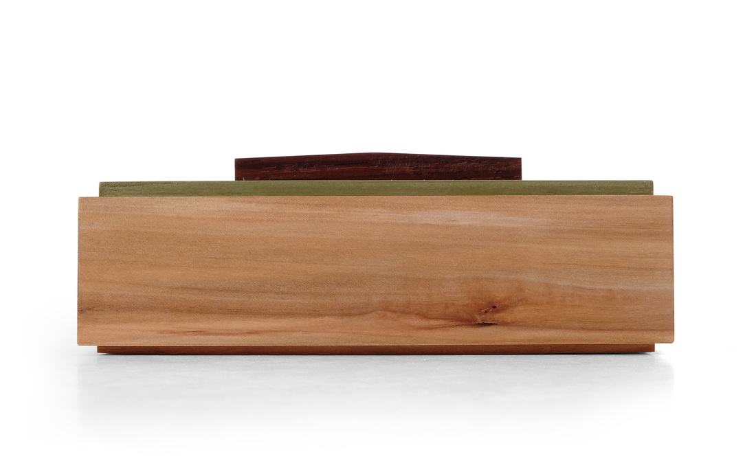
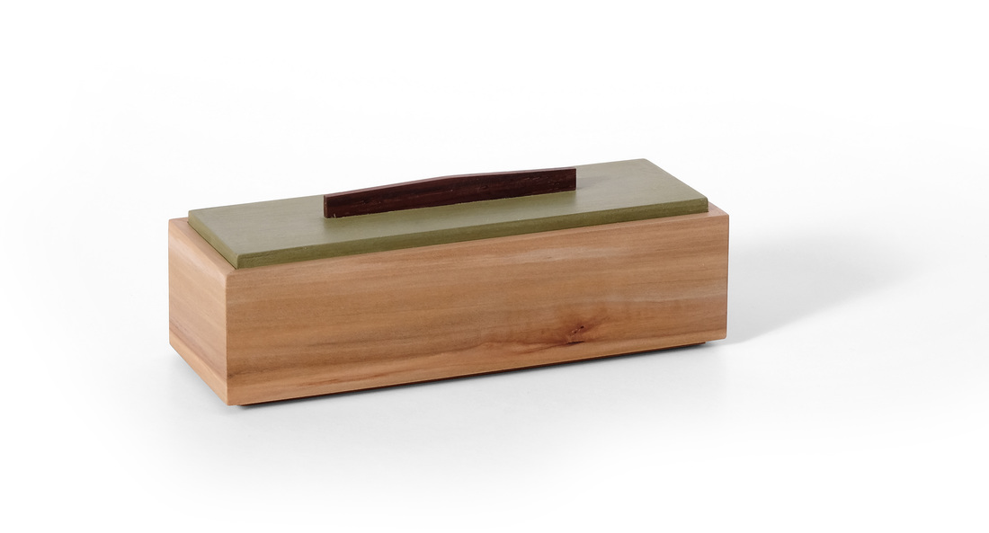
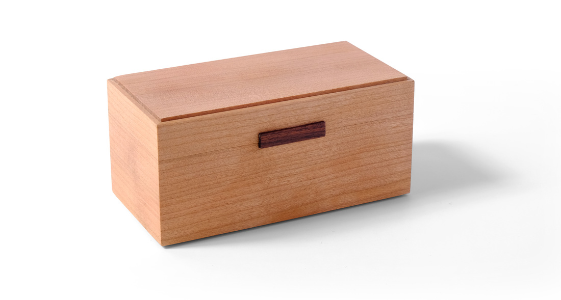
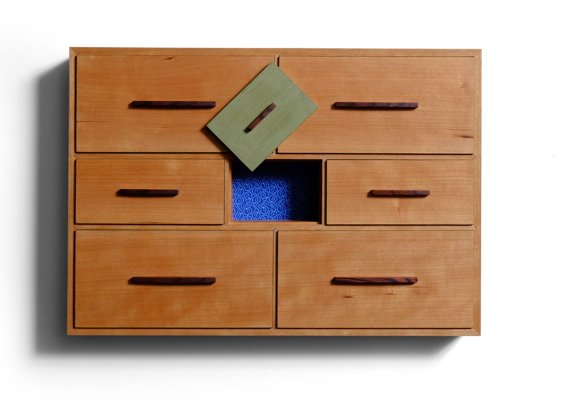
  This box came out of nowhere. As I was finishing box 35, I was a bit frustrated because the quality of workmanship is a bit lower than I'd like. There are a few gaps in the bird's beak joints. So, I decided to make a box and make it as perfectly as I could. For some reason the first thing that popped into my head at this point was a very small ebony box. I thought that if I could come up with a good design and execute it perfectly, then ebony would make the box seem like a little jewel. I don't know if I accomplished my goal, but I really like this box. For the most part it's a pretty normal box. It's 2 in. wide and 4 in. long. The sides are 1 3/4 in. tall. The top and bottom have shopsawn ebony veneer on the outside faces, and fabric on the inside faces. There's some shopmade poplar plywood between the ebony and fabric. The top and bottom are glued into rabbets cut into the sides. I glued up the sides, glued in the top and bottom, then cut the lid free. And here's where to box takes an unexpected turn. A common approach to keeping this style of lid on it's box is to use an insert on the inside of the box. I used this technique on boxes 12, 28, 29, and 30. When I was designing this box, I decided not to use an insert. Instead, I though that I might inlay some thin circles into the front and back of the box. The inlay would be glued into the lid, but not the box, so you could pull the top off, but when the top was on, the inlaid circle would lock into the half-circle mortise in the box bottom and keep the lid in place. I considered several other shapes, too. But, honestly, all of that seemed like a colossal pain to make. So, I thought some more about it. Here's what I came up with, and it wasn't hard to do. After cutting the lid free and cleaning up the sawn edges of the lid and box, I routed a small rabbet into the lid and box. I then made some strips of maple that were just wider than the "groove" created when I put the lid on the box. I also left the maple a bit thicker than the groove was deep, so that it was just a few hairs proud of the ebony. My plan was to paint the maple, then glue it into the rabbet in the lid. That's what I did. The green strips are mitered at the corner. The strips automatically fit into the rabbet it the bottom and hold the lid on the box. There's not much else to say about this box, but I do want to explain why I painted the strips that hold the lid on the bottom. I thought about using solid wood, and quickly ran through the species I have on hand, like cherry, walnut, apple, mahogany, madrone, white oak, maple, holly (It's really not very good holly. I should not have bought it.), etc. None of them were the right color. And then there's the issue of grain. Ebony's grain is so difficult to see, that even a wood with very little grain, like madrone or apple, looks odd against it. I also thought about using curly maple, which can look great with ebony, but the strips are so small that I feared the maple would no longer look curly. Also, ebony is so lacking in variation of color, that other woods look odd juxtaposed against it when ebony is the primary wood. So, I decided to go with milk paint. It shouldn't be a surprise that I think it looks great. One last point about the strips. I left them proud of the ebony for a few different reasons. First, I wanted there to be a tactile indication of how the lid comes off. When you put your fingers on the lid, you feel the strips slightly and can grasp them to help pull off the lid. Second, it would be damn near impossible to get them truly flush with the ebony. Normally, you'd glue them in place and then plane them flush, but I couldn't do that because it would remove the paint. Of course, you could remove material from the inside face until the outside was flush, but because a bit of the inside face is exposed and painted, I couldn't do that, either. A third option would be to plane the strips flush to the ebony before I painted them, but then they would no longer be flush after I painted them and you would feel that. So, I intentionally made them proud, and they're proud enough that it's clearly intentional. Good design is always intentional. Alrighty, then, here's some random thoughts.
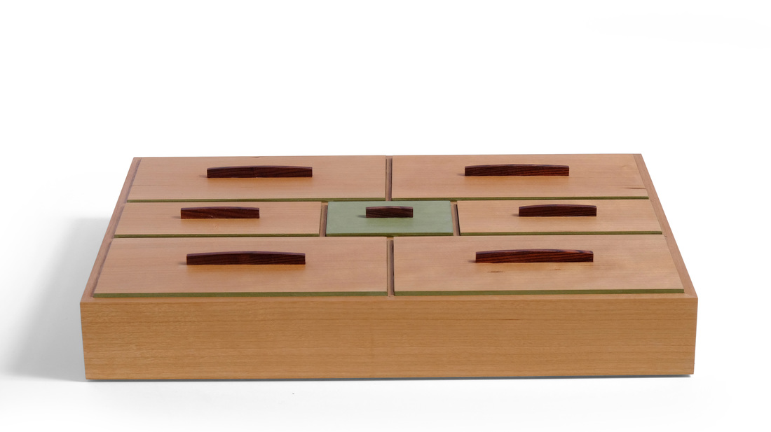
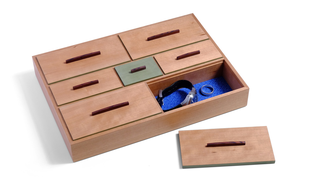
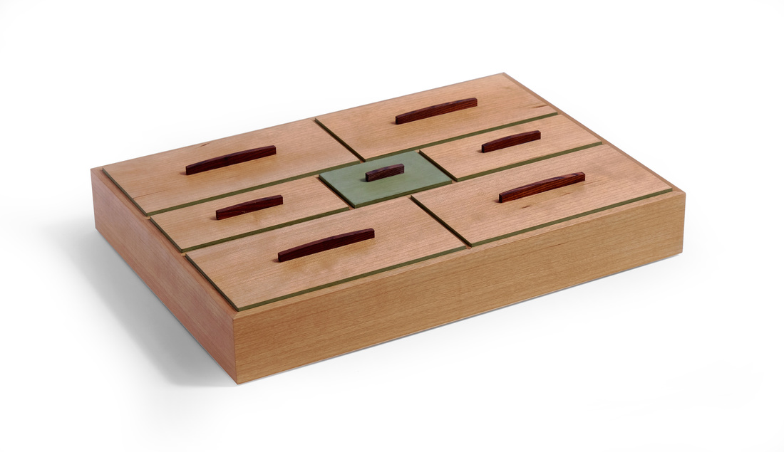
 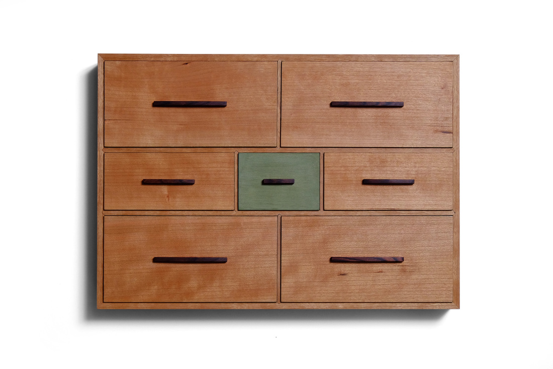  When I'm designing a box, the first three things I think about are the box's proportions, whether I'll be able to use the box's elements (lids, pulls, etc.) to create a geometric pattern, and how to incorporate a bit of color without overpowering the box. All three elements have a prominent role in box 35. I'm not sure how I feel about the box, but the more I'm around it, the more I seem to like it. This is the biggest box I've made so far, it's just over 12 in. long and 8 in. wide. The sides are 1 3/4 in. tall. It had to be this big to get so many compartments into it and still have them useable. I actually started out by determining the sizes of the individual compartment lids. I drew them out full scale, with the spaces between them, and that determined the overall dimensions. Of course, I could have adjusted the length of width of the lids to change the box's proportions had they not been good. I'm glad that I didn't need to do that. However, figuring out that stuff came second in the design process. From the start this box was all about looking straight down at the lids, so I started by sketching out various patterns for them. I did this on a piece of graph paper with a 1/8 in. grid, so that I could draw a bunch of neat little scale patterns that are proportionally accurate. I don't worry about dimensions at this point. After I had the pattern and the proportions (for the big lids, it was 1 wide by 2 long—a nice proportion of width to length) I figured out the actual dimensions (going with 3 in. wide by 6 in. long). The spaces between the lids are just as important as the lids, so I spent some time figuring this out. The visible top edge of the sides is 1/4 in. wide. The two long dividers that separate the three rows are 3/16 in. wide on their top edge, and the dividers on each row are 1/8 in. wide on their top edge. The lids sit in 1/16 in. rabbets, so the sides are 5/16 in. thick. The long dividers are also 5/16 in. thick, but have a rabbet on both sides. The short dividers are 1/4 in. thick. The lids, plus the spaces between them, create a nice pattern. The pulls also create a pattern. There are a couple things at play with the pattern created by the pulls. First, there's the placement of the pull on the lid. I centered them, knowing this would create almost a rounded pattern. Second, there is the length of the pulls. Changing their length would change the look of the pattern. I think I did OK on this point. The pulls were actually the hardest part of this box. Initially, I was going to use rectilinear pulls, but they looked weird. Fortunately, I recalled the pull I made for box 33. It's something of a stressed arc. I used that shape here, too. It greatly improve the look of the box over simple, straight top edges on the pulls. No matter how good you think something looks, always ask yourself what you could do differently and play around with the ideas that come to mind. So, that's proportions and patterns. Let's talk colors. You've got the earthy, warm brown of the cherry. (All of the cherry came from a single board. It's the edge grain of a very old piece of 12/4 I bought from a former FWW editor, along with many other pieces of 12/4 cherry.) Then there's the rich brown of the kingwood pulls (made from material left over from the sides of box 33). I knew that I wanted paint the center lid. Picking the color wasn't tough. This particular green goes well with just about every wood I use. But that's not the only place I used it. I also used it on the edges of the other lids. This, I thought, was necessary to give some separation between the cherry lids and the cherry sides. It helps to emphasize the pattern created by the lids, too. The edge of the bottom is painted green, too, but you can't see it in any of these pictures. The last bit of color is discovered when you open one of the compartments. I covered the bottom with a bold, blue fabric. I love how it jumps out, and adds a bit of brightness to the interior. There's a lot more I could write about this box, but I've blathered enough. Let's get to some random thoughts.
|
AuthorI love furniture design, and smart techniques. This blog is about both. Archives
August 2020
Categories |
 RSS Feed