
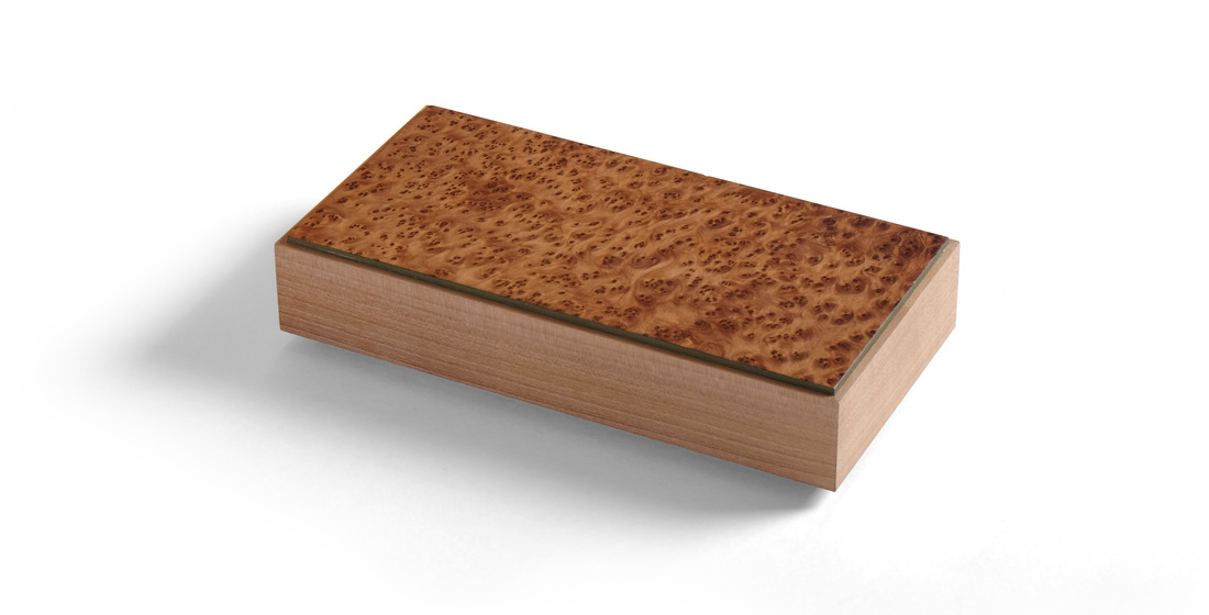
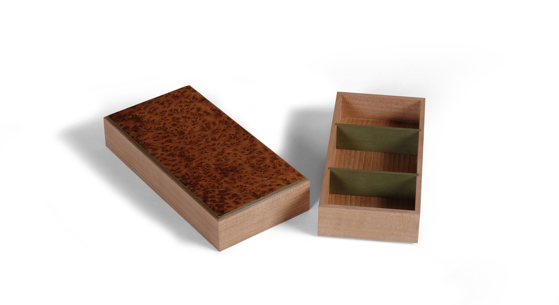
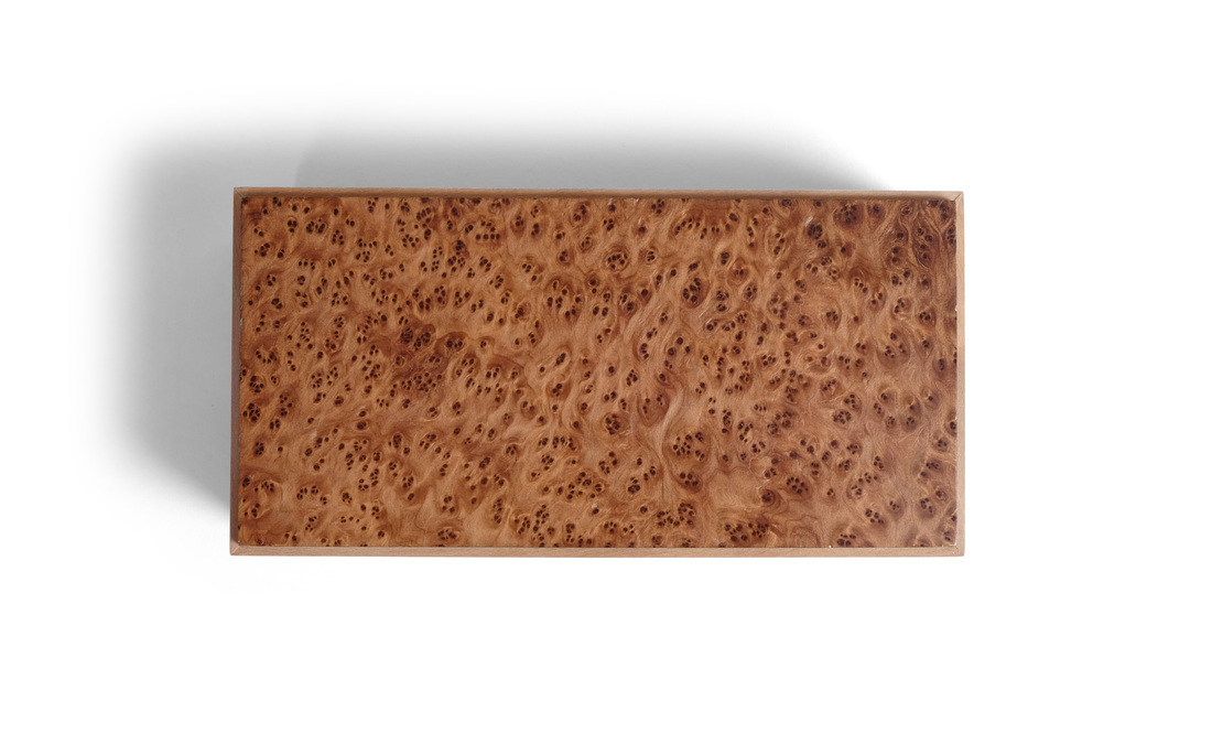
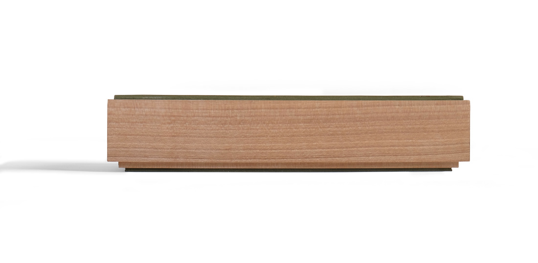
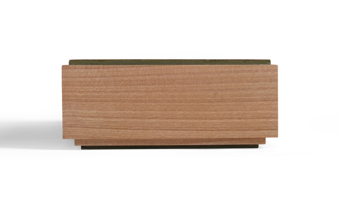
  This is a simple box. It's just a small piece of veneer, some quiet wood for the sides, and a bit of milk paint as an accent. But it's stunningly beautiful. I think this is because of the balance struck between them. It certainly helps that the proportions are spot on—good bones are always beautiful. (It's less than 2 in. tall, 4 in. wide and 8 in. long.) And the box is an excellent example of using woods (and colors) that compliment rather than contrast with one another. Sometimes, a plan comes together. And like Hannibal, I love it when that happens. Let's start with the burl veneer I used on the top. I have no idea what species of wood it is. I was given three flitches of this veneer by a friend. The color is fantastic. So, too, is the figure. But what really makes this veneer work on this box is that the individual "burls" are small. It's super intense, but it's also well-proportioned for a small box. Big, loose burl wouldn't have looked right. It would have been out of scale to the rest of the box and that would have disrupted the box's harmony. That might sound silly—or even overly precious—but when you design a box or piece of furniture, you must give thought to every detail. I chose riftsawn madrone for the sides. I could have used cherry, but cherry has too much red and pink in it. I could have gone with walnut, but walnut is too dark for this veneer. Madrone is a finely grained wood with a lovely earthy brown sapwood. The grain on the piece I used was straight and tight. It's quiet—the perfect compliment to the muscular burl on top. There can be only one dominant wood in any one piece. The others should serve to bolster it's strength. (By the way, this piece of madrone was small, an offcut from a wall cabinet I made years ago. It's been hanging out in the shop, waiting for the right box to come along. It finally did. It's wonderful how little pieces of wood, long forgotten, pop up from the depths of memory at just the right moment. And this piece did. I remembered everything about it: dimensions, color, and grain. Perhaps I grow too attached to the lumber I own.) The green milk paint was easy to pick. The madrone is close enough in color and the fineness of its grain to apple that I knew that this green (which I used on box 25) would work well as an accent. Deciding to paint just the edges of the top (and bottom) was easy, too. I've done that before and it works well to separate the box sides from the top. Here it emphasizes the shape and figure of the top. Figuring out what to do on the inside of the box was harder. At first, I was going to paint the bottom and the dividers (and have more dividers), but that seemed too busy for such an understated box. I eventually worked my way to a bottom made from plywood and shopsawn veneer (riftsawn madrone), and just two dividers painted green. By the way, in the past I would have joined the dividers to the sides with a bird's mouth joint, but here I went with a simple dado. I gambled that painted dividers would look better with a squared end in a shallow dado. I think the gamble paid off. The joint emphasizes the distinct difference between the sides and dividers. In this case, that's a good thing. Here's something that struck me after I had completed the box. It was easy to design and even easier to build. That sounds tremendously arrogant, I'm sure, but let me explain why I say it. The design part was easy, because I was pulling together several design details that I knew worked: the top that's a bit proud of the sides (and has painted edges), a top that slides over the bottom, tightly figured veneered set against riftsawn lumber, dividers used to create a cool geometric pattern. I've used all of the design details in this box before. I just put them together in a fresh way. This excites me, because it means that maybe, just maybe, I'm getting to the point where my design aesthetic has a well-define grammar and vocabulary that can be relied upon to produce beautiful work. The danger is that I'll be lulled into a aesthetic slumber and get lazy with my design, rehashing the same details over and over. I think I can avoid that, at least for now. The making was easy because, hell, I've done it all before. There are no new techniques here. I made the box quickly. I didn't have to figure anything out. I could just work. In fact, it took me longer to finish it (because of the paint). Thoughts of a random nature:
12 Comments
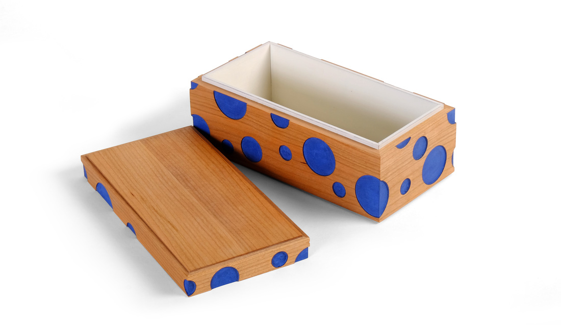
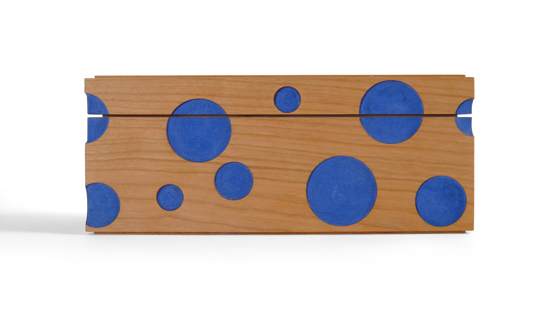
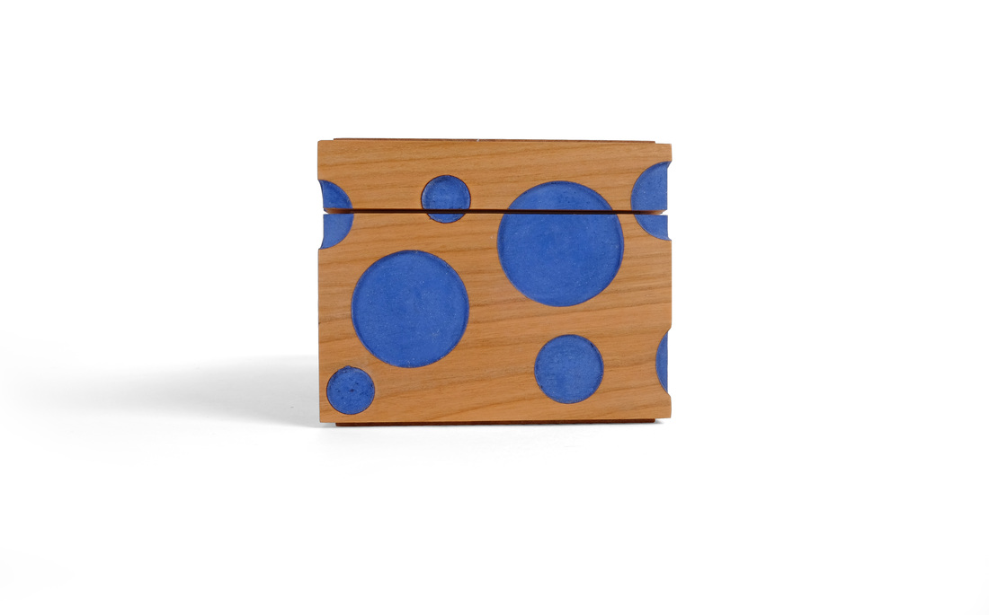
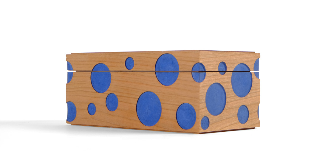 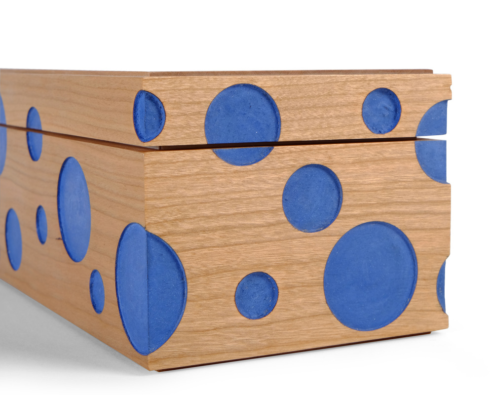 I was tempted to post nothing but photographs of this box. I think these photos say more than enough about the box, but I figure at least a few will want to know what the hell I was thinking when I designed it. So, I'll do some writing, too. This is one of the first boxes I thought of after deciding to attempt 52 boxes in 52 weeks. Honestly, I don't recall where the idea came from. I think something like it has been bouncing about my brain for several years. I do know that it was boxes like this one that inspired me to undertake the challenge. All of the boxes I've made so far have been nice, but some of them really didn't push me aesthetically. I fell back into my comfort zone. This box is definitely not one of those. What appeals to me about this box is how strong a graphical statement it makes. I love that the blue circles dominate the box. The riftsawn cherry I used for the sides is really just a background color. That's what I wanted. This box is about color and geometry. (But note how the cherry's grain rises and falls with the larger circles. This symmetry between the grain and pattern of the circles helps the grain disappear. Again, design is always in the details.) This also is why the top is made from some book matched and riftsawn cherry. Keep the grain quiet. Don't distract from the sides. I thought about adding a few circles to the top, but I'm glad I didn't. That would have been too much. This box took a long time to figure out and make because it is technically challenging. The blue circles you see are actually about 1/16 in. deep. At first, I was going to drill through a thin, shop sawn veneer, paint the underlying substrate and then glue the veneer to the substrate. I thought and thought about how to do that and still get a good four corner match. All the solutions I came up with were too fussy. I then moved to the idea of making a template and routing the circles into the sides. That's what I did, but I need to thank Mike Pekovich for helping me figure out exactly how to do it (Mike and I have some great mind melds every now and then when we bat ideas back and forth, developing them—sublating [google Hegel and aufheben] them, really—as we go. These always seem to benefit me. I doubt I've ever helped Mike. He's a technical genius.) After cutting the sides to length, I laid them out in order (front, side, back, side) between two fences and two stops at the ends. A long template fit over the top of the sides. I then routed the circles with my DeWalt 611 with the plunge base. I used a 1/2 in. diameter "dado clean out" bit from Whiteside. (It's the same bit I use with hinge mortise jigs.) This arrangement allowed me to wrap circles around the corners. I don't know if any of that makes sense, but I took some pictures and I'll post them to my Instagram account (kenney.matt). Here's another important part of the design that also involves technique. Some of the circles bridge the bottom and top. I cut the top free at the bandsaw and then sanded the top and bottom on a piece of sandpaper stuck to my tablesaw to get rid of the machine marks. The cutting and sanding removes material and part of the circles. If the top sat directly on the bottom, you'd see a disruption in the circles' circumference. To overcome this, I used the box liner to raise the top and create a gap equal to the material removed. (Remember when I did this with box 12? I was testing out the technique so that when I made this box, I'd have it figured out. I've been working on Box 30 for a long time.) I need to thank Mike for planting the seed for this in my mind. I come to him with crazy ideas and the beginnings of how to get it done and he helps me get to a solid technique for doing it. I don't know what else to say. The box is the same size as boxes 28 and 29. The top and bottom are glued into rabbets. They're plywood—painted on the inside face and covered with shopsawn veneer on the outside. The liner is cherry, too, but painted with light cream milk paint from Old Fashioned Milk Paint. The blue for the circles is my old friend, Federal Blue. Looks like random thoughts are back on the menu, boys!
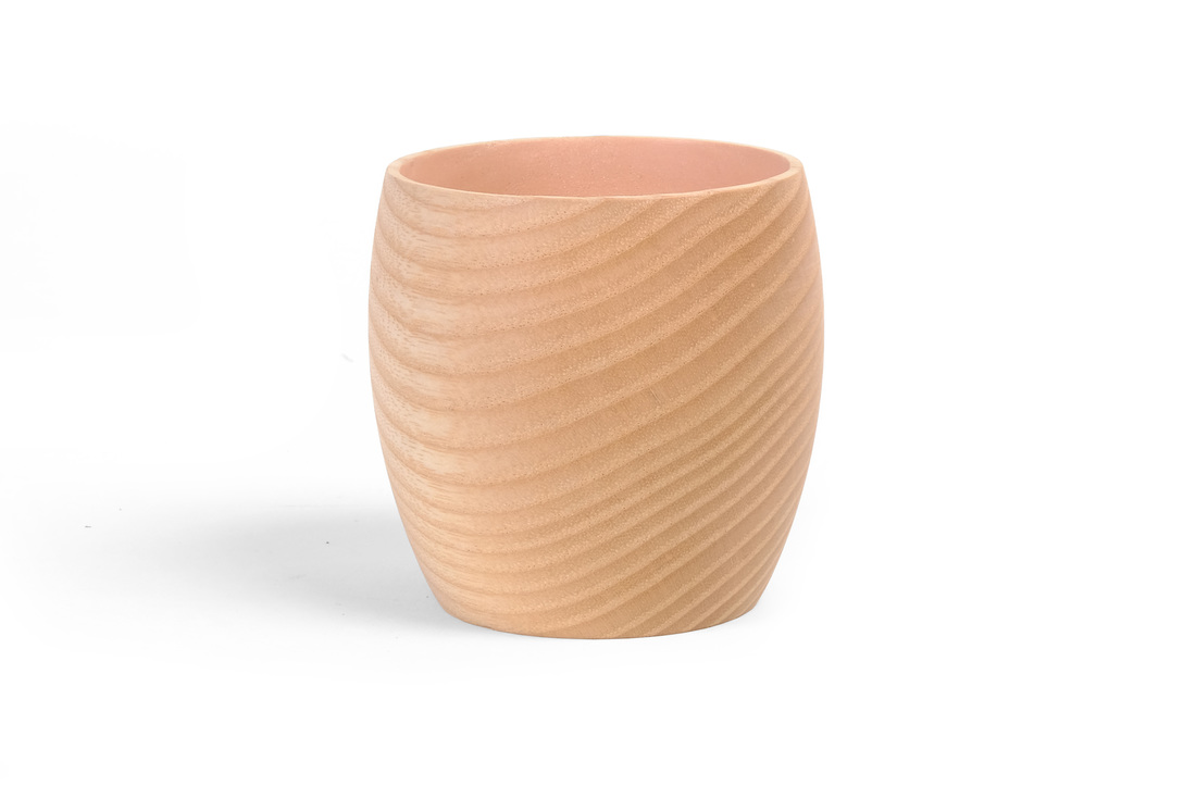
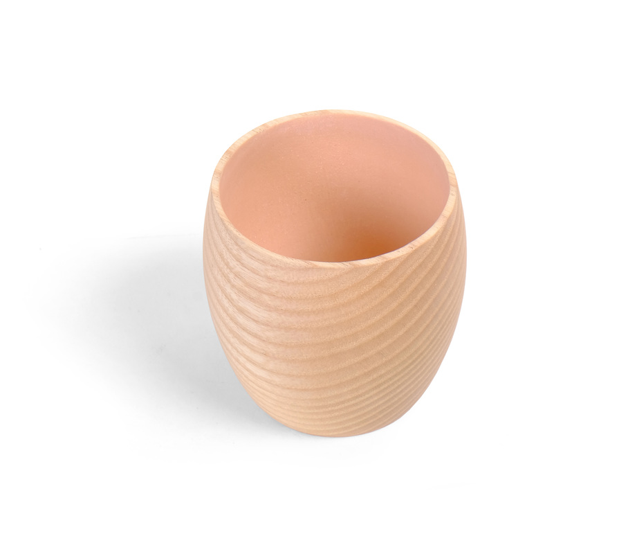
 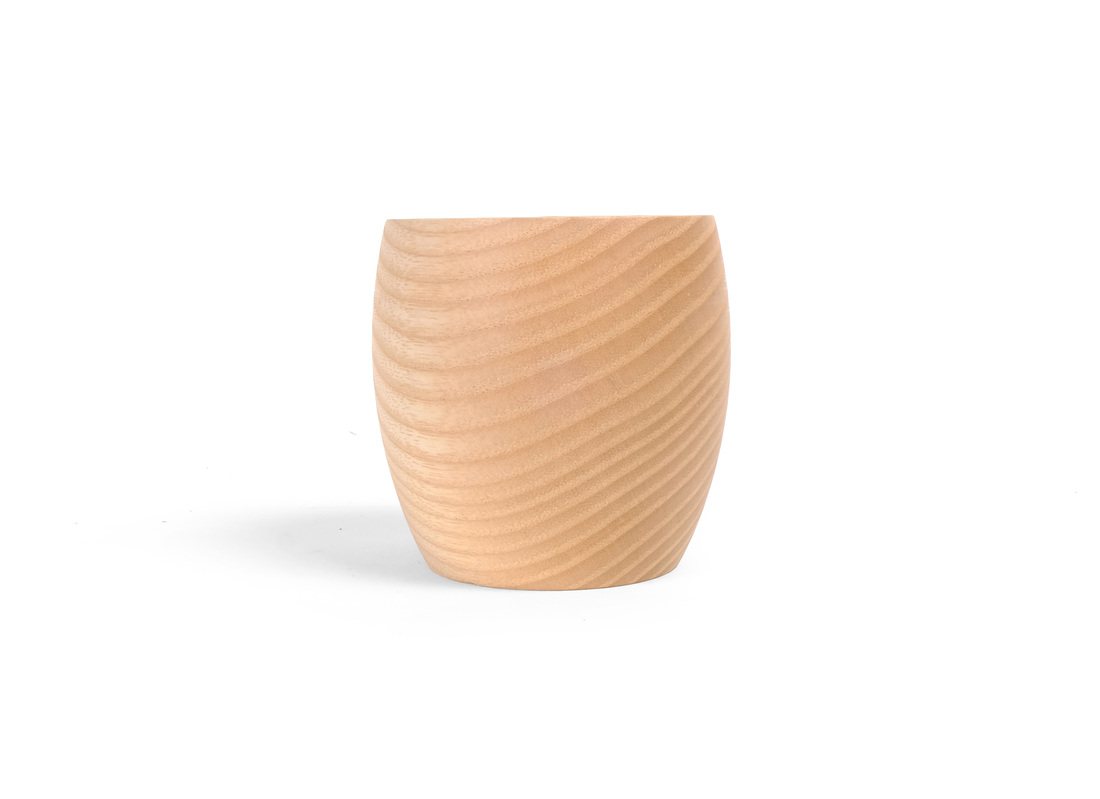 Here's another small turning. It's 2 1/2 in. tall and about the same at it's largest diameter. I used a piece of riftsawn ash, turning the vessel like a bowl so that the grain would wrap around the outside in nice, clean lines. I love the sweep of the grain. I painted the inside with a custom milk paint mixed from snow white and pumpkin milk paints. It's mostly white with a hint of the pumpkin to create the nice pastel color. I've just about finished my next box. It's been near completion for a while now, but I haven't had a chance to finish it because my mom died after a long battle with a brain tumor. (I've been back home in Florida twice in the last month.) I'll have it up next week. And I have some great boxes planned for the next several.
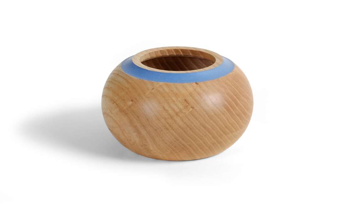 This looks like a hollow vessel, and I guess it really is. But it was turned with the blank oriented like a bowl, not like a spindle. So, I'm calling it a bowl. The ash I used is from the same stack as the small vessel, and the first bowl. (Maybe I should just call all of them turnings.) All of the ash in that stack was given to me by the owner of a local woodworking school. It's a bunch of small offcuts leftover after a celebrity woodworker came to town to help students make bench. I like the shape of this bowl. I like the grain. And I like the blue stripe. It's small, about 3 1/2 in. dia. by 2 1/2 in. tall. By the way, no box this week either. I've had a very busy two weeks outside of the shop, but I'll have a new box up next week. 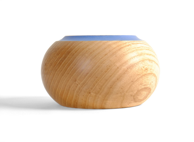 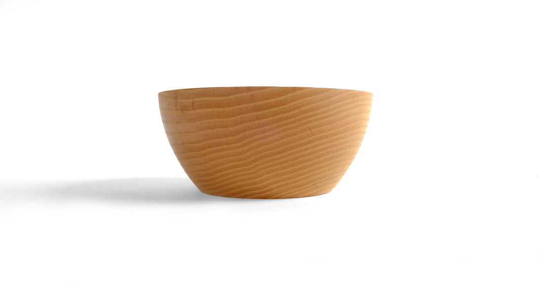 I don't have a box for this week (I'm hard at work on a pretty cool one, though), so here's a little bowl I turned last weekend. I choose a piece of flatsawn ash, because I knew that the end and edge grain would flow nicely in straight lines all the way around the outside of the bowl. It's a cool effect. There's also a very nice chatoyance. Sadly, my photography and lighting skills aren't quite good enough to capture it. The bowl is about 2 1/8 in. tall and the diameter is nearly 5 in. at the lip. 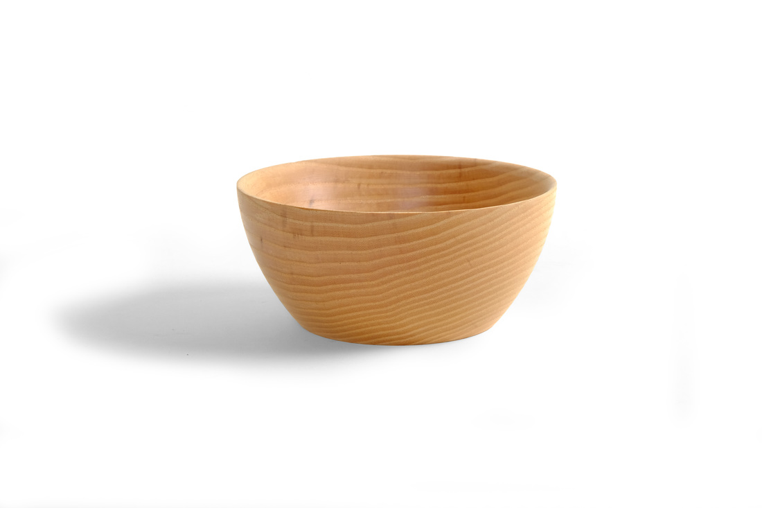 |
AuthorI love furniture design, and smart techniques. This blog is about both. Archives
August 2020
Categories |
 RSS Feed