
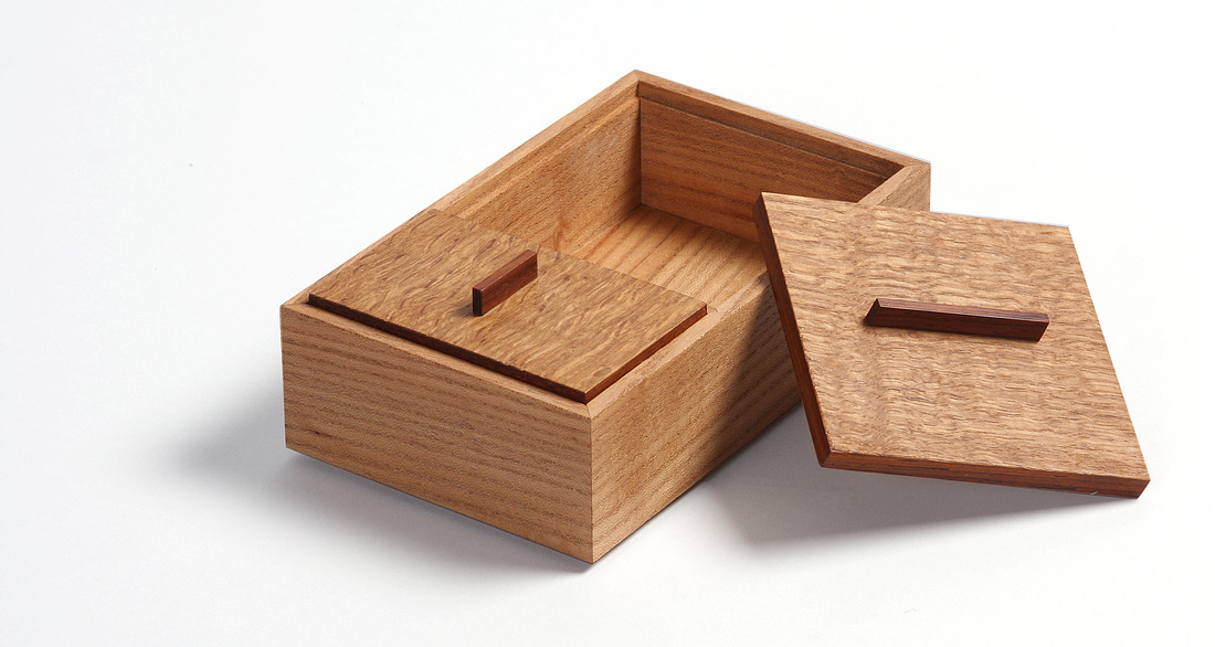
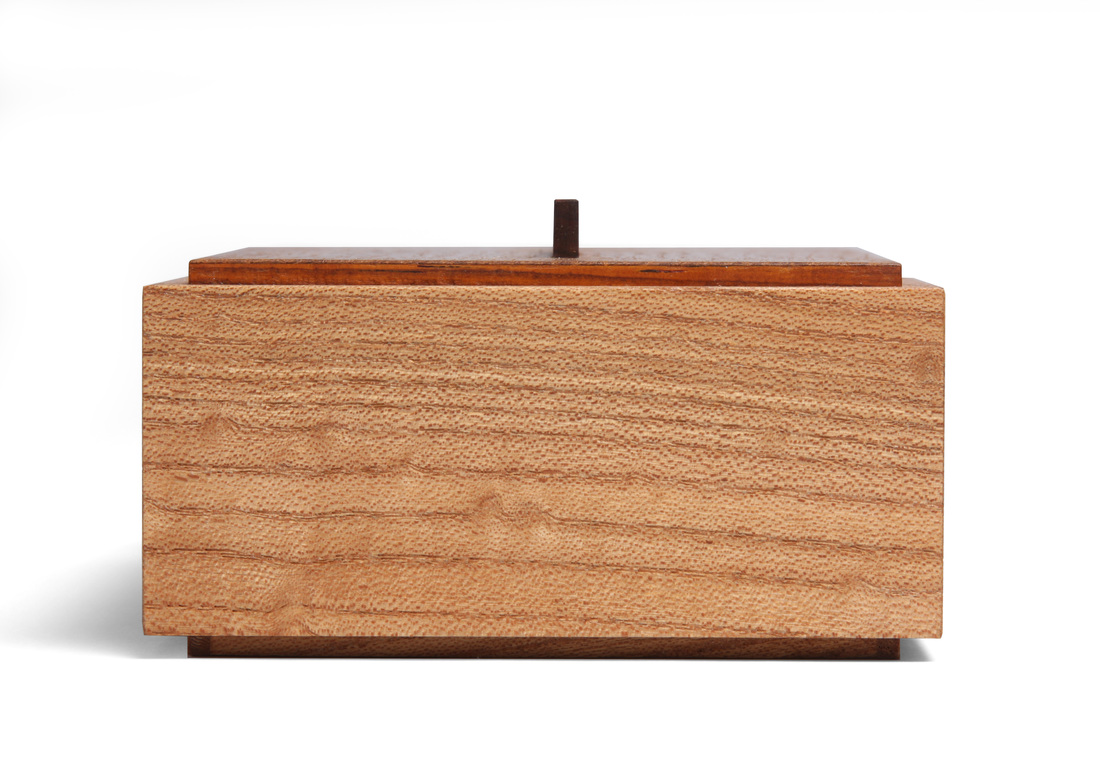
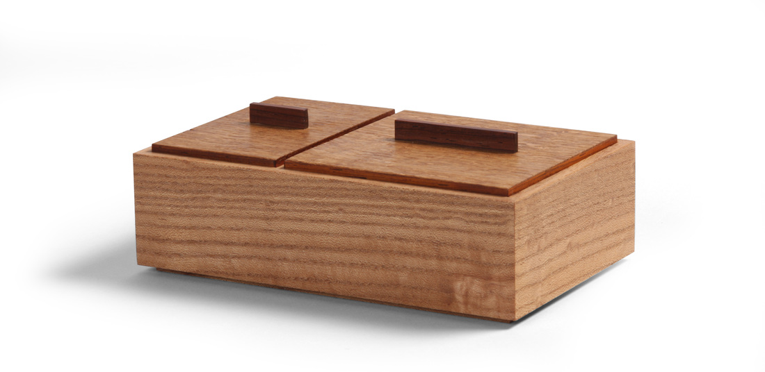
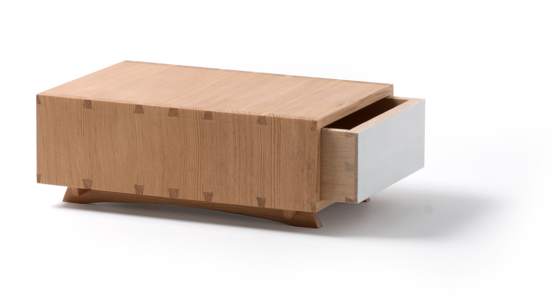
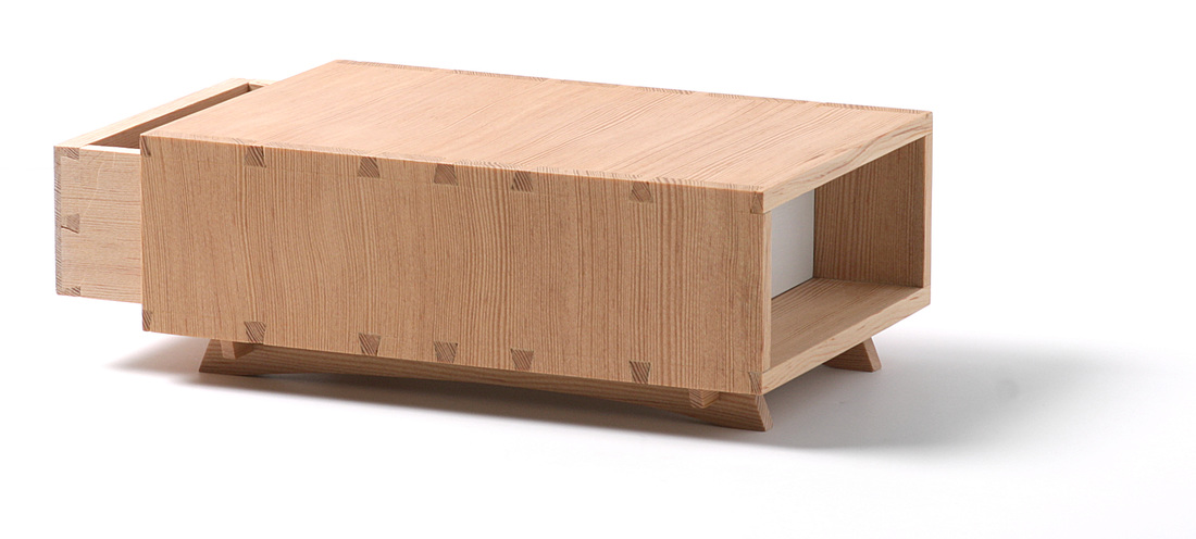
  I've made many boxes like this one before. It's actually my second go at a box I made many years ago (see the box at right). I made that box in one night, using a Phi ruler to determine the box's height, width, and length. I like the width and length, but think it's too tall. I always wanted to go back and make it again, but shorter. That's what box 6 is. I should admit that I'm not positive that the two boxes have the same width and height. The only record I could find of the original box's dimensions was an approximation, so I guessed as best I could. (I gave the box to a family friend not long after I made it, so can't measure it.) I like the proportions of the new box much better. The first box was made from English elm. So is this one. The difference in color between the two is amazing. I really like the color of the first box, but that board is long gone. I also like the English elm I used for this box, especially the random spots of wild grain, but it's not quite as nice. The top of the first box is solid wood. I think it's flame birch. (It came from a very old, but decrepit, table, so I don't know for sure.) The top of this one is plywood banded in cocobolo and then veneered with English brown oak. The lifts are cocobolo. The three woods complement each other very well, I think. And the darker oak works here because the box sides are a light brown. It would not have worked with the elm I used to make the previous box. Box 6 wasn't hard to make, but it was tedious. Both the lids and the bottom involved veneering plywood. The banding on the top is mitered at the corners and getting those miters tight and clean was a slow, shaving at a time process. The bottom involved some tedious labor, too. First I veneered the bottom face. I then did the end banding. After that, it was the front and back. This way, when you look at the bottom from the front, you see what looks like a piece of solid wood. Last came the veneer for the top face. I wanted this to cover the banding, so that when you look at the inside of the box, you don't see any banding. (I should do a blog about box bottoms, right?.) The veneers on the lids are commercial, but think. Those on the bottom are shopsawn. Alright, let's get to the random thoughts.
21 Comments
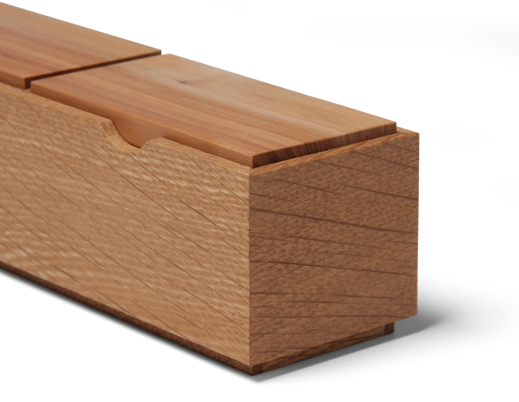
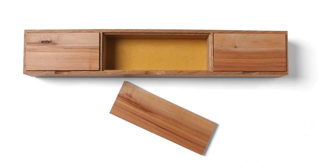
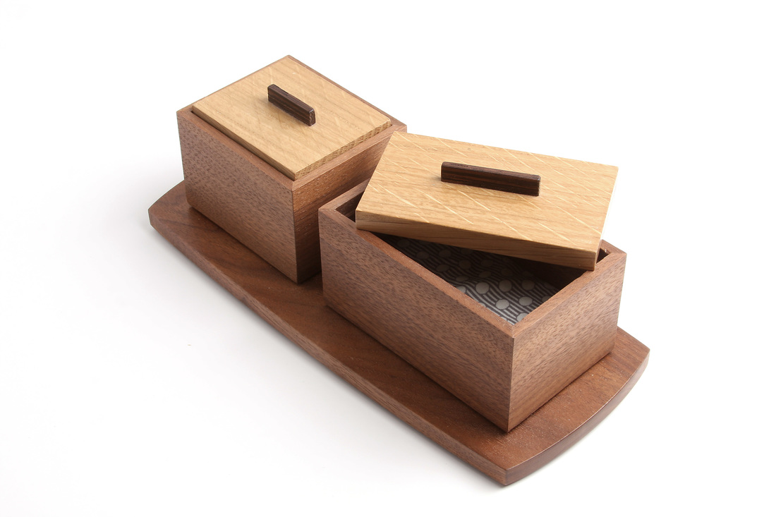
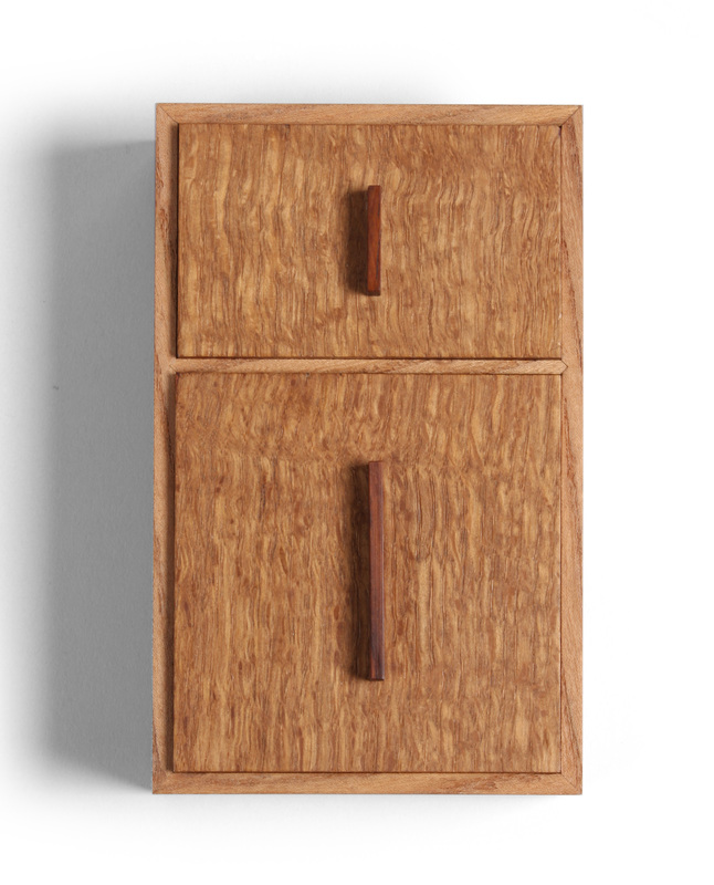
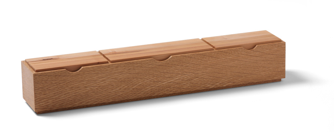 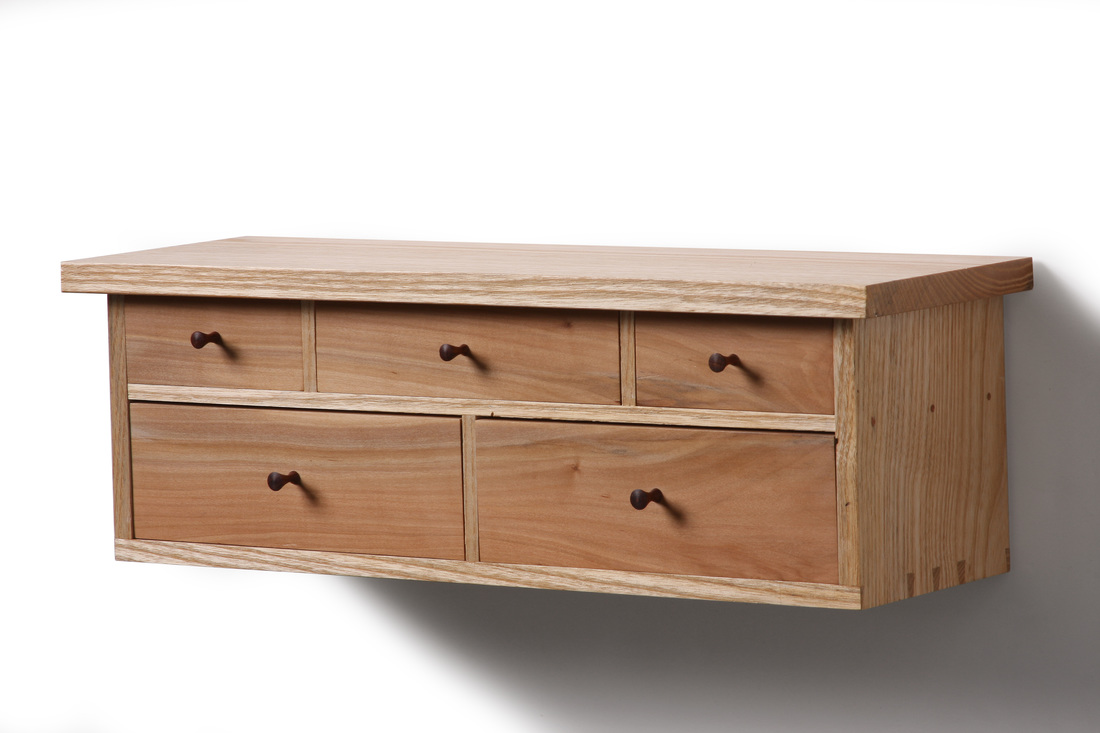 The idea for this box has been floating around in my head for quite some time. I had not made it yet because every time it surfaced I couldn't get the proportions right. But inspiration often comes when we are least looking for it. After I had completed box 4, I put it on the counter, knelt down in front of it to get a head on look at the front elevation, and it hit me. Those were the perfect dimensions for this box. The length and width of this box are the same as the length and height of box 4. I haven't been giving dimensions, but if you're wondering the box is 2 in. wide and 12 in. long. When I thought of this box in the past, I never had particular species in mind for the sides and lids. As I was looking through my lumber rack and assorted piles of small pieces of lumber, I took a break to go into the house and see what the kids were doing. My daughter was in her room, which is where I saw a little wall cabinet I made several years ago (see the picture at left). It's ash and apple. The apple is gorgeous. I immediately decided to make the lids from apple. I thought about making the body from ash, but back in my shop I came across a very nice piece of quartersawn white oak that was just the right size for the sides. The earthy, multi-hued apple, I thought, would compliment the white oak's brown very well. I think the woods go very well together. Sadly, my stash of apple got a bit smaller. I had planned to put some cocobolo lifts on the lids. But when I got to that point in the construction I just couldn't do it. No matter where I placed the lifts, they obscured the apple's beautiful grain and colors. The box body was already finished, but that didn't deter me. At the drill press, I used a Forstner bit to create the finger openings. I actually used two different bits. The opening in the middle is larger than the ones on the sides. I plan to reuse this technique (I might even remake this box in different woods), and I'll put a finger opening on both the front and back for each compartment. You can open the compartments just fine as it is, but it will be easier if you can pinch the lid between two fingers. I don't remember when I decided to paint the top face of the box bottom. In the past, I've made fabric cushions for the insides of boxes, and I always choose a fabric that popped. (Take a look these boxes to see what I mean). That lead to the milk paint, I guess. I just like the surprise of opening an all wood box and seeing a bright splash of color. The marigold yellow milk paint looks great, I think. I like how it crackled of it's own accord. OK, time for some random thoughts:
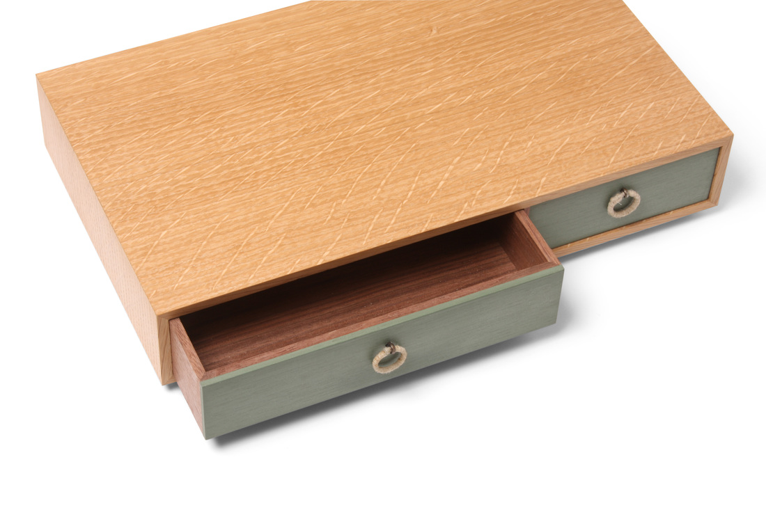
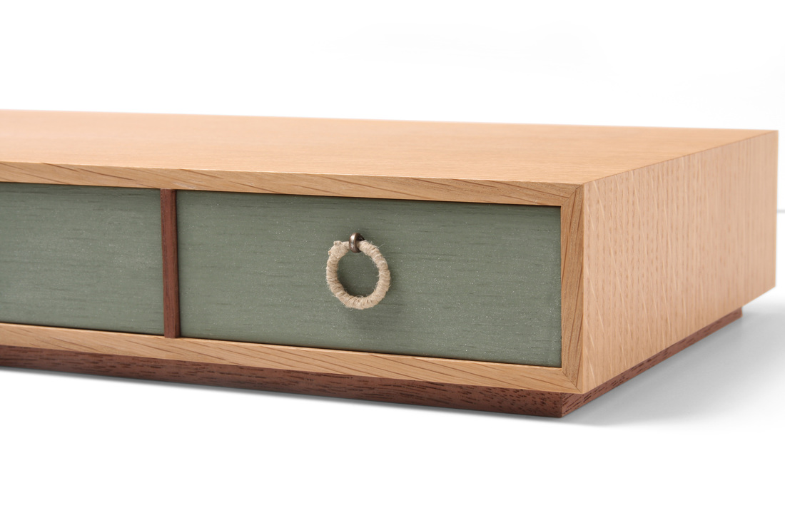
   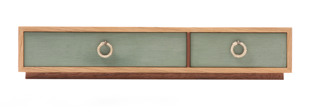 Quartersawn white oak, walnut, Lexington green milk paint, hemp twine 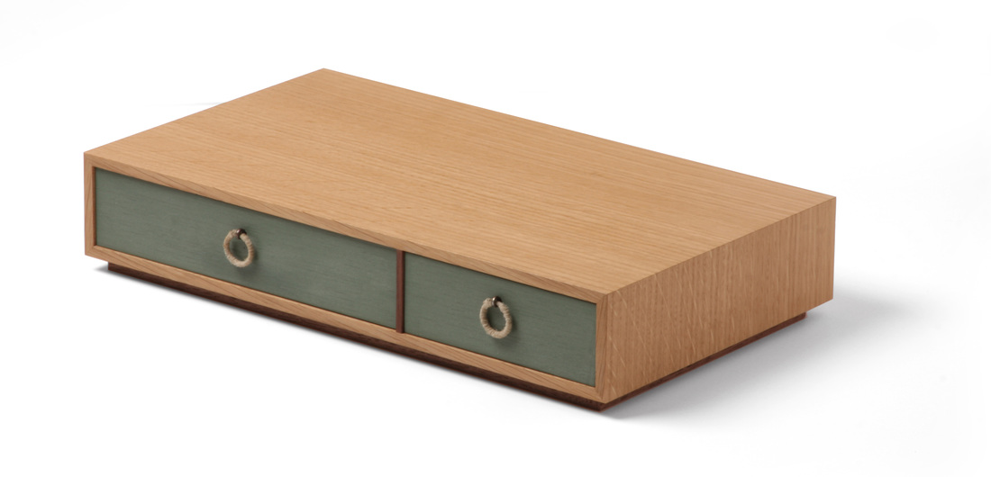 What a difference one week makes. Unlike box 3, which I still have a hard time liking (even though some of the comments folks made have softened me on it), I like everything about this box. I know this one is fairly different from last week's box, but I see the two as directly related. When thinking about how I'd change box 3, I came up with box 4. This is especially true about the overall dimensions. Box 4 is about 3 in. narrower, but twice as long (if you are reading width across the grain and length with the grain, which is how I do it). It's also much shorter. These are the proportions I had in mind when I first came up with the concept for box 3. I don't know where or why I changed them on box 3. I also like a particular design leap that I made with box 4: the walnut divider. I have always, without even thinking about it, made drawer dividers from the same species as the case or box. Most of the time, I think that's the right way to do it. But there is something very nice about this walnut divider paired with the white oak box. Perhaps it's the walnut stand the box sits on, or that the divider is a preview of the beautiful walnut drawers inside. (By the way, this is all air-dried and unsteamed walnut. Hence, the rich and variegated color. Steaming walnut destroys what's most beautiful about the wood. I'll never use it again, if I can at all avoid it.) I'll definitely revisit this design detail in the future, on a wall cabinet or large case piece. The pulls are made from key rings wrapped with a very thin hemp twine. I like them very much, even if there's a bit of a hump where I tied off the twine. I used cotter pins to attach them to the drawer fronts. I blackened them with some chemical from a bottle. I have no idea what it really is, as I got it from Mike Pekovich. It's something used to darken the lead in stained glass. I think it was also used by Sauron when he was crafting the one ring to rule them all. I'm sure it's not all that bad, but I have been referring to the box as my precious. And all of my other boxes are slowly beginning to turn invisible. By the way, I've used gun bluing on metal before, and this looks much better. The drawer boxes are walnut, mitered at the corners. I know this is a risk, but the drawers aren't going to be loaded down with gold bullion or lead. The painted fronts are white oak, which I chose because I knew the milk paint wouldn't completely cover the open grain of the oak. So, you still get a hint of the oak through the paint. I looks nice. I cut the Lexington green paint with a bit of snow white to lighten the color a small amount. Also, the drawers are inset about 1/16 in., to create some depth and to disguise the box's seasonal movement. Random thoughts:
I recently completed a box for the 52 box challenge. The drawers fit a bit too well, as the video below shows. I plan to plane the drawer sides down just bit to get rid of the piston effect. I'll post more about the box later this week.  Vertical grain Douglas fir, snow white milk paint  This box is a bit funky because the drawer opens from both ends. It's made from a wonderful, 10 in. wide piece of vertical grain Douglas fir. Given how tight the grain is, I'm guessing it's old growth. I found the piece in a small lumberyard near my house. (Boards like it are why I drop into lumberyards on a whim and look around for hours.) Vertical grain Douglas fir is one of my favorite woods. It has a very modern feel to it. I love the concept for this box: a drawer that slides out at both ends. I also like the feet, and that the box has a modern feel to it. That could be all that I like. The snow white milk paint turned out to have much less variation in color than other colors of milk paint that I've worked with, so it doesn't read as painted wood. I'm also bummed that I didn't get the box's proportions right. It should be shorter and wider. Finally, I should have gone with miters instead of dovetails. The box is too small for dovetails. They just crowd up the place, and interrupt the flow of the fir's grain. But that's the way it goes sometimes. I'll definitely revisit this idea after I've had time to think about it more, do more sketches, and play with the dimensions some. Of course, I'm happy to answer any questions you have about the box. It took me two weeks to make this box, because I was shooting a video for Fine Woodworking at the same time. But, I'm still on schedule. It's been three weeks and I've made three boxes.
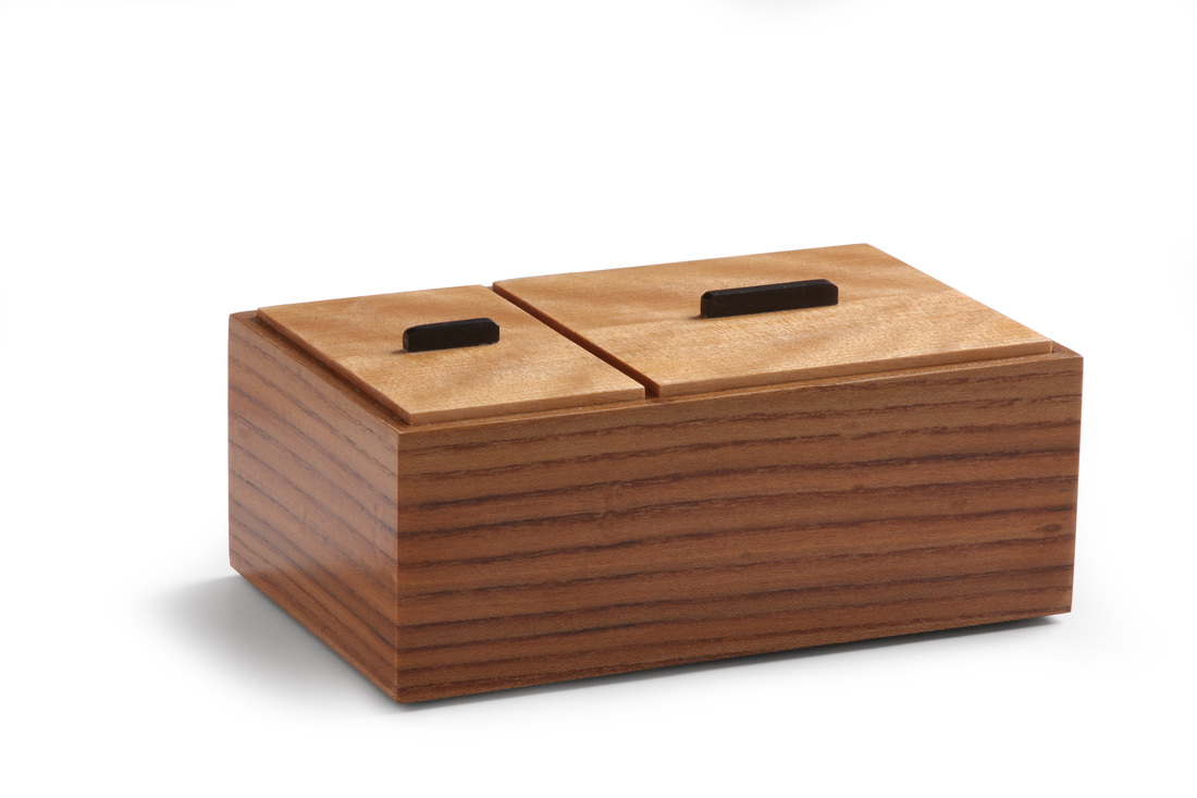
 Yesterday, I mentioned that I had made six boxes using the same core set of design details. You can see all six in the gallery below. To my eye the boxes are all clearly related, but also distinct from one another. I suppose one could argue that the two turned boxes (painted body v. painted lid) are too similar to be called distinct. But for me, the little walnut round box with the yellow lid is a substantial step up in elegance. It feels like a different creature. (I also believe it's the best thing I've made.) Here's what's common to them. The sides are raised 1/8 in. off the surface by a bottom that is inset from the perimeter of the box. The top sits in a rabbet and is 1/8 in. proud of the top edge of the sides. There are three woods in use for each box: The sides are the primary wood, the top is the secondary wood, and the lift is the tertiary wood. Paint has replaced either the primary or second wood in some. Also, the woods are always complimentary to one another, never contrasting. (I hate the notion of contrasting woods.) And the relationship between the color of the sides and the color of the lid reinforces the shape of the lid(s), allowing it to make a stronger geometric statement. There is an emphasis and dependence on good proportion. This started with the first box. All three of its sides are related by the golden mean. This emphasis on proportion explains the clean, simple lines. When you gussy up a piece with ornamentation or complicated lines, you begin to obscure the proportions--or so I think. |
AuthorI love furniture design, and smart techniques. This blog is about both. Archives
August 2020
Categories |
 RSS Feed