
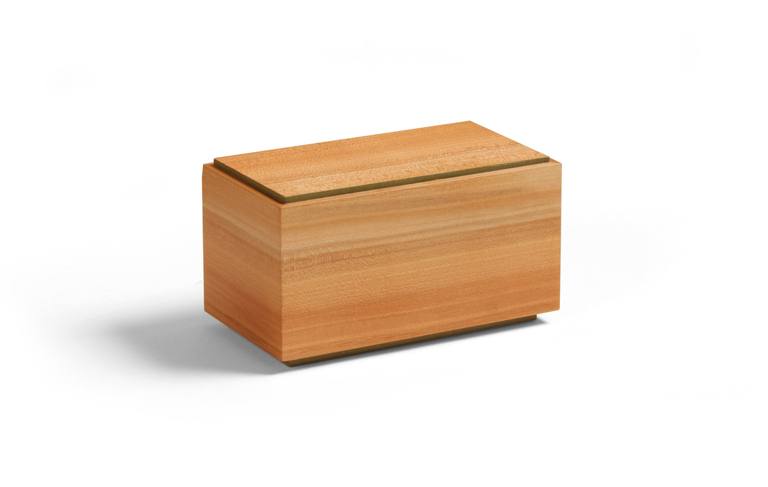
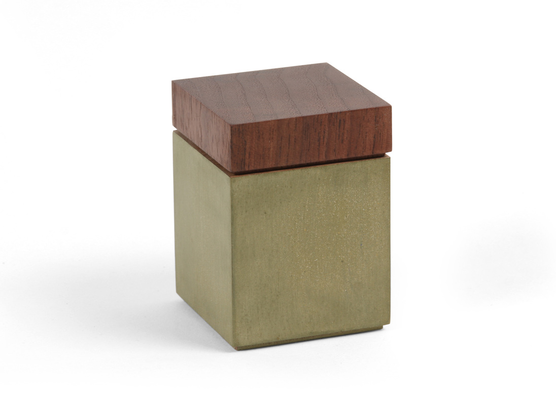
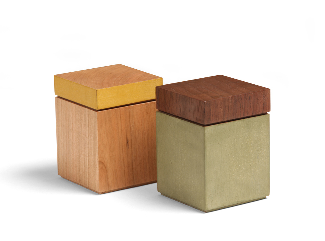
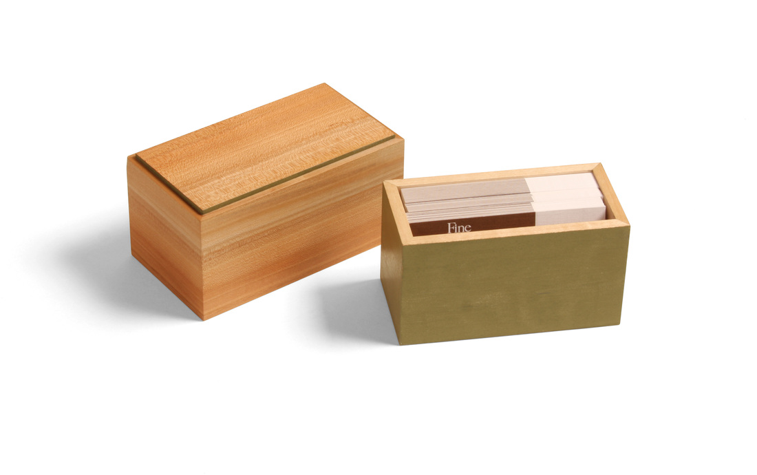
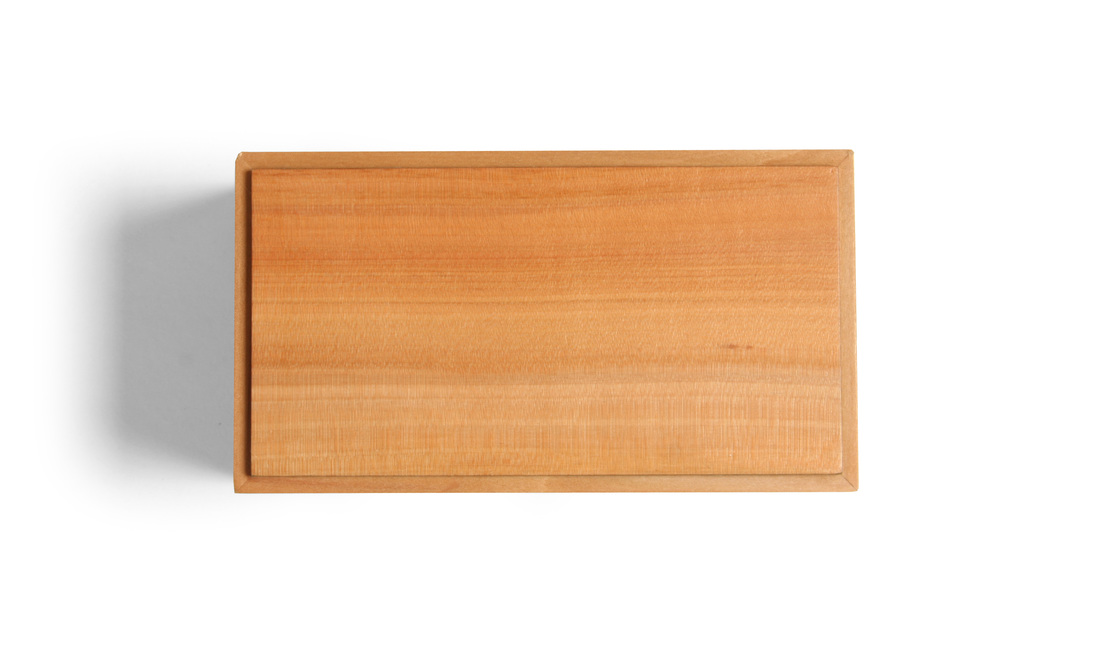
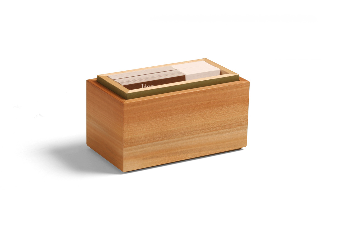
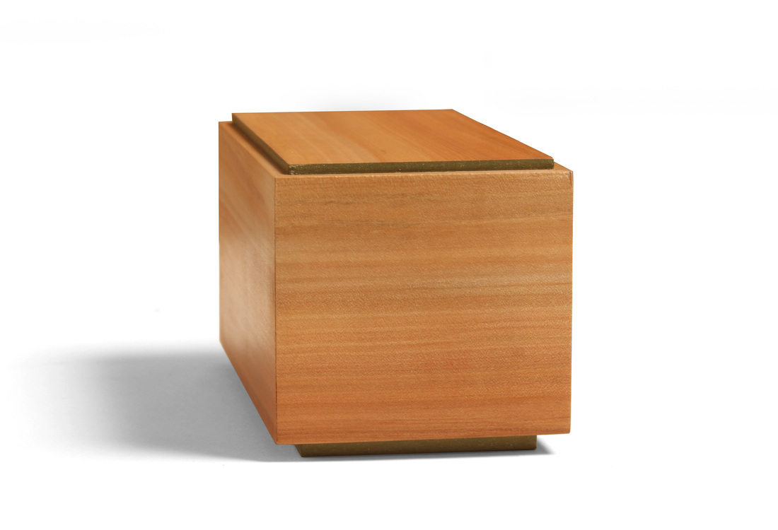
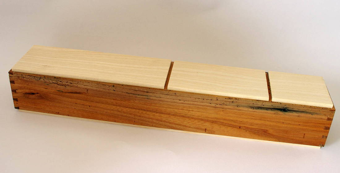
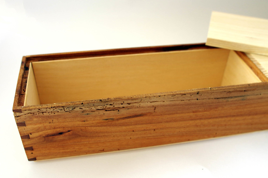
  This is the first of two boxes that I hope to post this week. I missed last week, so I'm trying to catch up a bit—even though I posted four boxes the week before. I began this box back at the beginning of July, at the Lie-NIelsen open house. It sat around because I've had so much else to build. (I made Shaker inspired cupboard this summer, for example.) But I glued it up this past weekend and made the top and bottom. I'm glad it's finally done, because it's a fantastic little box. It's my take on a box made by Fine Woodworking's executive art director, Mike Pekovich. I love the simplicity of having a bottomless box fit over a box with no top. I wish I'd thought of this first! Mike's box has a curly maple top—finished smooth with a nice luster—over an ebony bottom. He left the ebony rough on the outside (milling marks from the bandsaw), just burnishing the surface with some steel wool. The contrast between the surface textures is fantastic. I've held this box and it's truly wonderful. My version of the box has an apple top and a hard maple bottom. Of course, there a dash of milk paint, too. Painted the exterior of the maple bottom as well as the top face of the bottom panel. Only the inside faces and top edges of the maple was left natural. The bottom panel is plywood and glued into a rabbet. It's just a bit proud of the bottom sides, so that sit just a smidgen off the surface. The top box, I think, is gorgeous. The apple is amazing. I love the variegated color, and the green of the bottom is a perfect match. The top panel is plywood—like the bottom panel—and glued into a rabbet. I did paint the inside surface and the edge of the top panel with the same green milk paint. I like that little bit of green on the top box. It's a nice accent that picks up the bit of green that you can seen when the top box is over the bottom one. The box is wonderfully minimalist, I think, and modern in the best way. As you can tell from the pictures, the box was made to hold business cards. This is the first box of the 25 I've written about so far that was made for a specific purpose. I think the box design works well for the purpose because you can flip the top box over and stick the bottom box back into it and have the cards ready for the taking. I made the box to carry my cards when I go on the road to demonstrate or teach. It's such a pain to carry a big stack of cards and keep them clean, neat and tidy. I have an idea for a thinner box for business cards that I might get to soon. It should fit into a coat pocket. I actually started a second box along with this one (walnut top, similar bottom but to be painted marigold yellow), and I might finish it one day, but won't count it as one of my 52 boxes. A few random thoughts.
6 Comments
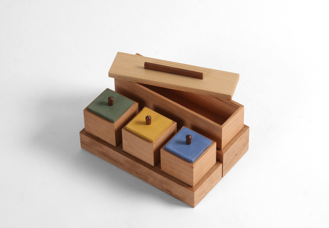
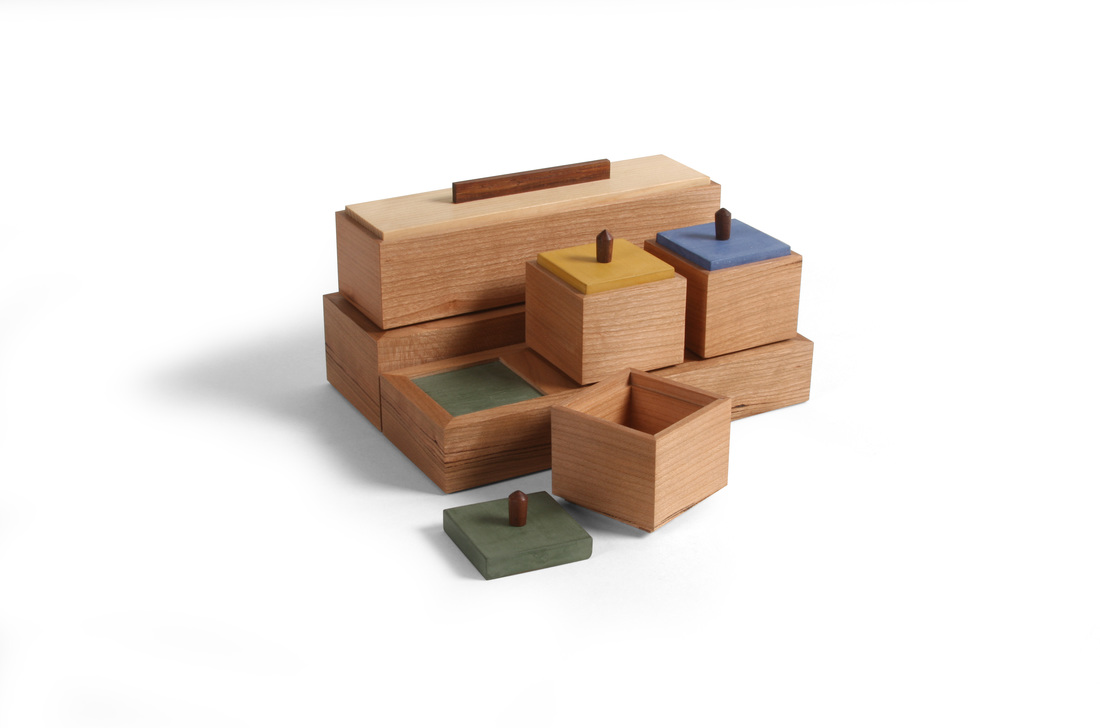
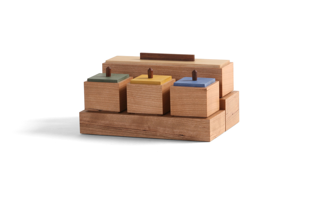 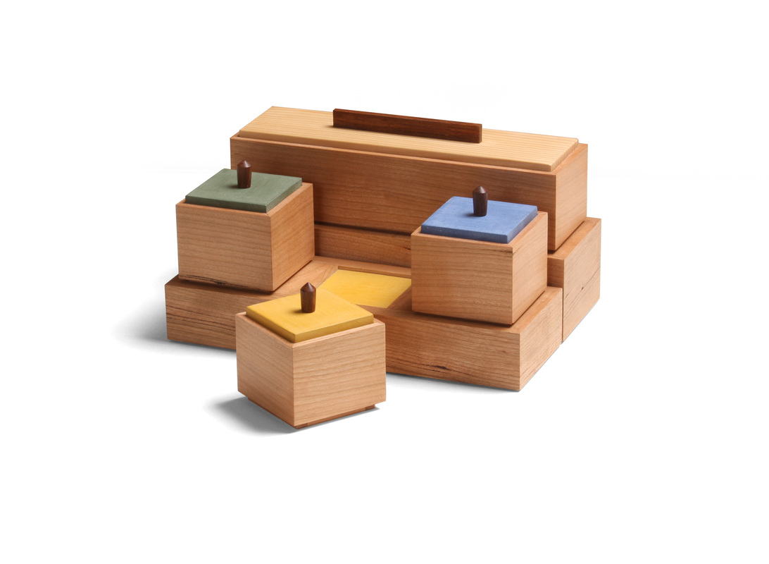 I made this set of four boxes quite some time ago, but I didn't not what to do about pulls for the three small boxes up front, so they sat. I'm not crazy about the pulls I eventually turned for them, but at least the boxes are done now. If I were to turn them again, I think that I would give them a more pronounced inward taper from top to bottom. The problem is that they are so small that it's hard to get too much shape on them without risking too narrow a diameter for the tenon and lower section of the pull. OK, enough about what I don't like. (At any rate, the turned pulls are the only part of these boxes that I'm not thrilled with.) The idea for this box has been beating about in my head for a long time. I've sketched out numerous versions of it, and I might make a few of the other versions, too. (One version I'd like to try involves a set of small round boxes arranged radially around a rectilinear box.) I decided on this particular arrangement because I knew that the boxes would not be hard to make, leaving me to focus on the pedestals beneath them. For me, the pedestals are not just a place to put the boxes, but also a way to create negative space around the boxes. It's the particular arrangement of the boxes, included the shadow lines between them, that makes this set work. This meant that I needed to design them in such a way as to ensure that the boxes always maintain that negative space when the pedestals are fully loaded. The four sides of the pedestal are made like a mitered box. The bottom fits into a rabbet, and the thin "top" into a groove cut into the sides. To create the defined recesses for the three square boxes, I fit dividers into dadoes cut into the front and back. These dividers also have grooves for the colored "tops." (By the way, the colored "tops" are just pieces of 1/8 in. thick cherry painted with milk paint.) There was quite a bit of math involved in getting every thing sized right so that the spaces between the boxes would be the same size and would put the outside ends of the first and third boxes in line with the ends of the long box in back. It also took some figuring to determine how thick the sides of the pedestals should so that the boxes would be inset the amount I wanted. But I was able to manage (and I damn well should be able to, given the amount of education I have! It might have all been in the humanities, but I did well in calculus, too.). I really like the proportions of the square boxes. I started designing the boxes by determining the width of the rectangular box, because I knew that the square boxes would have the same dimension. I then had to do some work to get three square boxes to fit into the length of the long box. In other words, I sketched out different lengths for the long box, trying out various widths of the spaces between the square boxes. Then I worked on the space between the rectangular box and the there square ones. After I figured out all the spacing, I turned to the pedestals. I think it all turned out well. The recesses that hold the boxes are painted to match the lid of the box that fits into each one. For the rectangular box, which has a lid made from some very old white pine (salvaged from studs in my 100+ year old house), I mixed up a custom yellow that's close to the color of the pine. I like the little surprise you get from the colored recesses when you pick up one of the boxes. I had these boxes in the office today, and I heard several folks ooh and aah when lifting up the boxes. That's a great response, and it made me happy. And no one said a word about the turned pulls—as woodworkers were always harder on ourselves than we should be. OK, time for some random thoughts.
  There were several boxes I could have chosen for box 20, but I went with this one because of its link to the last three I shared. I made the body for this one at the same time I made the other three, with the intention of painting it and using a lid from natural wood. Otherwise, it's the same as those three boxes. (It's the same size as the smallest of those three, about 2 1/2 in. tall.) And prepare yourself for at least one more go at this one. I want to experiment with different ways of making it. I want to see how it works as a bandsaw box, but I'm also tempted to hollow out the body with a hollow chisel mortises for kicks. So, I think I see two more in the near future. At any rate, on to box 20. The body is painted with a custom green milk paint that I mixed from Federal blue and Marigold yellow milk paint. I really like it. In fact, it has earned a place alongside Marigold yellow as my favorite. It is very close in color to a glaze used a lot of Arts & Craft pottery I have seen. (There seems to be some in every RAGO catalogue that we get at work. I don't know why we get them, but I'm glad we do because there is always a ton of great furniture—everything from A&C to Midcentury Modern to Nakashima.) I've even figured out a way to apply it with a brush that makes it look very much like a ceramics glaze. I know that many woodworkers would question why I'd want that. After all, don't we make things from wood because we love its natural beauty? Absolutely, but I've been fascinated with the amazing ceramics I've seen when teaching at Peters Valley Craft Center and I've been working towards incorporating something akin to glazes in my work. This is especially true of my work at the lathe. I want to turn pottery on a lathe. Maybe when I'm done with the box project I'll do 52 turnings in 52 weeks. I originally want to make a cocobolo lid for this box, but because of how I make it (turning a round lip to fit into the round cavity in the box), the lid begins as a rather think blank that can be chucked up in the lather. I don't have any cocobolo the right dimensions to do this. But I do have a lot of offcuts from some 8/4 air-dried walnut slabs. I knew that some of that walnut would have a nice, rich brown color when finished, so that's what I used. I like the color with the green paint. I also like the bold, straight grain visible on the top face of the lid. To make the walnut darker than it would be when finished only with shellac (my usual finish), I applied a coat of Watco before the shellac. I forgot to do any random thoughts the last two times I shared boxes. So, here you go.
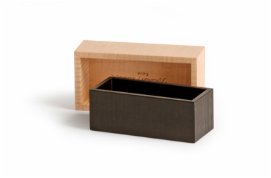
 Long ago I heard that good artists borrow, but great ones steal. I have no recollection of where I heard it or who spoke it. On the surface it's an odd claim, because theft is not often praised, and the thief rarely lauded as great. So, I thought about it (for a long time because I'm not too smart) and eventually decided the best way to understand this aphorism is in terms of possession. If I borrow something from you, it still belongs to you. But if I steal it, then I've made it mine. We could argue about the accuracy of this second claim in relation to your car, television or iPad. But I don't really care about that. Let's think about what it means in terms of artistic creativity—and furniture makers are artistically creative. If I borrow a design detail from you, then all I do is lift it directly from your work and plunk it down in mine. I make no effort to alter it, to weave it in seamlessly, to make it my own. It remains alien to my design aesthetic. A knowledgeable person would see my work and say, "That bit there is taken from Maker X, and it doesn't really fit here." The worst case of this is the person who simply copies wholesale from another maker and attempts to pass of the design as his own. (This happens. Within the last year I saw a person present a table as his own when every design detail and even some rather unique techniques were borrowed from a regular and very well known Fine Woodworking author. No acknowledgement was given to him.) However, if I steal a design detail from you, then I take it in, digest it, and weave it into my design vocabulary. Only then do I use it. It's no longer recognizably yours. It has become a seamless and natural part of my own work. That takes skill, and I have no problem doing it or having it done to me. And this brings me to an email I received from a maker in France who has been reading my blog. He sent me photos of a box he made that was inspired by box 5. I was thrilled to see it. There is no greater compliment than to be told that you've inspired another furniture maker. It encourages me to keep designing and making boxes. You can see photos of his box below. When viewed next to a photo of my box, the connection is obvious. However, you can also tell that the maker made an attempt to produce a box that is truly an expression of his design aesthetic and not mine. From the wood selection, to the joinery, to the fact that he used inserts instead of paint on the inside of the box. (By the way, I love the wood choice for those inserts.) He also changed the arrangement and size of the individual compartments. So feel free to steal from my work, but please don't borrow. By the way, if you'd like to know more about the history of the aphorism, Google reveals that T. S. Eliot (although not the first person to use it in some form), explained it pretty much as I do here. However, I did not know this until I sat down to write this entry. He explains it better than I do, and was a way, way, way better poet than me, too.
|
AuthorI love furniture design, and smart techniques. This blog is about both. Archives
August 2020
Categories |
 RSS Feed