
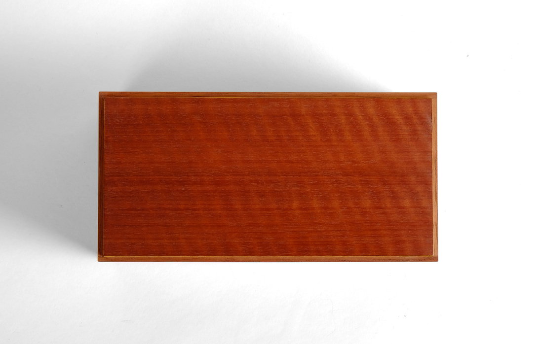
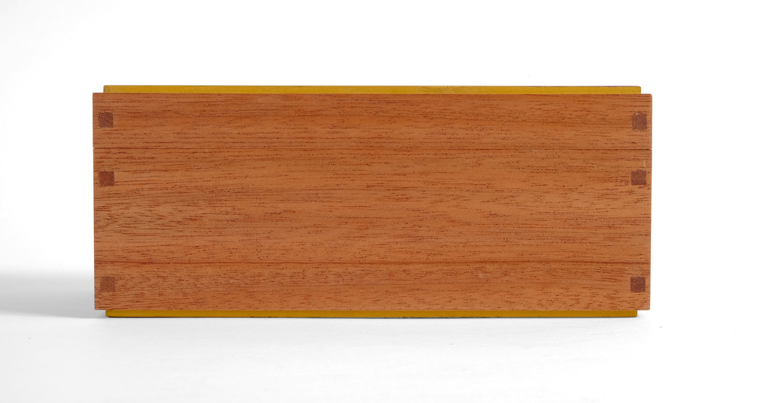
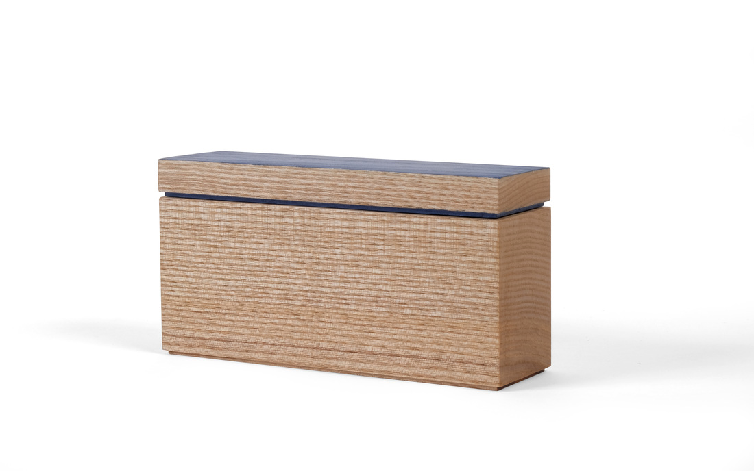
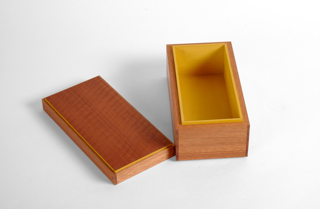
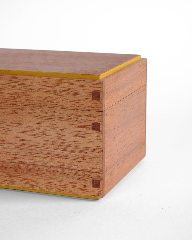
  Superficially, this box is almost exactly like box 28, which I wrote about last week. The obvious differences between them: woods, milk paint colors, pin shapes. But I think these differences make for two boxes that each have their own soul. A coworker at the magazine picked up on this right away. Box 28, she said, is feminine, while this box is its masculine counterpart. This distinction in their character can be explained, at least in part, by the choice of woods. The body of this box is mahogany. It's deep, rich color gives a sense of formality. This box would sit nicely in one of those obnoxious, wood-paneled club rooms with leather chairs where men sit around smoking cigars, drinking after-dinner port, and deriding the peasants like me. The sycamore of box 28, even though it has a lovely shimmer, is more gentle, more loving. The beautiful curl of the figured top (and bottom) reinforce the box's formality, especially when compared to the earthy—and a bit carnal—warmth of the apple I used for box 28. The apple is a late-autumn nap by the wood stove with a soft but somewhat saucy lady friend. (What? That's not the image that the color, texture, and smell of apple evokes in your mind?) The curly veneer on this box is a well-fitting suit and tie, a freshly-shaven face, and an Old Fashioned in your hand. The shape of the pins also contributes to the difference in soul between the two boxes. Here I've used 3/16 in. square mahogany plugs over some white oak pins. (The plugs are very shallow, about 1/16 in. deep.) Straight sides are harder than the softness of a circle. Even the choice in milk paint colors emphasis the difference in soul. Marigold yellow, which I've used on this box, is a strong, bold color, especially set against the mahogany. The green I used on box 28 just doesn't strike the same tone. It's welcoming. It wants company, I think, where the marigold yellow sings its independence. What does this all mean? It points to the importance of choosing the correct woods, colors, and details for your work. Everything affects the overall character or soul of a piece: the color of the wood, the grain of the wood, the joinery, the size of the joinery, the choice of secondary and accent wood, the amount of secondary and accent wood (or paint), and a thousand other details to boot. This is the real work of a furniture maker. This is where you make or break a piece. And why it's more important to make something, then make another thing, then a third thing, and then a fourth than it is to worry about the tool you're using or the technique you used to cut a joint. That's how I see it anyway. For me, the journey is as much (no, actually it's more) about the aesthetics of what's being as how it's being made. Random thought time:
4 Comments
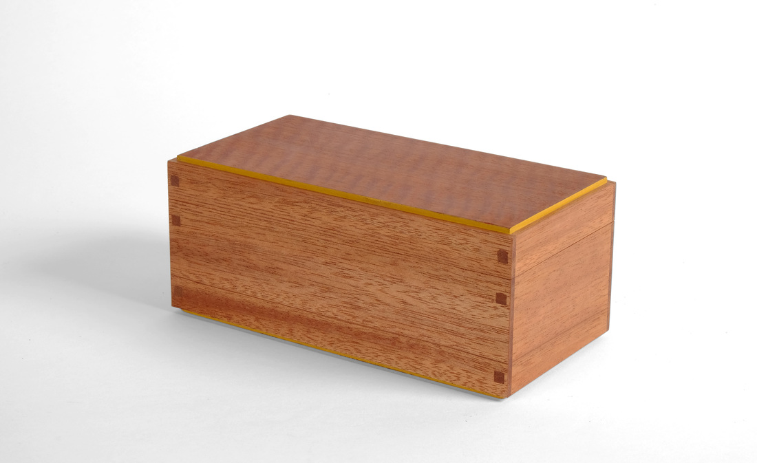
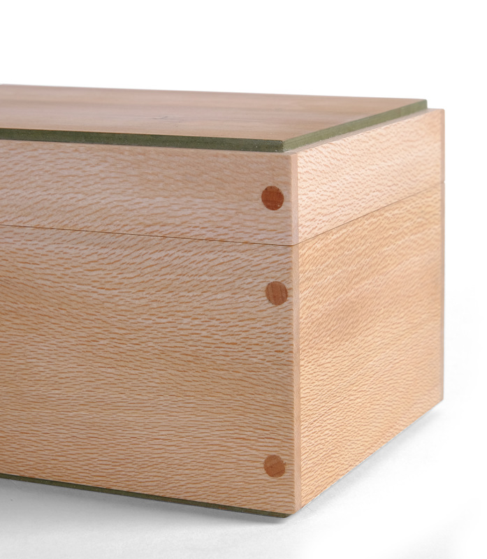
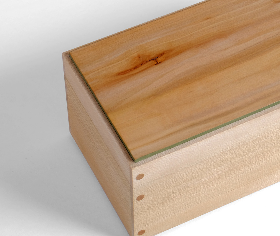
 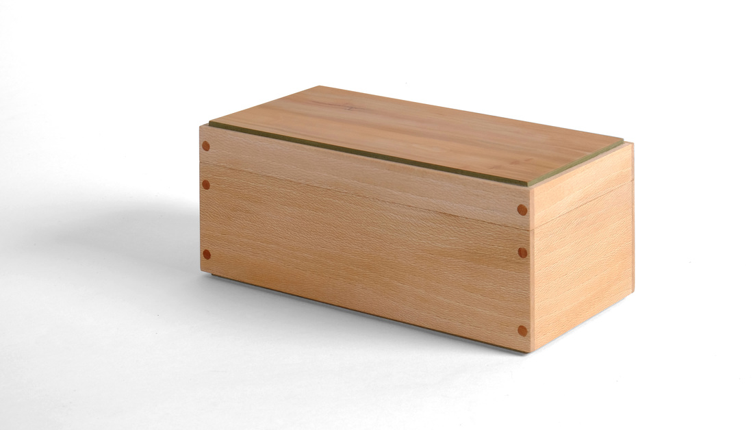 This style of box has been around for ages. The ends are rabbeted into the front and back. The joints are reinforced with pins. A liner keeps the lid in place. Honestly, I have no fondness for the design. But I was curious to see what I could do with these design details. Here is how I went about giving this well-traveled box design my own spin. I started by picking the lumber. I have some quartersawn sycamore—well, it's really riftsawn, but it's nice—and decided to use it for the body. I like the hint of warm, earthy brown underlying the overall lightness of the wood. Cherry might have worked for the pins, lid, and bottom, but it's a very rich color, especially after oxidizing for a year or so. And it would eventually be too strong for the sycamore. So, no cherry. Instead, I went back to me favorite: apple. I had some shopsawn apple veneer that I knew would work for the top and bottom, and I just happened to have some apple pins sitting around, too. The apple's color is muted enough to compliment rather than contrast with the sycamore. And the apple's variated color is a good match for the multitude of hues in the sycamore. I sorted through the apple veneer and settle on this particular piece because of the small inclusion in the upper left corner and the three little knots in the lower right hand corner. These imperfections add interest to an otherwise calm piece of apple. And that's important, because both the sycamore and the apple are subdued otherwise. After picking the woods to use, I next thought about whether or not to use any milk paint. Just kidding. Of course I was going to use milk paint. The actual questions: What color and where? My home-cooked green is a great match for apple and I thought it would go nicely with the sycamore, too. On the outside, I wanted the apple lid and subtle shimmer of the sycamore to predominate, so I only painted the edges of the top and bottom. This is in keeping with my belief that you should only use three woods/colors on a piece: a primaryThe inside of the box is a different story altogether. I like a nice pop of color when you open a box or cabinet. So, I painted the inside faces of the top and bottom and the liner. The darkness of the green stands out nicely against the sycamore body. The only thing I would have differently is to have not painted the inside face of the bottom. Instead, I would have glued a nice piece of fabric down. I have some great light-green fabric with lovely little flowers (I am not ashamed that I think of things like this, and I like flowers) on it that would have been awesome in this box. Alas, I remembered too late. The bottom was already glued in place. I also thought a bit about the box's size. I wanted to make something bigger than the one's I've been making. I like the proportions. It's about 7 1/2 in. long and 3 1/2 in. wide. I think the sides are 3 in. tall, and the top and bottom are about 1/8 in. proud. Proportions are always important. Now, for a word from our sponsor, the good folks at Random Thoughts, Inc.
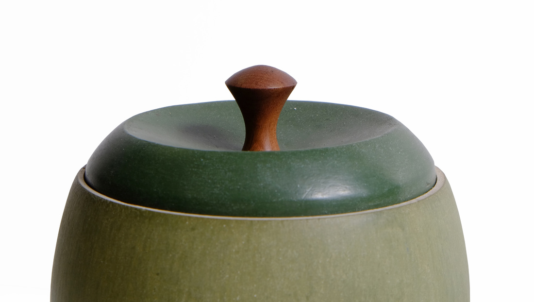
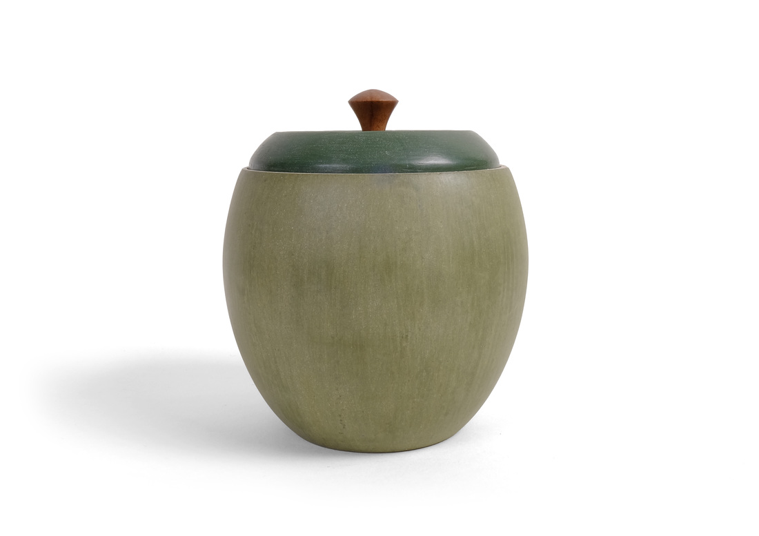 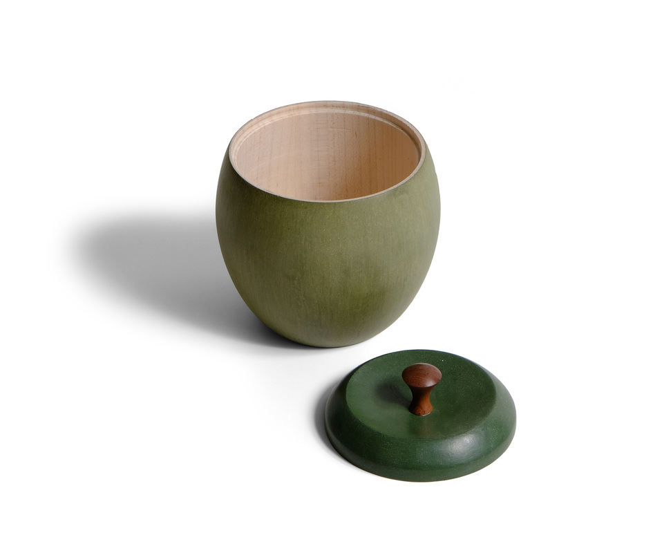 I both love and hate this box. I turned the bottom quite some time ago, and it was inspired by some Japanese tea cups that I've seen. I love its shape. But then it needed a top. I like the top. I also like pull. But when the pull is put on the top and top and bottom, you get a freaking apple. And I don't like that at all. Of course, everyone who has seen it, held it, and opened it has loved it. Evidently, it would make a great sugar container for some tea drinkers I know. This is a case where I have to trust what those folks say. My dislike for the box comes from the fact that I had set out to make a box that gives a strong nod to some understated but undoubtedly gorgeous Japanese tea pottery I've seen. I ended up with a somewhat kitschy apple box. Perhaps I'll take a few more shots at the lid. I have several other ideas about how to make it, all of which would take the apple stink off the box. Enough complaining. There is still a lot to like about this box. First, the lovely shape of the bottom. It fits my hands perfectly. Had I been a potter, this would be a wonderful tea cup. (Handles, as I understand it, are a bad thing on tea cups. If you can't hold it by wrapping your hands around a full tea cup, then the tea is too hot to drink. I don't tea—or coffee—but this is what I've been told.) The milk paint finish also is lovely. It's a homemade green that I made my mixing marigold yellow and Federal blue. The "texture" in the finish comes from the brush strokes. There's a particular way to brush on the paint that leaves marks like this. The finish, I think, looks very much like a pottery glazing, which is the look I was after. The lid is straight Lexington green. To emphasize the difference between the two, I finished the lid with shellac and wax where the body has only wax. Shellac darkens milk paint much more than wax alone. It compliments the homebrew green quite well. The curve of the lid is meant to pick up on the curve of the body, and the top of the pull is meant to bring the curve to a close. The three aren't exactly matched, but that's OK. The connection is suggested, and a suggestion is often better than an explicit statement. By the way, the pull is turned from the wortled heartwood of a quizzical pear tree. Lovely stuff with great color. I left the top rim of the bottom and its interior unfinished. I turned the bottom from hard maple. The stark creamy white is a nice surprise when you open the box. The pale rim is a nice way to separate the lid from the body. Eventually, it will darken to the lovely honey gold that maple becomes, and that will be a nice touch, too. A few random thoughts:
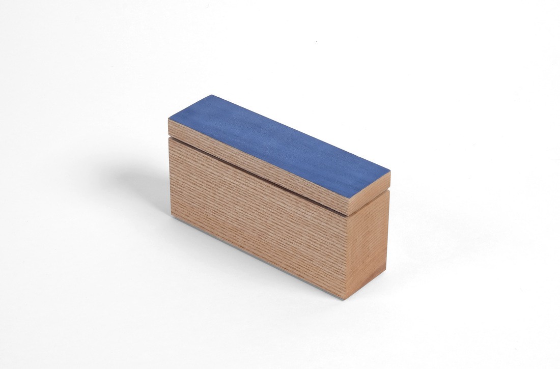
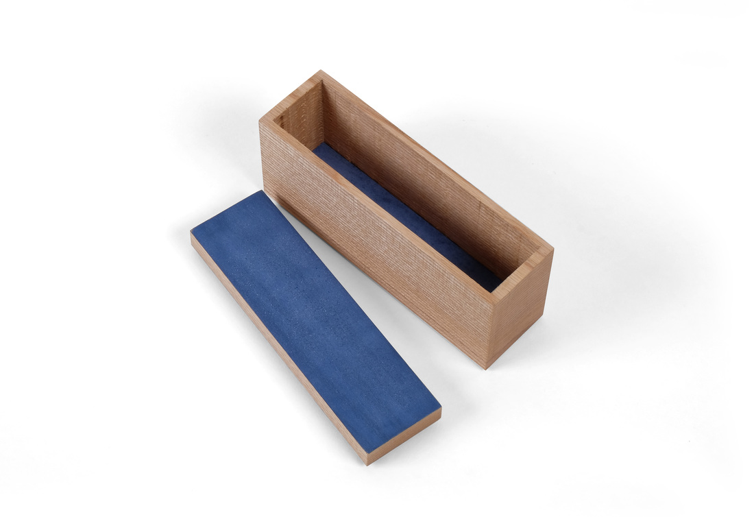
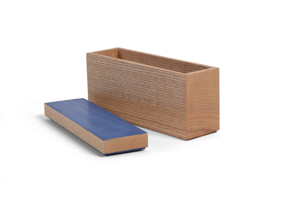
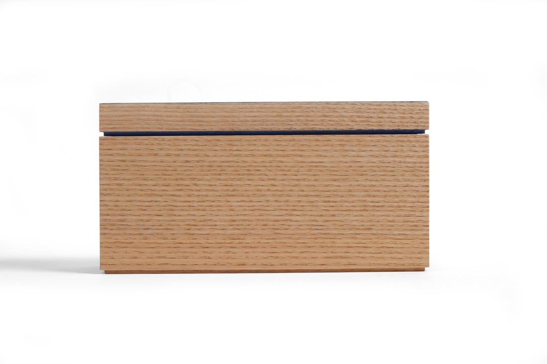
 OK, before I get to the latest box, let me take a moment to point out that this is box 26. I'm halfway there. It's been 18 weeks since I posted boxes 1 and 2. I'm very happy, but also bit surprised that I've been able to crank out boxes so quickly. I'm also relieved, because I have some challenging boxes in the queue, and some might take me more than a week to make. That's OK now, because I'm well ahead of schedule. Well, let's get to box 26. Although it's not immediately obvious, I used a peculiar technique to make this one. Take a look at the end of the box. That's end grain. Not surprising. This could be a bandsaw box. But it's not. It's a hollow chisel mortiser box. I took a solid piece of ash, ripped off a slice to be the top and then headed over to the mortiser. I then mortised out the inside of the box. This could be one of the smartest things I've done in the shop, but it's more likely one of the dumbest. I suppose I'll find out after a very dry Connecticut winter. If it stands up to severe contraction and then some Spring expansion, I'll be happy. I think it will, but even if it doesn't it was still fun to make. It took all of 3 minutes to hollow out the box and that's pretty cool. This particular piece of ash is an offcut from the ash I used to make turn this little hollow form vessel. I love the super tight and straight grain on the sides. The end grain is good looking, too. Because the ash is almost perfectly quartersawn, the top and bottom are flatsawn. The bottom doesn't matter much, because you never see it, but the top is another story. I didn't want some ugly flatsawn grain messing up this box, so I decided to paint the top before I even cut it free from the blank. I didn't chose the color (Federal blue) until after I had hollowed out the box. I like the blue here because it stands out against the slightly-brown creaminess of the ash. I also painted the underside of the top, so that the space between the top and box body would be more than just a shadow line. Speaking of the top, I rabbeted around it's bottom edge (the rabbet is the same size as the one around the box's bottom) to create the space between the top and box. I then glued a thin piece of maple to the underside of the top. This thin piece fits into the box and keeps the lid in place. As you can see, the underside of the top is also painted. If you've used a hollow chisel mortiser before, you know that the drill bit cuts a little deeper than the chisel. It leaves nasty drill bit marks. There was no way to get rid of them (without extensive and tedious chisel work), so I just cut a bottom from some thin maple, painted the top surface and then put it in the box. I was going to glue it in place, but when I was testing the fit, it got stuck, so I just forced it all the way down. If it falls out this winter, I'll glue it down. A few random thoughts.
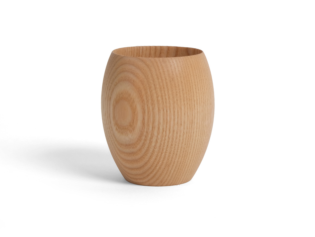 This is a little guy. It's about 3 in. tall and 2 1/2 in. at the widest diameter. I finished it with a very light cut of shellac and then wax. The grain accentuates the form of the vessel so well that I just couldn't bring myself to paint over it as I had originally planned to do. And that's all I have to say about that.
One more thing: I plan to start posting more of my turnings and furniture, but with very few words. They'll be photo tours, so to speak. |
AuthorI love furniture design, and smart techniques. This blog is about both. Archives
August 2020
Categories |

 RSS Feed