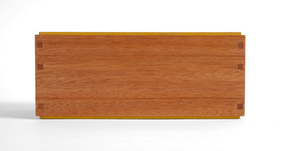
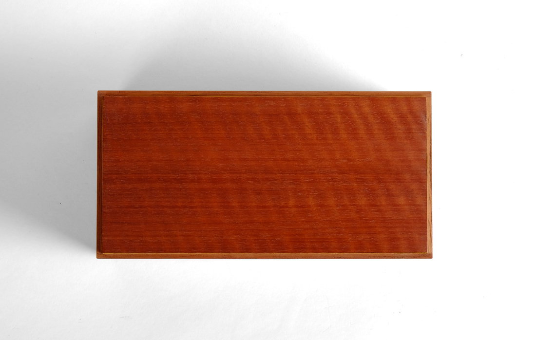
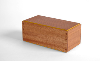
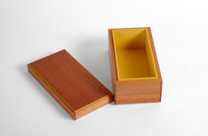
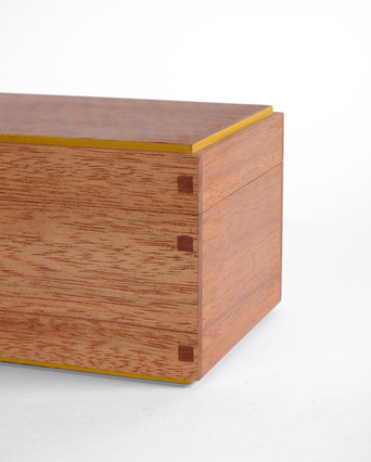
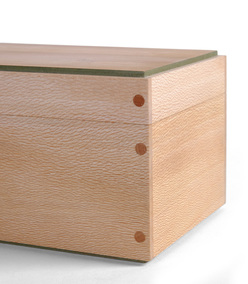
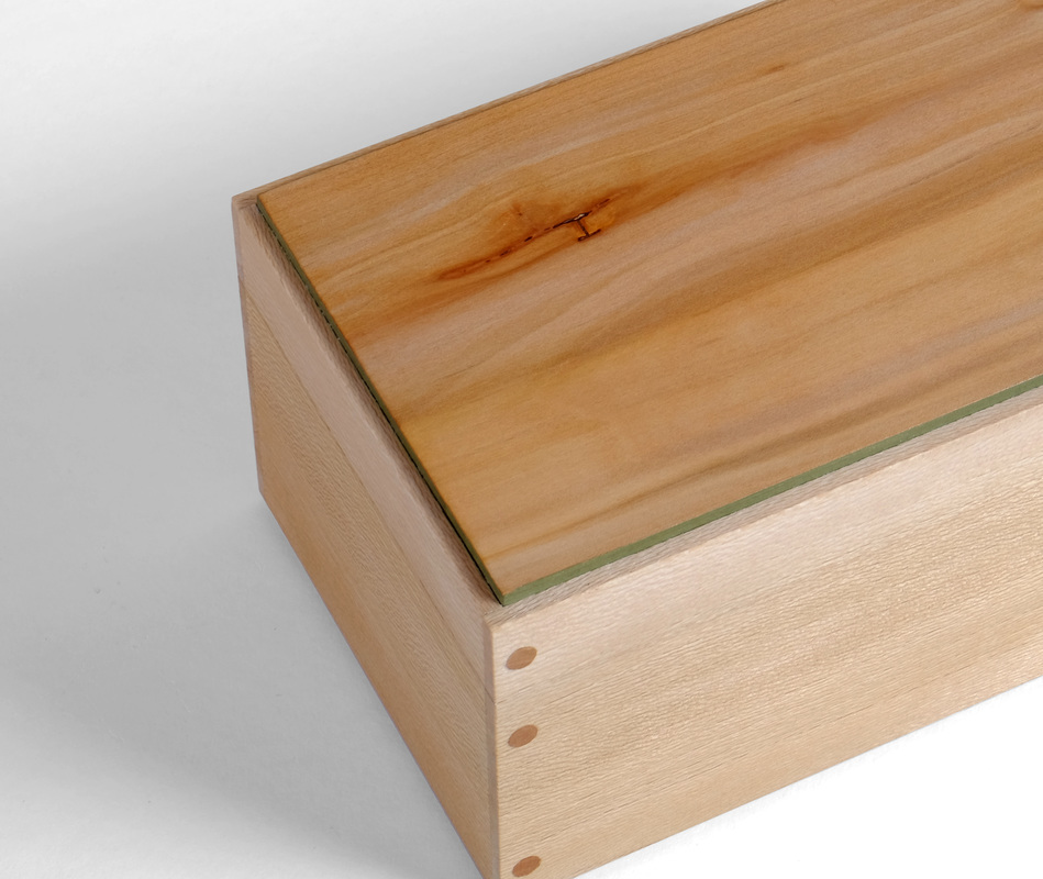
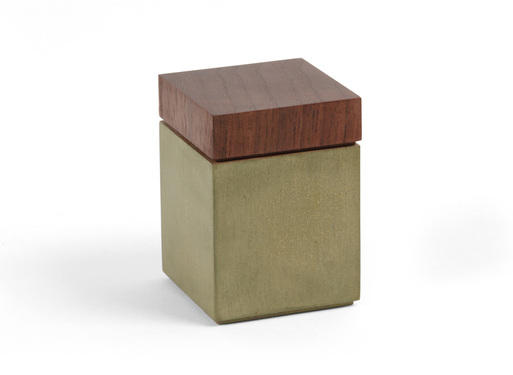
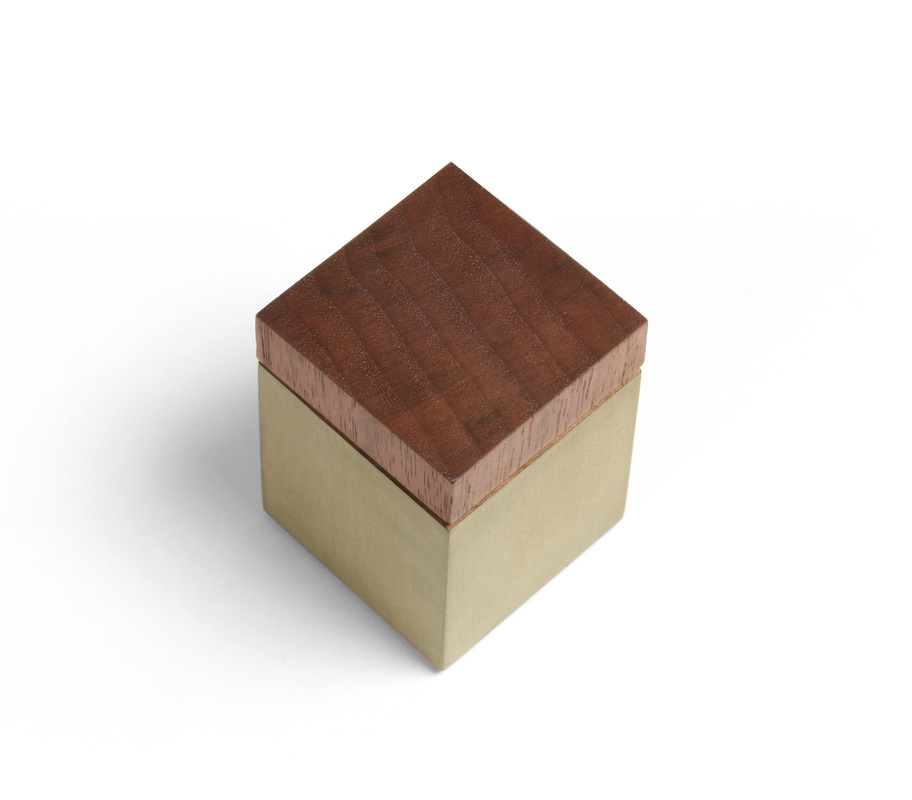
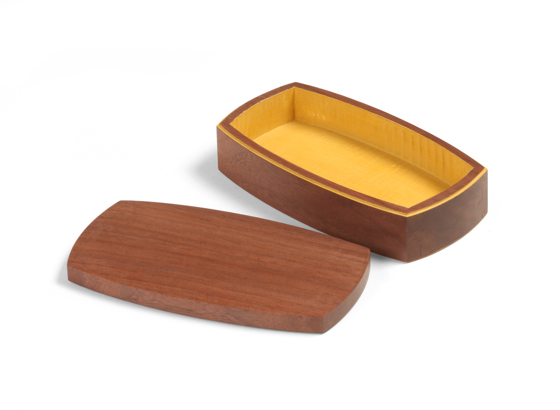
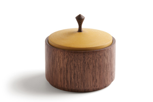
 Superficially, this box is almost exactly like box 28, which I wrote about last week. The obvious differences between them: woods, milk paint colors, pin shapes. But I think these differences make for two boxes that each have their own soul. A coworker at the magazine picked up on this right away. Box 28, she said, is feminine, while this box is its masculine counterpart. This distinction in their character can be explained, at least in part, by the choice of woods. The body of this box is mahogany. It's deep, rich color gives a sense of formality. This box would sit nicely in one of those obnoxious, wood-paneled club rooms with leather chairs where men sit around smoking cigars, drinking after-dinner port, and deriding the peasants like me. The sycamore of box 28, even though it has a lovely shimmer, is more gentle, more loving. The beautiful curl of the figured top (and bottom) reinforce the box's formality, especially when compared to the earthy—and a bit carnal—warmth of the apple I used for box 28. The apple is a late-autumn nap by the wood stove with a soft but somewhat saucy lady friend. (What? That's not the image that the color, texture, and smell of apple evokes in your mind?) The curly veneer on this box is a well-fitting suit and tie, a freshly-shaven face, and an Old Fashioned in your hand. The shape of the pins also contributes to the difference in soul between the two boxes. Here I've used 3/16 in. square mahogany plugs over some white oak pins. (The plugs are very shallow, about 1/16 in. deep.) Straight sides are harder than the softness of a circle. Even the choice in milk paint colors emphasis the difference in soul. Marigold yellow, which I've used on this box, is a strong, bold color, especially set against the mahogany. The green I used on box 28 just doesn't strike the same tone. It's welcoming. It wants company, I think, where the marigold yellow sings its independence. What does this all mean? It points to the importance of choosing the correct woods, colors, and details for your work. Everything affects the overall character or soul of a piece: the color of the wood, the grain of the wood, the joinery, the size of the joinery, the choice of secondary and accent wood, the amount of secondary and accent wood (or paint), and a thousand other details to boot. This is the real work of a furniture maker. This is where you make or break a piece. And why it's more important to make something, then make another thing, then a third thing, and then a fourth than it is to worry about the tool you're using or the technique you used to cut a joint. That's how I see it anyway. For me, the journey is as much (no, actually it's more) about the aesthetics of what's being as how it's being made. Random thought time:
4 Comments
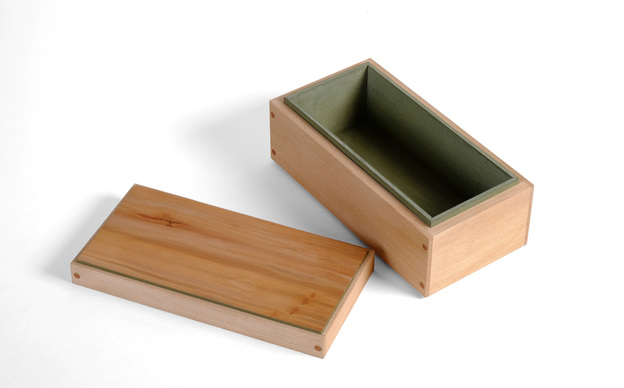
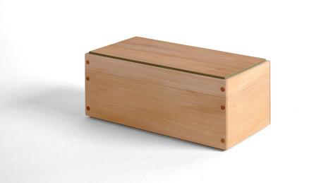 This style of box has been around for ages. The ends are rabbeted into the front and back. The joints are reinforced with pins. A liner keeps the lid in place. Honestly, I have no fondness for the design. But I was curious to see what I could do with these design details. Here is how I went about giving this well-traveled box design my own spin. I started by picking the lumber. I have some quartersawn sycamore—well, it's really riftsawn, but it's nice—and decided to use it for the body. I like the hint of warm, earthy brown underlying the overall lightness of the wood. Cherry might have worked for the pins, lid, and bottom, but it's a very rich color, especially after oxidizing for a year or so. And it would eventually be too strong for the sycamore. So, no cherry. Instead, I went back to me favorite: apple. I had some shopsawn apple veneer that I knew would work for the top and bottom, and I just happened to have some apple pins sitting around, too. The apple's color is muted enough to compliment rather than contrast with the sycamore. And the apple's variated color is a good match for the multitude of hues in the sycamore. I sorted through the apple veneer and settle on this particular piece because of the small inclusion in the upper left corner and the three little knots in the lower right hand corner. These imperfections add interest to an otherwise calm piece of apple. And that's important, because both the sycamore and the apple are subdued otherwise. After picking the woods to use, I next thought about whether or not to use any milk paint. Just kidding. Of course I was going to use milk paint. The actual questions: What color and where? My home-cooked green is a great match for apple and I thought it would go nicely with the sycamore, too. On the outside, I wanted the apple lid and subtle shimmer of the sycamore to predominate, so I only painted the edges of the top and bottom. This is in keeping with my belief that you should only use three woods/colors on a piece: a primaryThe inside of the box is a different story altogether. I like a nice pop of color when you open a box or cabinet. So, I painted the inside faces of the top and bottom and the liner. The darkness of the green stands out nicely against the sycamore body. The only thing I would have differently is to have not painted the inside face of the bottom. Instead, I would have glued a nice piece of fabric down. I have some great light-green fabric with lovely little flowers (I am not ashamed that I think of things like this, and I like flowers) on it that would have been awesome in this box. Alas, I remembered too late. The bottom was already glued in place. I also thought a bit about the box's size. I wanted to make something bigger than the one's I've been making. I like the proportions. It's about 7 1/2 in. long and 3 1/2 in. wide. I think the sides are 3 in. tall, and the top and bottom are about 1/8 in. proud. Proportions are always important. Now, for a word from our sponsor, the good folks at Random Thoughts, Inc.
OK, before I get to the latest box, let me take a moment to point out that this is box 26. I'm halfway there. It's been 18 weeks since I posted boxes 1 and 2. I'm very happy, but also bit surprised that I've been able to crank out boxes so quickly. I'm also relieved, because I have some challenging boxes in the queue, and some might take me more than a week to make. That's OK now, because I'm well ahead of schedule.
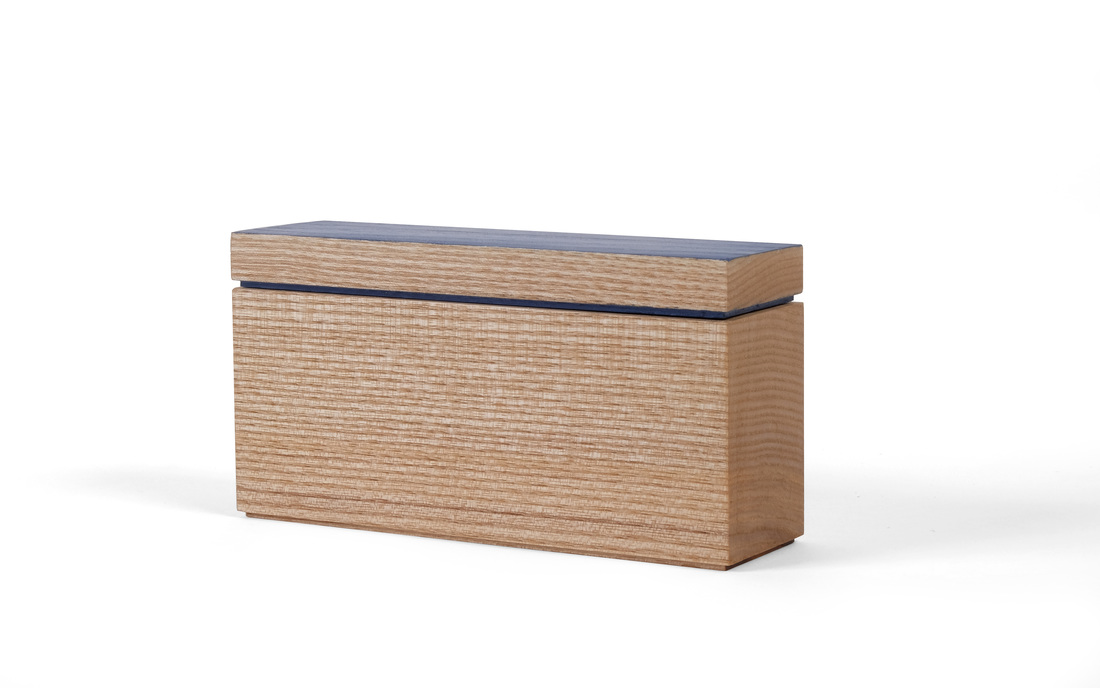
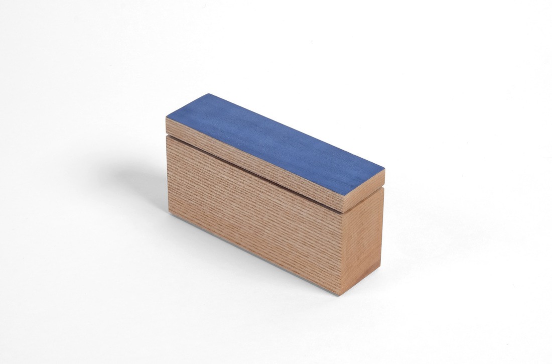
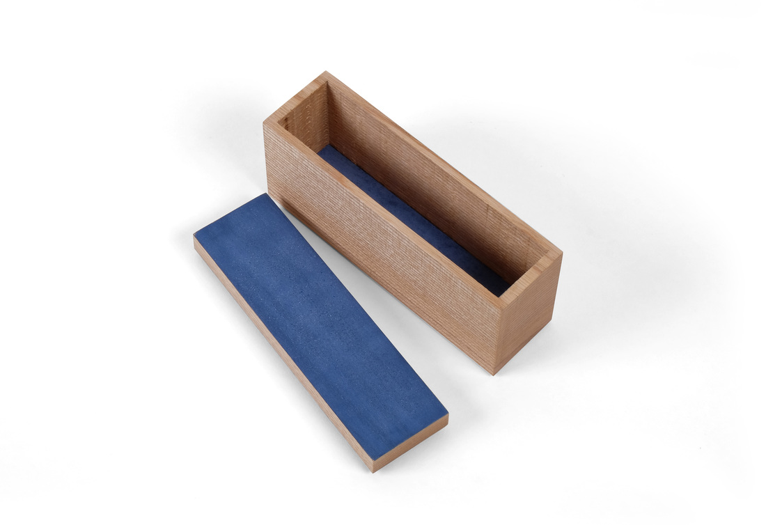
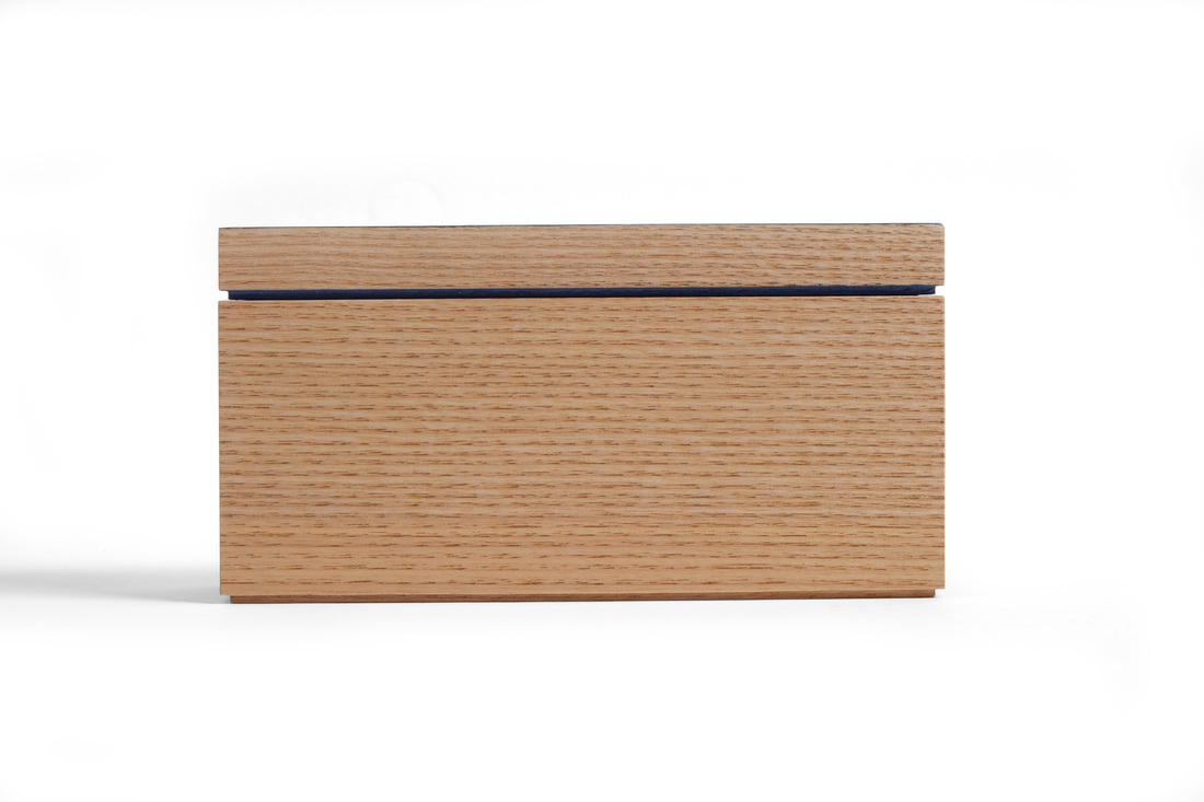
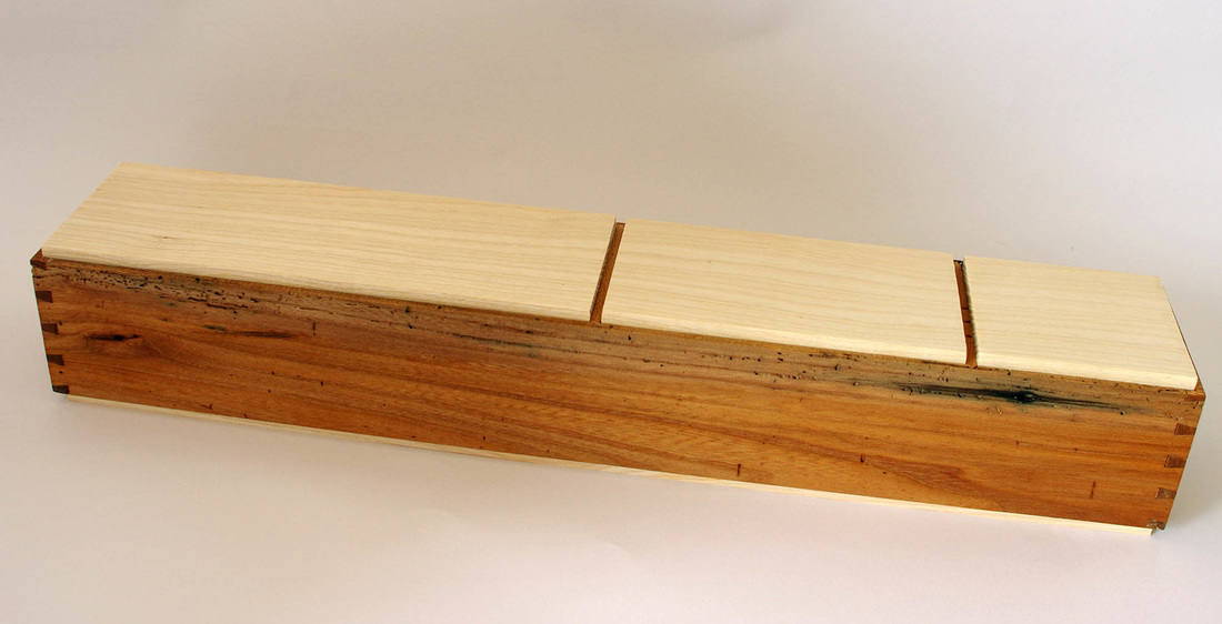
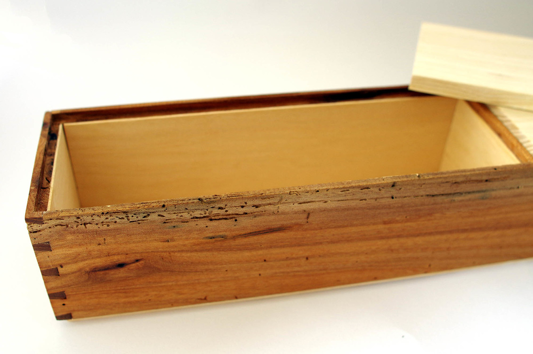
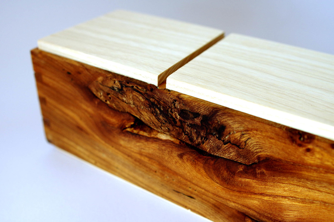
Well, let's get to box 26. Although it's not immediately obvious, I used a peculiar technique to make this one. Take a look at the end of the box. That's end grain. Not surprising. This could be a bandsaw box. But it's not. It's a hollow chisel mortiser box. I took a solid piece of ash, ripped off a slice to be the top and then headed over to the mortiser. I then mortised out the inside of the box. This could be one of the smartest things I've done in the shop, but it's more likely one of the dumbest. I suppose I'll find out after a very dry Connecticut winter. If it stands up to severe contraction and then some Spring expansion, I'll be happy. I think it will, but even if it doesn't it was still fun to make. It took all of 3 minutes to hollow out the box and that's pretty cool. This particular piece of ash is an offcut from the ash I used to make turn this little hollow form vessel. I love the super tight and straight grain on the sides. The end grain is good looking, too. Because the ash is almost perfectly quartersawn, the top and bottom are flatsawn. The bottom doesn't matter much, because you never see it, but the top is another story. I didn't want some ugly flatsawn grain messing up this box, so I decided to paint the top before I even cut it free from the blank. I didn't chose the color (Federal blue) until after I had hollowed out the box. I like the blue here because it stands out against the slightly-brown creaminess of the ash. I also painted the underside of the top, so that the space between the top and box body would be more than just a shadow line. Speaking of the top, I rabbeted around it's bottom edge (the rabbet is the same size as the one around the box's bottom) to create the space between the top and box. I then glued a thin piece of maple to the underside of the top. This thin piece fits into the box and keeps the lid in place. As you can see, the underside of the top is also painted. If you've used a hollow chisel mortiser before, you know that the drill bit cuts a little deeper than the chisel. It leaves nasty drill bit marks. There was no way to get rid of them (without extensive and tedious chisel work), so I just cut a bottom from some thin maple, painted the top surface and then put it in the box. I was going to glue it in place, but when I was testing the fit, it got stuck, so I just forced it all the way down. If it falls out this winter, I'll glue it down. A few random thoughts.
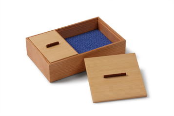
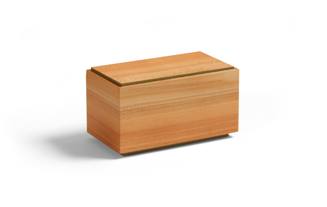
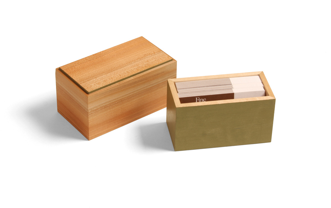
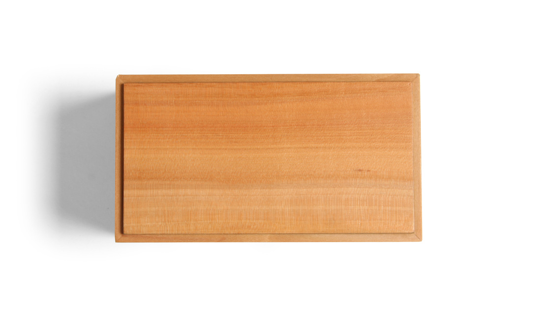
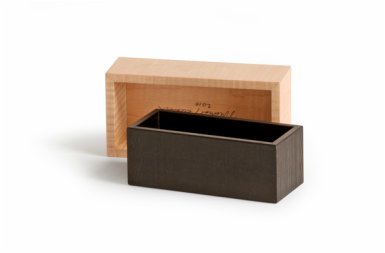 This is the first of two boxes that I hope to post this week. I missed last week, so I'm trying to catch up a bit—even though I posted four boxes the week before. I began this box back at the beginning of July, at the Lie-NIelsen open house. It sat around because I've had so much else to build. (I made Shaker inspired cupboard this summer, for example.) But I glued it up this past weekend and made the top and bottom. I'm glad it's finally done, because it's a fantastic little box. It's my take on a box made by Fine Woodworking's executive art director, Mike Pekovich. I love the simplicity of having a bottomless box fit over a box with no top. I wish I'd thought of this first! Mike's box has a curly maple top—finished smooth with a nice luster—over an ebony bottom. He left the ebony rough on the outside (milling marks from the bandsaw), just burnishing the surface with some steel wool. The contrast between the surface textures is fantastic. I've held this box and it's truly wonderful. My version of the box has an apple top and a hard maple bottom. Of course, there a dash of milk paint, too. Painted the exterior of the maple bottom as well as the top face of the bottom panel. Only the inside faces and top edges of the maple was left natural. The bottom panel is plywood and glued into a rabbet. It's just a bit proud of the bottom sides, so that sit just a smidgen off the surface. The top box, I think, is gorgeous. The apple is amazing. I love the variegated color, and the green of the bottom is a perfect match. The top panel is plywood—like the bottom panel—and glued into a rabbet. I did paint the inside surface and the edge of the top panel with the same green milk paint. I like that little bit of green on the top box. It's a nice accent that picks up the bit of green that you can seen when the top box is over the bottom one. The box is wonderfully minimalist, I think, and modern in the best way. As you can tell from the pictures, the box was made to hold business cards. This is the first box of the 25 I've written about so far that was made for a specific purpose. I think the box design works well for the purpose because you can flip the top box over and stick the bottom box back into it and have the cards ready for the taking. I made the box to carry my cards when I go on the road to demonstrate or teach. It's such a pain to carry a big stack of cards and keep them clean, neat and tidy. I have an idea for a thinner box for business cards that I might get to soon. It should fit into a coat pocket. I actually started a second box along with this one (walnut top, similar bottom but to be painted marigold yellow), and I might finish it one day, but won't count it as one of my 52 boxes. A few random thoughts.
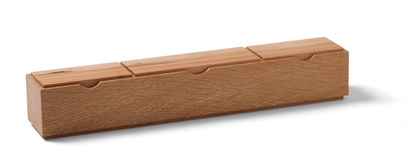
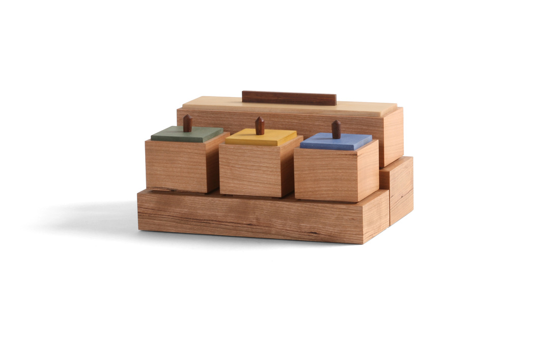
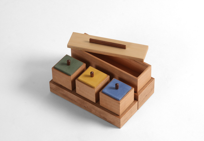
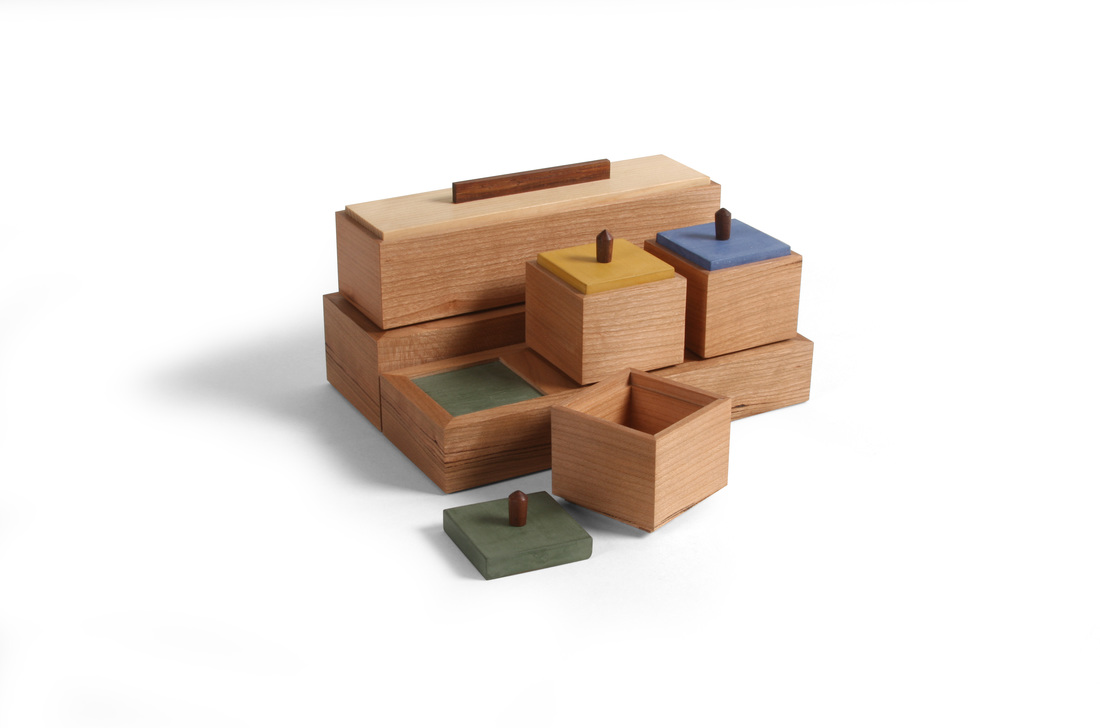
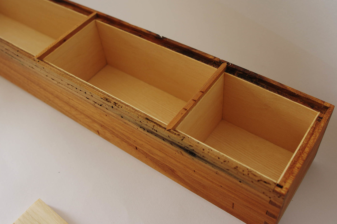
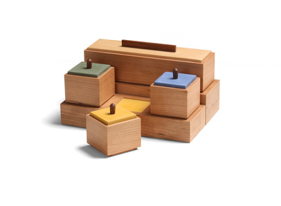 I made this set of four boxes quite some time ago, but I didn't not what to do about pulls for the three small boxes up front, so they sat. I'm not crazy about the pulls I eventually turned for them, but at least the boxes are done now. If I were to turn them again, I think that I would give them a more pronounced inward taper from top to bottom. The problem is that they are so small that it's hard to get too much shape on them without risking too narrow a diameter for the tenon and lower section of the pull. OK, enough about what I don't like. (At any rate, the turned pulls are the only part of these boxes that I'm not thrilled with.) The idea for this box has been beating about in my head for a long time. I've sketched out numerous versions of it, and I might make a few of the other versions, too. (One version I'd like to try involves a set of small round boxes arranged radially around a rectilinear box.) I decided on this particular arrangement because I knew that the boxes would not be hard to make, leaving me to focus on the pedestals beneath them. For me, the pedestals are not just a place to put the boxes, but also a way to create negative space around the boxes. It's the particular arrangement of the boxes, included the shadow lines between them, that makes this set work. This meant that I needed to design them in such a way as to ensure that the boxes always maintain that negative space when the pedestals are fully loaded. The four sides of the pedestal are made like a mitered box. The bottom fits into a rabbet, and the thin "top" into a groove cut into the sides. To create the defined recesses for the three square boxes, I fit dividers into dadoes cut into the front and back. These dividers also have grooves for the colored "tops." (By the way, the colored "tops" are just pieces of 1/8 in. thick cherry painted with milk paint.) There was quite a bit of math involved in getting every thing sized right so that the spaces between the boxes would be the same size and would put the outside ends of the first and third boxes in line with the ends of the long box in back. It also took some figuring to determine how thick the sides of the pedestals should so that the boxes would be inset the amount I wanted. But I was able to manage (and I damn well should be able to, given the amount of education I have! It might have all been in the humanities, but I did well in calculus, too.). I really like the proportions of the square boxes. I started designing the boxes by determining the width of the rectangular box, because I knew that the square boxes would have the same dimension. I then had to do some work to get three square boxes to fit into the length of the long box. In other words, I sketched out different lengths for the long box, trying out various widths of the spaces between the square boxes. Then I worked on the space between the rectangular box and the there square ones. After I figured out all the spacing, I turned to the pedestals. I think it all turned out well. The recesses that hold the boxes are painted to match the lid of the box that fits into each one. For the rectangular box, which has a lid made from some very old white pine (salvaged from studs in my 100+ year old house), I mixed up a custom yellow that's close to the color of the pine. I like the little surprise you get from the colored recesses when you pick up one of the boxes. I had these boxes in the office today, and I heard several folks ooh and aah when lifting up the boxes. That's a great response, and it made me happy. And no one said a word about the turned pulls—as woodworkers were always harder on ourselves than we should be. OK, time for some random thoughts.
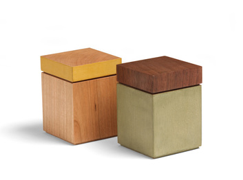 There were several boxes I could have chosen for box 20, but I went with this one because of its link to the last three I shared. I made the body for this one at the same time I made the other three, with the intention of painting it and using a lid from natural wood. Otherwise, it's the same as those three boxes. (It's the same size as the smallest of those three, about 2 1/2 in. tall.) And prepare yourself for at least one more go at this one. I want to experiment with different ways of making it. I want to see how it works as a bandsaw box, but I'm also tempted to hollow out the body with a hollow chisel mortises for kicks. So, I think I see two more in the near future. At any rate, on to box 20. The body is painted with a custom green milk paint that I mixed from Federal blue and Marigold yellow milk paint. I really like it. In fact, it has earned a place alongside Marigold yellow as my favorite. It is very close in color to a glaze used a lot of Arts & Craft pottery I have seen. (There seems to be some in every RAGO catalogue that we get at work. I don't know why we get them, but I'm glad we do because there is always a ton of great furniture—everything from A&C to Midcentury Modern to Nakashima.) I've even figured out a way to apply it with a brush that makes it look very much like a ceramics glaze. I know that many woodworkers would question why I'd want that. After all, don't we make things from wood because we love its natural beauty? Absolutely, but I've been fascinated with the amazing ceramics I've seen when teaching at Peters Valley Craft Center and I've been working towards incorporating something akin to glazes in my work. This is especially true of my work at the lathe. I want to turn pottery on a lathe. Maybe when I'm done with the box project I'll do 52 turnings in 52 weeks. I originally want to make a cocobolo lid for this box, but because of how I make it (turning a round lip to fit into the round cavity in the box), the lid begins as a rather think blank that can be chucked up in the lather. I don't have any cocobolo the right dimensions to do this. But I do have a lot of offcuts from some 8/4 air-dried walnut slabs. I knew that some of that walnut would have a nice, rich brown color when finished, so that's what I used. I like the color with the green paint. I also like the bold, straight grain visible on the top face of the lid. To make the walnut darker than it would be when finished only with shellac (my usual finish), I applied a coat of Watco before the shellac. I forgot to do any random thoughts the last two times I shared boxes. So, here you go.
 Long ago I heard that good artists borrow, but great ones steal. I have no recollection of where I heard it or who spoke it. On the surface it's an odd claim, because theft is not often praised, and the thief rarely lauded as great. So, I thought about it (for a long time because I'm not too smart) and eventually decided the best way to understand this aphorism is in terms of possession. If I borrow something from you, it still belongs to you. But if I steal it, then I've made it mine. We could argue about the accuracy of this second claim in relation to your car, television or iPad. But I don't really care about that. Let's think about what it means in terms of artistic creativity—and furniture makers are artistically creative. If I borrow a design detail from you, then all I do is lift it directly from your work and plunk it down in mine. I make no effort to alter it, to weave it in seamlessly, to make it my own. It remains alien to my design aesthetic. A knowledgeable person would see my work and say, "That bit there is taken from Maker X, and it doesn't really fit here." The worst case of this is the person who simply copies wholesale from another maker and attempts to pass of the design as his own. (This happens. Within the last year I saw a person present a table as his own when every design detail and even some rather unique techniques were borrowed from a regular and very well known Fine Woodworking author. No acknowledgement was given to him.) However, if I steal a design detail from you, then I take it in, digest it, and weave it into my design vocabulary. Only then do I use it. It's no longer recognizably yours. It has become a seamless and natural part of my own work. That takes skill, and I have no problem doing it or having it done to me. And this brings me to an email I received from a maker in France who has been reading my blog. He sent me photos of a box he made that was inspired by box 5. I was thrilled to see it. There is no greater compliment than to be told that you've inspired another furniture maker. It encourages me to keep designing and making boxes. You can see photos of his box below. When viewed next to a photo of my box, the connection is obvious. However, you can also tell that the maker made an attempt to produce a box that is truly an expression of his design aesthetic and not mine. From the wood selection, to the joinery, to the fact that he used inserts instead of paint on the inside of the box. (By the way, I love the wood choice for those inserts.) He also changed the arrangement and size of the individual compartments. So feel free to steal from my work, but please don't borrow. By the way, if you'd like to know more about the history of the aphorism, Google reveals that T. S. Eliot (although not the first person to use it in some form), explained it pretty much as I do here. However, I did not know this until I sat down to write this entry. He explains it better than I do, and was a way, way, way better poet than me, too. This week I took another stab at a bandsaw box. I decided to stay with walnut and marigold yellow paint to have a connection from my first attempt. It also has a similar shape, but because the blank was much wider, I was able to give the sides a more pronounced curve. But this one is shorter, as it was made from a piece of 8/4 air-dried walnut, and I like the shape. The first one was made from a piece of 8/4 walnut (from the same board), but was turned on edge, so that the width (instead of the height) came from the 2 in. dimension. I took other design details from the earlier box. I rabbeted the bottom edge of the sides to give the box some lift off of the surface, and the lid overhangs the sides.
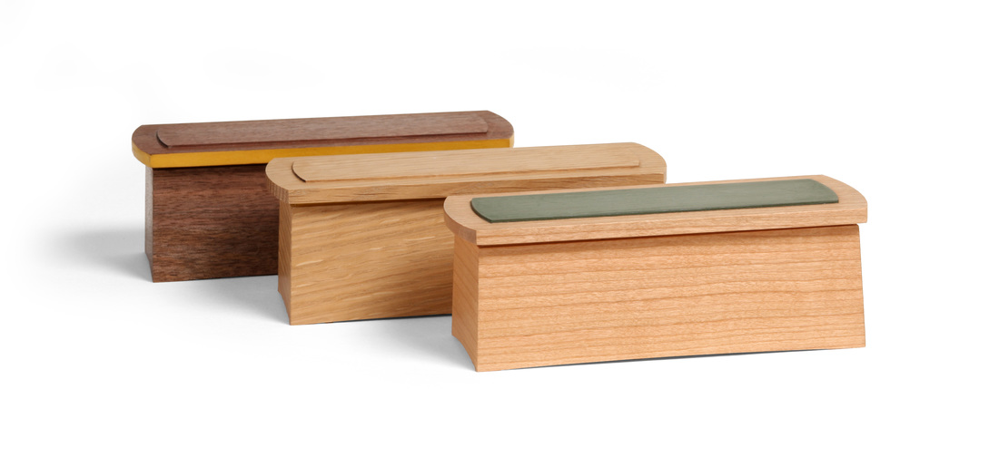
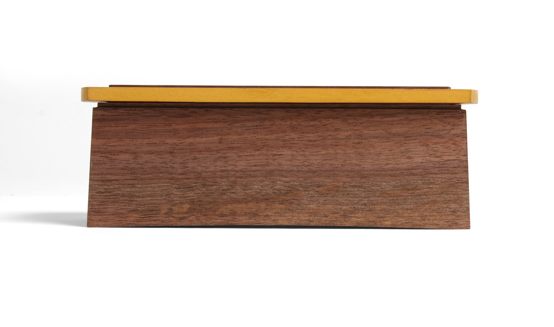
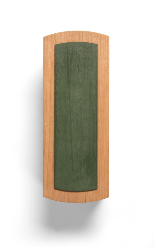
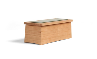
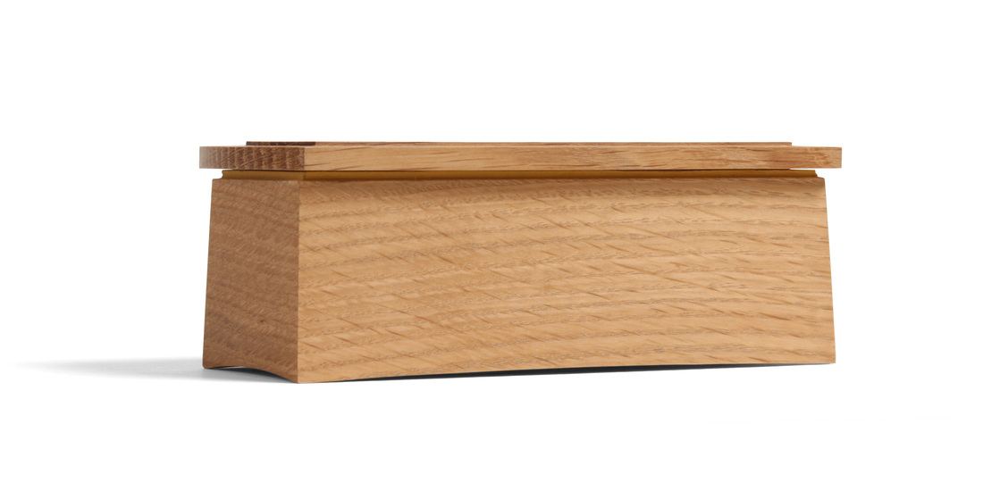
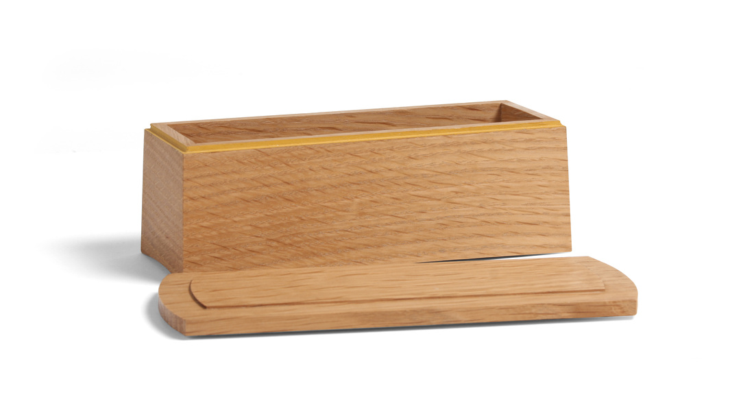
I also rabbeted the top edge of the sides, a detail I borrowed from the last three boxes that I made. And borrowing from the white oak version of those three boxes, I painted the top (and bottom) rabbet. I especially like this detail on the top edge as it emphasizes the separation between the lid and box. The milk paint continues on the inside of the box. I did not clean up the machine marks on the inside, so there is also a nice texture to the interior, and after I sanded the paint to smooth it, a bit of the walnut color peeked through. It's a nice touch. As for the process of making a bandsaw box, I think I did better this time. I used the same technique, but added a shopmade pivot fence, so that when I cut the sides free from the middle I could control their thickness more easily. I liked having the solid point of reference to work off. 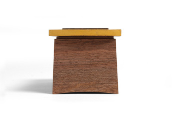 I'm not sure where to start with these boxes. I could talk about the design, and I certainly will. However, in making these boxes I employed a technique that is pretty freaking brilliant (I developed it with significant help from Mike Pekovich). I guess I'll start with the design, as that will naturally lead to the technique. There is quite a bit going on with these little boxes (they're only 6 in. long), but it all started with a desire to make a box with sides that slope gently inward. I don't know the angle of the slope. I sketched it out on graph paper, and went from there. But it is very slight. Because the sides slope inward, the miters at the corner are compound, and that's where the technique comes into play. I'll get to that soon. I believe that a box needs to be lifted off the surface in some way. The way I normally do this is to have a bottom that is slightly proud (1/16 or 1/8 in. depending on the size of the box) of the bottom edges of the sides. This lift creates a nice shadow line and gives the box a sense of lightness. With these boxes, I decided to try something different. I cut a gentle curve into the bottom edge of the sides, create "feet" at the corners. The arc suggests that the box lifted up off the surface. All of the arcs are 1/8 in. tall at their apex, but the ones on the ends look taller, because the radius of the arc is smaller than the radius of the arc on the front and back. I really like this technique for creating lift and I'm sure that I'll return to it. When I first sketched this box, the lid sat directly on top of the sides. It struck me as odd, as if the lid was a heavy slab holding down the box. I though some lift would be nice, so I rabbeted the outside edge of the sides. The rabbet gives the tops a bit of float, and I really like the shadow line it creates. The tops have a shallow rabbet on their bottoms, which creates a raised field in the middle of the lid. This field fits into the box and that's how the lid stays in place. Because the box is rectangular, the sides of the field need to be straight. So, before I rounded the ends of the lid, I cut the rabbets on the bottom. I then formed the round ends with a template and router bit. After the ends were arced, I routed the rabbets on the top of the lid so that the field would be arced on the ends like the lid. I decided to make the box in three different woods (and I actually made two in each species, for a total of six) for several reasons, some having to do with experimenting with a new technique, but the primary reason was so that I could try out different ways of using milk paint on the box. The walnut box has paint just around the edges of the lid. The cherry box has it only on the top field of the lid. (I like the Lexington green with cherry.) I used marigold yellow on the white oak box, too, but where isn't immediately obvious. I painted the rabbet on the top edge of the sides. You can see it when you open the box, of if you get down low and view it from straight on. This box got the best reaction around the office at Fine Woodworking. OK, enough about design. On to the technique. I'll explain it as best I can, but I'm sure that I won't explain as well as should be. (I see an article in my future.) Compound miters are a pain to cut. Normally, you angle a miter gauge and then tilt the tablesaw blade to some angle other than 45 degrees. Because I worked on an article with Chris Gochnour, I know a technique for doing this that doesn't involve any math. It's a technique that Steve Brown from North Bennett Street School wrote about about 10 years before. It works, and I've used it, but I thought there might be a better way. So I went to Mike one day and threw some ideas at him. He came back with the wedge. He said that I should cut a wedge to match the slope of the sides, put it on a crosscut sled, and then tilt the blade to 45 degrees. The wedge would hold the sides at the correct angle to cut the compound miter. I immediately saw that it would work, and it did. The miters were absolutely perfect. And it was so easy. By the way, the wedge I made was actually longer than the front and back, so that it supported the full length of the sides. But I took the wedge even further. I realized that I could put the wedge in the routing templates for the arcs and that when I routed the sides, the bottoms would automatically be cut with the correct bevel on them. I also used the wedge when I ripped the sides to width, and that cut the top edge at the correct bevel. I even used the wedge to cut a groove for the bottom, and the rabbet not the top edge. Without the wedge, all of this would have been difficult. With the wedge is was dead simple. There was no fussing with the blade angle. For the miters it was at 45 degrees. For all of the other cuts, it was square to the table. There was no hokey pokey with miter gauge fences. I used my everyday box sled for all of the cuts. The routing templates were made as normal and then a bit of wedge of put on them. Freaking awesome. Random thoughts.
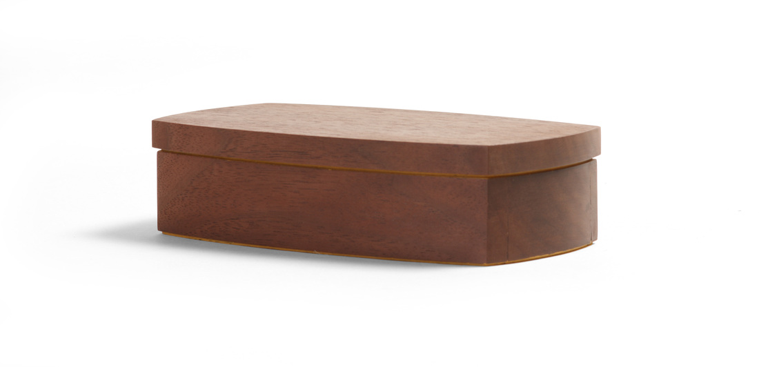
 I have an Instagram feed, and a few days ago I posted a picture of box 12 to it. One fellow commented that he'd like to see what I'd do if I designed a box to hold a specific item. That's a perceptive query, because honestly I normally don't worry about what a box will hold when I design it. Another editor at Fine Woodworking has said many, many times that boxes of the sort I make really have no function in modern society, and he likes to make his point by repeatedly joking that every box is really just a place for a person to stash his or her stash. But boxes can have a purpose. Mike Pekovich, who also works at Fine Woodworking, has made some beautiful boxes to store tea packets. But I'm not worried about function when I design a box, except on rare occassions. For me, boxes are decorative and I see them as an opportunity to make something that is beautiful. I suppose you could say that the purpose of my boxes is to be beautiful. I don't know if I've made any boxes that are truly beautiful, but I like them. I'd like to think that when my time in the shop is over for good that I will have made one truly beautiful box or piece of furniture (unlike boxes, furniture should always be functional). The pictures I've included with this post show the furniture and boxes that I think are the closest to being beautiful. Nonetheless, the primary goal of this 52 box challenge is to push myself in terms of design, so I'm going to make an effort to design a few boxes for a particular function. Over on Instagram, it was suggested that I make a box for a set of dominos. I'll give that a shot. Another suggestion was to make a box for an old Stanley level. Hmm. Should it be just a storage box or a storage/display box? I'll think on that. And then get in the shop and see what I can make. |
AuthorI love furniture design, and smart techniques. This blog is about both. Archives
August 2020
Categories |

 RSS Feed