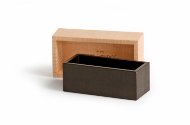
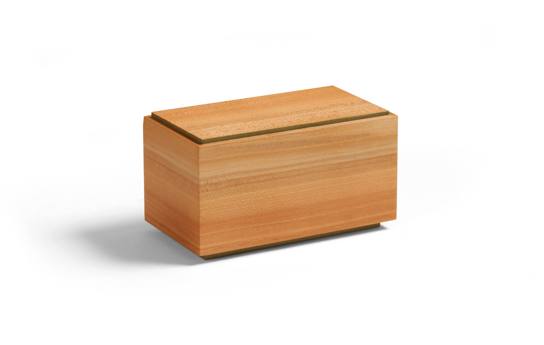
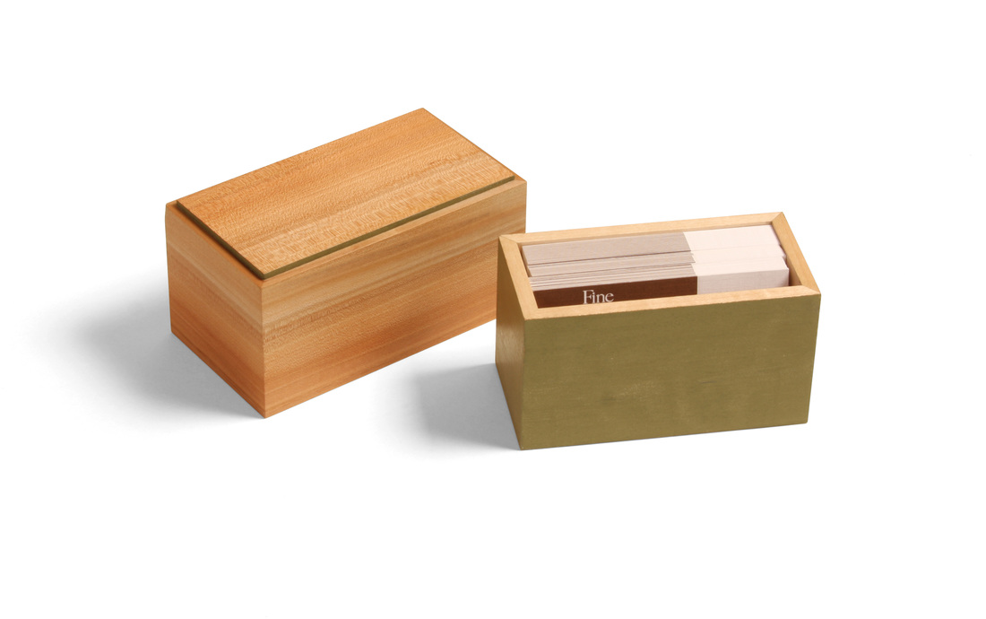
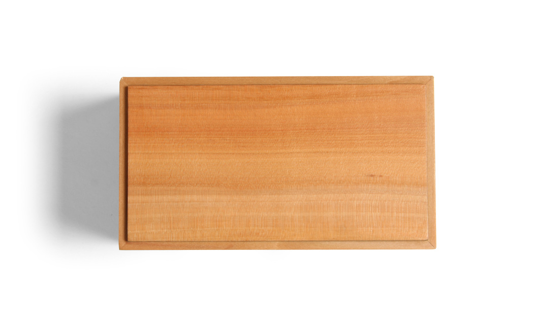
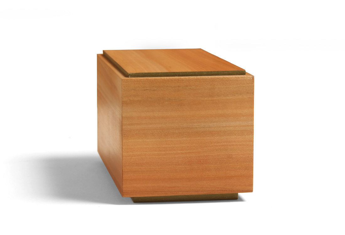
 This is the first of two boxes that I hope to post this week. I missed last week, so I'm trying to catch up a bit—even though I posted four boxes the week before. I began this box back at the beginning of July, at the Lie-NIelsen open house. It sat around because I've had so much else to build. (I made Shaker inspired cupboard this summer, for example.) But I glued it up this past weekend and made the top and bottom. I'm glad it's finally done, because it's a fantastic little box. It's my take on a box made by Fine Woodworking's executive art director, Mike Pekovich. I love the simplicity of having a bottomless box fit over a box with no top. I wish I'd thought of this first! Mike's box has a curly maple top—finished smooth with a nice luster—over an ebony bottom. He left the ebony rough on the outside (milling marks from the bandsaw), just burnishing the surface with some steel wool. The contrast between the surface textures is fantastic. I've held this box and it's truly wonderful. My version of the box has an apple top and a hard maple bottom. Of course, there a dash of milk paint, too. Painted the exterior of the maple bottom as well as the top face of the bottom panel. Only the inside faces and top edges of the maple was left natural. The bottom panel is plywood and glued into a rabbet. It's just a bit proud of the bottom sides, so that sit just a smidgen off the surface. The top box, I think, is gorgeous. The apple is amazing. I love the variegated color, and the green of the bottom is a perfect match. The top panel is plywood—like the bottom panel—and glued into a rabbet. I did paint the inside surface and the edge of the top panel with the same green milk paint. I like that little bit of green on the top box. It's a nice accent that picks up the bit of green that you can seen when the top box is over the bottom one. The box is wonderfully minimalist, I think, and modern in the best way. As you can tell from the pictures, the box was made to hold business cards. This is the first box of the 25 I've written about so far that was made for a specific purpose. I think the box design works well for the purpose because you can flip the top box over and stick the bottom box back into it and have the cards ready for the taking. I made the box to carry my cards when I go on the road to demonstrate or teach. It's such a pain to carry a big stack of cards and keep them clean, neat and tidy. I have an idea for a thinner box for business cards that I might get to soon. It should fit into a coat pocket. I actually started a second box along with this one (walnut top, similar bottom but to be painted marigold yellow), and I might finish it one day, but won't count it as one of my 52 boxes. A few random thoughts.
6 Comments
Matt Kenney
9/2/2015 03:52:16 am
Thanks, Matt. And thanks for reading.
Reply
9/2/2015 03:09:08 am
The apple is indeed beautiful. I've very much enjoyed seeing your use of colour to compliment the wood.
Reply
Matt Kenney
9/2/2015 03:50:52 am
Thanks, Mike. I really enjoy the spark that a bit color gives.
Reply
Phil
9/2/2015 05:16:50 am
I love me some apple. A few years ago, I used apple to make a wood-bodied spokeshave using the Lee Valley kit. Recently, I made a clock that had an apple front panel with the case made from riftsawn to barely quartersawn white oak (not much ray fleck). These two woods complement each other pretty well.
Reply
10/17/2015 12:40:06 pm
Matt, all of your boxes are great. I particularly like this one and I'm thinking about "stealing" your / Mike's design and making one of my own. Are the sides of the box 1/4" thick?
Reply
Your comment will be posted after it is approved.
Leave a Reply. |
AuthorI love furniture design, and smart techniques. This blog is about both. Archives
August 2020
Categories |
 RSS Feed