
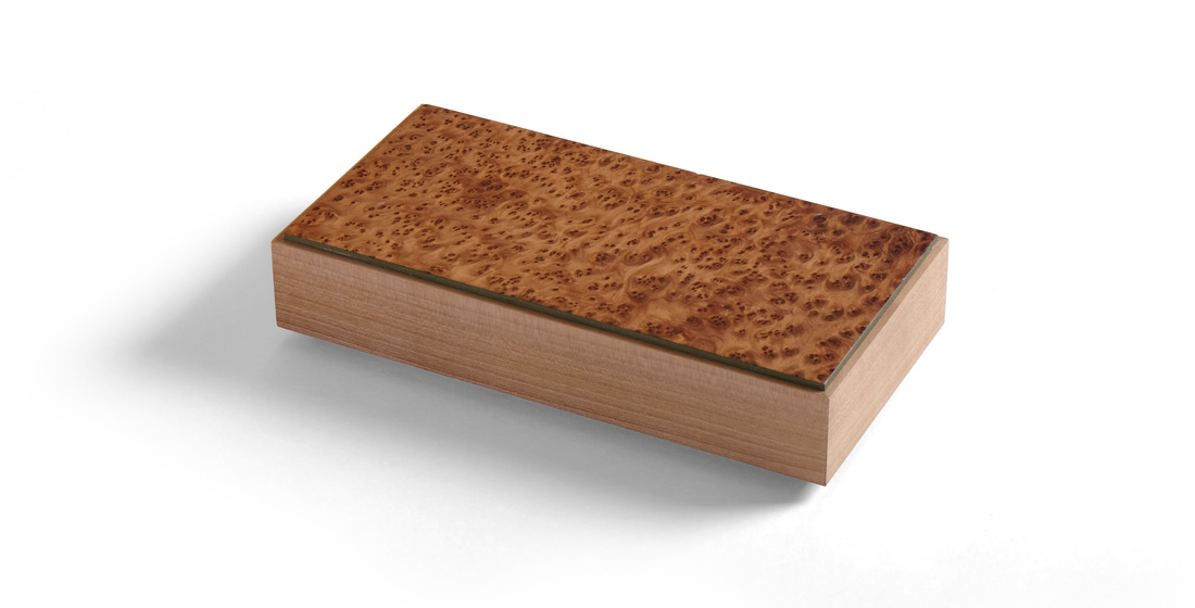
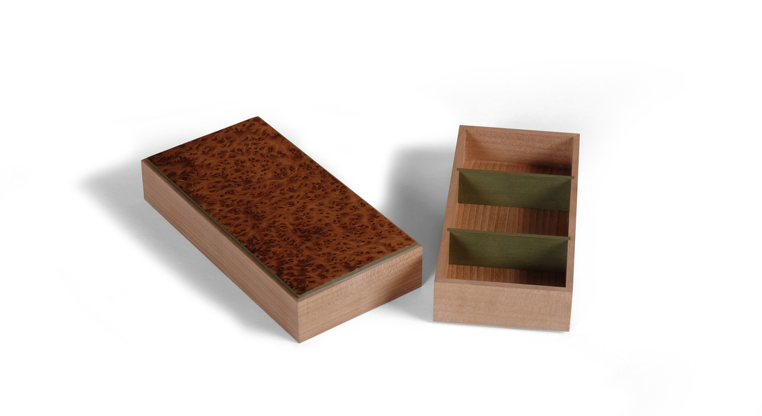
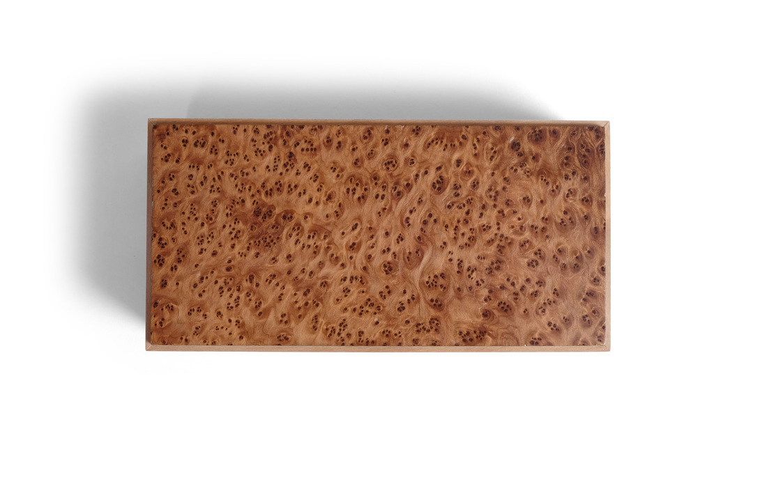
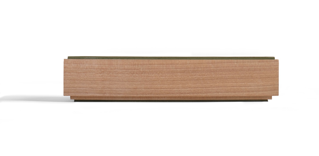
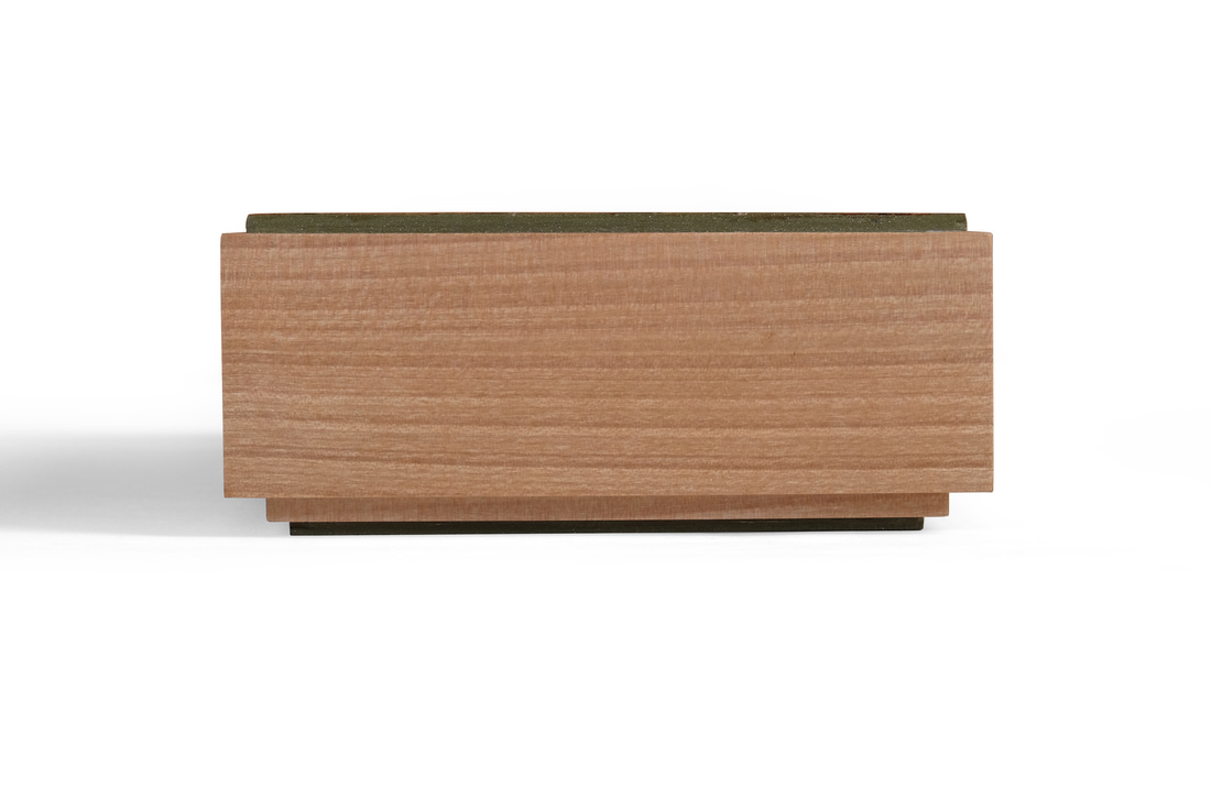
  This is a simple box. It's just a small piece of veneer, some quiet wood for the sides, and a bit of milk paint as an accent. But it's stunningly beautiful. I think this is because of the balance struck between them. It certainly helps that the proportions are spot on—good bones are always beautiful. (It's less than 2 in. tall, 4 in. wide and 8 in. long.) And the box is an excellent example of using woods (and colors) that compliment rather than contrast with one another. Sometimes, a plan comes together. And like Hannibal, I love it when that happens. Let's start with the burl veneer I used on the top. I have no idea what species of wood it is. I was given three flitches of this veneer by a friend. The color is fantastic. So, too, is the figure. But what really makes this veneer work on this box is that the individual "burls" are small. It's super intense, but it's also well-proportioned for a small box. Big, loose burl wouldn't have looked right. It would have been out of scale to the rest of the box and that would have disrupted the box's harmony. That might sound silly—or even overly precious—but when you design a box or piece of furniture, you must give thought to every detail. I chose riftsawn madrone for the sides. I could have used cherry, but cherry has too much red and pink in it. I could have gone with walnut, but walnut is too dark for this veneer. Madrone is a finely grained wood with a lovely earthy brown sapwood. The grain on the piece I used was straight and tight. It's quiet—the perfect compliment to the muscular burl on top. There can be only one dominant wood in any one piece. The others should serve to bolster it's strength. (By the way, this piece of madrone was small, an offcut from a wall cabinet I made years ago. It's been hanging out in the shop, waiting for the right box to come along. It finally did. It's wonderful how little pieces of wood, long forgotten, pop up from the depths of memory at just the right moment. And this piece did. I remembered everything about it: dimensions, color, and grain. Perhaps I grow too attached to the lumber I own.) The green milk paint was easy to pick. The madrone is close enough in color and the fineness of its grain to apple that I knew that this green (which I used on box 25) would work well as an accent. Deciding to paint just the edges of the top (and bottom) was easy, too. I've done that before and it works well to separate the box sides from the top. Here it emphasizes the shape and figure of the top. Figuring out what to do on the inside of the box was harder. At first, I was going to paint the bottom and the dividers (and have more dividers), but that seemed too busy for such an understated box. I eventually worked my way to a bottom made from plywood and shopsawn veneer (riftsawn madrone), and just two dividers painted green. By the way, in the past I would have joined the dividers to the sides with a bird's mouth joint, but here I went with a simple dado. I gambled that painted dividers would look better with a squared end in a shallow dado. I think the gamble paid off. The joint emphasizes the distinct difference between the sides and dividers. In this case, that's a good thing. Here's something that struck me after I had completed the box. It was easy to design and even easier to build. That sounds tremendously arrogant, I'm sure, but let me explain why I say it. The design part was easy, because I was pulling together several design details that I knew worked: the top that's a bit proud of the sides (and has painted edges), a top that slides over the bottom, tightly figured veneered set against riftsawn lumber, dividers used to create a cool geometric pattern. I've used all of the design details in this box before. I just put them together in a fresh way. This excites me, because it means that maybe, just maybe, I'm getting to the point where my design aesthetic has a well-define grammar and vocabulary that can be relied upon to produce beautiful work. The danger is that I'll be lulled into a aesthetic slumber and get lazy with my design, rehashing the same details over and over. I think I can avoid that, at least for now. The making was easy because, hell, I've done it all before. There are no new techniques here. I made the box quickly. I didn't have to figure anything out. I could just work. In fact, it took me longer to finish it (because of the paint). Thoughts of a random nature:
12 Comments
Matt Kenney
10/31/2015 10:57:50 am
Mike,
Joe Wiener
11/5/2015 08:45:56 am
Great use of the Colonel's perspicaciousness. I would suggest that looking at the side views. number the layers 1 from the bottom to 4 at the top, align the edges of layer 4 with the edges of layer 2. Keep the colors as you have them. Try it on the pictures and I think you will see what I mean.
Matt Kenney
11/6/2015 10:06:20 am
Joe,
Joe Wiener
11/6/2015 12:14:20 pm
Yes, I now get it and thank you. Joe
Jeff Moore
11/6/2015 04:03:04 pm
I have a block of redwood burl that looks very much like your box lid. Do you think that's what it might be?
Matt Kenney
11/6/2015 08:16:05 pm
Jeff,
Jerry
11/8/2015 08:32:41 am
Great wood. Great box.
John Reed
11/8/2015 10:05:52 am
My favorite so far, the colors just jumped off the page at me, funny the subtle things that trigger us to like or dislike a piece of art or woodwork. Thank you for this entire project and for sharing it with us, I think about working in a small shop over 40 years ago and the differences today and all the inspiration we can gain from the current media, its just amazing. Looking forward to the next 20 boxes and the conclusion of your project. Great Work! John
Matt Kenney
11/10/2015 10:05:43 am
John,
Michael
11/10/2015 11:05:25 pm
Beautiful box. The veneer is obviously stunning, but I also appreciate the simple design. The profile is perfect.
Wim
2/24/2019 04:29:55 am
Love this one ! Your comment will be posted after it is approved.
Leave a Reply. |
AuthorI love furniture design, and smart techniques. This blog is about both. Archives
August 2020
Categories |
 RSS Feed