
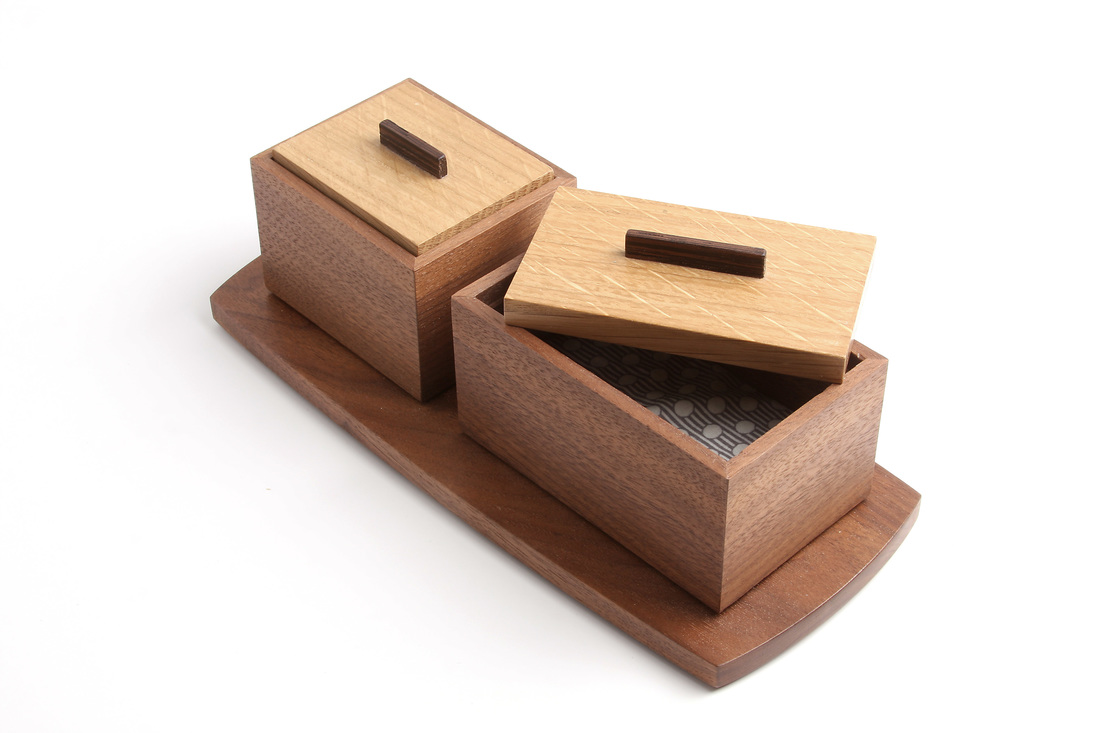
 Yesterday, I mentioned that I had made six boxes using the same core set of design details. You can see all six in the gallery below. To my eye the boxes are all clearly related, but also distinct from one another. I suppose one could argue that the two turned boxes (painted body v. painted lid) are too similar to be called distinct. But for me, the little walnut round box with the yellow lid is a substantial step up in elegance. It feels like a different creature. (I also believe it's the best thing I've made.) Here's what's common to them. The sides are raised 1/8 in. off the surface by a bottom that is inset from the perimeter of the box. The top sits in a rabbet and is 1/8 in. proud of the top edge of the sides. There are three woods in use for each box: The sides are the primary wood, the top is the secondary wood, and the lift is the tertiary wood. Paint has replaced either the primary or second wood in some. Also, the woods are always complimentary to one another, never contrasting. (I hate the notion of contrasting woods.) And the relationship between the color of the sides and the color of the lid reinforces the shape of the lid(s), allowing it to make a stronger geometric statement. There is an emphasis and dependence on good proportion. This started with the first box. All three of its sides are related by the golden mean. This emphasis on proportion explains the clean, simple lines. When you gussy up a piece with ornamentation or complicated lines, you begin to obscure the proportions--or so I think.
2 Comments
Phil
5/6/2015 09:35:03 am
Matt, in considering boxes 1 & 2, it seems as if the lid and sides are made using "contrasting" materials (light vs. dark) rather than complimentary. What do you dislike about contrasting tones? Is it mostly the stark contrasts like walnut and maple that get to you?
Matt Kenney
5/6/2015 03:11:55 pm
Phil, Your comment will be posted after it is approved.
Leave a Reply. |
AuthorI love furniture design, and smart techniques. This blog is about both. Archives
August 2020
Categories |
 RSS Feed