
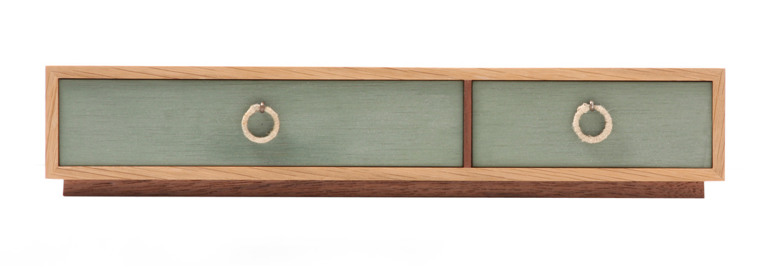
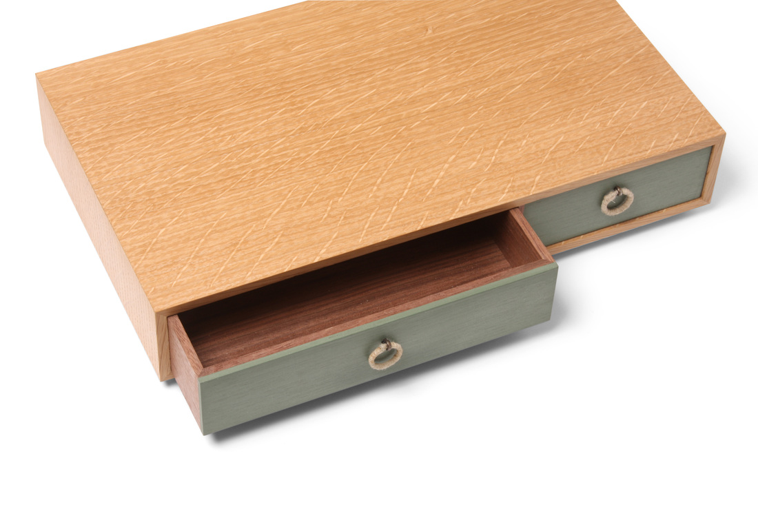
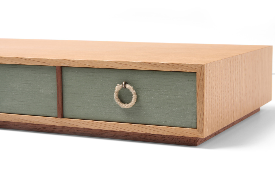
 Quartersawn white oak, walnut, Lexington green milk paint, hemp twine 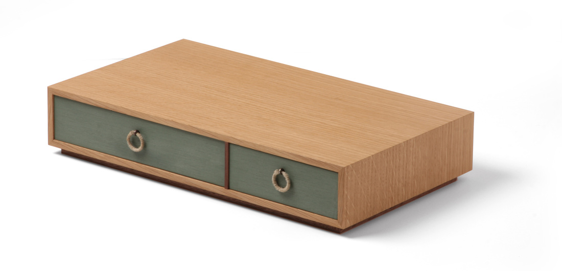 What a difference one week makes. Unlike box 3, which I still have a hard time liking (even though some of the comments folks made have softened me on it), I like everything about this box. I know this one is fairly different from last week's box, but I see the two as directly related. When thinking about how I'd change box 3, I came up with box 4. This is especially true about the overall dimensions. Box 4 is about 3 in. narrower, but twice as long (if you are reading width across the grain and length with the grain, which is how I do it). It's also much shorter. These are the proportions I had in mind when I first came up with the concept for box 3. I don't know where or why I changed them on box 3. I also like a particular design leap that I made with box 4: the walnut divider. I have always, without even thinking about it, made drawer dividers from the same species as the case or box. Most of the time, I think that's the right way to do it. But there is something very nice about this walnut divider paired with the white oak box. Perhaps it's the walnut stand the box sits on, or that the divider is a preview of the beautiful walnut drawers inside. (By the way, this is all air-dried and unsteamed walnut. Hence, the rich and variegated color. Steaming walnut destroys what's most beautiful about the wood. I'll never use it again, if I can at all avoid it.) I'll definitely revisit this design detail in the future, on a wall cabinet or large case piece. The pulls are made from key rings wrapped with a very thin hemp twine. I like them very much, even if there's a bit of a hump where I tied off the twine. I used cotter pins to attach them to the drawer fronts. I blackened them with some chemical from a bottle. I have no idea what it really is, as I got it from Mike Pekovich. It's something used to darken the lead in stained glass. I think it was also used by Sauron when he was crafting the one ring to rule them all. I'm sure it's not all that bad, but I have been referring to the box as my precious. And all of my other boxes are slowly beginning to turn invisible. By the way, I've used gun bluing on metal before, and this looks much better. The drawer boxes are walnut, mitered at the corners. I know this is a risk, but the drawers aren't going to be loaded down with gold bullion or lead. The painted fronts are white oak, which I chose because I knew the milk paint wouldn't completely cover the open grain of the oak. So, you still get a hint of the oak through the paint. I looks nice. I cut the Lexington green paint with a bit of snow white to lighten the color a small amount. Also, the drawers are inset about 1/16 in., to create some depth and to disguise the box's seasonal movement. Random thoughts:
25 Comments
5/15/2015 11:45:39 am
Love the commentary / random thoughts.
Matt Kenney
5/15/2015 01:26:11 pm
Marty, 5/16/2015 05:34:52 am
Regarding the in-work photos. I wasn't suggesting anything elaborate (requiring another person) or with high production values.
Matt Kenney
5/16/2015 08:30:37 am
I'll give some thought to taking process shots as I work. I know I could grab some quick shots with my personal camera or phone, but, to be honest, I'd prefer to maintain a consistent level of photography on the blog, and the shots of the boxes establish that level. 5/16/2015 12:37:04 pm
Hey, that's great that you were able to enable the click-to-view feature. Your boxes look even better now that I can see them as if they were in my hand.
Matt Kenney
5/15/2015 01:27:42 pm
Marty,
Jerry Stark
5/21/2015 11:16:32 am
Great box. Love everything about it.
Matt Kenney
5/21/2015 02:51:29 pm
Jerry,
James
5/16/2015 06:52:07 am
How about some photos of the bases, like a upside down shot so we can understand if it's pieces or a slab as the base.
Matt Kenney
5/16/2015 08:33:13 am
Thanks for the suggestion, James. I'll keep it mind as I move forward. This particular box sit on a four narrow pieces of walnut that are mitered at the corners. They are screwed to the bottom.
It's funny that I just posted a comment about showing more grain on the comments section for Box 3 and here you've accomplished that! That green is a really nice combo with the white oak. I've seen a lot of woodworkers make the mistake of thinking milk paint should be opaque. Bravo.
John Jenkins
5/30/2015 02:28:43 am
I really like the contemporary look of this one. It seems like an instant classic.
Barry Targan
5/30/2015 05:06:35 am
Is there any chance that you'd make your box plans available for others to build the boxes?
Matt Kenney
5/30/2015 05:15:46 am
Barry, 5/30/2015 06:58:45 am
Matt,
Wayne Willy
6/1/2015 06:22:42 am
Boxmakers eat and sleep box ideas.
Matt Kenney
6/2/2015 03:56:47 pm
Here! Here! I'll do my best.
Eric
6/18/2015 04:53:45 am
LOVE this box, and loving this series in general. Thank you for sharing this, and please keep it up!
Matt Kenney
6/19/2015 02:28:25 am
Eric,
Josh
6/20/2015 05:52:15 pm
Truly a beautiful box. Is it possible to get the overall dimensions (length, width, and depth) of the box itself?
Matt Kenney
6/22/2015 03:21:03 pm
Josh,
Dave B
9/3/2015 06:25:26 am
Hey Matt, I think this is my favorite of all of your boxes thus far. The simple and thoughtful design is perfect. I like to make small boxes also, but I've always been concerned about mitered corners, especially with thinner stock. Do you reinforce in some way?
Matthew Kenney
9/3/2015 10:33:23 pm
I don't usually reinforce the joints. The boxes are small and the wood movement is parallel to the joint, so there isn't much stress. Thanks for reading.
Jack
11/24/2015 12:58:47 pm
Hi Matt,
Matt Kenney
11/24/2015 01:34:28 pm
Jack, Your comment will be posted after it is approved.
Leave a Reply. |
AuthorI love furniture design, and smart techniques. This blog is about both. Archives
August 2020
Categories |
 RSS Feed