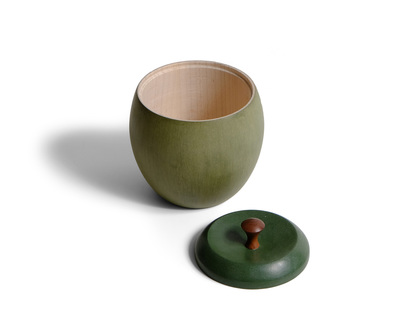
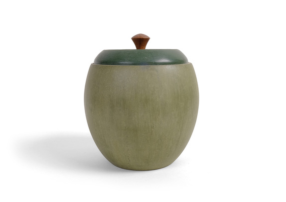
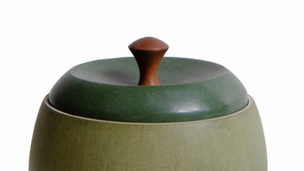
 I both love and hate this box. I turned the bottom quite some time ago, and it was inspired by some Japanese tea cups that I've seen. I love its shape. But then it needed a top. I like the top. I also like pull. But when the pull is put on the top and top and bottom, you get a freaking apple. And I don't like that at all. Of course, everyone who has seen it, held it, and opened it has loved it. Evidently, it would make a great sugar container for some tea drinkers I know. This is a case where I have to trust what those folks say. My dislike for the box comes from the fact that I had set out to make a box that gives a strong nod to some understated but undoubtedly gorgeous Japanese tea pottery I've seen. I ended up with a somewhat kitschy apple box. Perhaps I'll take a few more shots at the lid. I have several other ideas about how to make it, all of which would take the apple stink off the box. Enough complaining. There is still a lot to like about this box. First, the lovely shape of the bottom. It fits my hands perfectly. Had I been a potter, this would be a wonderful tea cup. (Handles, as I understand it, are a bad thing on tea cups. If you can't hold it by wrapping your hands around a full tea cup, then the tea is too hot to drink. I don't tea—or coffee—but this is what I've been told.) The milk paint finish also is lovely. It's a homemade green that I made my mixing marigold yellow and Federal blue. The "texture" in the finish comes from the brush strokes. There's a particular way to brush on the paint that leaves marks like this. The finish, I think, looks very much like a pottery glazing, which is the look I was after. The lid is straight Lexington green. To emphasize the difference between the two, I finished the lid with shellac and wax where the body has only wax. Shellac darkens milk paint much more than wax alone. It compliments the homebrew green quite well. The curve of the lid is meant to pick up on the curve of the body, and the top of the pull is meant to bring the curve to a close. The three aren't exactly matched, but that's OK. The connection is suggested, and a suggestion is often better than an explicit statement. By the way, the pull is turned from the wortled heartwood of a quizzical pear tree. Lovely stuff with great color. I left the top rim of the bottom and its interior unfinished. I turned the bottom from hard maple. The stark creamy white is a nice surprise when you open the box. The pale rim is a nice way to separate the lid from the body. Eventually, it will darken to the lovely honey gold that maple becomes, and that will be a nice touch, too. A few random thoughts:
7 Comments
Jeff Smith
9/11/2015 11:12:39 pm
I love the bottom too and the top is fine with me but I think the thing that makes it look like an apple is because of the pull. Why not go with a pull that somehow makes it look Japanese?
Reply
9/12/2015 12:33:58 am
I really like the "Apple" look. Thats the first thing I thought of when I saw it. I would go with the flow and make an apple stem, and remove that knob. I enjoy your box journey and look forward to the next one. I have made a few and would to do more. The thing I like most about your work is the simple clean design. Keep up the good work.
Reply
Dave B
9/12/2015 01:24:55 am
First, I like the box, but I'm also a fan of anything green. I think with a different color pair, you will lose the apple similarity completely. A two tone Federal Blue would also look nice.
Reply
Phil Huber
9/15/2015 11:31:15 am
I thought "apple" as soon as I clicked the link. But it doesn't come across as kitchy. I would be afraid for you if you had painted little apple seeds on the inside. Or if your carved spoon ends up looking like a worm. The "glazed" paint is a sweet effect something I'll need to try out. One question: do you create custom milk paint colors after mixing or from the dry powders? Or am I just not reading carefully?
Reply
Matthew Kenney
9/15/2015 07:26:58 pm
I mix the dry powders and then add water. I'm sure I just didn't explain myself clearly. And I'd never do apple seeds air worms!
Reply
Dave Miller
9/24/2015 06:36:46 am
I like this box. It's a bit different, not kitschy. Perhaps if the lid had a bit of an over hang, was slightly domed, and with a curved pull to match the contour of the slightly domed lid.
Reply
Wade H
10/15/2015 05:09:58 pm
I didn't think or see apple until you mentioned it. I was thinking wow that is a nice little box, maybe use it as a salt bin or a sugar container until you mentioned apple, now that is all I see. Thanks. :)
Reply
Your comment will be posted after it is approved.
Leave a Reply. |
AuthorI love furniture design, and smart techniques. This blog is about both. Archives
August 2020
Categories |


 RSS Feed